

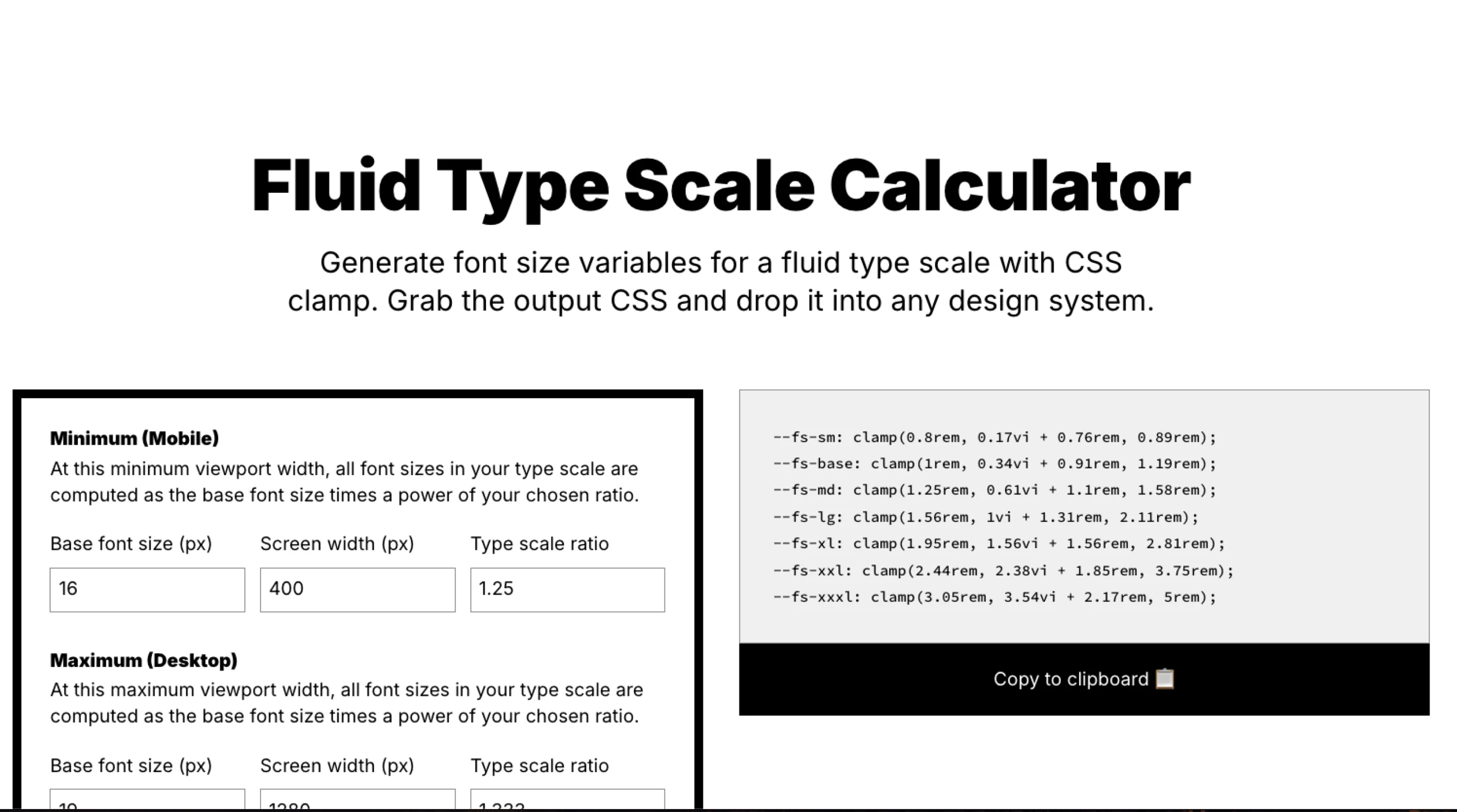
Fluid Type Scale Generator is a powerful tool for creating responsive typography in your design system. It uses CSS clamp and viewport units to ensure smooth scaling across different screen sizes.
Start by selecting a base font size and defining minimum and maximum viewport widths. Choose a scale ratio to control how each step in your typography grows. Customize units, rounding, and fallbacks to fit your needs.
The generator calculates CSS variables using the clamp formula, ensuring fluid text resizing without abrupt jumps. A live preview lets you test the scaling in real time. Once you’re happy with the results, simply copy the generated CSS and integrate it into your project.