


Typography Resources That Help You Choose (and Use) Fonts with More Confidence
A curated library of modern fonts, pairing tools, and type guides—made to help designers learn typography and pick the right font without second-guessing.
-
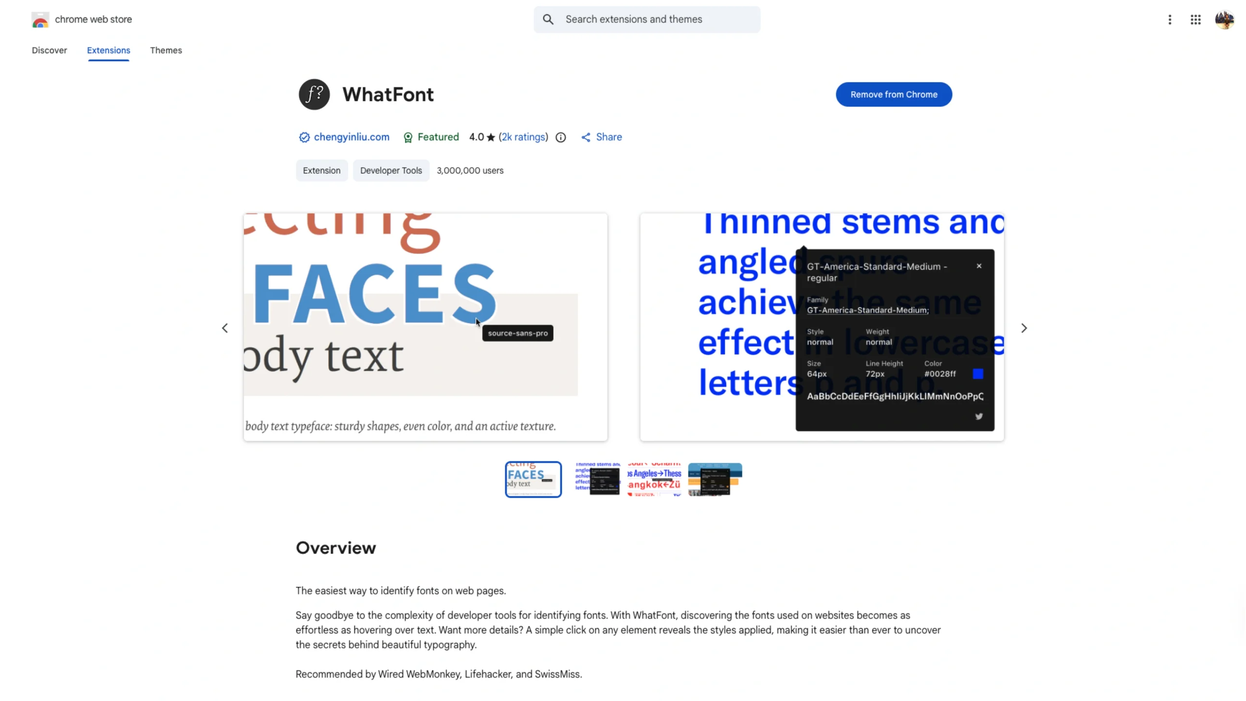
WhatFont – Chrome Browser Extension
-
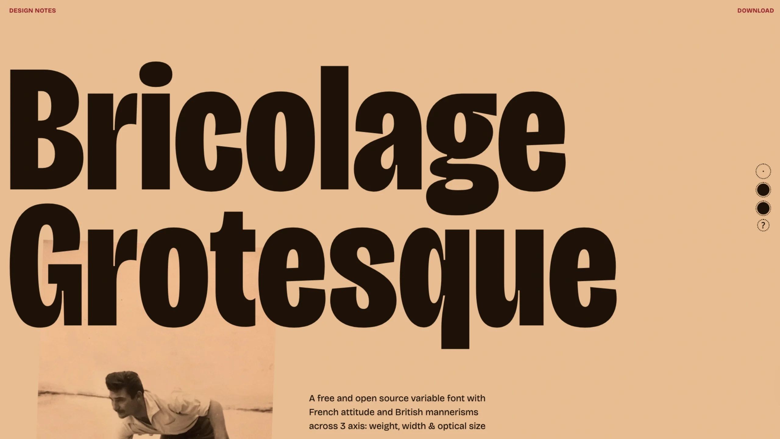
Bricolage Grotesque
-
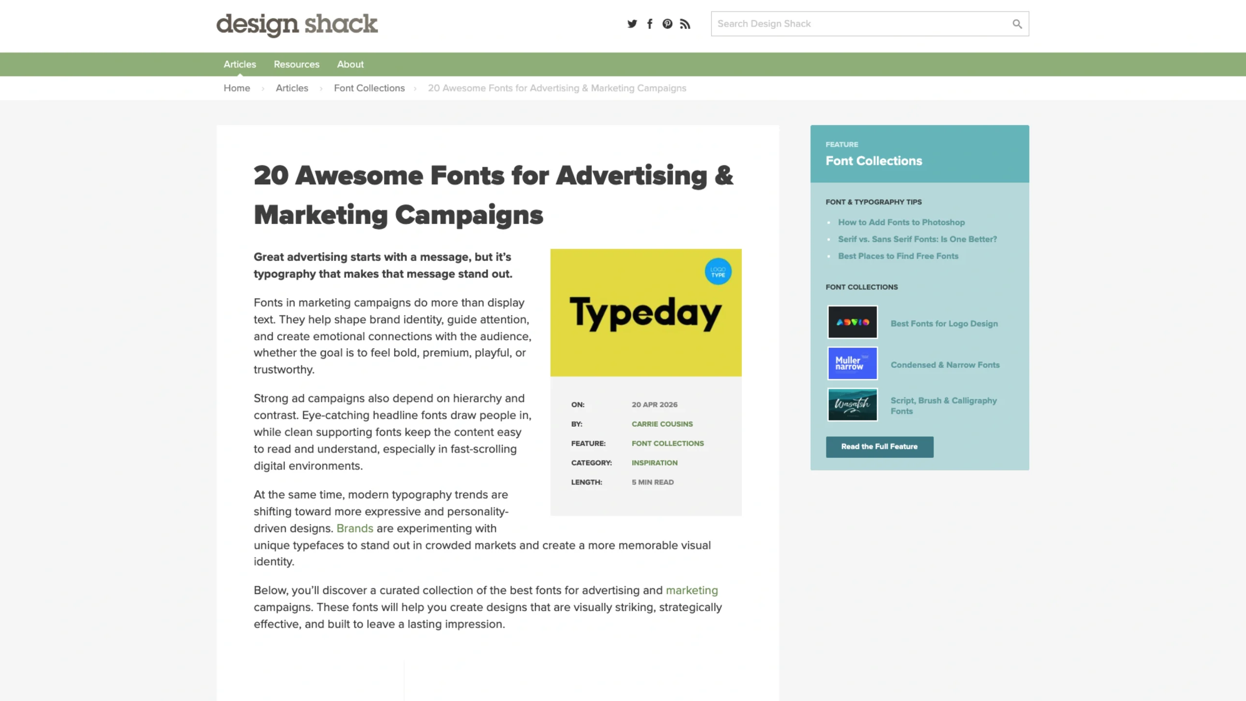
This resource features a curated collection of 20 impactful typefaces specifically selected for marketing and brand storytelling.
It categorizes fonts by their psychological impact—ranging from bold, high-visibility headline faces to elegant editorial serifs—helping designers choose typography that aligns with specific campaign goals and audience demographics.
20 Awesome Fonts for Advertising + Marketing Campaigns
-
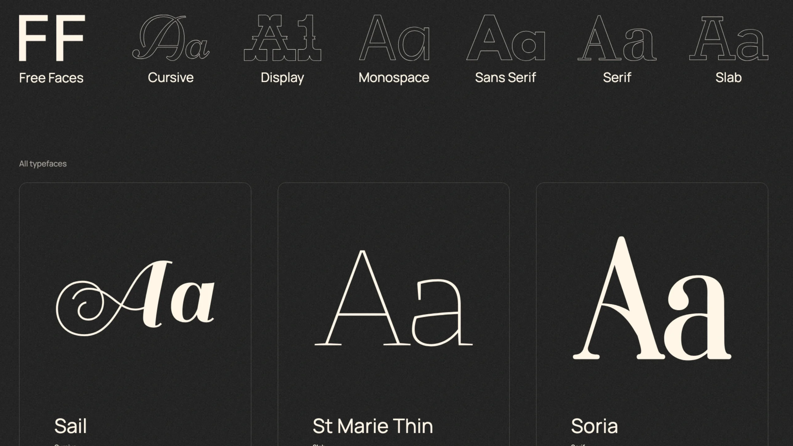
Free Faces Gallery
-
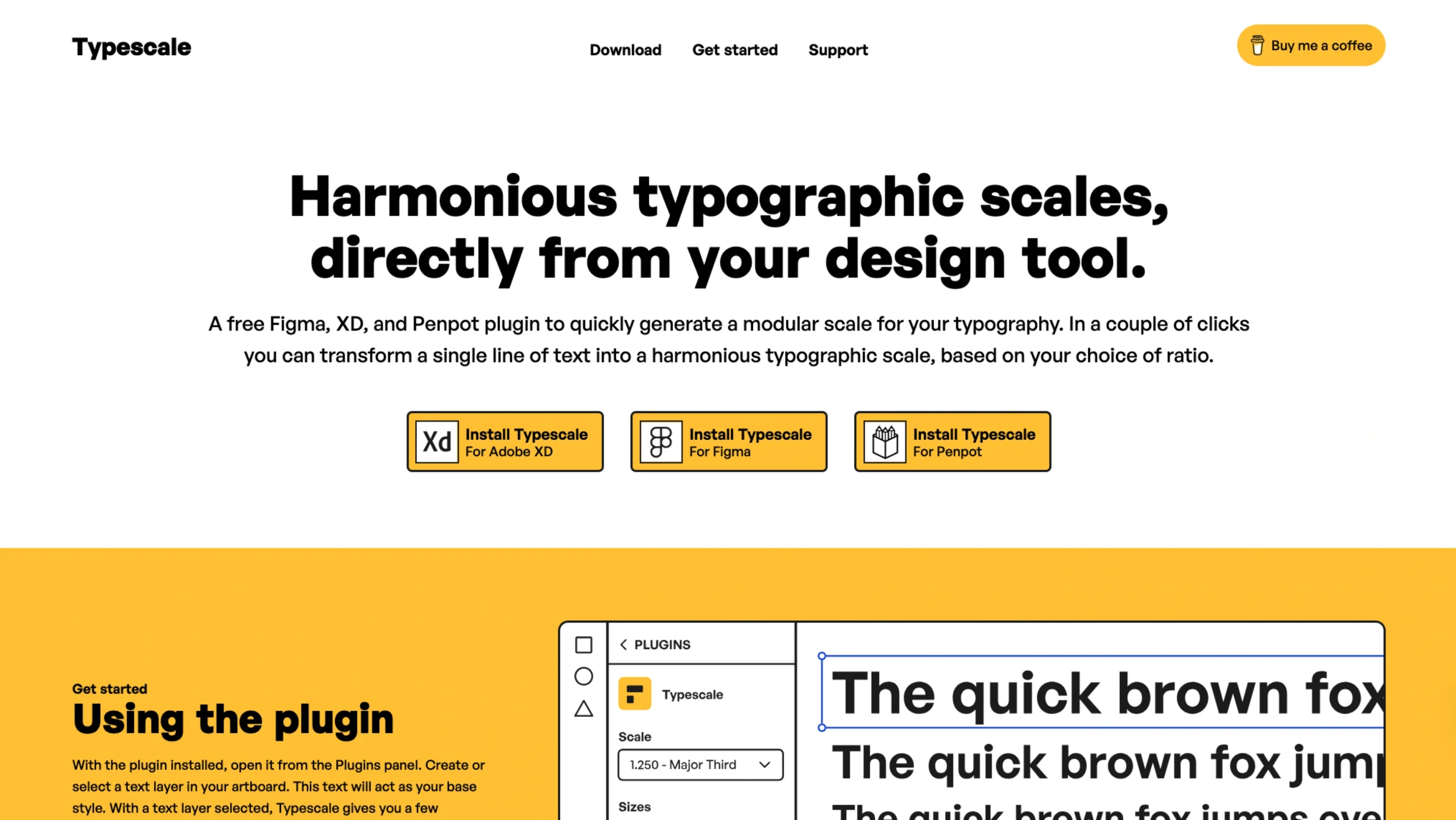
Typescale. Io
-

Laura Meseguer – Typographer
-
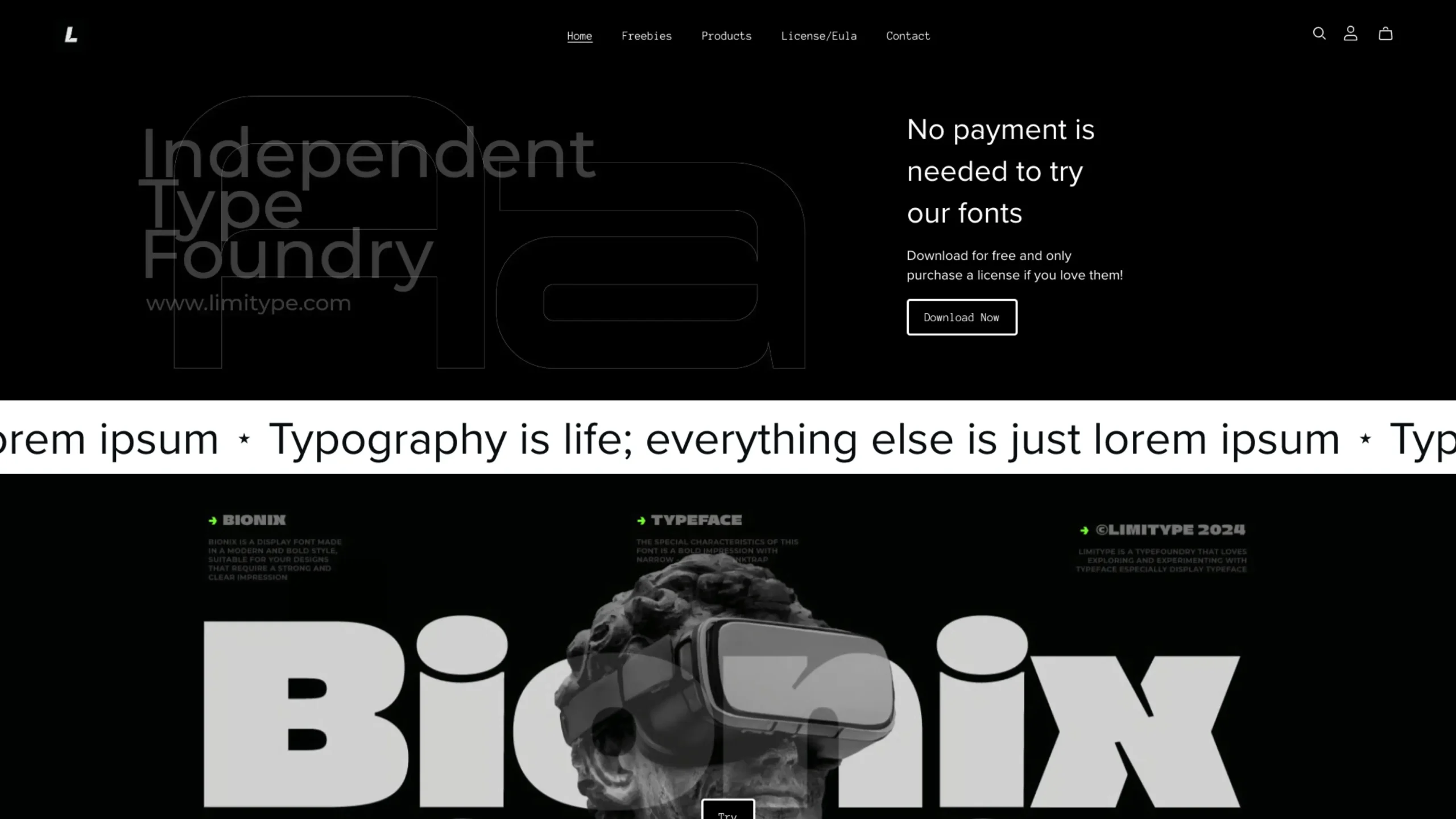
Limitype – Type Foundry
-
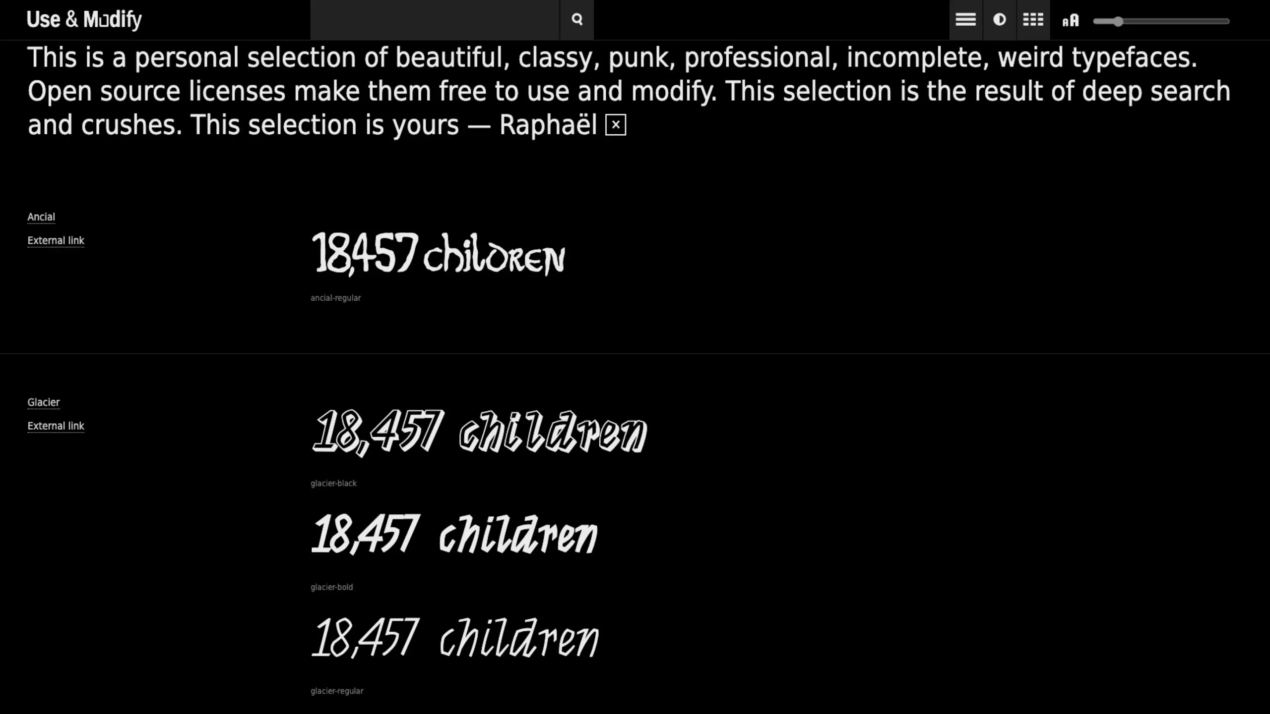
Use & Modify
-
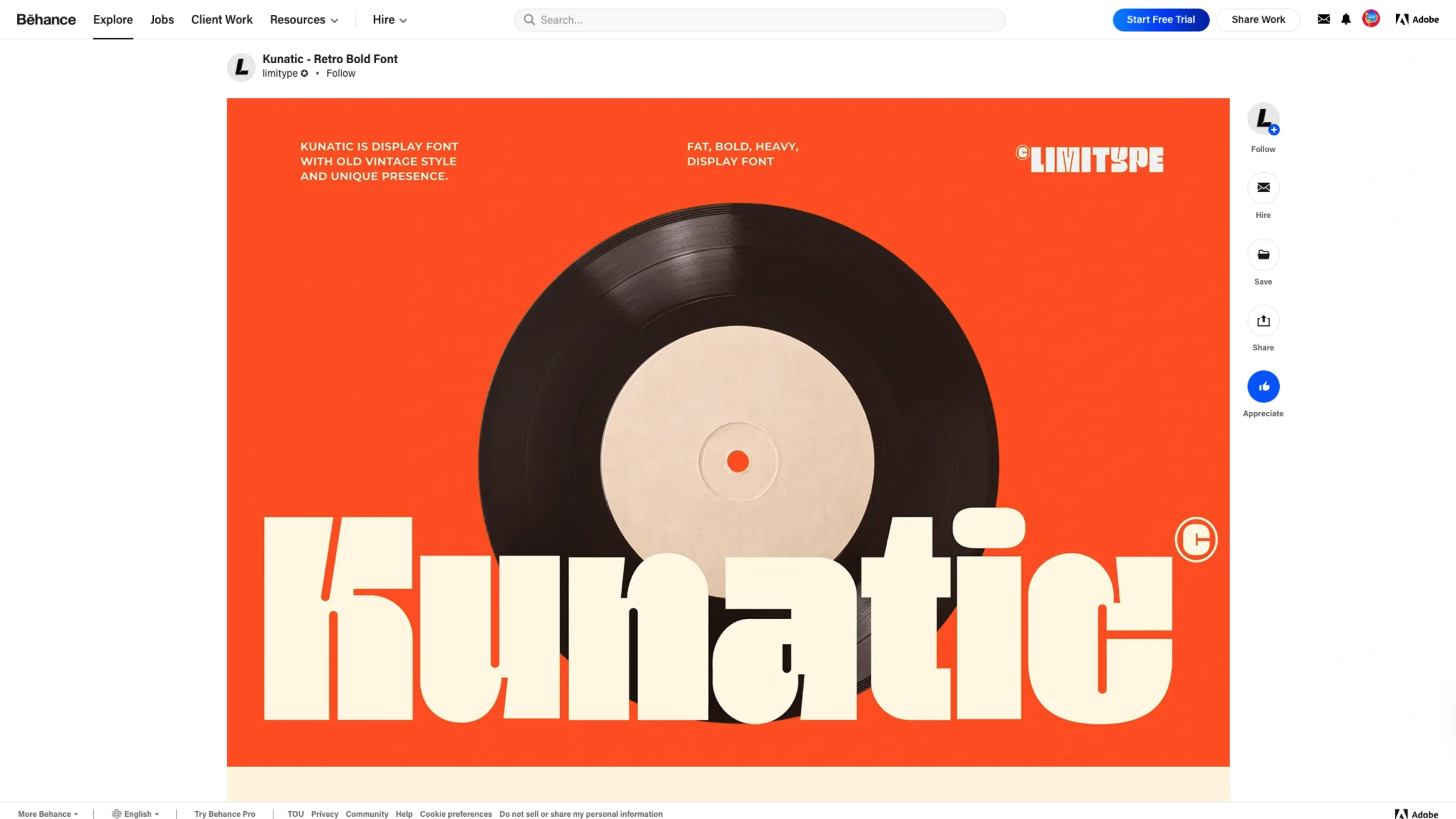
Kunatic – Retro Bold Font
-
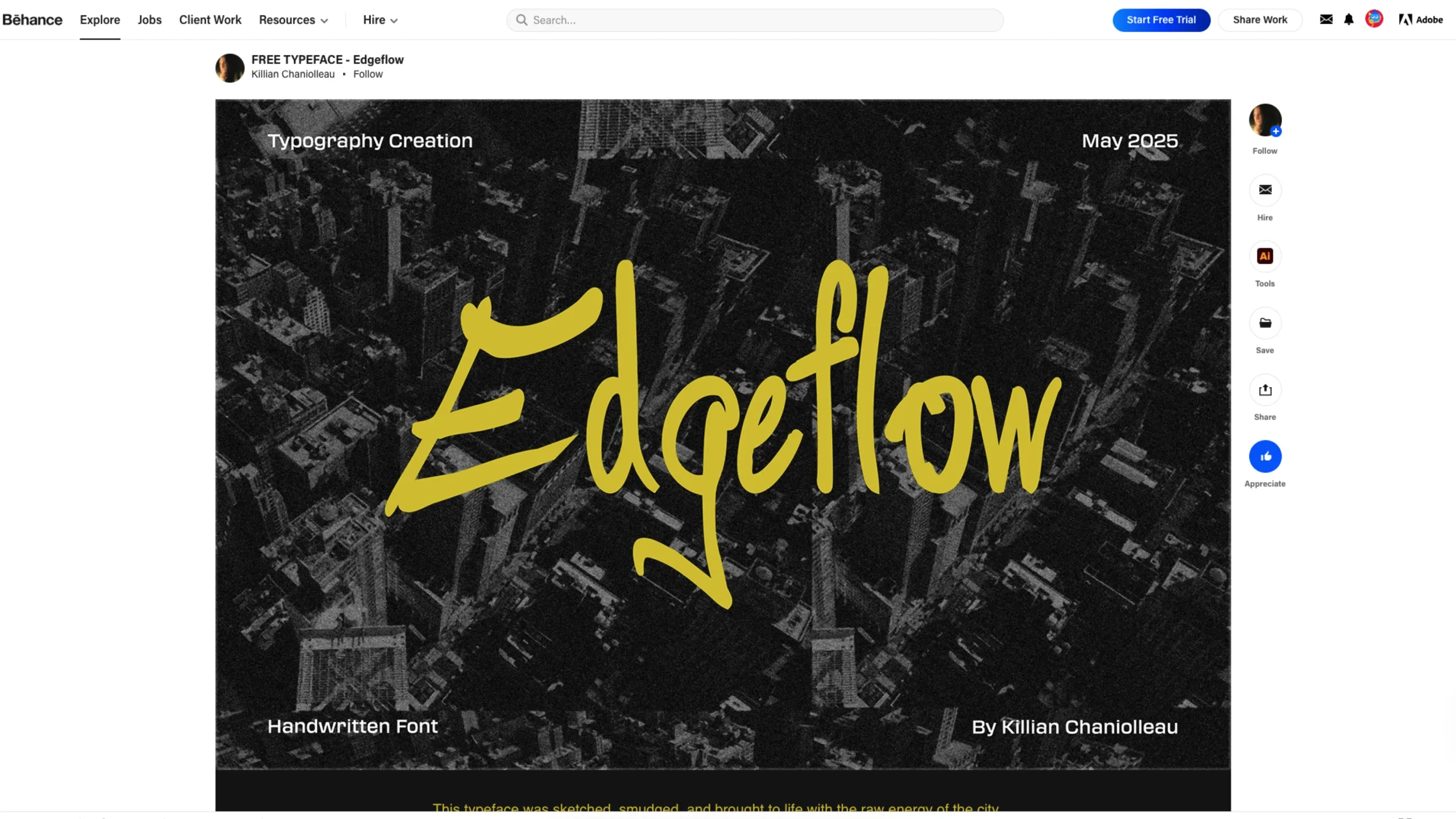
Edgeflow Typeface – Free Font
-
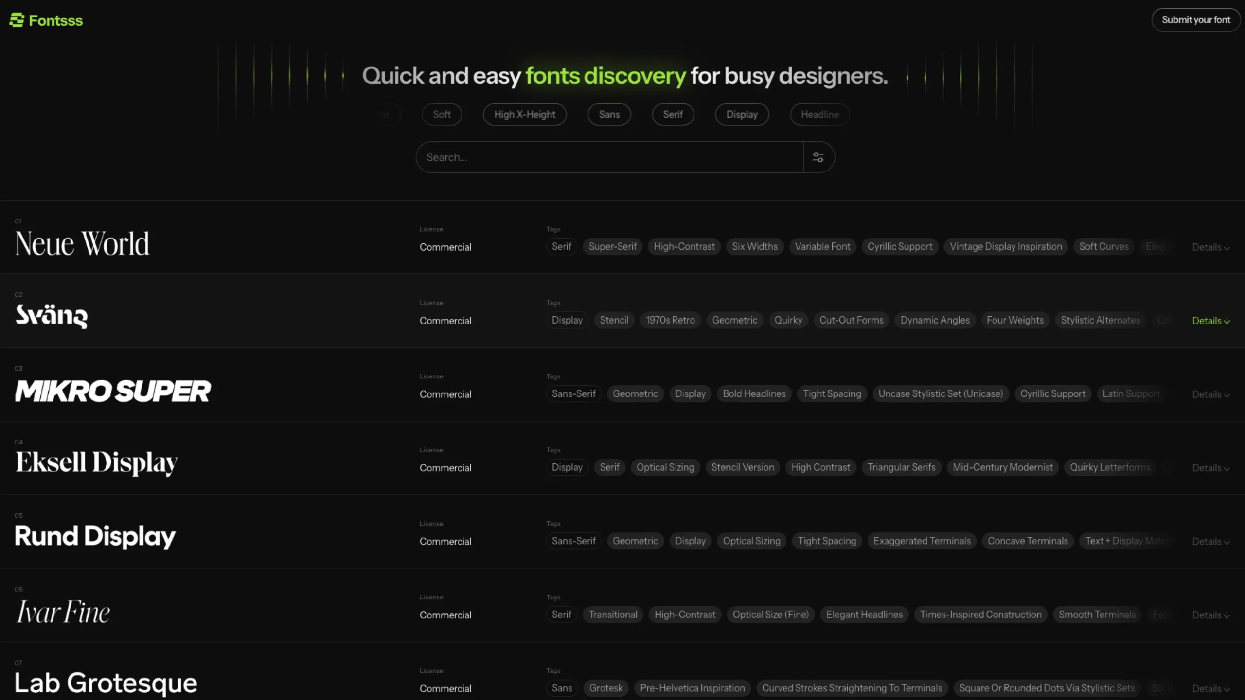
Fontsss
-
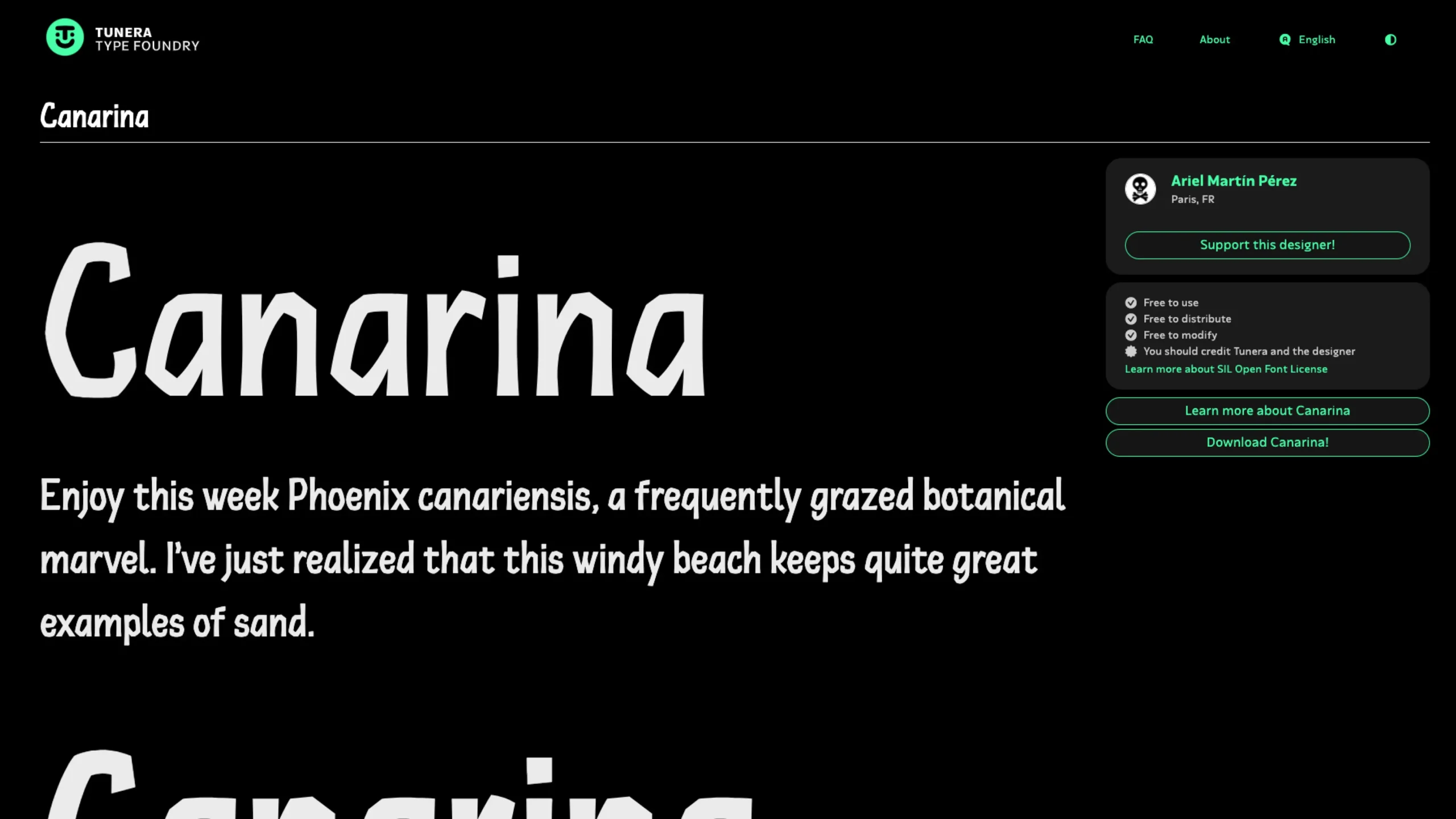
Tunera – Free Type Foundry
-

Google Sans Flex
-
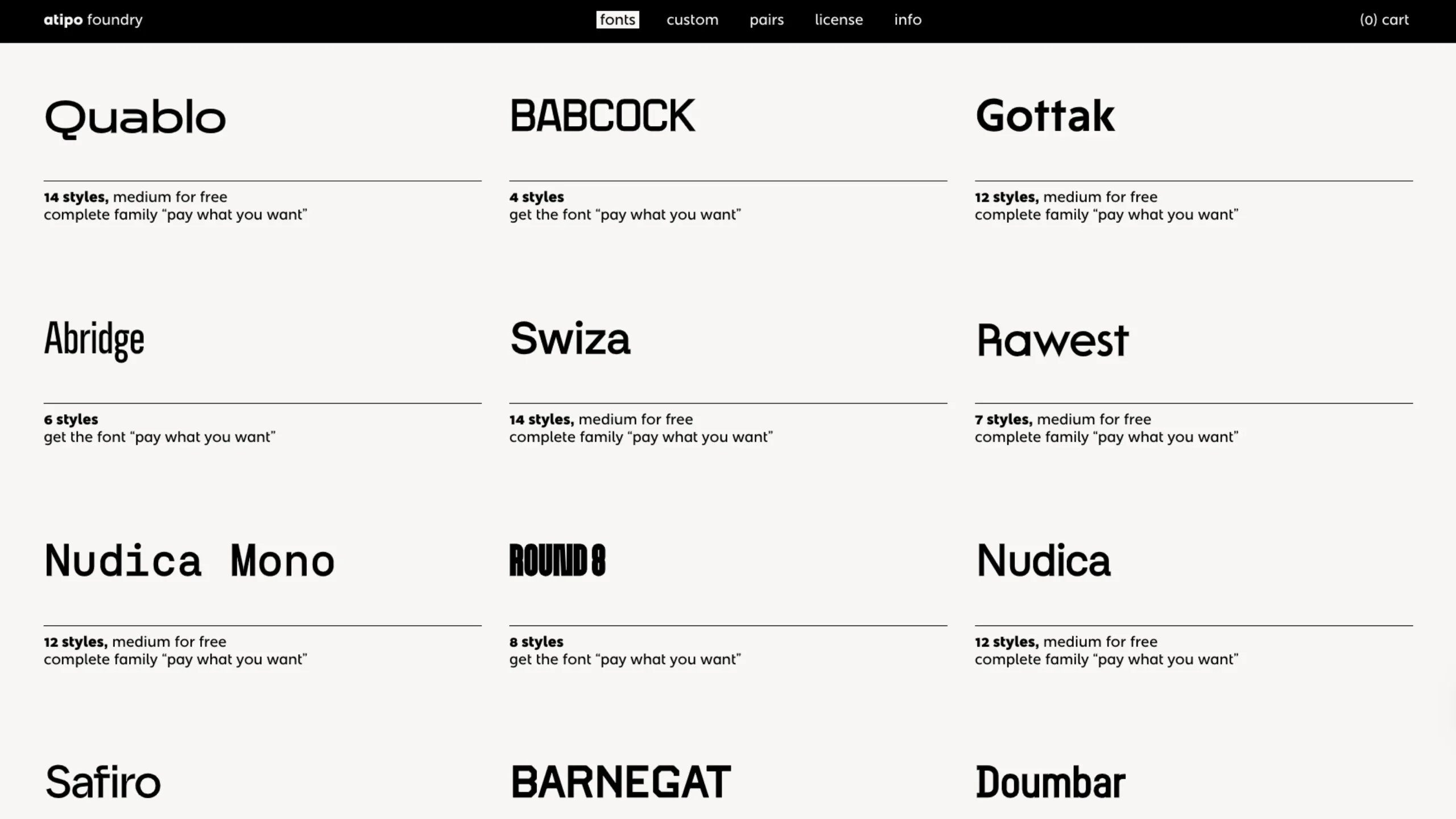
Atipo – Fonts Foundry
-
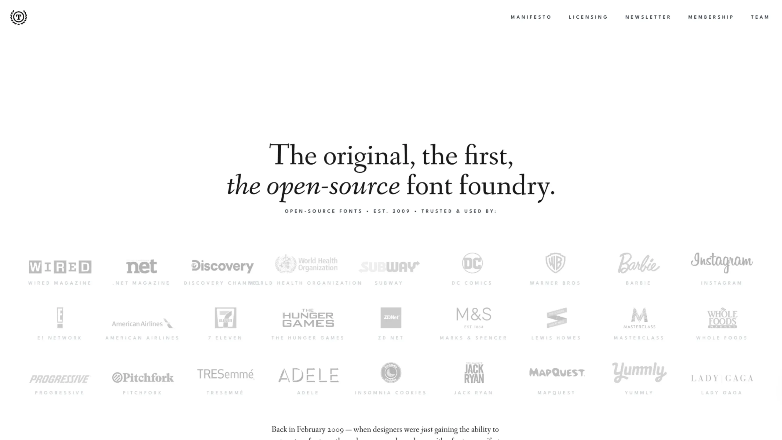
The League of Moveable Type – Free & Open Source
-
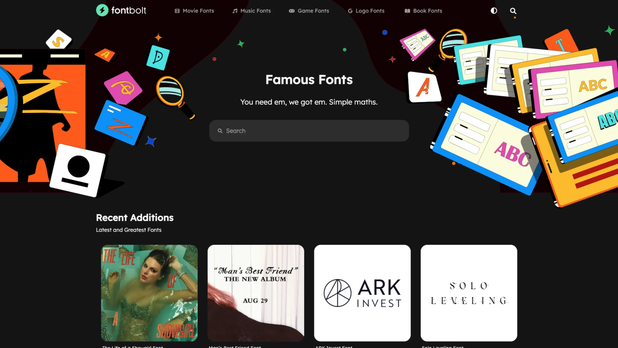
FontBolt – Free Fonts Generator
-
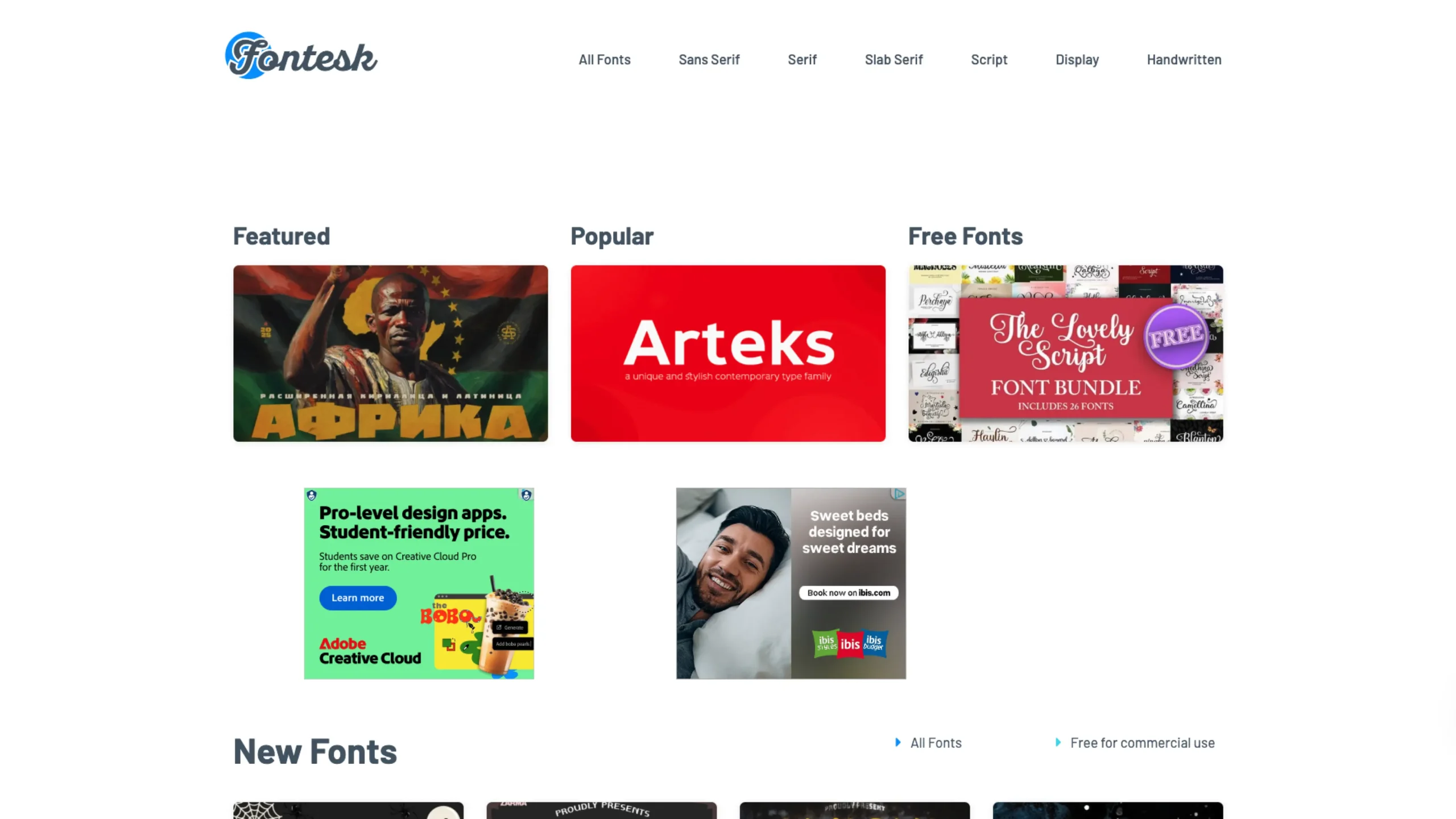
Fontesk
-
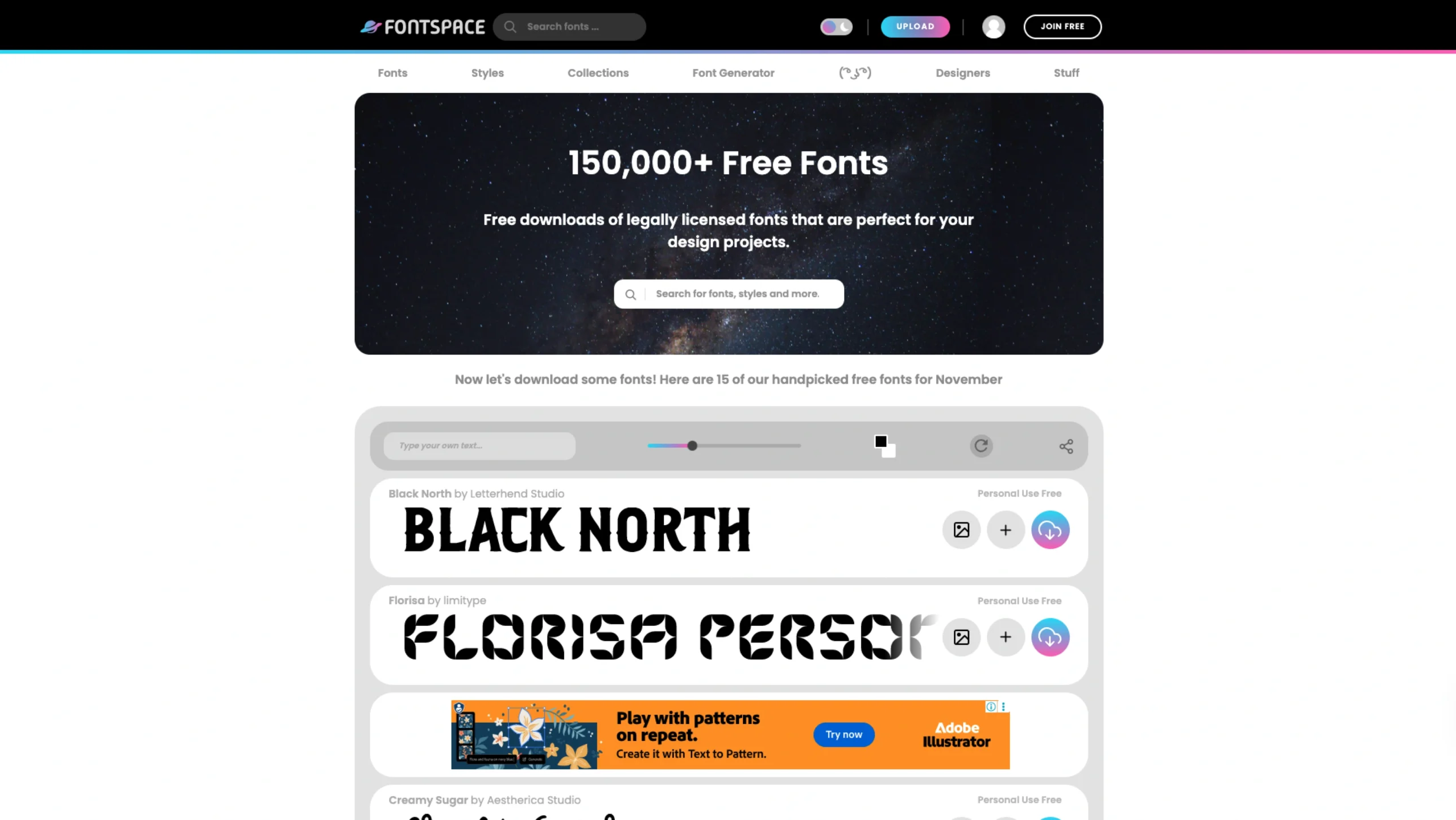
FontSpace
Stay in the loop.
Sign up for the newsletter to receive a weekly
dose of design resources delivered straight to
your inbox.
🔠 Typography Overview
Typography is one of those things you don’t notice—until it’s wrong. Or maybe not even “wrong,” just… off. A little too tight. Slightly unreadable. Or maybe it just doesn’t feel like the product it’s part of.
And yet, when it works? It’s seamless. Effortless, even. The kind of detail that quietly carries the whole design.
That’s exactly why we built this Typography category.
It’s not just a list of pretty fonts (though yes, there are plenty of those here). It’s a curated collection of resources that help you understand how typography works—how letters create rhythm, guide attention, build trust, or even shift emotion. That might sound dramatic. But honestly, the right typeface can do all of that.
We’ve included everything from guides on choosing the right font for your brand, to type pairing tips, to downloadable font collections—modern, free, and well-made. Some are expressive. Some are intentionally invisible. All of them earn their spot here.
Whether you’re designing a landing page, working on a mobile app, or just trying to figure out why your layout feels “off”—this section is here to help you look at type with a sharper eye (and maybe a bit more appreciation).
🧰 What You’ll Find Inside the Typography Library
🧠 Practical Typography Guides
Not theoretical essays—actual, useful insights. Why line height matters. When to kern (and when to leave it alone). What makes a body font readable. And how to use typography to create visual hierarchy without shouting.
🔤 Free & Modern Font Collections
We’ve curated high-quality, downloadable fonts that are free to use and feel fresh—whether you’re designing for startups, portfolios, or editorial projects. No junk. No 2006 gradients. Just type that works.
🎯 Font Pairing Resources
Pairing fonts is part logic, part intuition, and sometimes… a bit of trial and error. These tools and articles help you explore combinations that balance contrast, character, and clarity.
📐 Tools to Test and Preview Type
Want to see how a font looks in a real layout before committing? These web tools let you preview headlines, body text, and UI labels—all in context. It’s like trying on typography before buying (or downloading).
📚 Learning Platforms for Type Fundamentals
Some resources dig deeper—into anatomy, classification, even historical context. If you’re the kind of designer who likes to understand why something feels elegant or authoritative, this part’s for you.
🙋 Why This Exists
Because type is everywhere. And yet, it’s surprisingly easy to treat it like decoration instead of design. We wanted to create a space where typography is treated with care—but not ceremony.
This is for designers who want to stop guessing. Who want their layouts to feel deliberate, not default.
And maybe, for the ones who want to enjoy the process of picking a font, instead of dreading the endless scroll through options that all kind of look the same.
💡 Frequently Asked Questions (FAQs)
1. Are these fonts really free?
Yes. We do our best to only include fonts that are free for personal or commercial use. Licensing notes are included where needed.
2. Do you feature Google Fonts too?
Of course. But we also dig deeper—beyond the usual suspects. Many fonts here come from independent designers and lesser-known foundries.
3. I’m new to typography. Will this help me?
Absolutely. This category is meant to guide, not overwhelm. Start with a guide or try out a few pairings. You’ll get the hang of it.
4. What makes a font “modern”?
Good question. It’s partly about visual trends—clean lines, versatility, legibility across devices—but also about tone. Fonts that feel current without feeling gimmicky.
5. Can I use these in client projects?
Yes, unless noted otherwise. Always double-check licenses, but many are open for commercial use.
6. Do you include variable fonts or type systems?
We’re starting to. Variable fonts are becoming more relevant, especially in UI work. And when they’re well-made, they’re powerful.
7. How do I know which font is right for my project?
There’s no formula, but the guides and tools here can help you narrow it down. And sometimes… you just have to try one and live with it for a bit.
8. Are these tools for web or print?
Mostly web, but the fundamentals apply to both. We’ve tried to keep the library focused on digital product design—but good type is good type.
9. Can I suggest a font or resource to include?
Yes, always. If you’ve used something great—or made something great—send it over. We’re always updating the list.