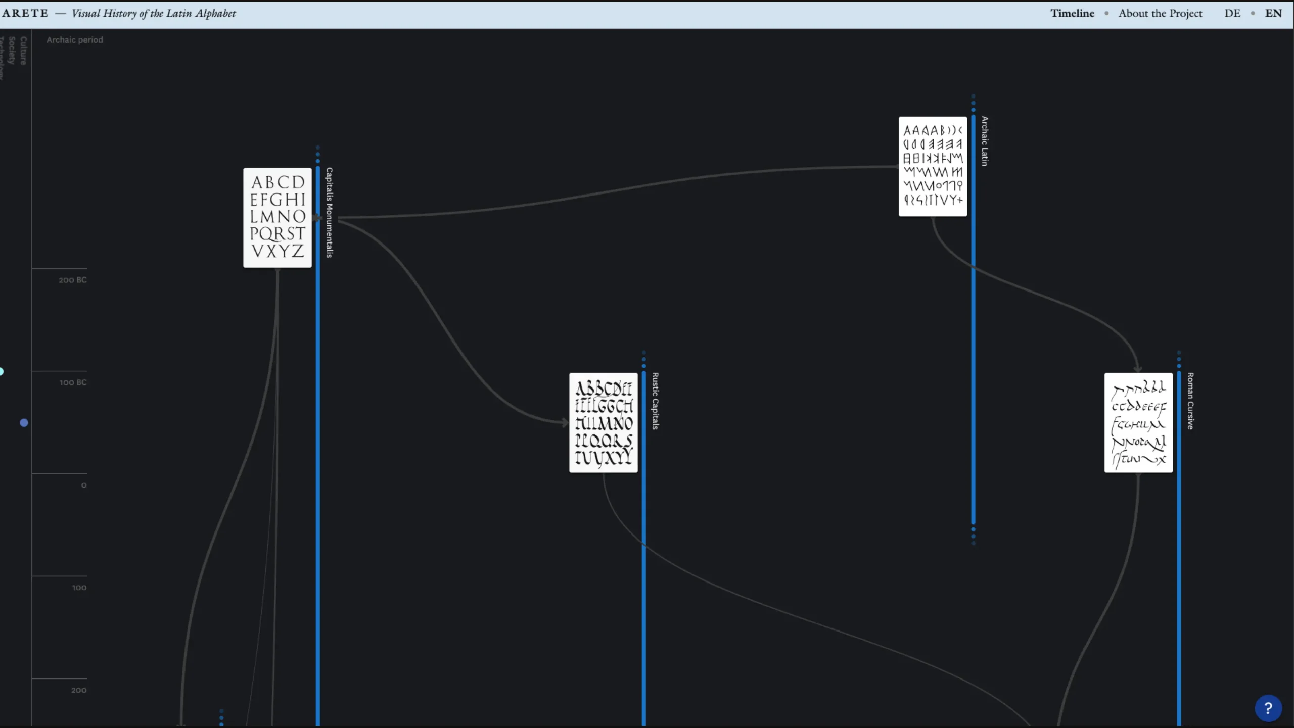
ARETE is an interactive visualization project that traces the evolution of the Latin alphabet across 2,000 years, showing how scripts and typefaces are interconnected rather than following a simple linear path.
When I first explored ARETE, I immediately realized it wasn’t just another academic project — it’s a beautifully thoughtful visualization created by UCLAB at the University of Applied Sciences Potsdam, capturing the entire evolving story of the Latin alphabet.
Their goal? To help people finally see how rich, diverse, and interconnected the history of type truly is.
What They’re Really Trying to Show
Most of us grew up hearing a simple story: Roman capitals evolved into Antiqua, then into Grotesk, and eventually into the clean typefaces we use today. But that linear narrative oversimplifies everything.
They believe — and they prove — that type history is not a straight line. It’s a network of influence, where designers learn from each other, borrow ideas, adapt existing forms, and create unexpected variations.
Across different centuries, you’ll find intense periods of standardization… followed by wild bursts of experimentation.
ARETE aims to make this full spectrum visible. Their visualization lets you explore how scripts and typefaces influenced one another, evolved, merged, or diverged.
Beyond Typography: Calligraphy & Handwriting Matter
One thing I love about their approach is that they don’t limit the story to typography alone.
Even long after the printing press arrived, handwritten books and documents flourished — especially in the 17th and 18th centuries.
Calligraphy, everyday handwriting, illuminated manuscripts… all of that is part of the same living ecosystem of writing. And ARETE treats it with the importance it deserves.
How They Organize the Chaos
To make sense of centuries of development, they use a classification system — not to impose a rigid structure, but to make the timeline more straightforward to understand.
These “classes” come from respected historical sources, including:
- Die schöne Schrift (František Muzika)
- Schriftkunst (Albert Kapr)
- Bruckmann’s Handbuch der Schrift (Stiebner & Leonhard)
Each class includes carefully chosen examples that illustrate the defining characteristics of that script or style. Some groups are wildly varied, others remarkably consistent — and this contrast is part of the story.
Making It Easy to Explore
On the left side of ARETE’s visualization, you’ll find a timeline filled with cultural, technological, and societal events. This gives you context — a sense of what was happening in the world when certain typographic styles emerged.
The whole thing is meant to be explorative: nonlinear, flexible, visual—more like wandering through a living museum than reading a dry textbook.
And They’re Not Done
They’re very clear: this is a first version. Not a definitive archive, but the beginning of a long-term attempt to visually map the history of type in a way that’s insightful, approachable, and beautifully structured.
The Bigger Picture: Why This Project Matters
What surprised me most is how little attention writing and printing history gets, even though reading and writing are fundamental human activities. Compared to its importance, the academic research is surprisingly thin.
ARETE steps in as an ambitious attempt to visually and formally describe how the Latin alphabet has evolved over centuries.
The team debated whether to include other writing systems (such as archaic Greek), but ultimately chose to focus on the Latin script to reveal the depth and complexity hidden behind a system that appears standardized today.
Two Worlds: Typography vs. Calligraphy
Typography tends to tell a clean story:
- Roman capitals → capital letters
- Carolingian minuscule → lowercase
- Protosinaitic ox → our printed A
But reality is far more complex.
Calligraphers, meanwhile, often emphasize the medieval manuscript tradition. Their lens is entirely different.
ARETE attempts to bridge these perspectives — typography, calligraphy, and handwriting — into a unified, interconnected narrative. Something rarely attempted.
Muzika’s work, in particular, inspired them: he showed how messy and overlapping history truly is. Type didn’t evolve step-by-step.
Many styles coexisted simultaneously, and even after printing was invented, handwriting and illumination continued to flourish for centuries.
Why This Matters Today
In the digital age, type has exploded. We don’t just write by hand anymore — we shape letters digitally, using tools, scripts, and fonts from all eras.
Many historical scripts now reside within our software tools, making it more critical than ever to understand their origins.
Calligraphy and handwriting are even making a comeback — a kind of quiet rebellion against the noise of digital everything.
In that environment, ARETE becomes more than a visualization.
It’s a reminder that type history is cultural history, and that understanding it helps us appreciate the craft, the experimentation, and the human hands behind every letter we see.
The Heart of Their Work
The ARETE project encourages us to adopt a more contextual and nonlinear understanding of type and script. The result is a richer, more accurate picture of how the Latin alphabet has grown, shifted, collided, and expanded over centuries.
And honestly, it’s the kind of thoughtful, beautifully designed educational tool that the world of typography has needed for a long time.