


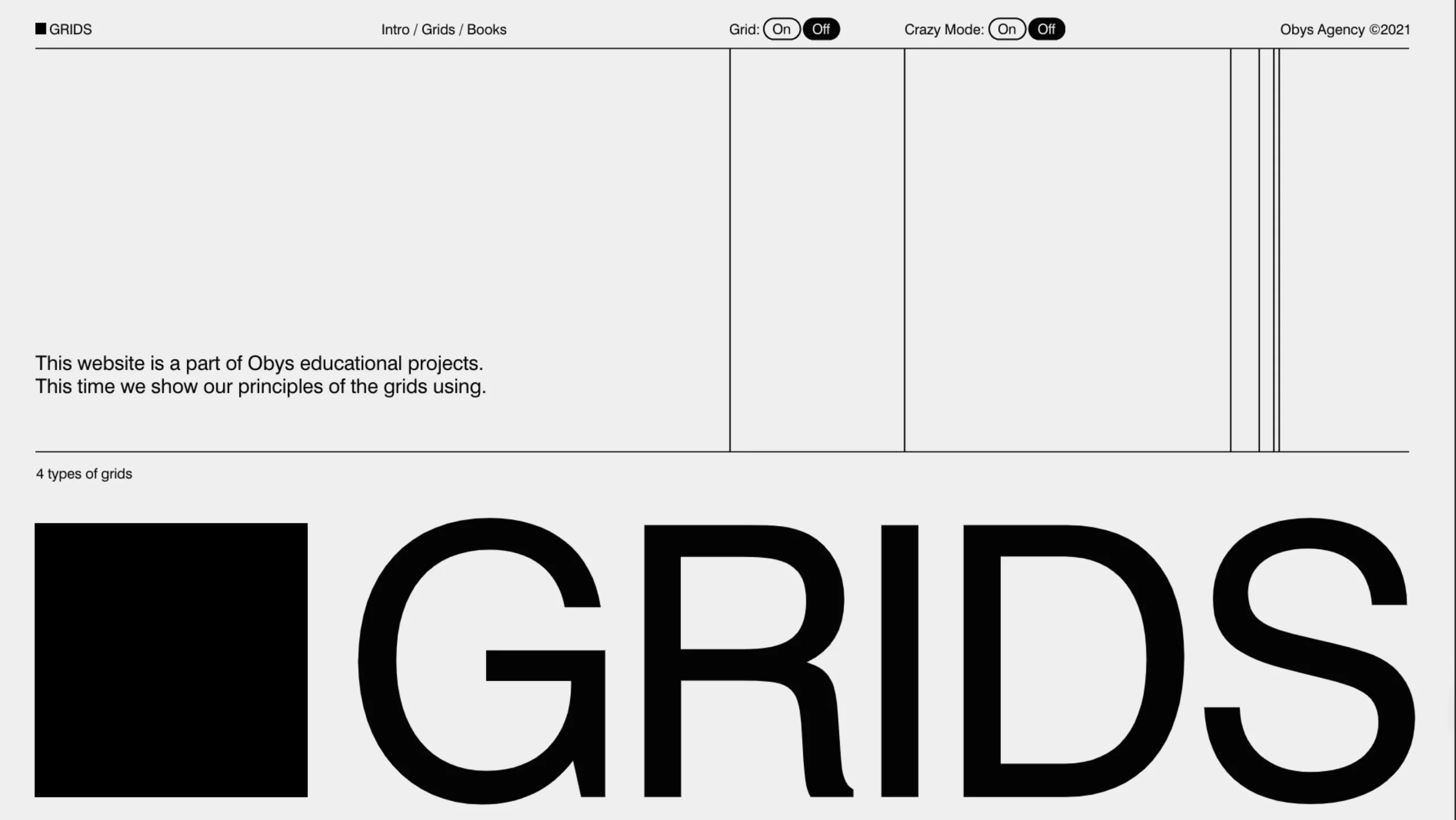
This page is part of the OBYS agency’s visual series exploring historical and modern grid systems.
Obys Grids: A Friendly Guide to Designing with Structure (Without Killing the Magic)
Grids are one of those quiet tools great designers lean on every day. They shape rhythm, organize information, and make complex layouts feel effortless. But they’re not meant to box you in—they’re there to support your ideas.
The site grids.obys.agency is part of Obys’s educational projects, and this edition walks through four practical grid types they use in real projects. What follows is a conversational, human take on their principles—so you can apply them with confidence (and a little playfulness).
Why grids matter (and when to break them)
A grid gives you structure: columns for rhythm, modules for scale, diagonals for drama, and “other” systems for when you want to bend reality a bit. Obys’s approach is refreshingly pragmatic: use the grid to support composition and communication—but don’t treat it like a religion. If the concept asks you to break a rule, do so with intention.
1) Columns
The classic agency workhorse.
Column grids are the most common system in design studios because they’re fast to set up, readable, and easy to adapt across screen sizes.

How they use it
They often combine a column grid with a padding system, or pair it with a typographic grid derived from line height. That way, spacing, content flow, and type cadence all move in harmony.
Setup (Step-by-step)
Step 1 — Set Margins
Add left and right margins to frame your layout and create breathing room.
Step 2 — Set Gutters
Define the space between columns. This is where rhythm lives.
Notes & pro tips
- You can absolutely run a grid without gutters or margins if your concept needs that edge-to-edge energy.
- Split columns to add detail. For example, turn an 8-column grid into 16 by halving each—great for fine-tuned alignment.
- Responsive by nature: column grids adapt well across breakpoints; just re-think column count and gutter logic as screens shrink or grow.
When to choose it
- Marketing pages, editorial layouts, portfolios, product detail pages—anywhere you want a fast, transparent, repeatable structure.
2) Rectangular (Modular)
A grid made of repeating modules—think of it as a checkerboard for content. It’s highly structured and flexible, and in practice it feels similar to a columns grid, but with a stronger vertical rhythm baked in.

Setup (Step-by-step)
Step 1 — Module Size
Pick a module size that suits your content density.
- Less content? Smaller modules keep the page lively.
- More content? Larger modules reduce noise and make scanning easier.
Step 2 — Proportions
Use module proportions that echo the screen (e.g., 16:9, 4:3). Proportional modules help your grid scale gracefully.
Notes & pro tips
- Module size and proportion generate both horizontal and vertical rails—great for image crops, card decks, and typographic rhythm.
- You can dedicate some modules as gutters to create intentional negative space and breathing zones.
When to choose it
- Dashboards, galleries, card-heavy pages, product grids—anywhere you need consistent blocks that scale and rearrange cleanly.
3) Van de Graaf (a.k.a. Golden Canon)
A page-canon approach rooted in classic book design. It’s based on the intrinsic proportions of the “carrier” (your canvas). The result feels refined, editorial, and a little unexpected on the web—perfect for unusual or concept-driven layouts.
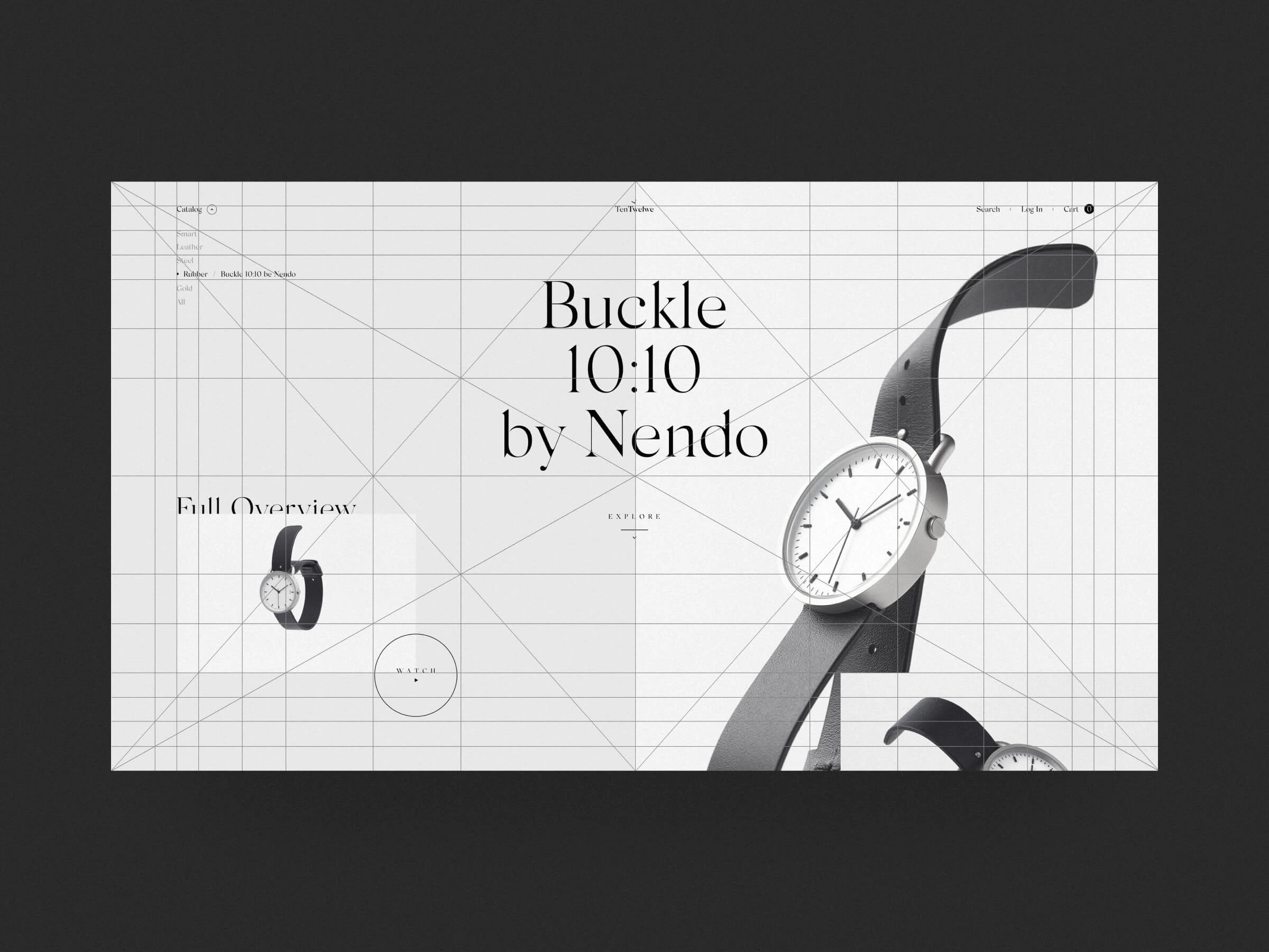
Setup (Step-by-step)
Step 1 — Diagonals
Draw the main diagonals across your canvas.
Step 2 — Main Lines
Add lines where those diagonals intersect. These intersections give you “power lines” for aligning type, imagery, and blocks.
Notes & pro tips
- Keep drawing lines at intersections until you reach roughly 40–100px margins from the screen edges.
- Don’t use every line—choose a handful of power lines that feel right and align key elements to them.
- This grid adapts easily to other screens: redraw diagonals at each breakpoint, reselect your power lines, and maintain the spirit intact.
When to choose it
- Editorial pages, hero compositions, storytelling sections, and brand experiences that need a literate, crafted feeling.
4) Others (Asymmetric, Round, Diagonal…)
This is the “everything else” category—and it’s where a lot of creative magic lives. Grids can be asymmetric, circular, diagonal, or even motion-responsive. The only absolute rule is that the grid should help you structure information, not fight against it.

Operating principles
Step 1 — Idea first
Work the concept before you draw lines. The grid is a tool to support the idea—not the other way around.
Step 2 — Think differently
Don’t be afraid of non-standard grids. If your design requires a slanted horizon or radial center, design the grid accordingly.
Notes & pro tips
- Composition and idea take priority. Use the grid to organize, not to tame your concept into blandness.
- A strong design concept can bend or even replace the site-wide grid on specific pages—if that serves the story.
- Combine non-standard elements with standard ones across a site: keep usability where you need it, and inject surprise where it helps.
- And seriously: don’t take it too seriously. A grid is a set of guidelines, not a legal code.
When to choose it
- Campaign pages, art-driven experiences, experimental portfolios—anywhere you want freshness without losing clarity.
Putting it all together: a practical workflow
- Start with content & intent
What’s the story? What’s the scanning pattern? Which moments deserve emphasis? - Pick a base system
- Need speed and clarity? Columns.
- Lots of blocks/cards? Rectangular.
- Editorial craft? Van de Graaf.
- Concept-first? Others.
- Layer type & spacing
Tie your grid to typographic line-height and a paddings system so vertical rhythm feels natural. - Prototype across breakpoints
Adjust columns, module size, and power lines as screens change. Keep the logic, not necessarily the exact measurements. - Choose your rule-breaking moments.
Let the hero breathe. Overlap a card. Steal a module and turn it into white space. Design needs tension as much as it needs order. - Refine with real content.
Swap in real headlines, real copy, real media. Tighten gutters. Tweak margins. Nudge baselines. The grid should serve content, not the placeholder.
Common pitfalls (and how to dodge them)
- Over-gridding the page
If everything snaps too perfectly, the layout can feel sterile. Introduce hierarchy and contrast—bigger margins, unexpected offsets, or a single element that breaks the rail. - Confusing rhythm across breakpoints
When you reduce the number of columns from 12 to 6 or 4, ensure that gutters and paddings scale proportionally. Keep a consistent visual tempo. - Forgetting negative space
Empty modules (or wider margins) are not “wasted” space—they’re your best tool for focus and elegance. - Using every line in Van de Graaf
Select power lines only. If everything is a rule, nothing is a rule.
Quick reference: which grid, when?
- Columns: Marketing, editorial, product pages, portfolios.
- Rectangular: Grids of cards, galleries, dashboards, and content hubs.
- Van de Graaf: Long-form editorial, premium brand sections, crafted hero layouts.
- Others: Campaigns, experimental sections, concept-led storytelling.
Final word (the Obys spirit)
Obys’s teaching is crisp: a grid should support the idea, not suffocate it.
Use columns to move fast, modules to scale, canons to craft, and non-standard systems to surprise. Combine them where it makes sense. And when the concept asks for it—bend the rails.
It’s just a guideline. The layout is yours.