


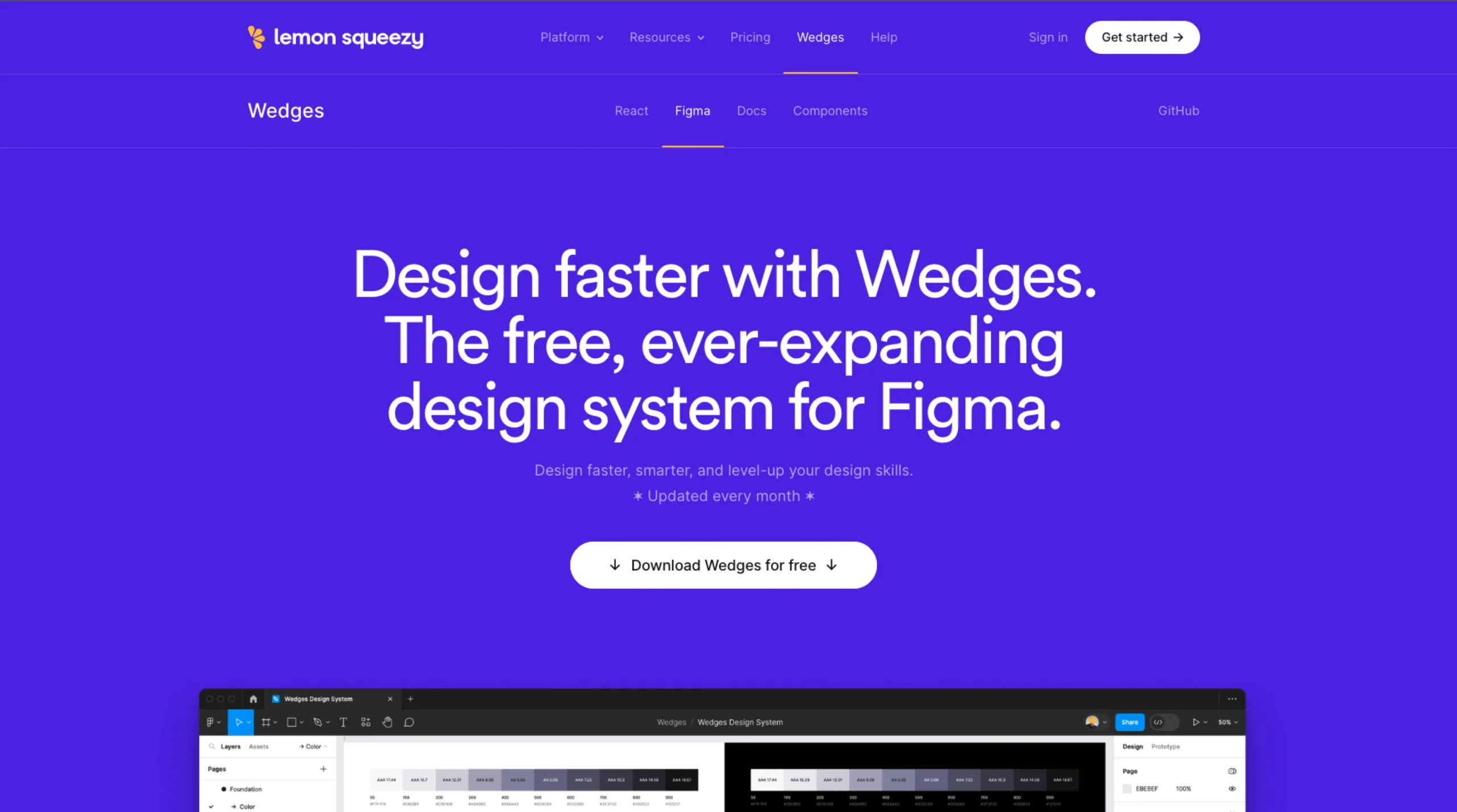
Figma Design System: A free, ever-expanding UI kit built with Figma’s latest features—Auto Layout, components, properties, variants, variables, and light/dark mode support.
React UI Library: Open-source, professionally designed components combining Radix UI and Tailwind CSS, offering accessible, themeable UI primitives (Buttons, Sliders, Inputs, etc.).
Brandable & Customizable: Apply your own typography, color tokens, shadows, and more across the entire system in seconds.
Monthly Updates & Community Backing: Gets regular monthly additions, with praise from designers (e.g., “A thorough and polished library,” “Makes a 10× designer”).
Learn how to create a design system using figma?
Lesson 1 – Welcome to design systems – Introduction to design systems
In this lesson, we’ll:
- Learn what a design system is and what’s included in one.
- Explore the problems a design system can help solve.
- Help you identify when you need one.
- And highlight a few key points to consider as you begin your design systems journey.
Check out the Intro to design systems course here: