


Summary – Web design trends in 2026 reflect a clear shift from visual noise to thoughtful, human-centered experiences. Interfaces are becoming calmer, more adaptive, and emotionally aware, shaped by AI that personalizes journeys without feeling intrusive. It’s less about impressing users with complexity and more about making them feel understood, confident, and at ease the moment a page loads.
Web design trends in 2026 aren’t about flashy tricks or showing off who learned the newest tool first. It’s calmer than that. More thoughtful. And, in some ways, more human than what we’ve seen over the last few years.
Yes, AI is everywhere. Yes, interfaces are getting smarter. But here’s the thing most trend lists miss: people are tired. Tired of cluttered dashboards.
Tired of interfaces that feel like they were designed for investors, not users. Tired of products that talk at them instead of with them.
So what does that mean for designers, developers, startup founders, and enterprise teams?
It means the web is quietly growing.
Let me walk you through what’s genuinely shaping web design in 2026—no hype, no buzzword soup, just patterns that are already sticking.
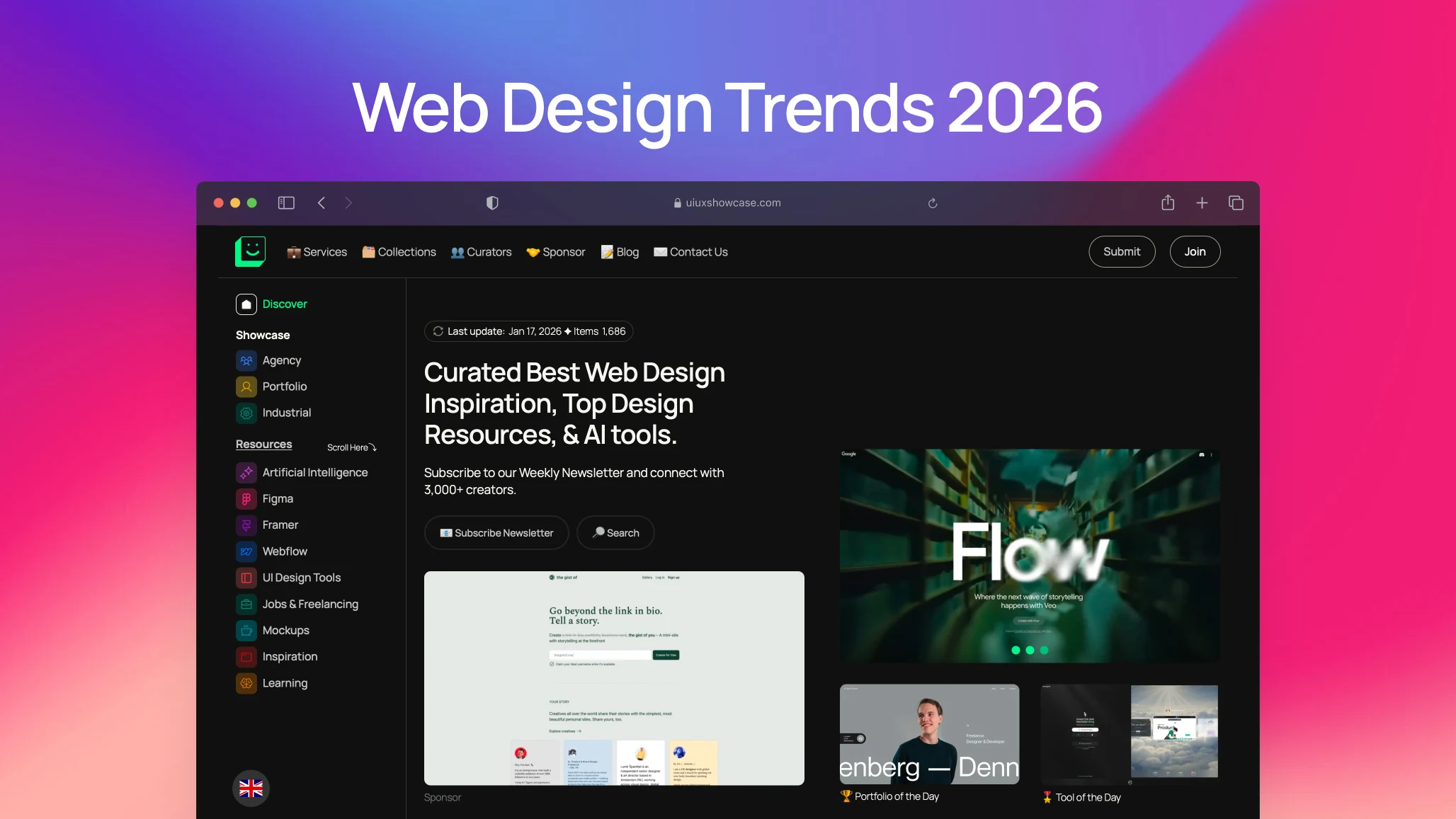
1. Why calm, focused design is winning again
Learn More | View Website ⤴︎
A few years ago, websites were looking for attention. Loud gradients. Oversized type. Scroll hijacking. Animations that screamed, “Watch me!”
In 2026, the tone is different.
Designers are asking softer questions:
- Does this page feel calm?
- Can I understand what to do in five seconds?
- Do I trust this product before I even read the pricing?
This is where intentional simplicity comes in. Not minimalism for aesthetics. Minimalism for clarity.
Whitespace is generous again. Text breathes. Buttons don’t compete with each other like they’re in a reality show. The interface gives you space to think.
Honestly, it feels a bit like walking into a well-designed bookstore after years of noisy social feeds.
2. How AI is changing the process, not just visuals
Learn More | View Website ⤴︎
Let’s clear something up.
AI didn’t “replace” designers in 2026. It changed how designers think and work.
Tools like Figma, Webflow, Framer and newer AI-first platforms aren’t designed for us. They’re speeding up the boring parts. The repetitive parts. The parts we secretly hated.
You know what? That’s a relief.
Where AI actually helps in web design now
- Generating layout variations early (so teams explore more)
- Writing first-draft microcopy
- Suggesting spacing and contrast improvements
- Flagging accessibility issues before QA
- Creating quick prototypes for stakeholder feedback
What’s interesting is what didn’t happen. AI didn’t kill taste. It didn’t kill judgment. If anything, it made bad design more obvious. When everyone has access to the same tools, taste becomes the differentiator.
And taste? That’s still human.
1. AI-Driven Personalization and Adaptive Interfaces
Learn More | View Website ⤴︎
AI isn’t just automating tasks; it’s reshaping how interfaces behave in real time. Websites will increasingly adapt based on user behaviour, preferences, device context, and even moment-to-moment interactions — a subtle kind of “interface intelligence.”
Some key AI shifts include:
- Dynamic UI adjustments: personalized layouts that change not just content but structure
- On-device AI co-pilots: AI assistants that run locally to protect privacy while improving responsiveness
- Contextual personalization: not just recommending content, but reconfiguring navigation and hierarchy based on intent
This creates a feeling of tailored experience — kind of like walking into a coffee shop and having the barista remember your order before you speak.
2. Conversational and Multimodal Interfaces
Learn More | View Website ⤴︎
As tech evolves, users will interact with sites in many ways — not just clicks or taps, but voice, gestures, and chat-style interfaces, integrated seamlessly.
Web experiences that support multimodal input feel:
- More intuitive
- More inclusive
- More context-friendly
Especially on mobile and mixed-mode devices, this becomes a usability advantage, not just a party trick.
3. Voice & Gesture-Based Navigation
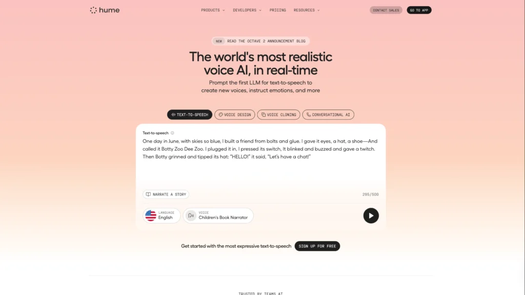
Learn More | View Website ⤴︎
Not just for apps and mobile, voice and gesture UI elements are starting to appear on web experiences, too.
These aren’t just accessibility add-ons — they’re alternative interaction modes that make navigation feel more natural, especially on touch devices and immersive contexts.
In practical terms, visitors might:
- Navigate sections with voice commands
- Use gestures to trigger interactions
- Get contextual feedback without touching a mouse or keyboard
AI-Driven Web Design Trends in 2026: The New Era of Intelligent Interfaces
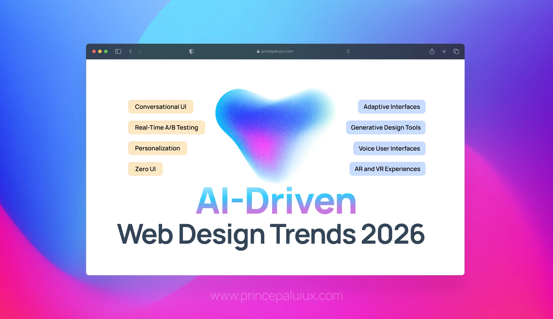
Discover 15 AI-driven web design trends transforming 2026. From intelligent personalization to voice UI and spatial computing—see how AI is reshaping digital experiences.
3. Personality Is Back—But It’s More Grown-Up
Learn More | View Website ⤴︎
Remember when brand personality meant quirky illustrations, sarcastic copy, and Easter eggs everywhere?
That version is… quieter now.
In 2026, personality shows up in:
- Thoughtful micro-interactions
- Honest, slightly imperfect copy
- Design choices that feel confident, not loud
A fintech site doesn’t need jokes to feel human. It needs clarity, restraint, and small moments of reassurance.
A creator platform, on the other hand, might lean playful—but still grounded.
The web is learning emotional intelligence. Finally.
4. Motion Design That Explains (Instead of Distracts)

Learn More | View Website ⤴︎
Motion used to be decorative. Then it became excessive. Now it’s becoming instructional.
Animations in 2026 often answer unspoken questions:
- “Did my action work?”
- “Where did that content go?”
- “What changed on this page?”
Micro-animations guide the eye, reduce cognitive load, and smooth transitions between states. They’re subtle. Almost forgettable. Which is exactly the point.
If users notice your animation too much, it’s probably doing the wrong job.
5. Accessibility Is No Longer Optional (And No One’s Complaining)
Learn More | View Website ⤴︎
Here’s a mild contradiction: accessibility used to feel like a constraint.
In 2026, it feels like a design advantage.
Readable type scales. Clear contrast. Logical focus states. Keyboard-friendly navigation. These aren’t just for compliance—they make products feel better for everyone.
And teams are realizing something important: accessible design ages well. It survives redesigns, new features, and platform changes.
Plus, accessibility tools are now baked directly into modern workflows. There’s less friction, less debate, and far fewer excuses.
This includes:
- Interfaces for people with ADHD, dyslexia, and other cognitive needs
- Optional simpler layouts or reduced motion modes
- Navigation that works for all interaction styles
When designers take accessibility seriously, the whole experience improves — not just for a subset of users.
6. Narrative and Illustration-Driven Design
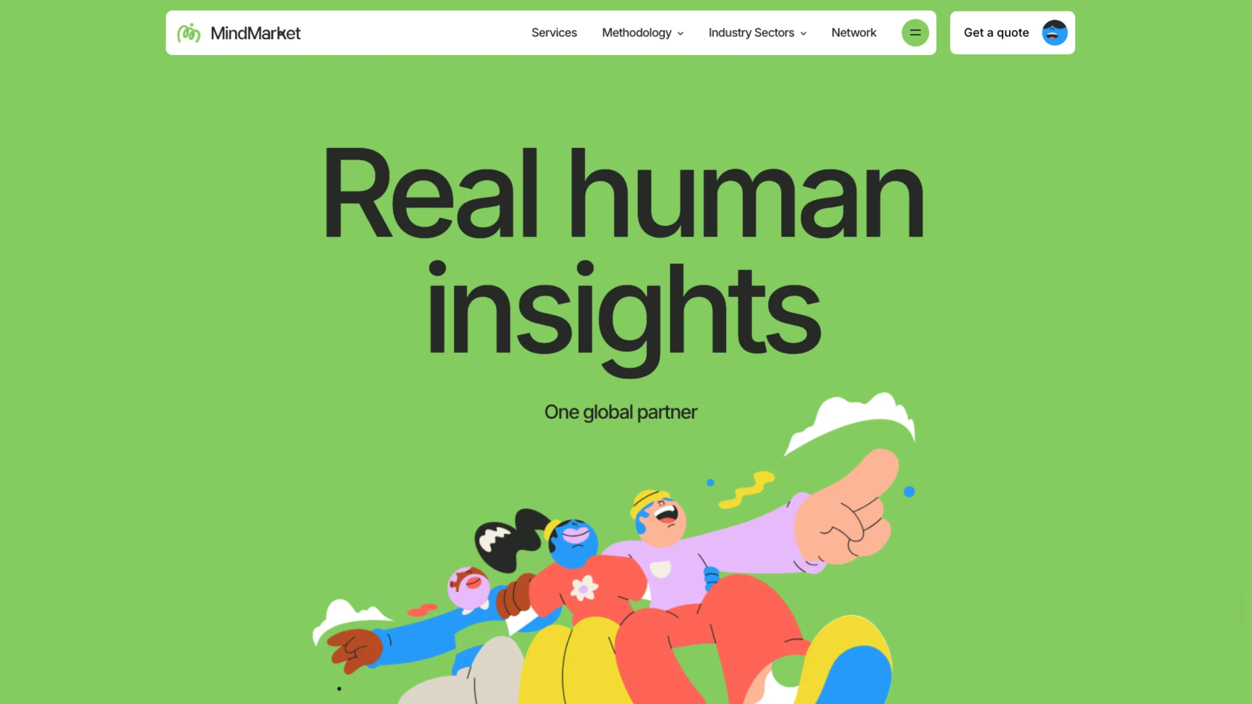
Learn More | View Website ⤴︎
Illustration — especially custom, expressive art — is gaining ground over stock photos because it:
- Speaks to brand personality
- Loads faster (helping performance metrics)
- Communicates abstract ideas clearly
Brands that use narrative illustrations (sometimes paired with parallax or subtle motion) create meaning rather than just fill space.
Expect:
- Story-rich visuals
- Character-driven design elements
- Illustrated modules that tell a story as you scroll
7. Dark Mode & Low-Light UX
Learn More | View Website ⤴︎
Dark mode is no longer an option — it’s a standard accessibility feature most users expect.
What’s changing is how designers implement it. Good dark mode isn’t a simple inversion — it’s crafted:
- With thoughtful contrast
- For reduced eye strain
- And to respect brand tone in low-light environments
Yep — even something as “simple” as dark mode now has real design skill behind it.
8. Content-First Layouts (Yes, Again—but Smarter)
Learn More | View Website ⤴︎
We’ve said “content-first” for years. The difference in 2026 is how teams get there.
Designers are collaborating earlier with writers, marketers, and product teams. Layouts grow around real content, not placeholders. Headlines aren’t decorative; they’re directional.
You’ll notice:
- Fewer hero sections that say nothing
- More scannable, narrative-driven pages
- Visual hierarchy that respects reading patterns
The web feels more like a conversation and less like a pitch deck.
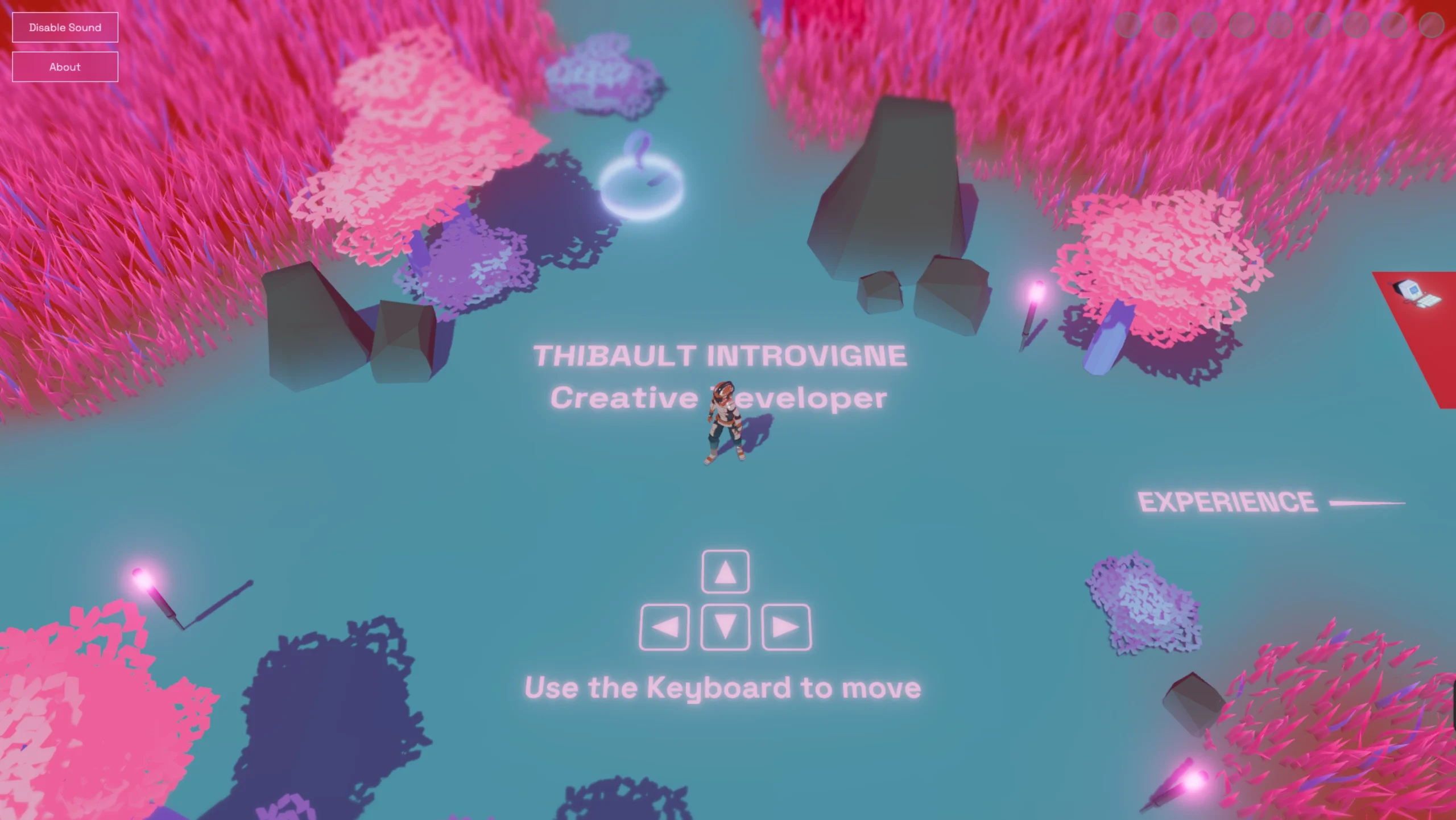
9. Immersive Tech: Fewer Gimmicks, More Purpose
Learn More | View Website ⤴︎
3D, spatial interfaces, and immersive elements didn’t disappear. They just calmed down.
Instead of full-on virtual worlds, we’re seeing:
- Product previews that feel tactile
- Subtle depth cues that aid focus
- Contextual 3D is used where it actually helps understanding
Devices like Apple Vision Pro nudged designers to think spatially—but most web experiences still live comfortably on screens. And that’s okay.
Immersion works best when it supports clarity, not spectacle.
10. Design Systems Are Getting Softer
Learn More | View Website ⤴︎
Rigid design systems had a moment. Everything aligned perfectly. Everything looked… the same.
In 2026, systems are still essential—but more flexible. Teams allow variation where it adds meaning. Tokens and components adapt to context. Brands feel cohesive without feeling cloned.
This balance is hard. But when it works, it really works.
11. Performance, Sustainability, and Quiet Efficiency
Learn More | View Website ⤴︎
Fast websites feel respectful. Lightweight pages load smoothly on slow networks. Efficient design isn’t just technical—it’s ethical.
Designers are paying attention to:
- Image weight
- Font loading
- Motion cost
- Energy usage
Sites that feel fast are remembered better — and Google increasingly rewards them in search.
No one brags about it on landing pages. But users feel it.
12. Tools Designers Are Actually Using in 2026
Trends aren’t just visual. They’re shaped by tools.
You’ll see teams relying on:
- Figma for collaborative thinking
- Webflow for fast, expressive builds
- Framer for No-Code designers
- AI copilots for ideation and iteration
- Lightweight analytics tools focused on behavior, not vanity metrics
The common thread? Speed without sloppiness.
13. Kinetic Typography Takes Center Stage
Learn More | View Website ⤴︎
Text isn’t just something you read — in 2026, it moves, reacts, and feels alive.
Headlines that gently expand or contract as you scroll, words that subtly shift to guide attention, and playful text animations that add character without harming readability are all rising trends.
Motion isn’t just aesthetic here; it becomes part of expression and storytelling.
14. Neo-Brutalism & Anti-Design Revival
Learn More | View Website ⤴︎
Some brands are rejecting slick, polished UI in favor of a raw, edgy, unfinished aesthetic — Neo-Brutalism. This trend intentionally embraces:
- Raw textures
- Harsh contrasts
- Unpolished layouts
It’s less a retreat from good design and more a rebellion against sameness.
For the right projects (think subculture brands, edgy art platforms, or identity-driven experiences), it’s a way to stand out and communicate authenticity.
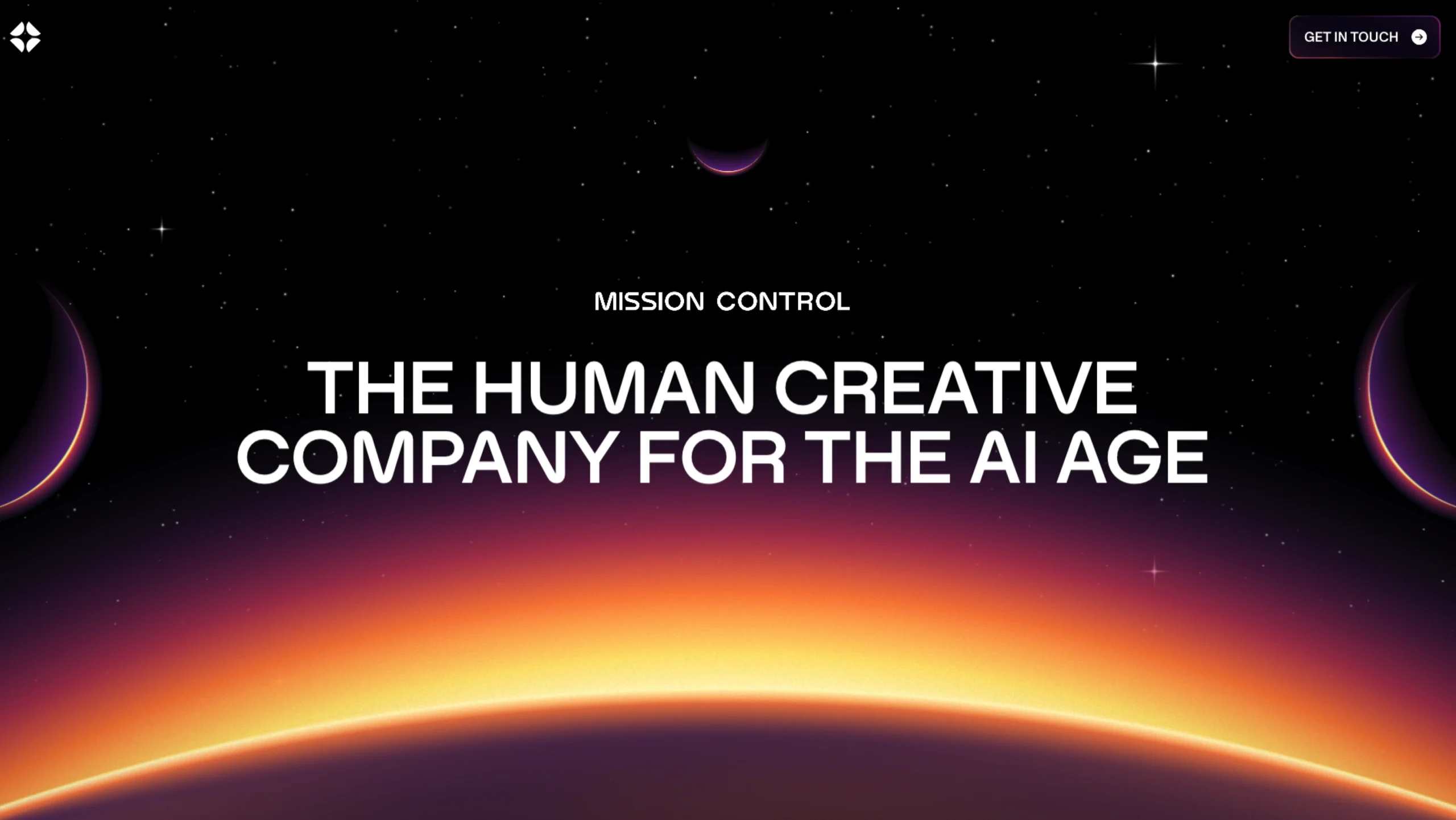
15. Retro-Futuristic & “Retrofuture Femme” Style
Learn More | View Website ⤴︎
At the intersection of old and new is a wave of aesthetics borrowing cues from past visions of the future — imagine shiny metallics, iridescent textures, bold gradients, and fluid geometric shapes inspired by 80s/90s sci-fi.
It’s a playful, expressive look that communicates optimism, creativity, and a willingness to break out of bland minimalism
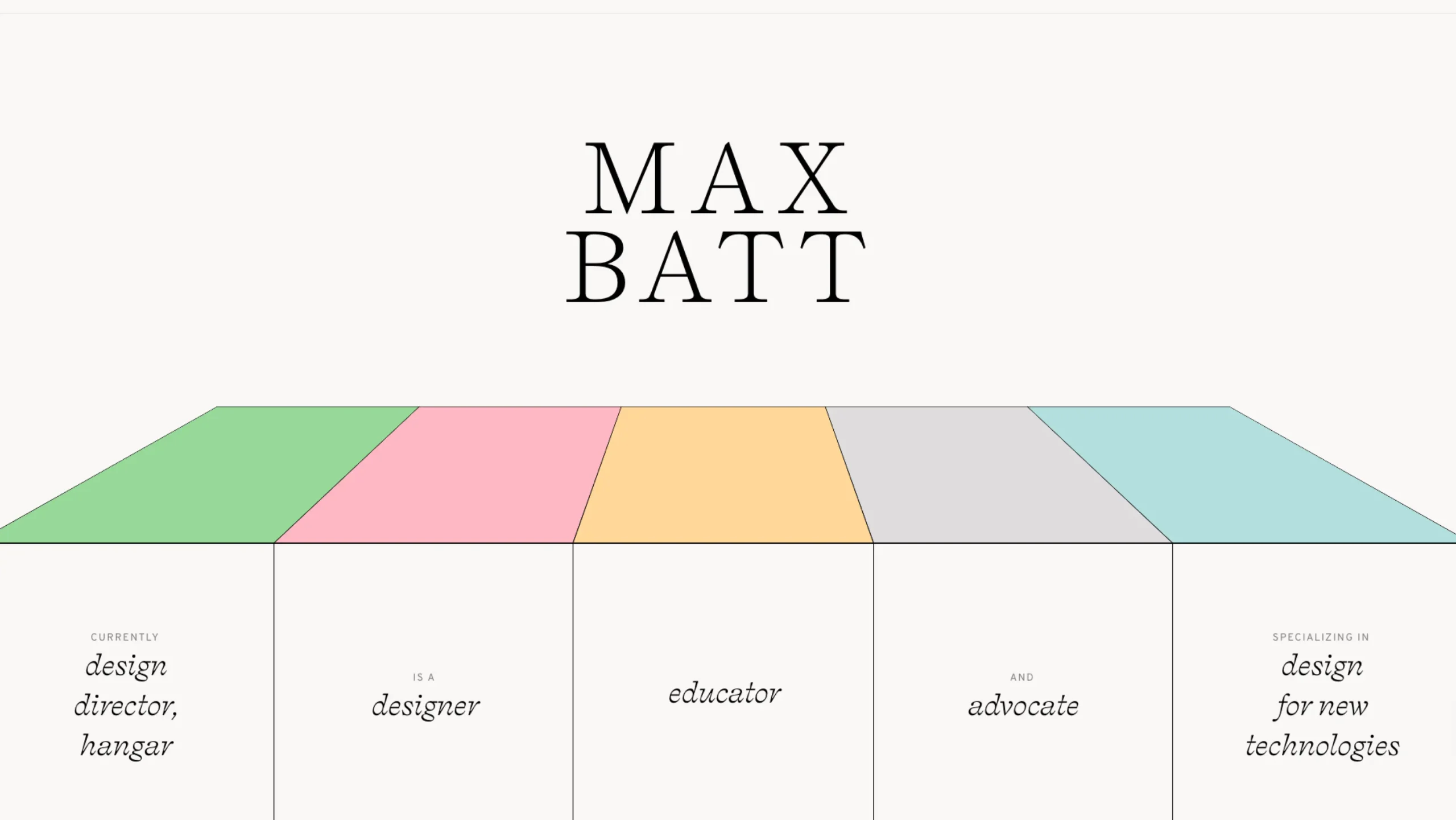
16. Friendly, Scannable Bento and Modular Grids
Learn More | View Website ⤴︎
Content block systems — sometimes called Bento Grids — are evolving into more dynamic and expressive layouts.
Instead of rigid grids, designers are using modular compartments that balance function with playful design. These systems help with:
- Quick content scanning
- Responsive adaptation
- Flexible storytelling
They feel organized yet alive—a welcome break from strict linear designs.
17. Abstract & Nostalgic Visual Styles
Learn More | View Website ⤴︎
Abstract and nostalgic visuals bring personality back. They create mood and emotion rather than just structure.
Think of it like flipping through an old photo album—but recreated with modern tools. The goal isn’t to copy the past, but to borrow its feeling.
Why this trend resonates in 2026
- Breaks away from template-driven UI sameness
- Adds emotional depth without heavy storytelling
- Helps brands feel intentional and artistic
- Softens the coldness of AI-heavy experiences
Common elements you’ll see
- Abstract, mood-driven shapes
- Subtle grain, noise, or texture
- Muted, emotionally warm color palettes
- Slightly imperfect layouts for the character
Used with restraint, this trend doesn’t hurt usability—it enhances emotional clarity. In 2026, the web isn’t trying to impress anymore. It’s trying to connect.
18. Glassmorphism is… interesting. And a little misunderstood.
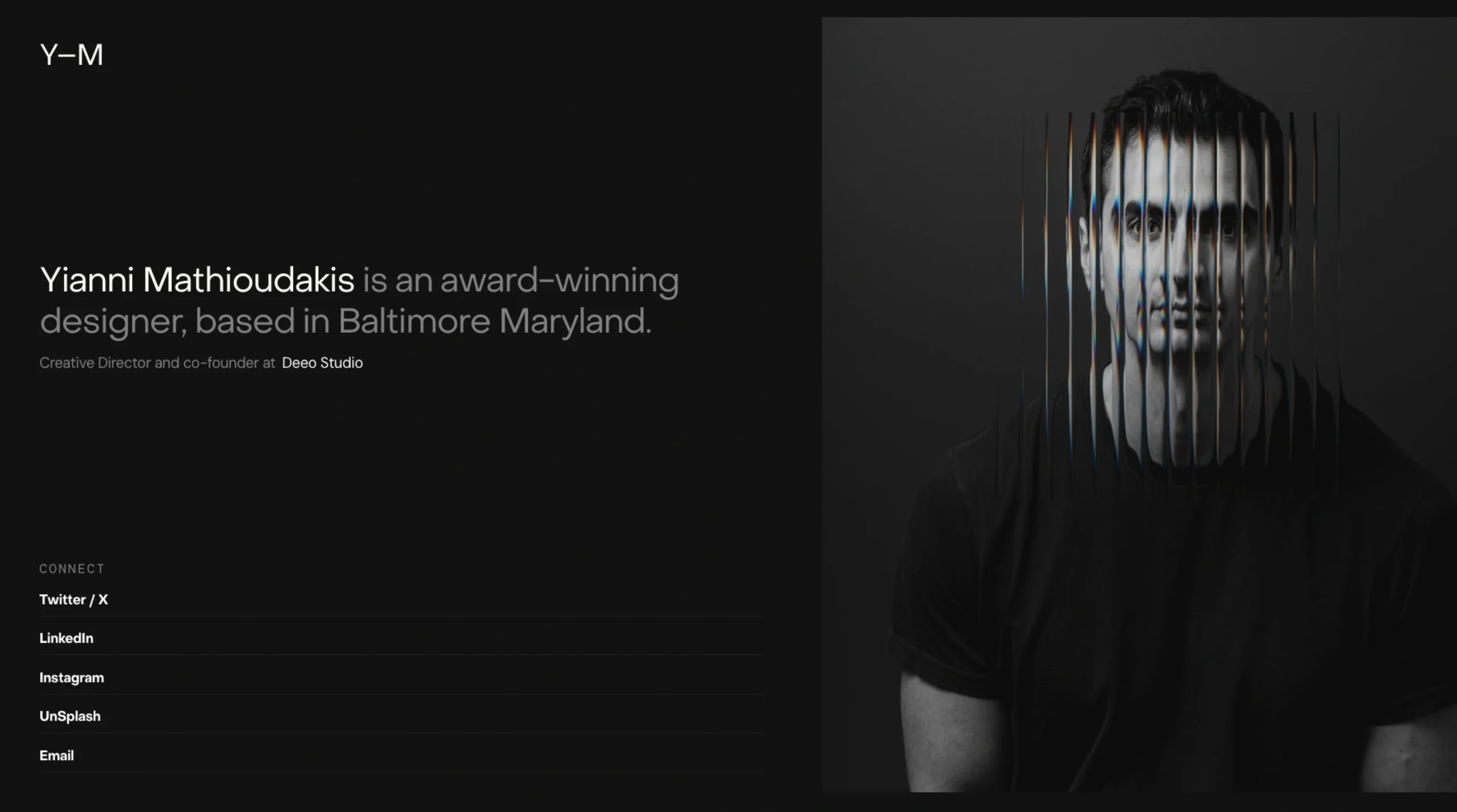
Learn More | View Website ⤴︎
At its best, Glassmorphism is a tool, not a style you apply everywhere. At its worst, it’s a visual shortcut that looks great in mockups and quickly falls apart in real products.
What Glassmorphism Gets Right
When used thoughtfully, Glassmorphism does a few things really well:
- Creates visual depth without heavy 3D or complex layouts
- Separates layers clearly, which can help with hierarchy
- Feels modern and lightweight, especially in dashboards or system UIs
- Pairs nicely with motion, making transitions feel fluid and spatial
That translucent, frosted-glass effect can give interfaces a sense of space—almost like UI elements are floating in front of content rather than sitting flat on top of it.
And yes, it photographs beautifully. Designers love it for hero sections, concept screens, and presentation decks. That’s not accidental.
Where It Often Goes Wrong
Here’s the uncomfortable part.
Glassmorphism is easy to overuse and hard to maintain:
- Accessibility suffers fast if contrast isn’t handled carefully
- Text readability can drop, especially on busy backgrounds
- Performance can take a hit on lower-end devices
- It often breaks down in real-world edge cases (dark mode, dynamic content, user-generated backgrounds)
Many implementations look great at first glance but struggle when real data enters the interface.
Glassmorphism in 2026: Still Relevant?
Yes—but in a quieter way.
In 2026, Glassmorphism works best when:
- Used sparingly, not as a global theme
- Applied to secondary layers like modals, tooltips, and side panels
- Combined with solid surfaces underneath to maintain clarity
- Tuned carefully for contrast, blur strength, and motion
It’s no longer the headline trend. It’s a supporting actor.
The Bigger Picture
Glassmorphism reflects a broader design desire: depth without clutter. But depth can come from many places—motion, hierarchy, spacing, typography—not just blur effects.
So my honest take?
Glassmorphism isn’t outdated.
It’s just no longer impressive on its own.
Use it with intent. Let it support clarity, not compete with it. And if the interface works perfectly without it… That’s usually the better sign.
19. Nature-Inspired “Distilled” Aesthetics
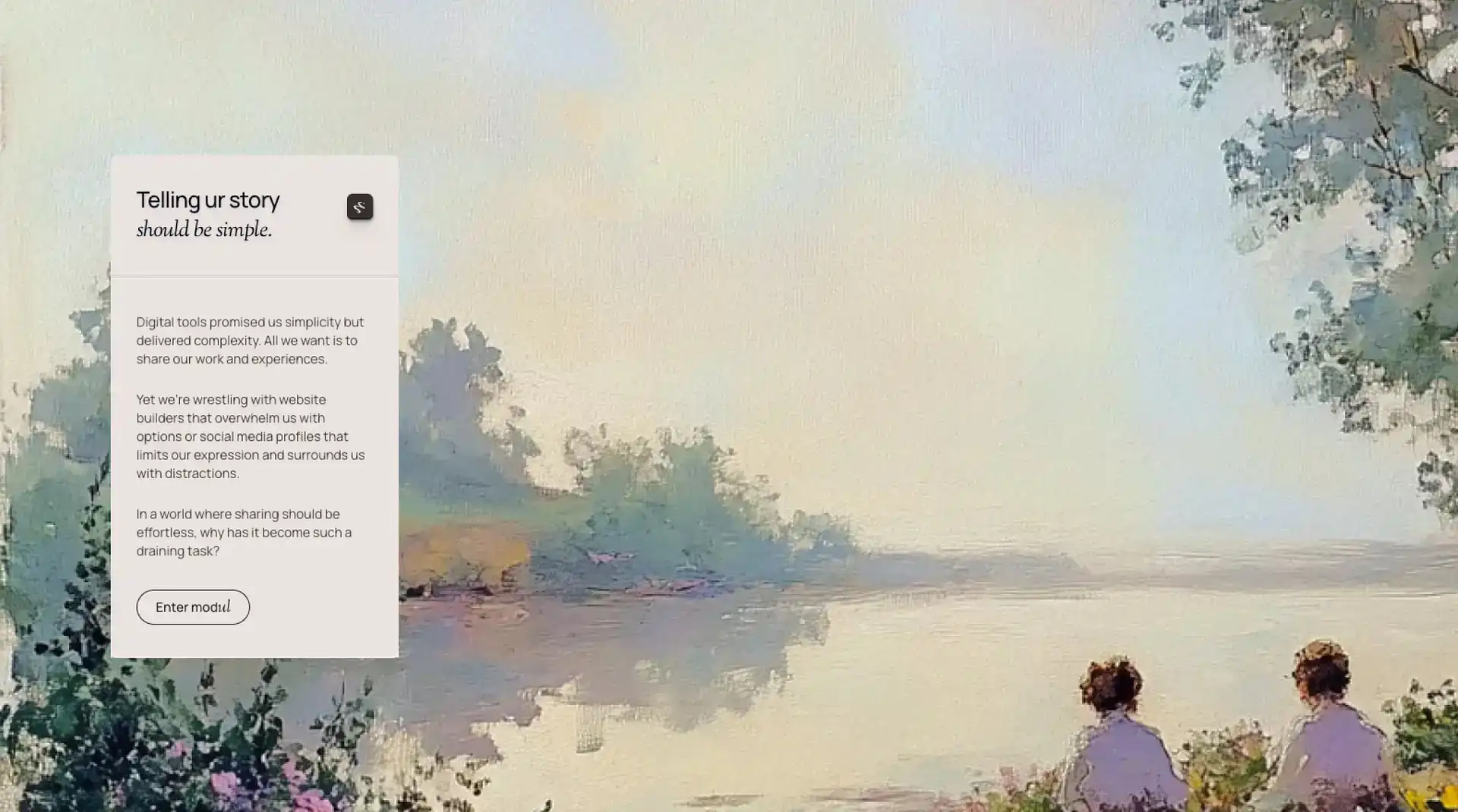
Learn More | View Website ⤴︎
Web design is borrowing from nature again — soft curves, earthy palettes, organic typography, and layouts that feel grounded rather than stark or overly minimalistic.
This trend isn’t just visual; it’s emotional — web interfaces start to feel like places you breathe in, not just click through.
Many designers link this to the broader cultural longing for calmness and balance in a noisy digital environment.
20. Hyperreality & High-Contrast Visual Play
Learn More | View Website ⤴︎
“Hyperreality” isn’t just a buzzword from sci-fi. In design, it’s about combining realistic elements with exaggerated, almost surreal visuals — like floating objects, bold layered images, and dramatic lighting that feels like AR mixed into the page.
This trend plays on perception and depth without needing complex VR.
This works especially well for entertainment, fashion, and portfolio sites — basically anywhere mood and vibe matter as much as information.
21. Exaggerated Visual Hierarchy
Learn More | View Website ⤴︎
Gone are the days when everything followed rigid grids and balanced symmetry. Now, designers are playing with bold contrasts and exaggerated scale to draw attention where it matters most — like:
- Jumbo headlines
- Modular layouts that twist reader paths
- Sections that break the traditional flow to enhance storytelling
This is especially effective for narrative brands, storytelling pages, and memorable landing experiences.
So… Where Is Web Design Really Heading?
Here’s the honest answer: toward maturity.
Web design in 2026 isn’t about impressing other designers. It’s trying to respect users’ time, attention, and emotional bandwidth.
It’s quieter. Clearer. More confident.
And maybe that’s the biggest trend of all.
Because when the web feels calm again, people stay longer. They trust more. They engage—not because they’re trapped, but because they want to be there.
That’s good design.
Not flashy. Not loud. Just… right.
