


We’ve all been there. You download an app because you desperately need it to do something specific. It works—technically. But using it feels like navigating a maze blindfolded. You get what you came for, but you’re frustrated, confused, and definitely not coming back unless necessary.
Ward Andrews’ UX Design Success Ladder captures this progression beautifully, showing us that “working” is just the first rung of a much taller ladder. Let’s explore what it really takes to climb from merely functional to genuinely meaningful.
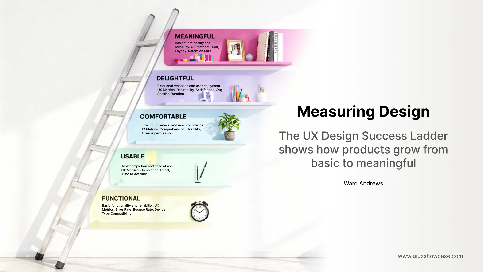
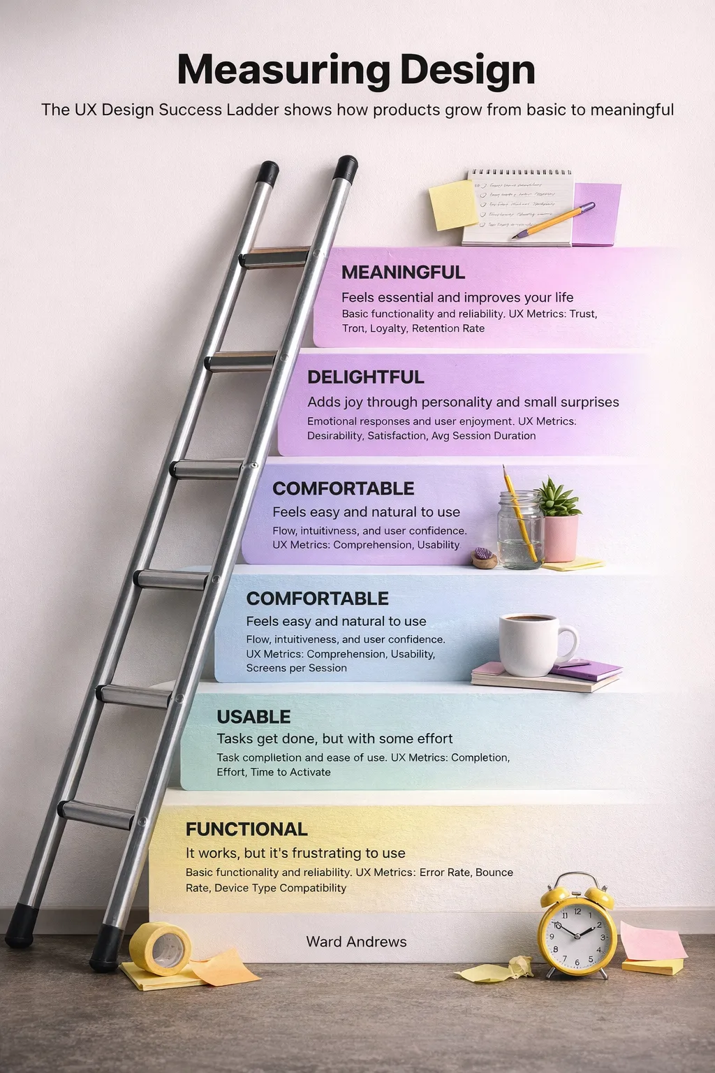
Starting at the Bottom: Functional (But Frustrating)
Here’s an uncomfortable truth: most products launch at this level. They work, but just barely. Buttons do what they’re supposed to, forms submit, pages load. The core functionality exists. But the experience? That’s another story entirely.
Think about that government website where you renew your driver’s license. It technically functions. You can complete the task. But you’ll probably need to try three different browsers, restart the process twice, and question your life choices along the way. High error rates, pages that don’t work on mobile, forms that mysteriously clear themselves—these are the hallmarks of functional-but-frustrating design.
The metrics here tell the story: error rates, bounce rates, and device compatibility issues. If you’re measuring these constantly, you’re probably still on this first rung. And that’s okay—it’s where everyone starts. The question is: how quickly can you move up?
Second Rung: Usable
Moving from functional to usable is where many products make their first real breakthrough. This is where tasks actually get done without users wanting to throw their devices across the room.
Usability is about removing friction. It’s realizing that your seven-step checkout process could be three steps. It’s adding clear labels to your navigation. It’s making sure your buttons are big enough to tap on mobile. It’s the difference between a user completing a task while grumbling versus completing it and thinking, “That was straightforward enough.”
The key metrics shift here to completion rates, effort scores, and time to activate. How many people actually finish what they started? How hard did they have to work for it? These questions become your north star.
But here’s the thing about usable: it’s table stakes in 2025. If your product is merely usable, you’re meeting minimum expectations, not exceeding them. You’re the restaurant with clean tables and food that arrives warm—necessary, but not memorable.
Third Rung: Comfortable
Now we’re getting somewhere interesting. Comfortable is where products start to feel like they were designed for humans, not just functional requirements.
A comfortable product anticipates your needs. The interface feels intuitive—not because you’ve memorized it, but because it flows naturally. You don’t need to think about navigation; you navigate. The app remembers your preferences. The workflow matches how you actually work, not how some product manager imagined you’d work.
This is where you start tracking comprehension and usability scores that go beyond mere task completion. Can users understand what’s happening? Do they feel confident using the product? How many screens do they visit in a session? These numbers tell you if people are truly comfortable or just tolerating your design.
The truth is that reaching comfort requires significant investment. It means user research—fundamental research, not just asking your colleagues what they think. It means iterating based on actual behavior data. It means sometimes throwing out features you spent months building because they don’t fit how people actually use your product.
Fourth Rung: Delightful
Here’s where things get magical, and also where many teams lose their nerve.
Delightful design adds joy. It’s the personality in your error messages. It’s the unexpected animation that makes you smile. It’s Slack’s loading messages (“Counting Stray Cats”), or Mailchimp’s high-five animation, or the way Duolingo guilt-trips you with a sad owl when you miss your lessons (somehow making you feel both terrible and entertained).
Delight isn’t frivolous—it’s strategic. It creates emotional connections. It transforms users into advocates. People don’t tell their friends about products that merely work; they share experiences that made them feel something.
The metrics shift dramatically here. You’re looking at desirability, satisfaction scores, and average session duration. Are people spending more time than necessary because they enjoy the experience? Do they choose your product over functionally equivalent alternatives? That’s delight doing its work.
But—and this is crucial—you can’t fake your way to delight. You can’t sprinkle some cute animations on a frustrating product and call it delightful. Delight only works when it sits on a solid foundation of functionality, usability, and comfort. It’s the cherry on top, not a distraction from a mediocre sundae.
The Top Rung: Meaningful
This is the peak. This is where products transcend being tools and become essential parts of people’s lives.
Meaningful products improve how you live. They solve problems you didn’t even know you had. They become so integrated into your daily routine that imagining life without them feels genuinely difficult.
Think about how note-taking apps like Notion or Obsidian have changed how people think and work. Or how Spotify has transformed our relationship with music. These products aren’t just convenient—they’re meaningful because they’ve enabled new ways of being and doing.
The metrics at this level are about deep engagement: trust, loyalty, and retention rate. But honestly, if you’re measuring whether your product is meaningful, you might be missing the point. Meaningful products have users who organize conferences about them, create educational content voluntarily, and build entire communities around them.
Getting to meaningful requires asking bigger questions: What does your product enable that wasn’t possible before? How does it align with your users’ values and identity? What would genuinely be lost if it disappeared tomorrow?
The Hard Truth About Climbing
Here’s what the ladder doesn’t explicitly show but every designer learns through experience: the gaps between rungs get exponentially harder to bridge as you climb higher.
Moving from functional to usable? That’s mostly about good design practices and removing obvious friction. Any competent team can get there with time and focus.
Moving from comfortable to delightful? That requires creative risk-taking, brand personality, and the courage to do things differently. Many organizations struggle here because delight often looks frivolous to stakeholders focused on quarterly metrics.
Moving from delightful to meaningful? That’s a fundamental strategic challenge. It requires your product to solve problems that genuinely matter to people’s lives, which you can’t always design your way into. Sometimes the product category itself limits how meaningful it can be.
Where Most Products Get Stuck
In my experience, most products plateau at “comfortable,” and for understandable reasons. Comfort is profitable. It retains users well enough. It doesn’t generate significant complaints. Moving beyond comfort requires investment that’s hard to justify on a spreadsheet.
But here’s the competitive reality: in mature markets, comfortable isn’t defensible. Your competitors can copy comfortably. They can’t easily copy delightful, and they definitely can’t copy meaningful.
Context Changes Everything
One critical caveat: not every product needs to climb to the top of the ladder, and the importance of each rung varies by category.
A medical device interface should absolutely prioritize usability and comfort over delight. Nobody wants whimsical animations when they’re managing their insulin dosage.
A banking app needs to be meaningful (people trust it with their financial lives) and comfortable, but too much personality in the form of delight might actually undermine trust.
A consumer social app, on the other hand, lives or dies on delight and meaning. Merely functional social apps become deserted ghost towns.
Measuring What Matters
Each level of the ladder comes with suggested metrics, and they’re genuinely helpful. But here’s what I’ve learned: metrics tell you where you are, not how to climb higher.
You can track error rates obsessively and still not understand why users make those errors. You can measure satisfaction scores without knowing what would actually increase satisfaction.
The real work happens in the qualitative space—watching people use your product, talking to them about their experiences, understanding their contexts and motivations. The numbers tell you what’s happening; conversations tell you why.
Starting Your Climb
If you’re looking at your product and wondering where you are on this ladder, here’s a brutally honest assessment method: ask yourself which of these describes your current situation.
If users frequently contact support for basic tasks, you’re functional at best. If users can complete tasks but rarely return unless required, you’re usable. If users return regularly and recommend you when asked, you’re comfortable. If users volunteer praise and share your product unprompted, you’re getting close to delightful. If users organize their lives around your product and feel genuine loyalty to it, congratulations—you’ve reached meaningful.
Most importantly, climbing this ladder isn’t about adding features. In fact, some of the best moves up the ladder involve removing things. It’s about deepening your understanding of users and being willing to make hard decisions based on that understanding.
The Real Question
Here’s what the UX Design Success Ladder ultimately asks us: Are we satisfied with good enough, or are we committed to creating products that genuinely matter to people?
There’s no moral judgment in that question. Good enough is often the correct business decision. But let’s be honest about what we’re choosing and why.
The products we remember, the ones that change industries and create devoted users, are the ones that climbed all the way up. They started functional, sure—everything does. But they didn’t stop there.
The ladder is always there. The question is whether we have the vision, resources, and courage to keep climbing.
Final Thought
Great UX isn’t about climbing fast.
It’s about climbing intentionally.
This ladder is a reminder that:
- Functionality earns entry
- Usability earns patience
- Comfort earns trust
- Delight earns affection
- Meaning earns loyalty
And the best products?
They don’t skip steps.
They respect them.
