


Resources
Scroll Here⤵︎


🧱 Free Design Systems Directory
A Free Design Systems Directory collection from Google, IBM, Atlassian & more—built for UI/UX designers who care about clarity, consistency, and scale.
Subscribe & receive top design resources direct in your inbox.
-
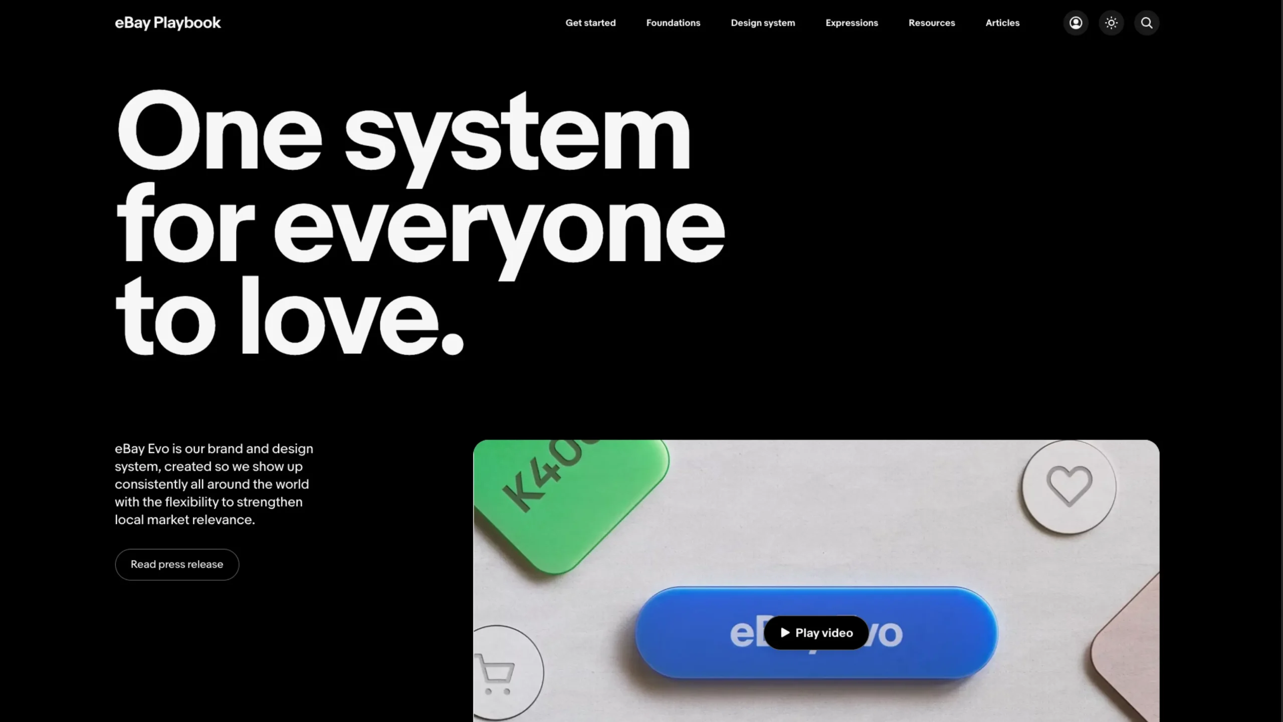
Evo – eBay Design Playbook
-
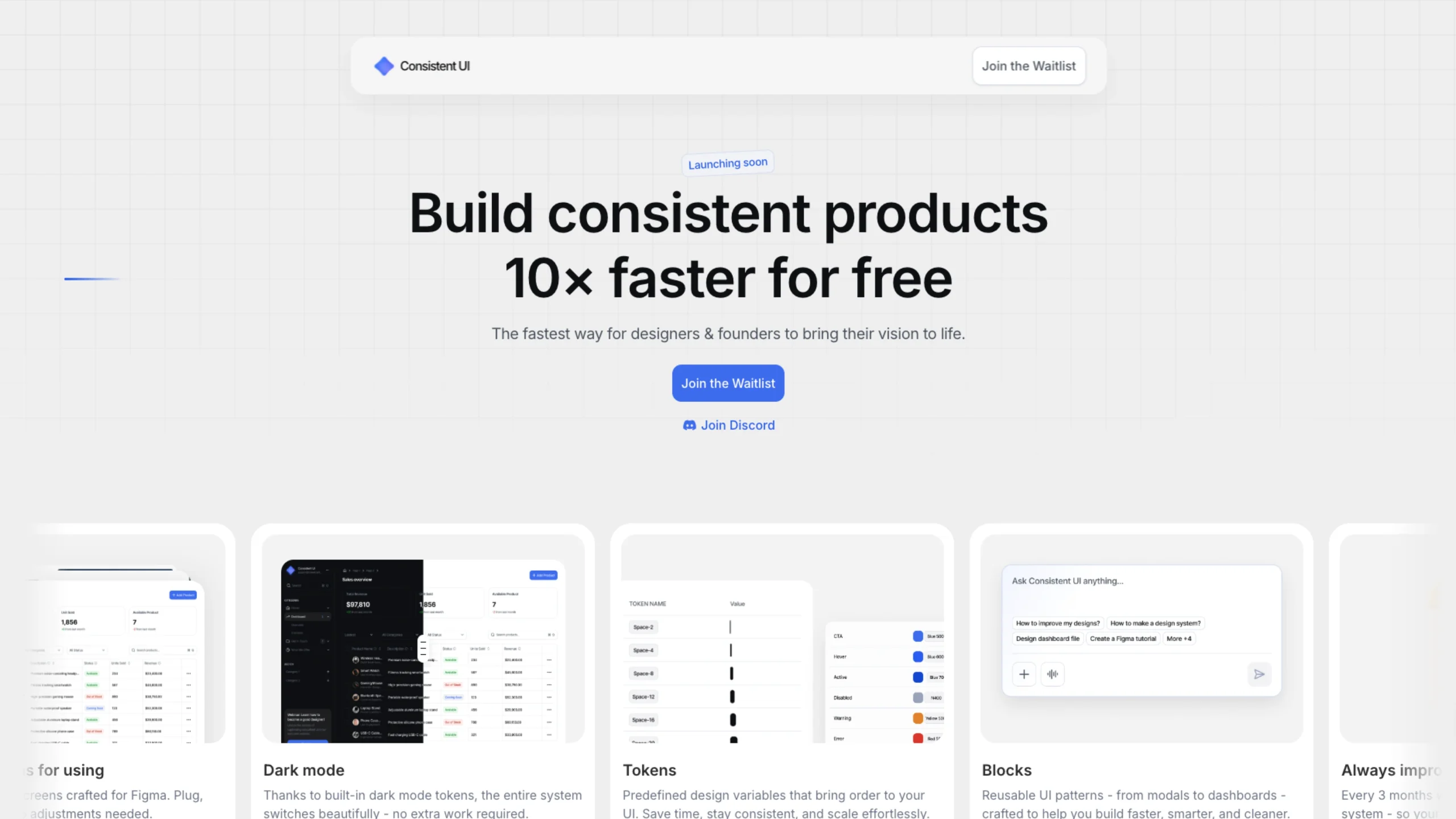
Consistent UI – Free Figma Design System
-

Relume Figma Library
-
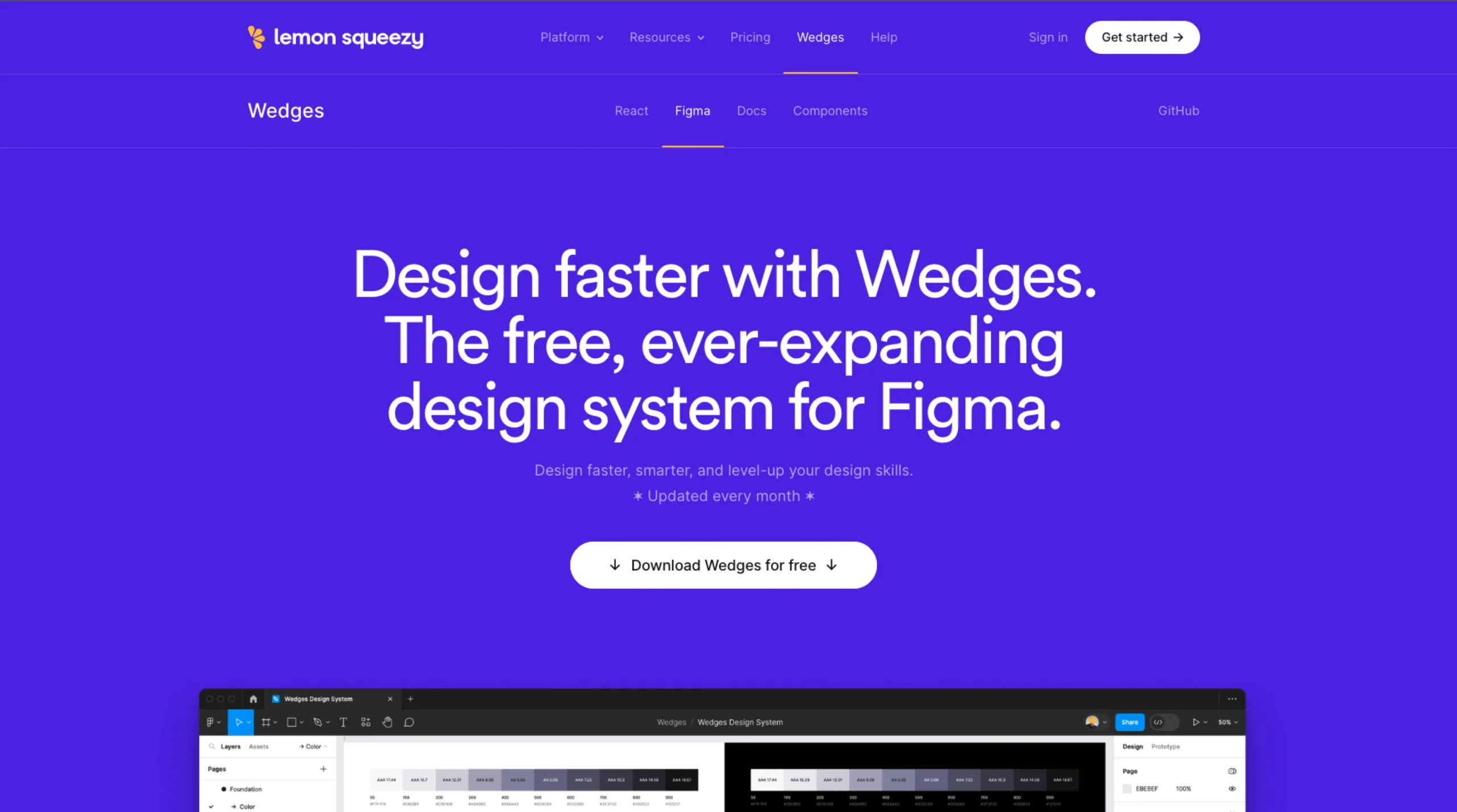
Wedges – Free Design System For Figma
-

The Design System Guide
-
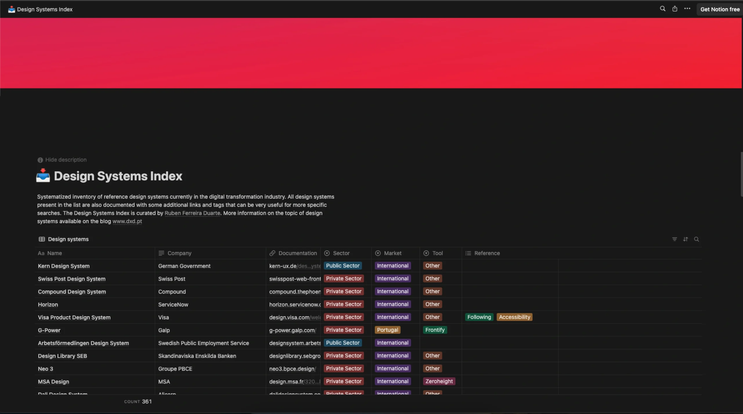
Design Systems Index by Ruben Ferreira Duarte
-
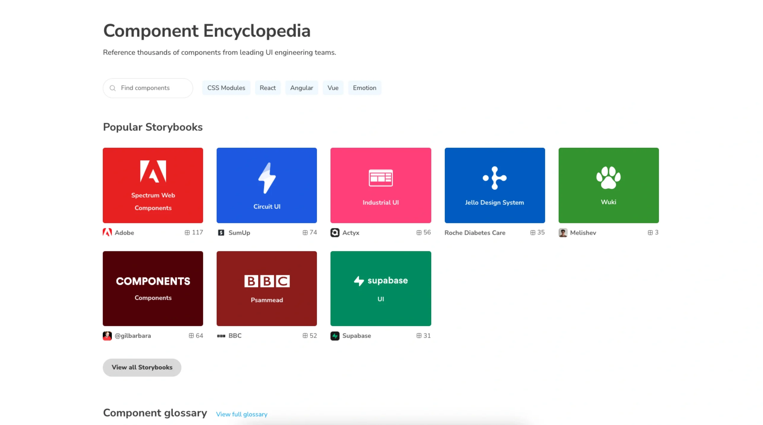
Storybook Showcase (Component Encyclopedia)
-
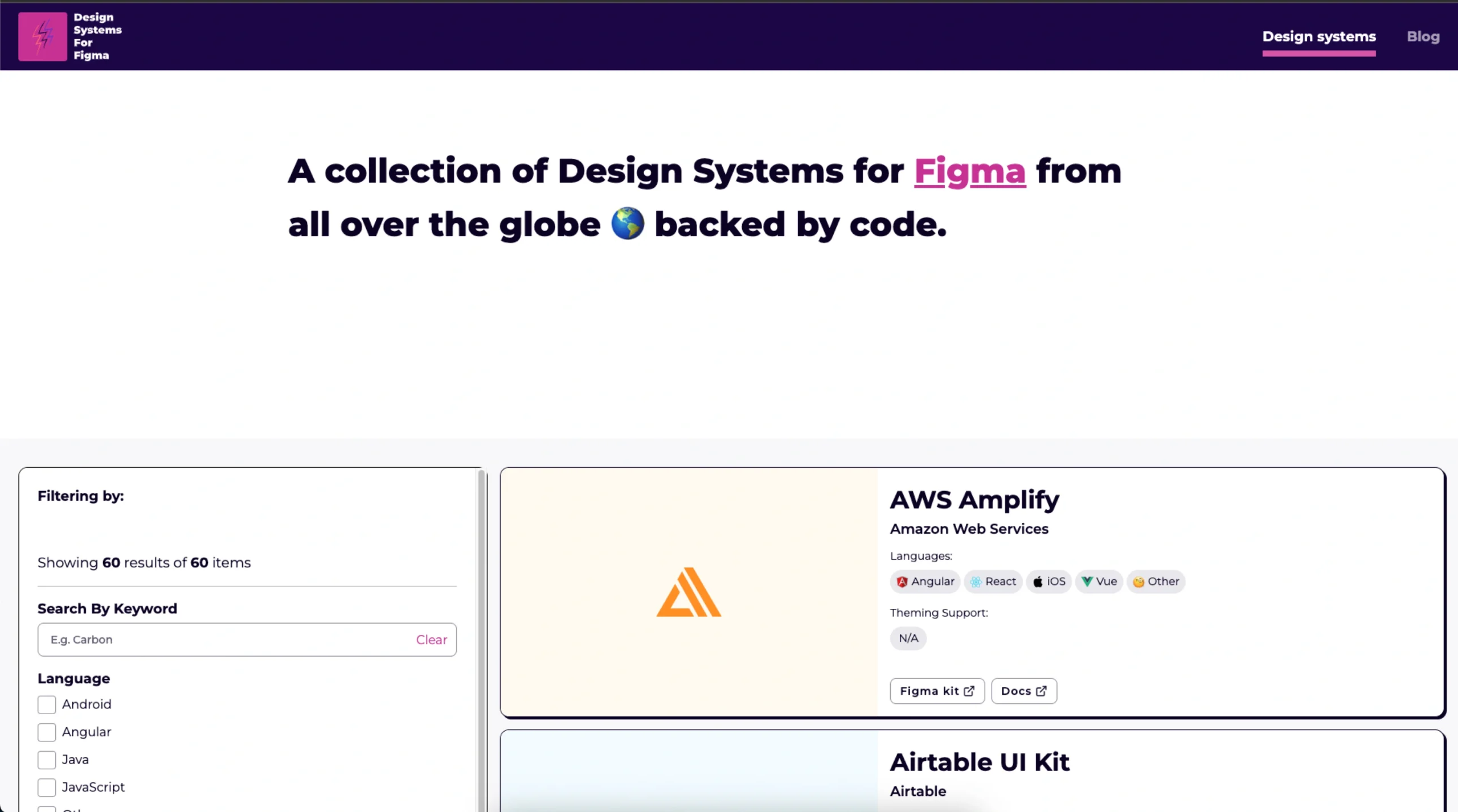
Design Systems For Figma
-
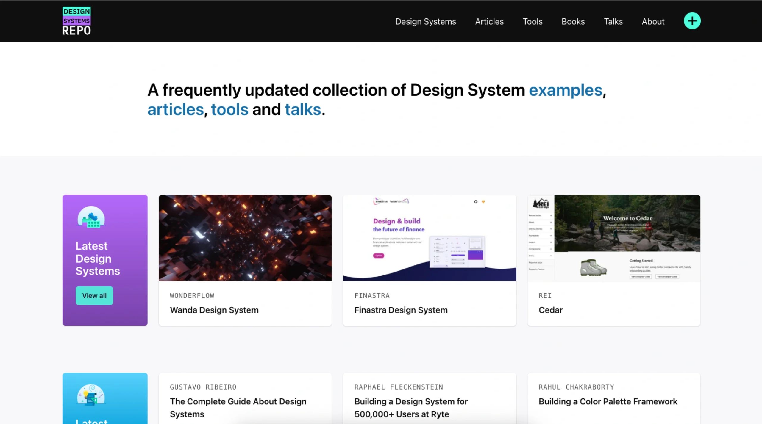
Design Systems Repo
-
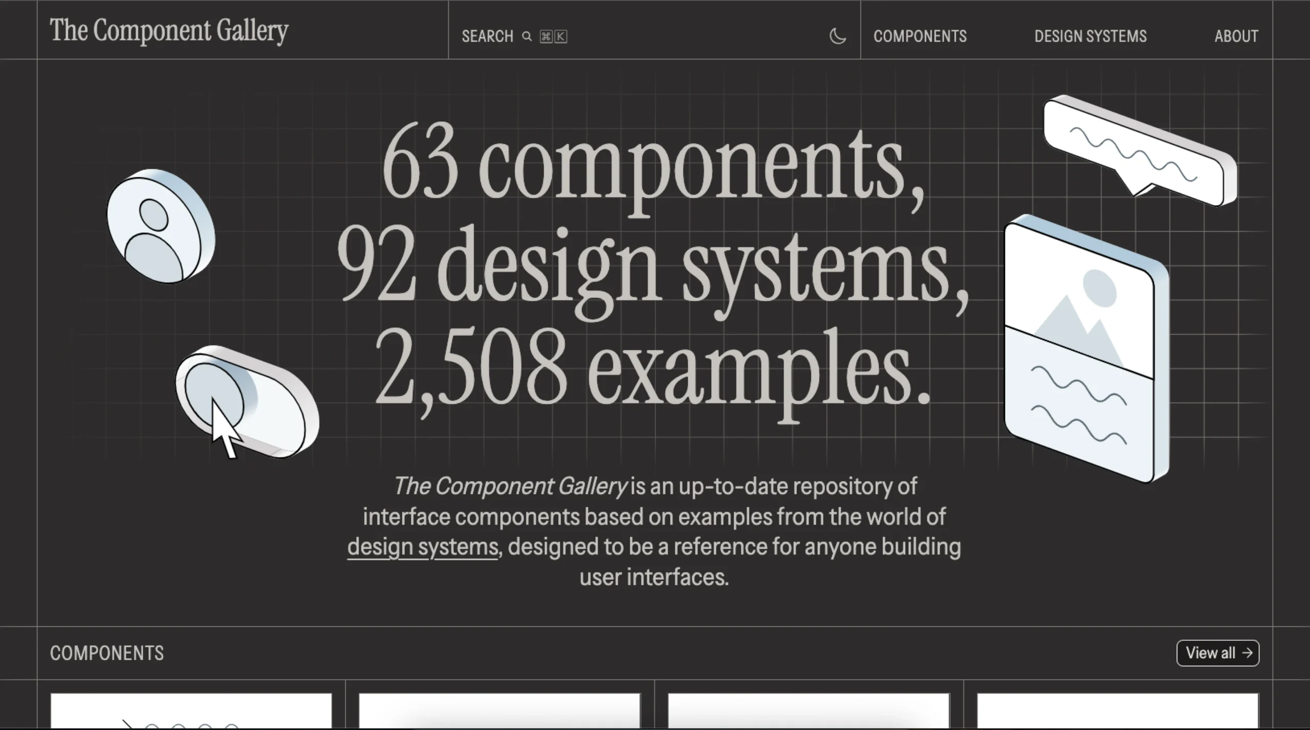
The Component Gallery
-
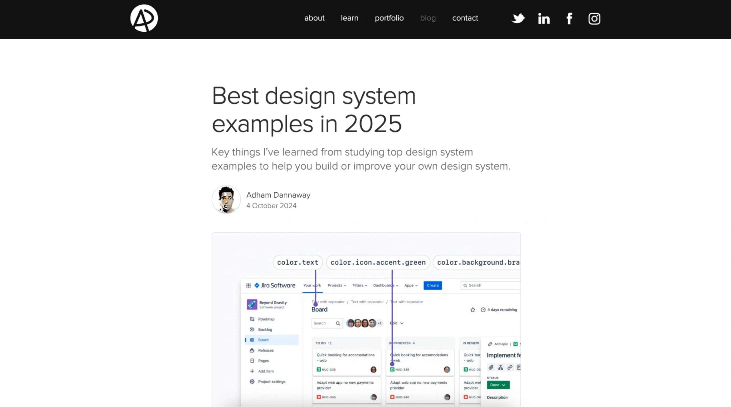
Best Design System Examples (2025)
-

Design Systems
-
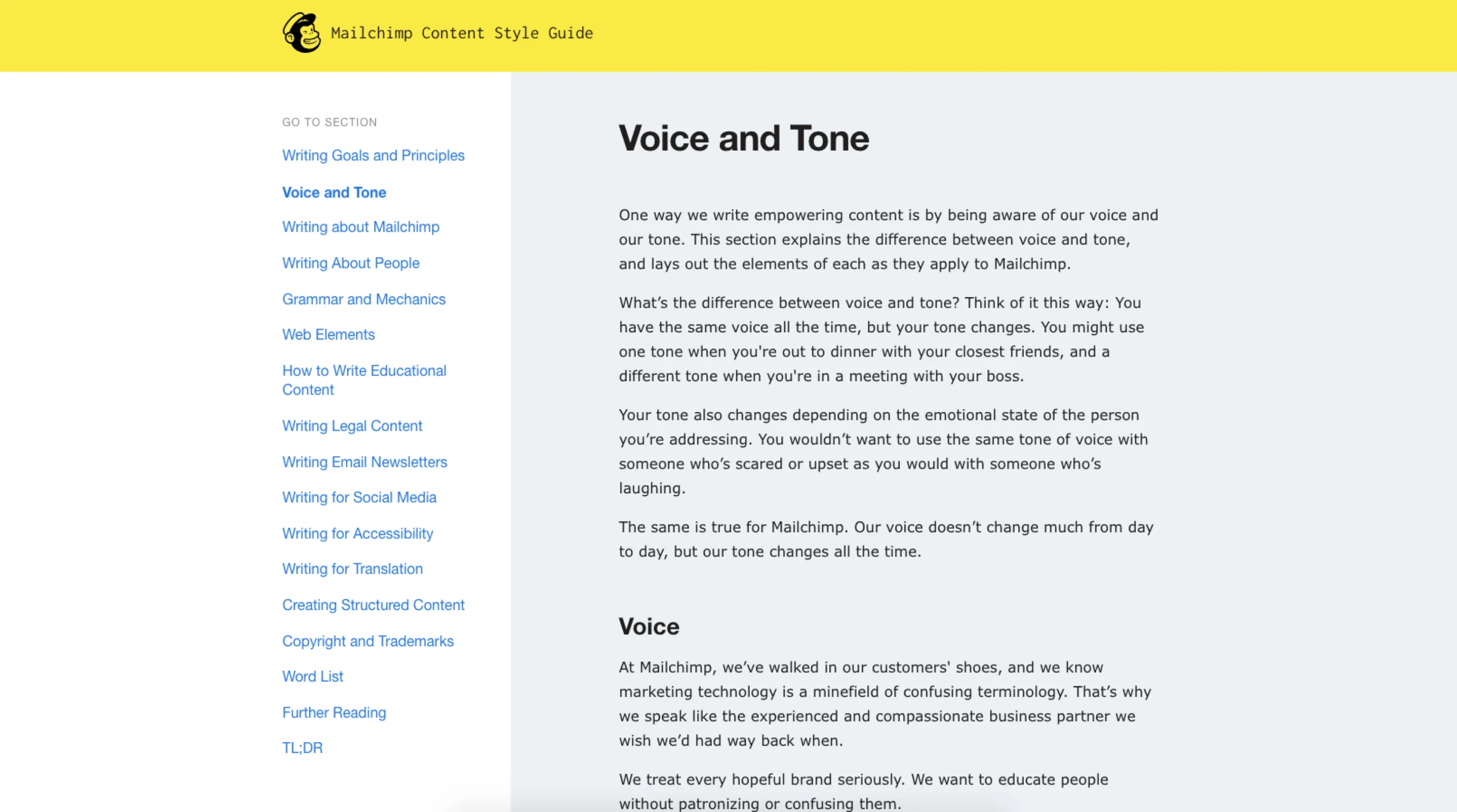
Voice and Tone Guide
-
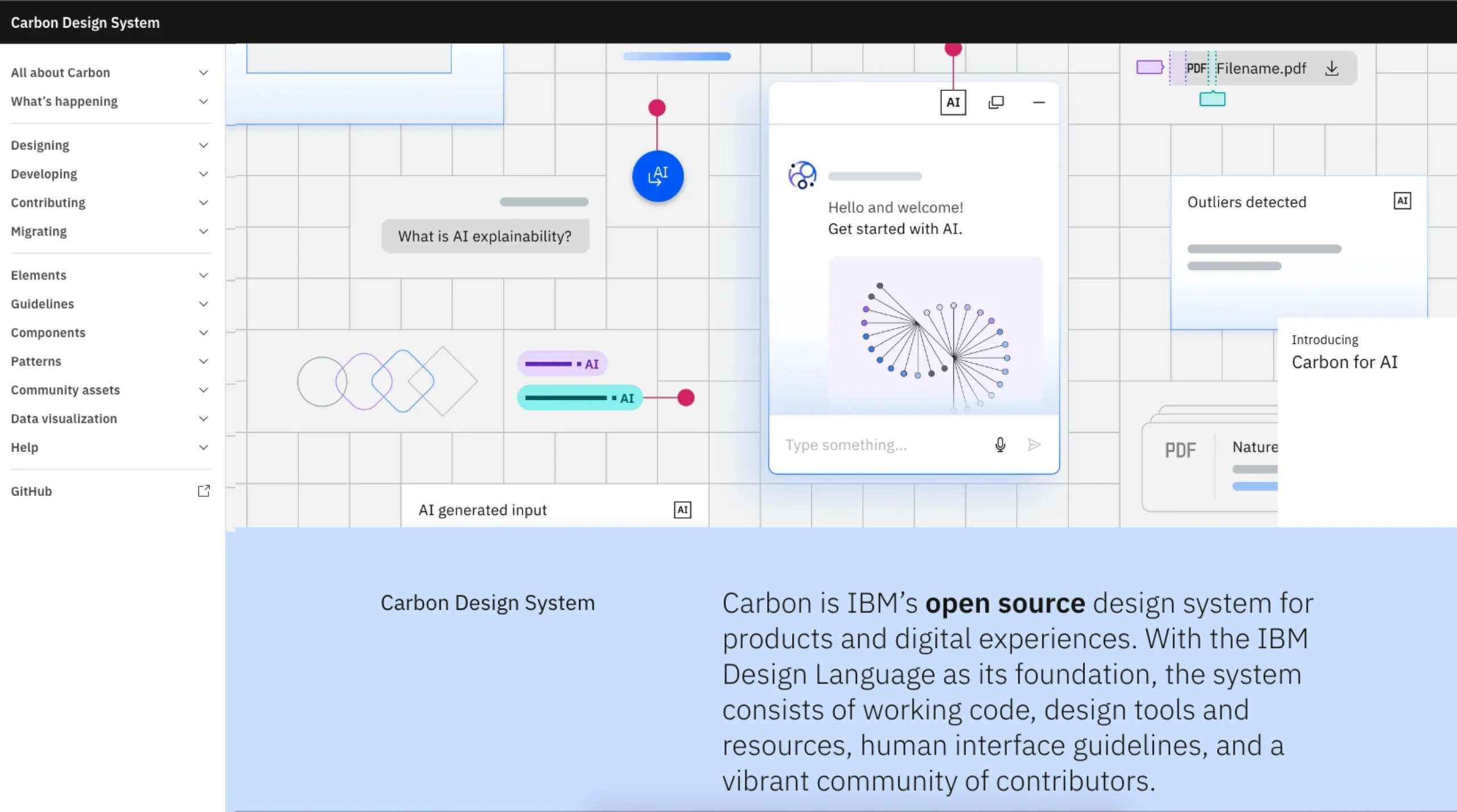
Carbon Design System
-
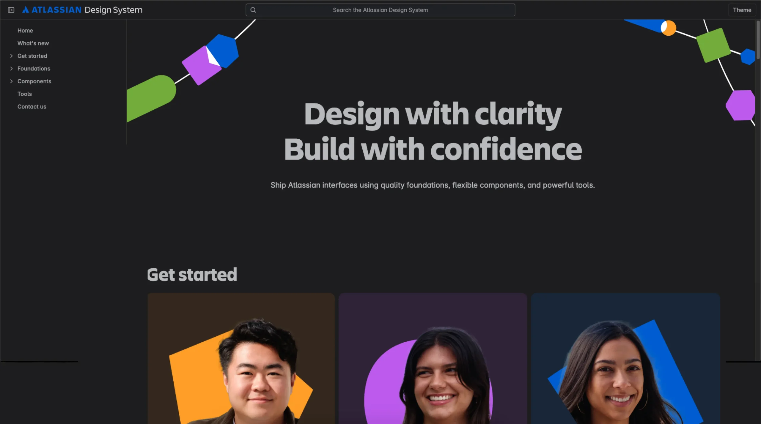
Atlassian Design System
-
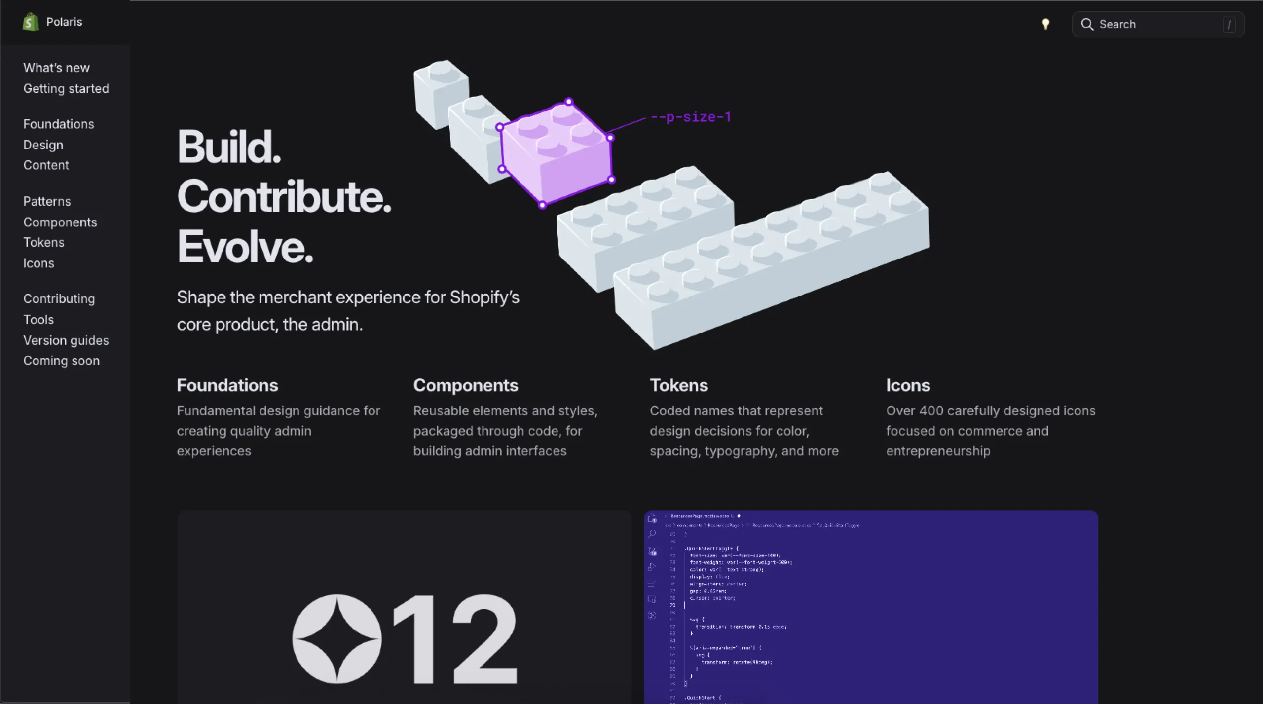
Shopify Polaris
-
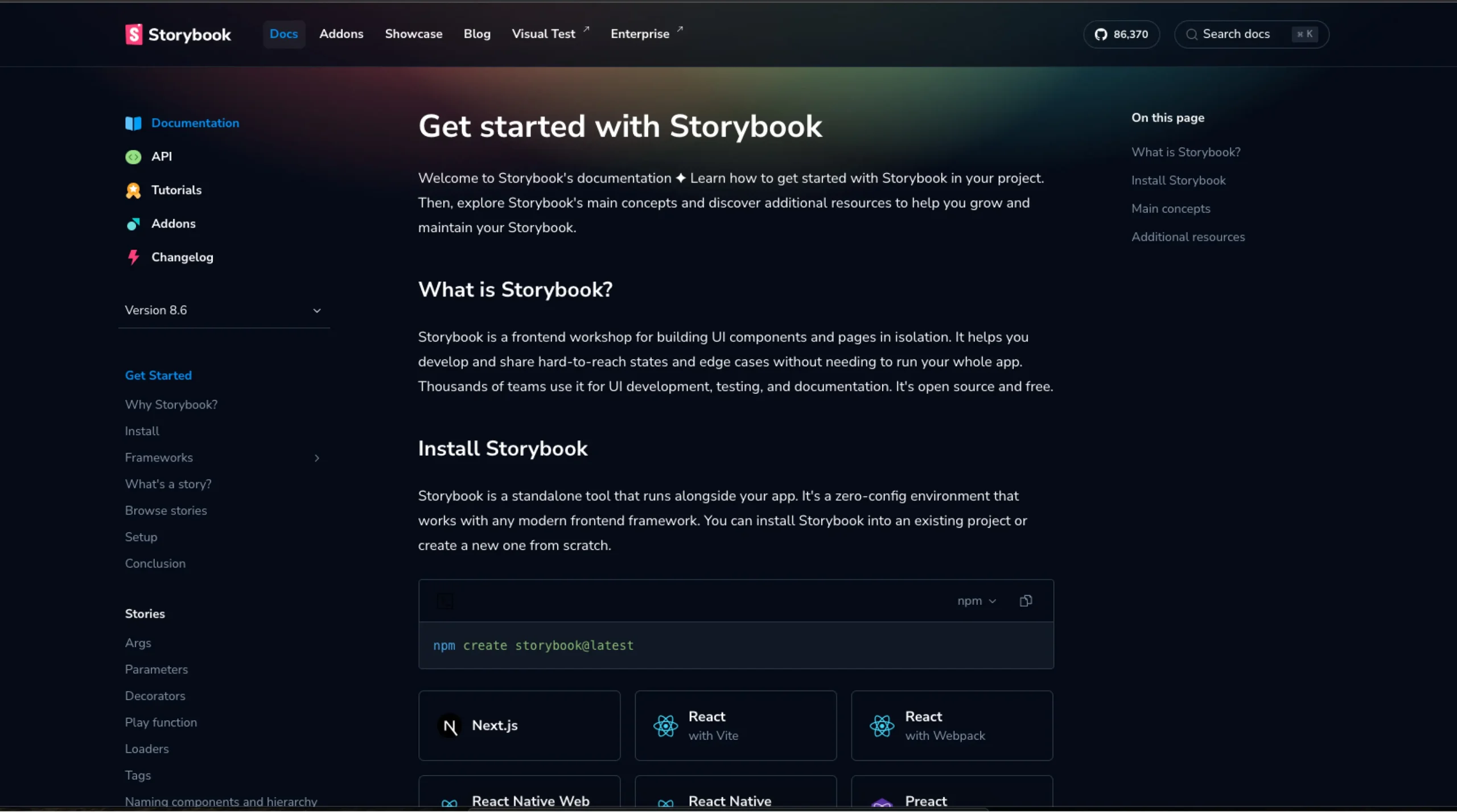
Story Book
-
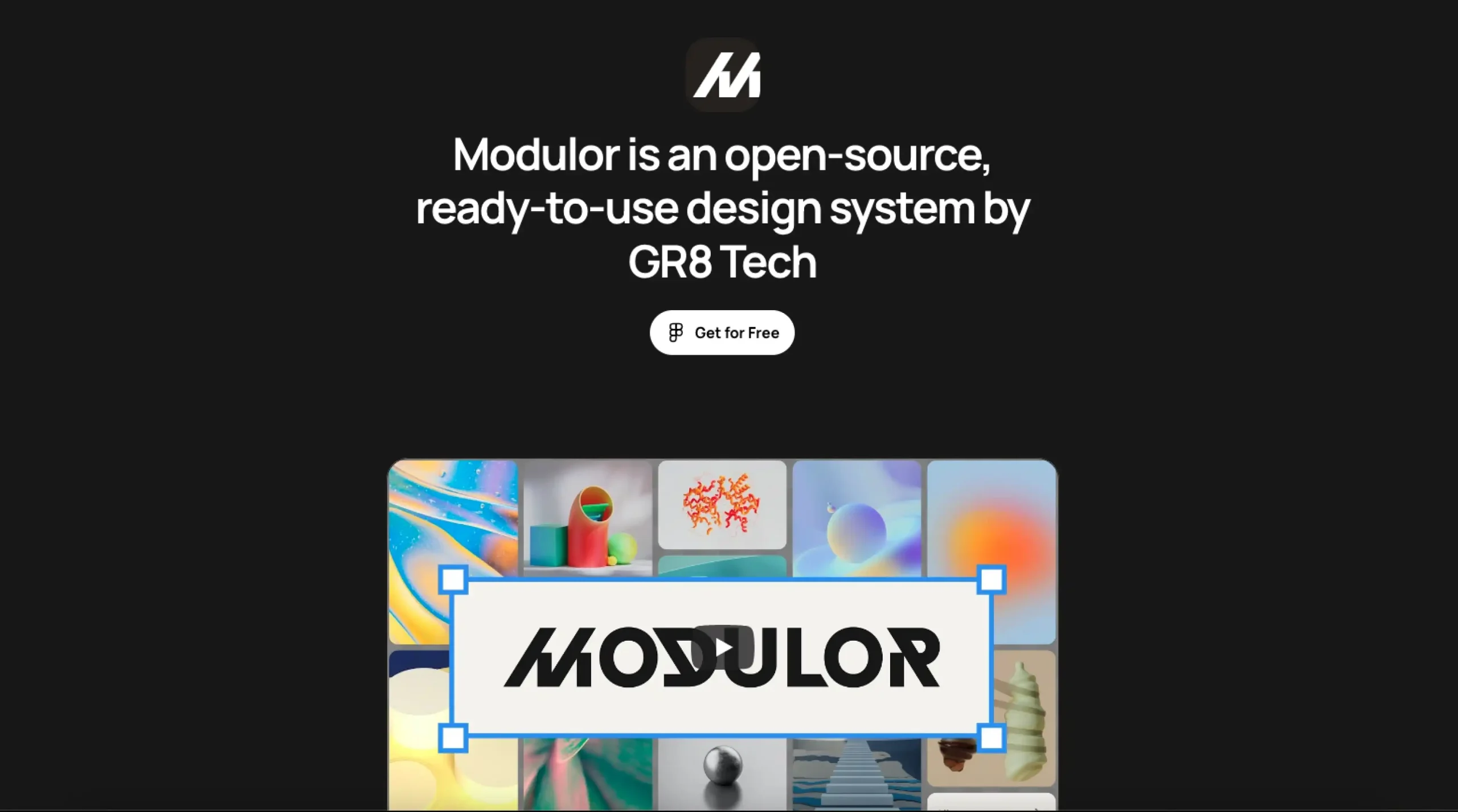
Modulor
Stay in the loop.
Sign up for the newsletter to receive a weekly
dose of design resources/inspiration delivered straight to
your inbox. We will never share your information. Ever.
🧱 Design Systems Category Overview
Design systems are one of those things you don’t really appreciate… until you’ve worked on a project without one.
Suddenly, you’re guessing font sizes. Rebuilding buttons for the third time. Arguing whether 8px or 12px spacing “looks cleaner.” It’s chaotic. And honestly? Exhausting.
That’s why we built this Design Systems category on UIUXshowcase.com.
It’s a curated collection of the most well-documented, thoughtfully constructed design systems from enterprise companies like Google (Material 3.0), IBM (Carbon), Atlassian, and others who’ve been in the trenches long enough to know what works—and what falls apart under scale.
But this isn’t just about peeking at shiny component libraries. These systems offer more than patterns. They offer a glimpse into how large teams align around design, code, accessibility, tone, and even organizational culture.
You don’t have to adopt every guideline. In fact, you probably shouldn’t. But studying these systems can shape how you build your own. They teach you how to think in systems—how to design less for today, and more for everything that comes after.
🧰 What You’ll Find in the Design Systems Library
📐 Full Design System Docs from Enterprise Teams
From foundational tokens to high-level content strategy, these public design systems cover everything. Layouts, grid systems, iconography, motion, accessibility—you name it.
🔍 Real-World Examples of Scalable Design
These aren’t theoretical models. They’re systems that have been used—stretched, challenged, revised—across actual products with millions of users. You’ll see what survived, and what had to evolve.
🧱 Component Libraries with Context
It’s one thing to build a button. It’s another to understand how that button behaves, adapts, and responds in different use cases. These systems give you both the component and the thinking behind it.
📣 Voice, Tone & Content Guidelines
Good design systems don’t stop at visuals. We’ve included systems that also address copywriting, tone of voice, and messaging—because communication is part of the user experience.
🛠 Tools and Frameworks to Build Your Own
Inspired to start (or refine) your own? You’ll find links to open-source kits, token generators, and structure templates to help you get going without reinventing the wheel.
🙋 Why This Category Exists
Because building consistent, scalable design isn’t just about saving time—it’s about reducing confusion.
And because a design system isn’t just for design. It’s for engineering, product, marketing, support—everyone who touches the experience. It’s the connective tissue behind the screens.
This collection is meant for product teams, freelancers, founders, and design leads. For anyone asking:
“How do we keep this consistent as we grow?”
or
“What does good, system-level thinking actually look like?”
These systems won’t give you all the answers. But they’ll definitely help you ask better questions.
💡 Frequently Asked Questions (FAQs)
1. What is a design system, really?
It’s more than a component library. A design system is a set of guidelines, principles, and reusable elements—visual and functional—that help teams build consistent products.
2. Are these systems open for public use?
Yes. All featured systems are publicly documented by the companies themselves. Some are open-source, others are read-only for reference.
3. Do these include code components too?
Many do. Systems like Google’s Material or IBM’s Carbon provide both design specs and front-end code libraries for React, Vue, and others.
4. Can I use these systems in my own product?
You can draw inspiration, yes. Some allow direct reuse (open source); others are meant for learning. Always check the license.
5. I’m a solo designer. Is this still useful to me?
Absolutely. Even if you’re not building a full system, understanding how the pros think about structure, scale, and handoff can improve your workflow.
6. Are these only relevant to big companies?
Nope. Small teams benefit just as much—sometimes more—by adopting system thinking early. It helps avoid costly redesigns later.
7. Do you include mobile-focused design systems?
Yes, where available. Many systems address responsive behavior or include mobile-specific patterns.
8. Can I contribute a design system to this library?
We’d love that. If your team has built a strong system—especially one that’s public or open-source—send it our way.
9. How often is this collection updated?
Regularly. We add new systems, remove outdated links, and sometimes highlight smaller, lesser-known systems doing really thoughtful work.