We’re excited to feature KERN on UIUXshowcase—not because it’s another flashy product page, but because it’s a rare example of deep product thinking expressed through design.
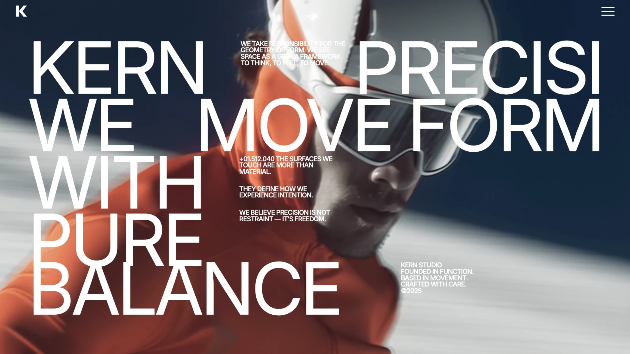
KERN isn’t software. It’s not a service. And it’s definitely not a conventional landing page.
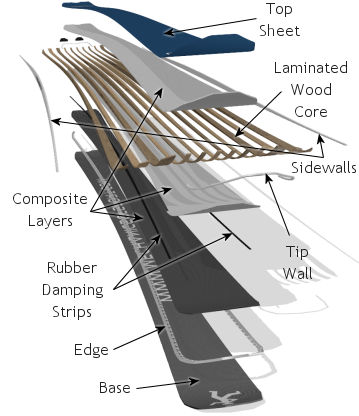
It’s an engineered ski system, presented through a product-focused microsite that feels more like a design manifesto than a sales pitch.

Not Just Skis — A System
At first glance, the KERN site feels minimal and precise. But spend a few minutes scrolling, and it becomes clear: this is about how skis behave, not just how they look.
The product is framed as a system, built around:
- Structure
- Motion
- Load distribution
- Balance
- Performance under real conditions
Instead of marketing buzzwords, you’re met with language rooted in engineering and physics—terms like flex, geometry, and load paths. This immediately signals that KERN is designed for people who care about how performance is built, not just promised.
Design That Explains Performance
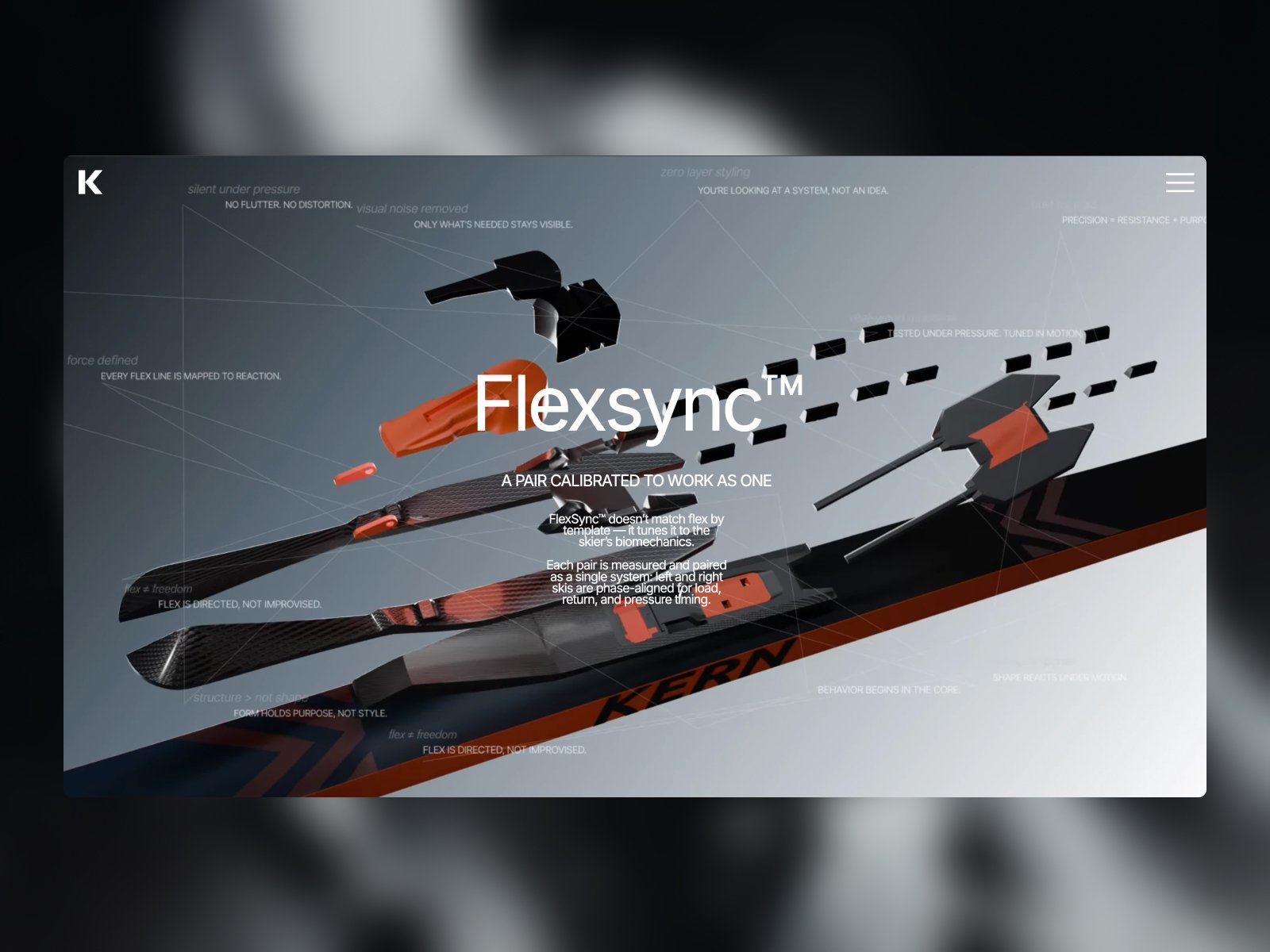
What makes KERN stand out is how clearly design is used to explain complexity.
The microsite uses:
- Clean sectional layouts to break down ski construction
- Visual cues that guide your eye through structure and force distribution
- Technical illustrations paired with restrained typography
There’s no overload. No unnecessary animation. Everything feels intentional—almost instructional—making the experience feel closer to a technical walkthrough than a marketing page.
This is a great example of design as a translation layer between engineering and the end user.
A Product Campaign, Not a Typical Website
KERN doesn’t behave like a standard product website:
- There’s no blog
- No pricing table
- No aggressive CTAs
Instead, it reads like a product campaign microsite—something you’d expect to see alongside a concept launch, exhibition, or design showcase. The goal seems to be understanding before conversion.
That choice alone speaks volumes about confidence in the product.

Transparency in Team & Craft
Another interesting detail: the site openly lists team members, including names and Telegram links. This adds a layer of human transparency, reinforcing that KERN is built by real people with real expertise—not a faceless brand.
The site credits UPROCK Studio, suggesting the microsite is a deliberate piece of design craftsmanship, not just a container for content.

Why KERN Belongs on UIUXshowcase
We feature tools, products, and experiences that demonstrate strong UX thinking, even outside traditional digital products. KERN fits perfectly because it shows:
- How industrial products can be explained through digital storytelling
- How clarity beats hype in product communication
- How design can bridge engineering and emotion
- How a microsite can act as a lens, not just a brochure
For designers, this is inspiration.
For product thinkers, it’s a lesson.
For brands, it’s a reminder: good design respects intelligence.
Final Thoughts
KERN is a quiet, confident example of what happens when engineering-led products meet thoughtful design. It doesn’t shout. It doesn’t oversell. It simply explains—clearly, calmly, and beautifully.