Meter.com feels like what enterprise networking should look like in 2025: clean, confident, and quietly powerful.
Who is Meter?
Meter is a San Francisco–based technology company that builds internet infrastructure for businesses.
Founded in 2015 by brothers Sunil and Anil Varanasi, they provide “network as a service” — a fully managed stack of hardware, software, and operations that delivers secure, high-performance networks for offices, warehouses, retailers, schools, and more.
Instead of buying switches, firewalls, and Wi-Fi gear from different vendors and managing it all yourself, companies use Meter to design, install, monitor, and maintain their entire network on a single integrated platform.
That positioning is evident in the website’s design.
First impression: calm, profound, and hardware-first
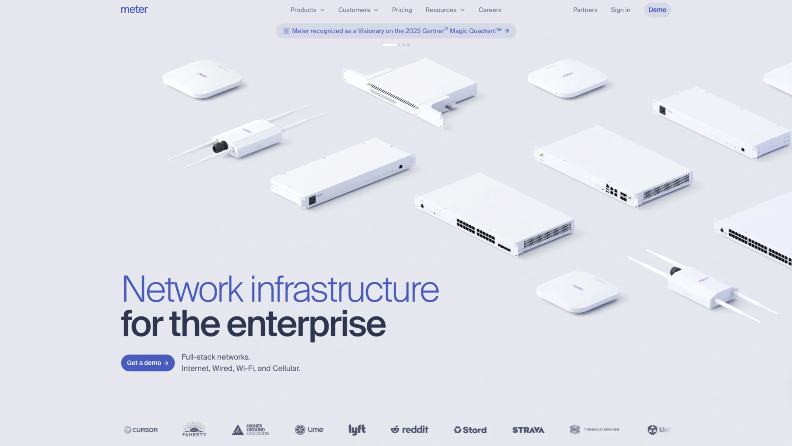
The hero section sets the tone immediately: a light, almost clinical background with carefully lit hardware components floating above the fold, paired with the headline “Enterprise networks, built from the ground up.”
Visually, three things stand out:
- Color palette:
Mostly whites and soft neutrals, with a subtle blue-purple accent. It communicates reliability and technical depth without feeling dark or intimidating. This is a typical pattern in infrastructure brands, but Meter executes it with a very modern, almost “Apple-for-networking” feel. - Typography:
The type is large, spacious, and highly readable. The main headline is bold and slightly condensed, making “Enterprise networks” feel strong and vital, while supporting lines are lighter and more conversational. It reads more like product storytelling than dry B2B marketing. - Hardware photography:
The hero doesn’t show dashboards first; it shows the actual devices. Firewalls, switches, access points, racks – all shot in a consistent, minimal style. This instantly signals, “We build real, serious infrastructure,” which is crucial in a category where reliability and trust matter more than visual gimmicks.
A primary “Get a demo” button anchors the hero and reappears later in the page, reinforcing the main conversion goal.
Clear structure and information hierarchy
The homepage follows a very logical narrative that matches how a buyer would think about network infrastructure:
- What they do (hero):
“Full-stack networks. Internet, Wired, Wi-Fi, and Cellular.” Short, direct, and benefits-oriented. - Physical foundation – Hardware designed by Meter:
The following section showcases the whole “Meter Network”: F-Series Firewalls, S-Series Switches, A-Series Access Points, G-Series Gateways, and P-Series PDUs – each listed with concise specs.
The layout feels like a product sheet turned into a landing page: dense with information, but visually spaced out so it never feels overwhelming. - How it gets deployed – Install to refresh:
Here, they shift into process: Meter or its partners handle design, deployment, and lifecycle management. This section uses a more narrative block of text, plus a CTA to the installation process page, which is excellent for buyers who care about rollout risk. - Software & control – Dashboard and Command:
A dedicated section highlights the Meter Dashboard and Meter Command, emphasizing “Intuitive software packed with enterprise controls.” Subheadings such as Configurability, Security, Visibility, and Resiliency serve as scannable pillars. Underneath, a detailed UI panel lists menu items (Network, Insights, Hardware, Security, Wireless, Design, etc.), giving a realistic sense of product depth. - Scale & social proof:
Further down, the “Built to scale” and “Trusted by technology and networking leaders everywhere” sections combine a simple explanatory paragraph with logos, a testimonial, and multi-site deployment imagery. This structure helps the page move from abstract promise to concrete proof. - Pricing and contact:
The footer and bottom CTAs point to Pricing, Get a demo, Free trial, and Switch to Meter– all clear paths for both exploratory and ready-to-buy visitors.
Overall, the information architecture feels like a well-designed sales deck flattened into a single scroll: introduction → proof of capability → how it works → scale → trust → next steps.
Navigation and wayfinding
The global navigation is compact but comprehensive:
- Products (Network, Connect, Cellular, Security, etc.)
- Customers & Solutions (Warehouses, Education, Retailers, Offices, Startups)
- Pricing
- Resources (Case studies, Blog, Events, Guides)
- Careers, Partners, Sign in, Demo
From a UX perspective, this does a few things well:
- Segmented navigation: Buyers can enter either by what Meter sells (Network, Command, Dashboard) or by who they are (Education, Warehouses, Retailers).
- Persistent “Demo” CTA: Having “Demo” in the top bar and again as buttons throughout the page keeps the main action always within one click.
- Deep linking: Product, operations, and resource pages are clearly broken out, so someone who lands via search (e.g., “Managed Wi-Fi” or “E-Rate”) still understands the broader platform.
If you’re studying Meter for UX patterns, this is a nice example of how to support multiple entry points without bloating the nav.
Interaction design and product storytelling
Even without seeing the live motion, the HTML and layout hint at a few interaction decisions:
- Dashboard preview as a live system metaphor
The Dashboard section includes a long, scrollable list of menu items and system states: online counts for firewalls, switches, access points, PDUs; ISP throughput graphs; sections for VLANs, SSIDs, firewall, DNS security, rack elevations, floor plans, tunnels, etc. This isn’t just decoration – it tells a story:
“This is a serious, full-stack console where you can control everything.”
It also shows the complexity the software hides, which reassures network engineers. - Guided flow through the lifecycle
Links to Network design & configuration, Installation & rollout, and Support & maintenance sit together under Operations.
That triad makes the service feel end-to-end and suggests a linear flow: design → deploy → operate. From an interaction perspective, users can follow that path across pages, learning the story in the same order Meter delivers the service. - Conversion micro-journey
The site doesn’t bombard you with forms. Instead, it gently nudges you from:- Homepage hero → Get a demoDeeper product pages → Demo or ContactResource pages (like Managed Wi-Fi) → educational content first, then subtle CTAs.
Visual details that build trust
A few subtle design choices make Meter feel more “infrastructure-grade” than typical SaaS marketing:
- Consistent device imagery:
Firewalls, switches, and access points share lighting, angles, and backgrounds, which makes the hardware family feel unified rather than pieced together. - Realistic dashboards, not dribbble shots:
The UI panels show real navigation labels (e.g., Topology, Logs, Network-wide, RADIUS profiles, mDNS, NIDS), the kind of language that resonates with network engineers and IT teams. - Tone of voice:
Copy like “Networks built the way they should be, from the ground up” and “Cohesive networks, not patchworks” balances technical authority with plain language. It’s confident without being hype-y. - Enterprise cues:
Sections titled “Trusted by technology and networking leaders everywhere” plus customer stories and multi-site deployment imagery anchor the brand as proven, not experimental.
What designers can learn from Meter?
For UI/UX designers and product teams visiting UIUXshowcase, Meter.com is a firm reference for:
- How to make deep technical products approachable
The content is dense, but the layout, spacing, and typography keep it digestible. - Hardware + software storytelling
Many B2B brands struggle to connect physical devices and cloud software. Meter does this by stacking hardware, operations, and dashboard views into one cohesive story. - Designing for trust in critical infrastructure
Everything – from the white, almost clinical palette to the precise copy and dashboard snapshots – is optimized for reliability, not trends. - Using the homepage as a narrative spine
If you follow the page from top to bottom, you move through a complete buyer journey: what it is → how it works → why it’s better → who uses it → how to start.
If you’re designing for infra, DevOps, networking, or any “invisible” backbone technology, Meter is an excellent example of how to make something highly technical feel both premium and clear, without losing credibility