


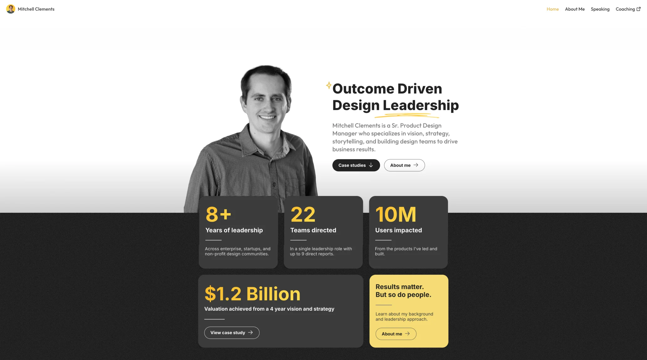
Mitchell Clements is a Senior Product Design Manager (currently at nCino) with 8+ years of leadership experience across enterprise, startups, and non-profits.
Known for building and scaling design teams—from 2 to 30 members—and shaping product vision, his work has impacted over 10 million users and driven valuations up to $1.2 billion.
A former developer and product manager turned designer, he thrives on weaving strategy, storytelling, and measurable outcomes into design leadership.
🎯 Overall Impression
The portfolio delivers a confident, leadership-driven first impression, which aligns with Mitchell’s positioning as a Sr. Product Design Manager. The use of a monochromatic scheme with yellow highlights communicates focus and intentionality.
✅ Usability Analysis
- Clear CTA Hierarchy:
- Two immediate CTA buttons — “Case studies” and “About me” — allow users to choose between credibility (proof of work) and personality (background).
- Consistent button styling with arrow icons helps hint at interaction.
- Above-the-Fold Clarity:
- The headline “Outcome Driven Design Leadership” communicates value quickly.
- Subtext explains his role and what he specializes in — ideal for quick scanning.
- Information Chunking:
- Stats (8+ years, 22 teams, 10M users) are broken into digestible cards — great for cognitive ease.
- Scannability:
- The use of bold typography and whitespace makes it very scannable, a key usability win.
♿ Accessibility Evaluation
- Contrast & Readability:
- Excellent color contrast between black text on white and yellow highlights for emphasis.
- Dark cards on black might pose some accessibility challenges, especially for low-vision users (e.g., grey-on-black subtext could be hard to read).
- Text Hierarchy:
- Heading tags and font sizes appear to be structured well (assuming proper HTML semantics in implementation).
- Interactive Elements:
- CTA buttons are large, tappable, and distinguishable — good for both mouse and touch users.
🎨 Visual Design & Branding
- Visual Tone:
- Balanced, clean, and credible. The black-and-white hero image with a splash of yellow suggests professionalism and authority without being flashy.
- Typography:
- Well-chosen font pairing. The bold headline draws attention, while the supporting text is readable and thoughtfully placed.
- Color Use:
- The black-yellow-white theme is consistent throughout. Yellow highlights are reserved for emphasis — like callouts or key metrics.
- Imagery:
- The grayscale photo of Mitchell humanizes the site. It’s confident yet approachable.
📚 Case Study & Value Communication
From the image alone, the callout “View case study” implies that the portfolio includes deep dives into actual project results, including:
- $1.2 Billion valuation: Very strong outcome-driven storytelling.
- Team & leadership impact metrics: Reinforces credibility through numbers.
This outcome-focused storytelling makes it extremely compelling for hiring managers or stakeholders evaluating leadership candidates.
🧭 Navigation & IA (Information Architecture)
- Top Navigation:
- Minimal, focused nav: Home | About Me | Speaking | Coaching.
- Likely uses anchor links or internal pages for smooth access — avoids clutter.
- Page Layout:
- Vertical flow: Hero → Stats → CTA → Case Studies. This reflects progressive disclosure — a UX best practice.
🧠 Final Thoughts
Mitchell’s portfolio homepage is a masterclass in clarity, authority, and trust-building — especially for leadership-focused UX/product professionals. It nails the first impression, communicates real impact through data, and invites users to explore deeper through well-placed CTAs.