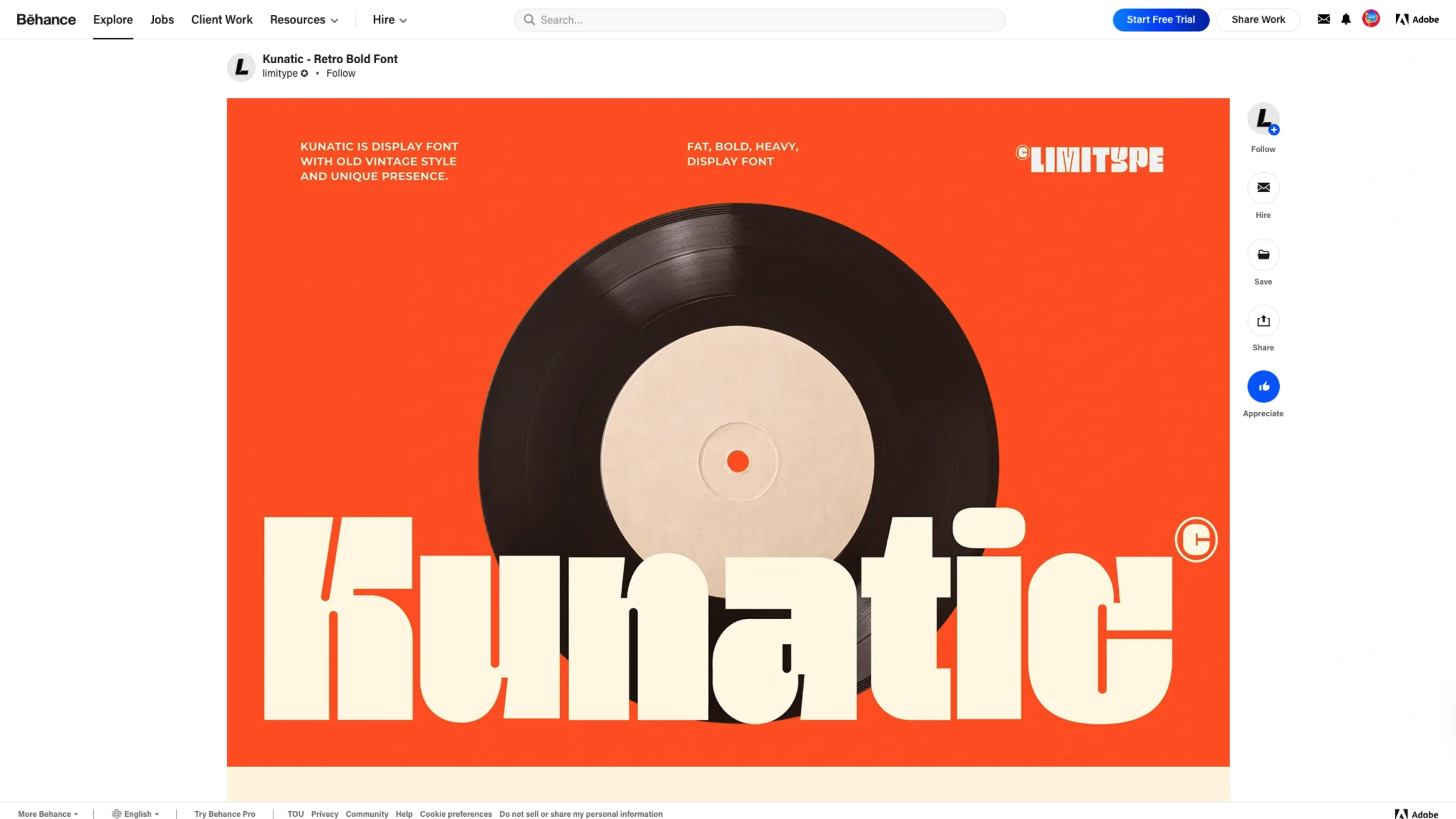
Kunatic – Retro Bold Font is a display typeface designed to make an immediate visual statement.
Rooted in retro influences, the font embraces thick strokes, confident curves, and expressive letterforms that feel energetic and unapologetically bold. It’s not subtle—and that’s exactly the point.
The typeface is clearly crafted for headlines, posters, branding, packaging, and editorial use, where personality matters more than neutrality.
Its exaggerated proportions and strong rhythm give it a playful yet commanding presence, making it ideal for designs that want to feel nostalgic, expressive, and full of character.
Kunatic balances retro inspiration with modern usability. While the forms reference vintage aesthetics, the execution feels clean and intentional rather than ornamental or cluttered.
This makes the font versatile enough for contemporary branding projects that want a retro edge without feeling dated.
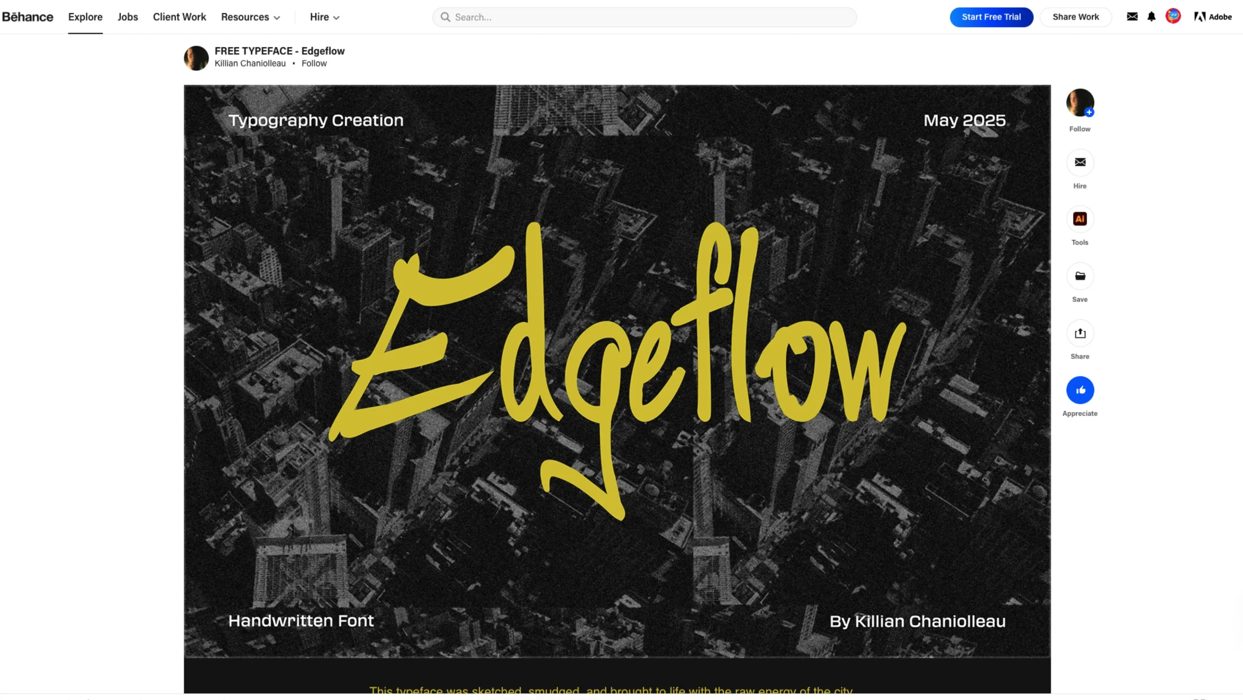
The Behance presentation focuses on letterform exploration and specimen-style layouts, allowing the shapes to speak for themselves.
Color usage, spacing, and composition reinforce the font’s bold attitude, showing how it performs at scale and in high-impact contexts.
Overall, Kunatic is a typeface built for designers who want typography to do more than support layout—it’s meant to lead the visual identity, set the tone, and demand attention.


