Colorsss is a playful, minimal tool for generating beautiful, modern color palettes with a simple tap.
Each refresh delivers a bold, harmonious set of colors, making it perfect for designers in need of quick palette inspiration.
Colorsss — A Simple, Playful, and Surprisingly Smart Color Tool for Designers
Every designer has their favorite color tools—some for palettes, some for gradients, some for harmony rules, and some… well, just because they’re fun to use.
Colorsss falls right into that last category, but don’t let its simplicity fool you.
It’s one of those rare tools that feels almost toy-like at first glance, yet becomes a quiet essential in your workflow.
I’ve been exploring colorsss.com, and honestly, it’s one of the most charming color utilities I’ve come across in a long time.
It leans into minimalism, but in all the right ways. No clutter, no settings buried behind four menus—just a clean interface that lets you play with color the way designers actually think about color: intuitively.
Let’s walk through what makes it special.
⭐ A Minimal Tool With Maximum Intent
Colorsss doesn’t try to be a full-blown color-management suite or a complex palette-building system. Instead, it focuses on doing one thing really well:
Helping you explore color through simple, fluid experimentation.
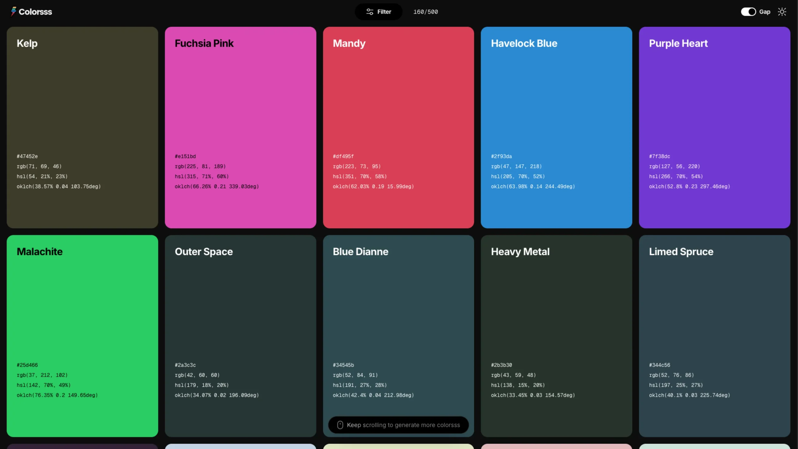
The interface is basically a blank canvas with color blocks you can click through, reshuffle, and regenerate.
That’s it—and yet, it’s surprisingly liberating. Unlike tools that bombard you with sliders, hex inputs, hue wheels, and contrast ratios the second you open them, Colorsss gives you space to play before you start thinking.
This is especially great when you’re stuck or need a spark of visual inspiration.
Sometimes you don’t want to calculate; you want to see something fresh and let your creative eye take over.
🎨 Instant Color Exploration With One Click
The core interaction is wonderfully simple:
- Click to generate new color combinations
- Shuffle for variations
- Keep exploring until something clicks visually
It feels a bit like rolling a dice, but for color. There’s no pressure to “get it right” immediately. Instead, you get to explore without overthinking, and that alone makes it a refreshing addition to a designer’s toolbox.
For moments when you’re:
- putting together a moodboard
- brainstorming brand directions
- searching for a palette for a landing page
- or just warming up creatively
…Colorsss gives you a fast, intuitive starting point.
🎛️ A Color Playground for Designers
What I genuinely appreciate is how Colorsss understands how designers think visually:
- It doesn’t throw theory at you.
- It doesn’t enforce rules.
- It doesn’t assume how you want to use color.
It just gives you color—pure, raw, ready to shape.
And because it’s so lightweight, you can open it in the background while working in Figma, Webflow, Framer, or Photoshop and call on it whenever you need that quick dose of color spontaneity.
⚡ Great for Fast Inspiration and Early Creative Exploration
We all know that early-stage design is messy—in a good way. There are no constraints yet, no guidelines, no brand system, no “official palette.”
That’s where Colorsss shines. Instead of forcing you to analyze color, it lets you feel it.
Think of it as:
- a color mood generator
- a palette warm-up tool
- a spark machine for visual direction
- a helpful tool for breaking creative blocks
Some days, you need something simple to loosen your mind. Colorsss does precisely that.
🧘♂️ A Surprisingly Relaxing Tool
This might sound funny, but Colorsss also has this calming quality.
There’s no UI noise.
No ads.
No upsells.
No dark patterns.
Just color.
Because everything is so intentional and minimal, it becomes almost meditative—click, color, click, color. It’s the kind of tool that reminds you why you love design in the first place.
💡 Where It Fits in Your Design Workflow
Here’s where Colorsss becomes genuinely helpful:
1. Exploring early palette ideas
Before you start defining color variables or system tokens, use Colorsss to explore interesting color combinations.
2. Speeding up concept and moodboard creation
Sometimes a palette direction pops up that perfectly matches the vibe you’re trying to build.
3. Breaking creative blocks
Colorsss is simple enough to distract you from overthinking and help you get moving again.
4. Discovering unexpected colors
If you’re always drawn to the same tones, Colorsss helps break patterns.
5. Sharing quick visual direction
Show a palette to a client or teammate in seconds. No complexity, no barriers.
🧩 Simple, But Surprisingly Addictive
One of the things I love most is that colorsss.com doesn’t pretend to be more than it is.
It’s not here to replace your whole design system. It’s here to give your creativity a nudge—a playful, visual kickstart when you need it.
And sometimes, that’s precisely what our workflows are missing.
❤️ Final Thoughts
If you’re a designer, developer, or anyone who works with color, Colorsss is worth bookmarking.
It’s fun, fast, and refreshingly minimal. In a sea of over-engineered tools, this one stands out by doing the opposite—keeping things simple.
Whether you’re brainstorming branding ideas, designing your next landing page, or just looking for a quick hit of color inspiration, Colorsss is the kind of tool you’ll find yourself returning to again and again.
It’s proof that sometimes the best tools aren’t the most significant or most complex—they’re the ones that make creativity feel effortless.