


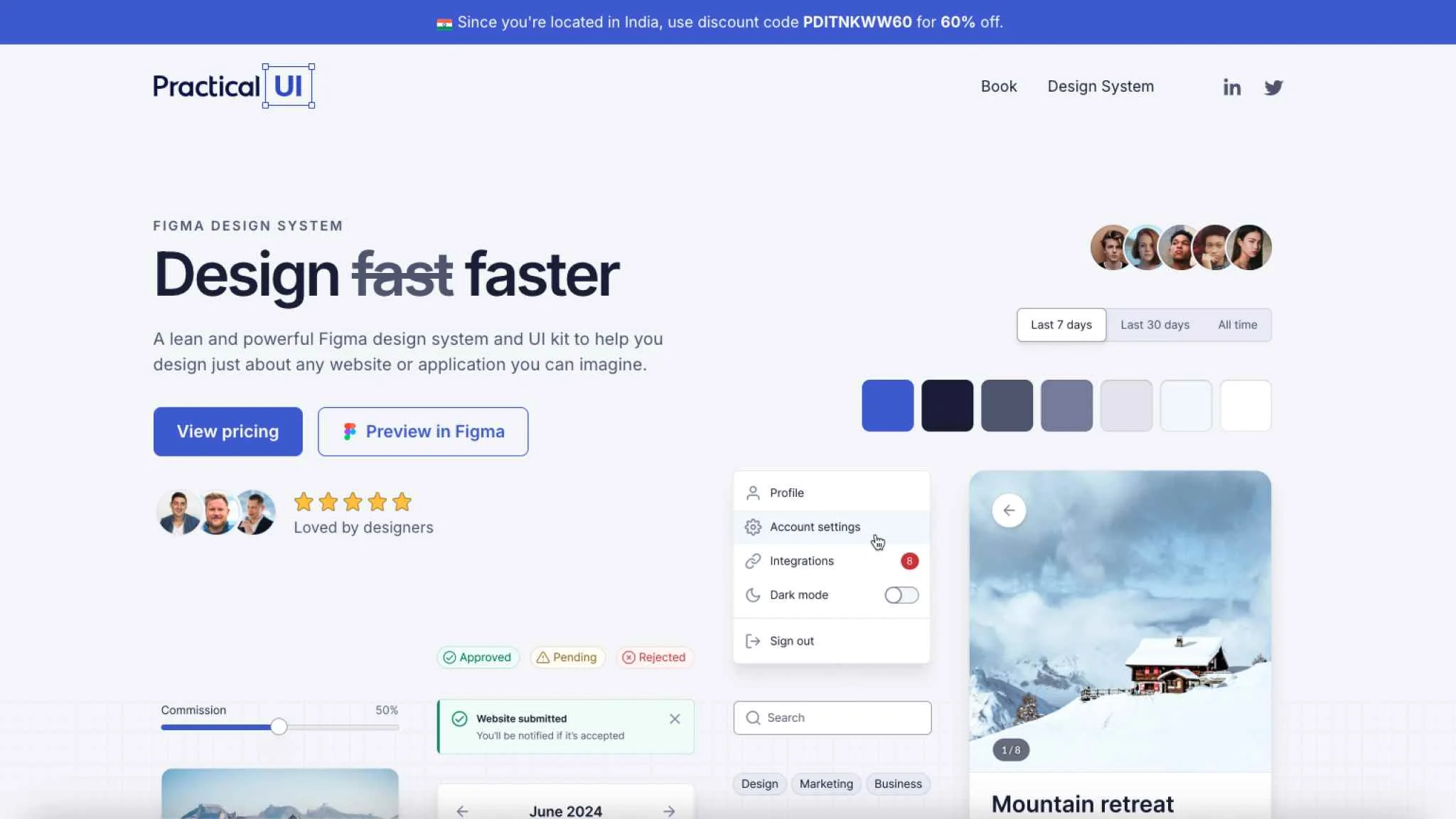
Practical UI provides a Figma design system and UI kit crafted to help designers efficiently create websites and applications. It features predefined styles for colors, typography, spacing, elevation shadows, light and dark modes, and a 4px layout grid, offering flexibility for customization. The system includes hundreds of component variants, ensures WCAG 2.1 level AA accessibility compliance, and utilizes Figma’s tools like auto layout, variables, and properties.
Practical UI is ideal for both individual designers and teams, enabling streamlined design workflows and consistency across projects. While no coding is included, users are required to develop their own coded components. Multiple licensing options, from individual to team licenses, are available with lifetime updates.