


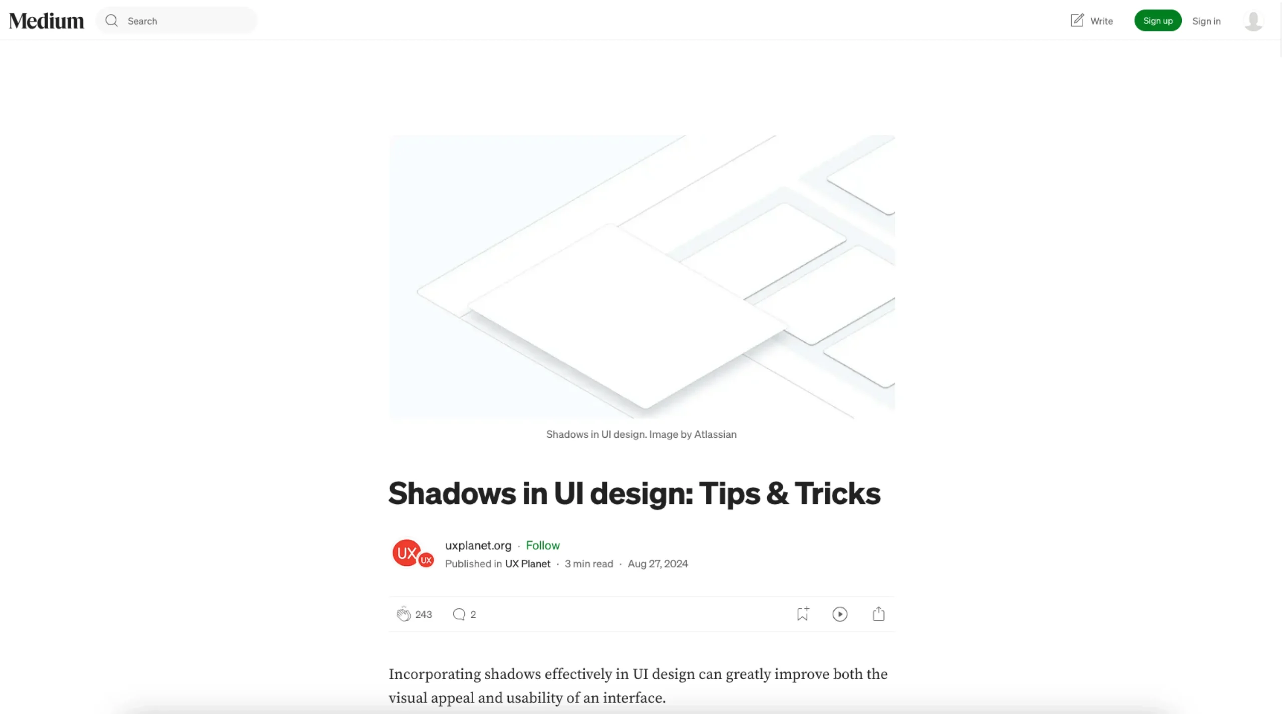
UX Planet offers a comprehensive guide on using shadows to improve both the aesthetics and functionality of user interfaces. Shadows are not just for decoration—they add depth, establish hierarchy, and enhance interaction clarity. The article breaks down shadows into three main types: soft shadows, which subtly add depth to elements like buttons and input fields; strong shadows, used to elevate elements like modals or dropdowns; and inset shadows, which create depth within elements like pressed buttons.
The guide provides practical tips, such as matching shadow colors to the element instead of relying on default black or gray to maintain a cohesive design. It also emphasizes the importance of consistent elevation levels to clarify visual hierarchy and recommends using dynamic shadows that respond to interactions like hovering or clicking for improved usability. UX Planet advises keeping a single light source for realistic effects and layering shadows for added depth. Finally, it cautions against excessive use of CSS shadows, as it can impact performance, particularly on lower-end devices.