


Before You Hit “Share”: 5 Figma File Tips Every Designer Should Know
There’s a quiet moment in every design project. You’ve pushed pixels, aligned grids, argued over spacing, maybe even fallen in love with a button. And then… You hand it off.
That moment? It’s where things either flow beautifully—or completely fall apart.
Because here’s the thing: a good design isn’t just what you see on the screen. It’s how clearly someone else can build it.
Let me explain.
Engineers don’t see your work the way you do. They don’t see your intent, your late-night iterations, your “this spacing just feels right” decisions. They see a file. A system. Or sometimes… a mess.
So if you want your designs to survive the handoff (and not come back slightly broken, like a bad photocopy), these five tips will make a real difference.
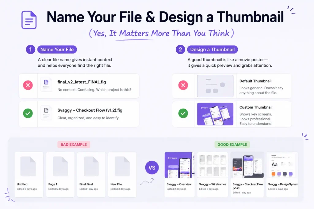
1. Name Your File & Design a Thumbnail (Yes, It Matters More Than You Think)
Let’s start with something deceptively simple.
“Final_v2_latest_final_FINAL.fig”
We’ve all seen it. Maybe… we’ve all created it too.
But imagine you’re an engineer opening Figma with 20 shared files. Which one do you click?
Exactly.
A clean file name like:
“Svaggy – Checkout Flow (v1.2)”
already tells a story. It gives context. It builds trust.
And the thumbnail? That’s your cover image. It’s like a Netflix poster—people judge fast.
A well-designed thumbnail:
- Shows key screens
- Uses consistent branding
- Gives a quick snapshot of what’s inside
It’s a small touch. But it signals professionalism instantly.
2. Creatively Name Your Figma Pages (Please, No “Page 1”)
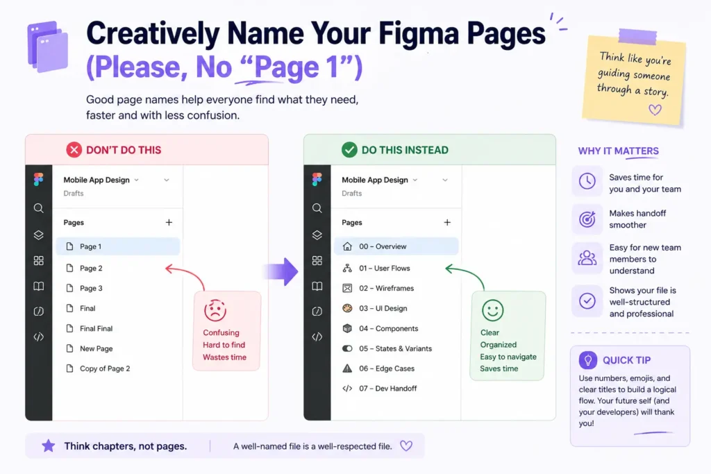
Here’s where things quietly go wrong.
You open a file and see:
- Page 1
- Page 2
- Exploration
- Final Final
- Final Final 2
At this point, even you might get confused—and you made it.
Instead, think like you’re guiding someone through a story.
Try:
- 00 – Overview
- 01 – User Flows
- 02 – Wireframes
- 03 – Final UI
- 04 – Edge Cases
- 05 – Dev Handoff
See the difference?
It feels intentional. Almost like chapters in a book.
And honestly, engineers appreciate this more than they say. Because now they’re not guessing—they’re navigating.
3. Show Your Work with Wireframes (Don’t Skip This Step)
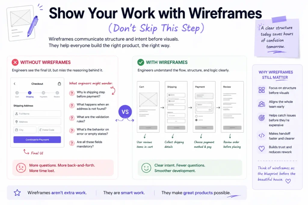
I know, I know.
Wireframes feel… old school. Especially when everything is moving fast, and clients want polished screens yesterday.
But here’s the twist: wireframes are not just for you. They’re for clarity.
When you include wireframes:
- You show structure before visuals
- You explain layout decisions
- You reduce ambiguity
Think of it like showing rough sketches before the final painting. It helps engineers understand why something exists—not just what it looks like.
And sometimes—this is important—they catch issues earlier. Before it becomes expensive to fix.
So yeah, skipping wireframes might save time upfront… but it often costs more later.
4. Note Important Information & Specs (Because Guesswork Is Expensive)
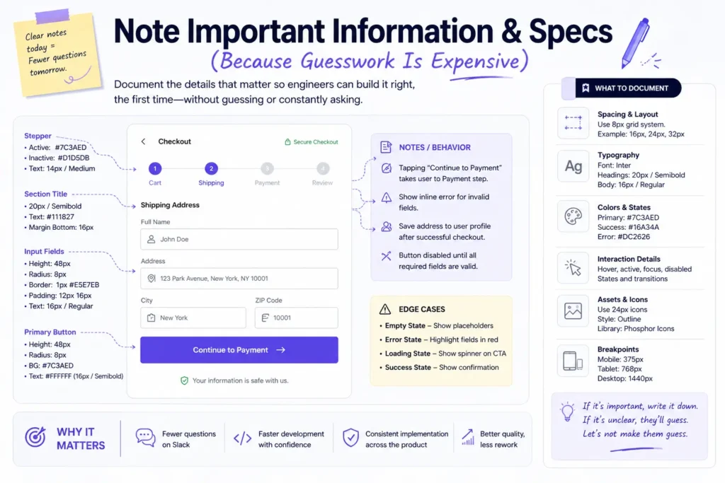
Here’s a small truth that stings a bit:
If you don’t document it, engineers will interpret it.
And interpretation leads to inconsistency.
Spacing, font weights, hover states, edge cases—these aren’t “nice-to-have” details. They’re the difference between a polished product and something that feels slightly off.
So what should you include?
- Padding and spacing rules
- Font sizes and line heights
- Color usage (especially states like hover, active, disabled)
- Interaction notes (what happens on click, scroll, error, etc.)
- Edge cases (empty states, errors, loading)
You don’t need to write a novel. Just enough to remove doubt.
Because every unanswered question becomes a Slack message… or worse, an assumption.
5. Make Use of Figma’s Dev Mode Feature (It’s There for a Reason)
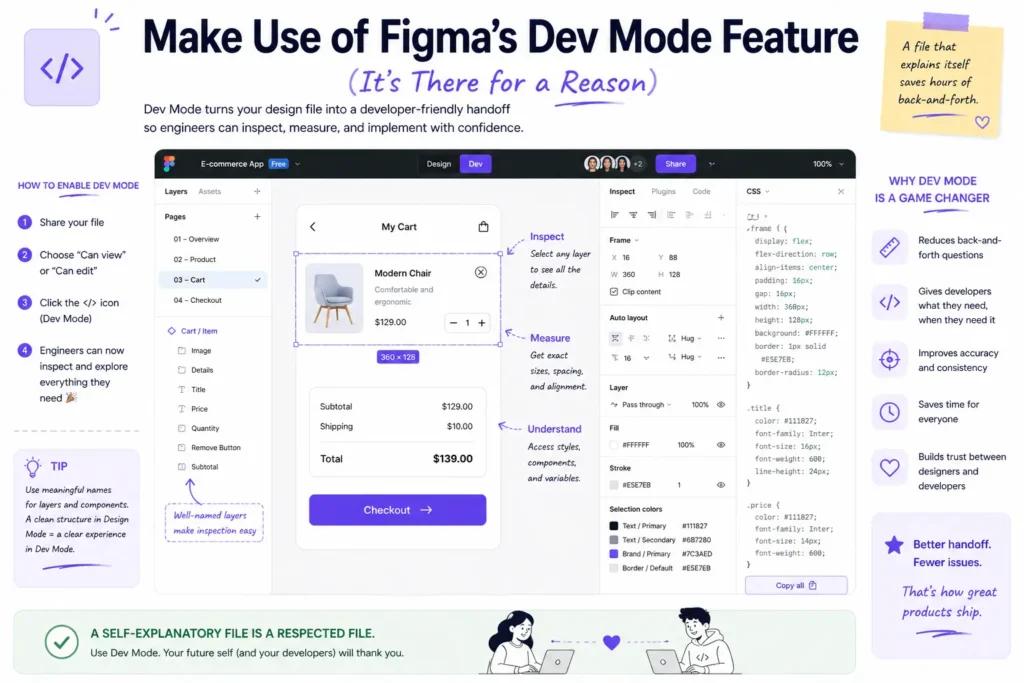
Let’s talk about something many designers still underuse: Figma’s Dev Mode.
Honestly, it’s one of those features that quietly solves half your handoff problems.
With Dev Mode:
- Engineers can inspect elements directly
- Copy CSS values
- Access measurements without asking you
- See components and tokens clearly
In a way, it shifts the relationship. Instead of you explaining everything, the file explains itself.
And that’s powerful.
It reduces back-and-forth. It saves time. It keeps things accurate.
If you’re not using it yet, you’re making handoff harder than it needs to be.
So… Why Does All This Matter?
Because design doesn’t end when the screen looks good.
It ends when the product works exactly as intended.
And that only happens when designers and engineers share the same understanding.
Clean files. Clear structure. Thoughtful documentation. These aren’t extra steps—they’re part of the craft.
You know what’s interesting?
The best designers I’ve worked with weren’t just great at visuals. They were great at communication. Their files felt calm. Predictable. Easy to follow.
And engineers loved working with them.
Not because their designs were flashy—but because their thinking was visible.
Final Thought
Before you hit that “Share” button next time, pause for a second.
Ask yourself:
“If I were seeing this file for the first time… would it make sense?”
If the answer is yes, you’ve done your job well.
And if not… You know exactly where to start.