


Color Palette, Color Theory & Color Psychology
Designing with meaning, not just decoration.
Color is never neutral.
It influences mood.
It shapes perception.
It drives decisions.
In UI/UX design, branding, and product design, color is a strategy. Not styling.
Let’s break this into three core layers:
Color theory. Color palette. Color psychology.
They are connected. But they are not the same.

1️⃣ Color Theory – The Foundation
Color theory explains how colors work together.
It starts with the color wheel.
The Color Wheel
The wheel has three main categories:
- Primary colors – Red, Blue, Yellow
- Secondary colors – Orange, Green, Purple
- Tertiary colors – Mixes of primary + secondary
From this wheel, we build harmony.
Color Harmony Types
These are classic combinations designers use:
- Complementary – Opposite colors (Blue + Orange). High contrast. Strong energy.
- Analogous – Colors next to each other (Blue + Teal + Green). Calm and cohesive.
- Triadic – Three evenly spaced colors. Balanced but vibrant.
- Monochromatic – One color, many shades. Clean and minimal.
Each harmony creates a different emotional rhythm.
High contrast feels bold.
Low contrast feels calm.
Designers use theory to create visual balance and clarity.
Warm vs Cool Colors
Warm colors:
- Red
- Orange
- Yellow
They feel energetic. Urgent. Emotional.
Cool colors:
- Blue
- Green
- Purple
They feel calm. Stable. Professional.
This matters in UI.
A banking app rarely uses neon orange as its primary color.
A kids’ game rarely uses corporate grey.
Color sets expectations instantly.
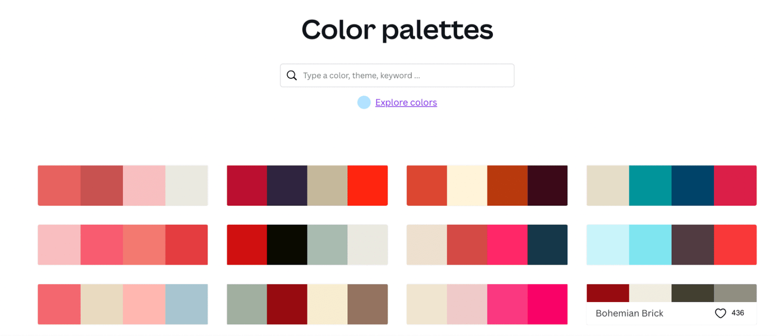
2️⃣ Color Palette – The System
A color palette is a structured selection of colors used in a product or brand.
It gives consistency.
Without a palette, design becomes chaotic.
Types of Colors in a UI Palette
Most digital products use:
- Primary color – Brand identity. Main CTAs.
- Secondary color – Support actions. Highlights.
- Accent color – Alerts or special emphasis.
- Neutral colors – Backgrounds, borders, typography.
- Semantic colors – Success (green), error (red), warning (yellow), info (blue).
A good palette balances emotion and usability.
Too many colors create noise.
Too few create boredom.
Saturation & Brightness Matter
Two designers can use the same blue.
One feels premium.
One feels childish.
Why?
Saturation and brightness.
- High saturation = playful, energetic
- Low saturation = mature, elegant
- Dark tones = serious, powerful
- Light tones = soft, friendly
Color is not just hue. Its depth.
Accessibility Is Non-Negotiable
Contrast ratio matters.
If users can’t read your text, your design fails.
WCAG guidelines recommend:
- 4.5:1 contrast for normal text
- 3:1 for large text
A beautiful palette that ignores accessibility is incomplete.
Good designers test colors.
Great designers design for everyone.

3️⃣ Color Psychology – The Emotional Layer
Color psychology studies how colors influence perception and behavior.
It’s not magic.
But it’s powerful.
Let’s explore common associations.
🔵 Blue
Feels trustworthy. Stable. Intelligent.
Used heavily in:
- Banking
- SaaS
- Healthcare
It builds confidence.
But too much blue can feel cold.
🔴 Red
Feels urgent. Passionate. Bold.
Used for:
- Sales
- Alerts
- Food brands
Red increases heart rate. It demands attention.
But overuse feels aggressive.
🟢 Green
Feels growth-oriented. Balanced. Natural.
Common in:
- Finance
- Sustainability
- Wellness
Green suggests progress and positivity.
🟡 Yellow
Feels optimistic. Energetic.
Used carefully in UI because:
Too much yellow strains the eyes.
It works best as an accent.
🟣 Purple
Feels creative. Premium. Imaginative.
Often used in:
- Beauty
- Innovation
- Luxury tech
It signals uniqueness.
⚫ Black
Feels powerful. Elegant. Minimal.
Luxury brands love black.
In UI, it feels modern and confident.
⚪ White
Feels clean. Open. Simple.
White space increases clarity.
It gives breathing room.
The Business Impact of Color
Color affects:
- Click-through rates
- Brand recall
- User trust
- Purchase decisions
Studies show users form a visual opinion within seconds.
Color plays a huge role in that snap judgment.
Your palette tells users:
“This is safe.”
“This is fun.”
“This is premium.”
“This is serious.”
Before they read a word.
How to Choose the Right Palette
Start with strategy.
Ask:
- Who is your audience?
- What emotion should they feel?
- What industry are you in?
- What action do you want them to take?
Then test.
Never rely only on intuition.
Create variations.
Check accessibility.
Validate with users.
Design is not personal preference. It’s behavioral science.
Final Thought
Color theory gives you structure.
Color palette gives you consistency.
Color psychology gives you meaning.
When you combine all three, color becomes more than decoration.
It becomes influential.
And in product design, influence is everything.