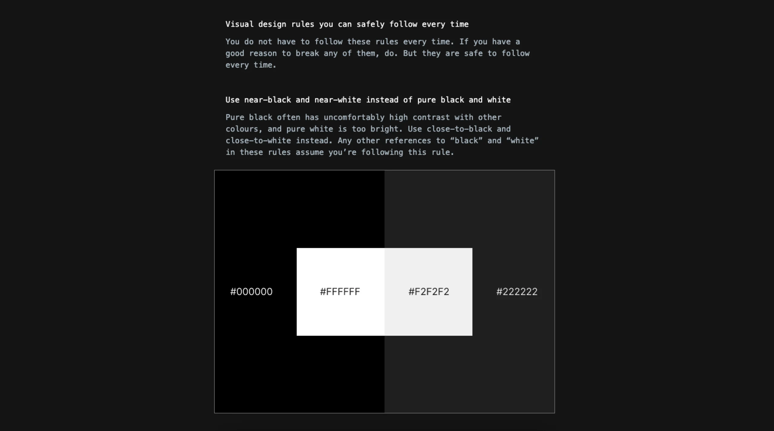
This resource, curated by Anthony Hobday, presents a comprehensive collection of practical visual design rules aimed at enhancing the aesthetics and usability of digital interfaces. The guidelines cover various aspects of design, including color usage, typography, spacing, alignment, and layout. Key recommendations include using near-black and near-white instead of pure black and white to reduce harsh contrast, saturating neutrals slightly to create a cohesive color palette, ensuring high contrast for important elements to draw user attention, and aligning elements optically rather than strictly mathematically for better visual harmony. The site emphasizes deliberate design choices, suggesting that every element should have a clear purpose and rationale. While these rules are not absolute, they serve as reliable principles that designers can confidently apply to create clean, coherent, and user-friendly interfaces.
Anthony Hobday – Visual Design Rules
Visual design rules you can safely follow every time.