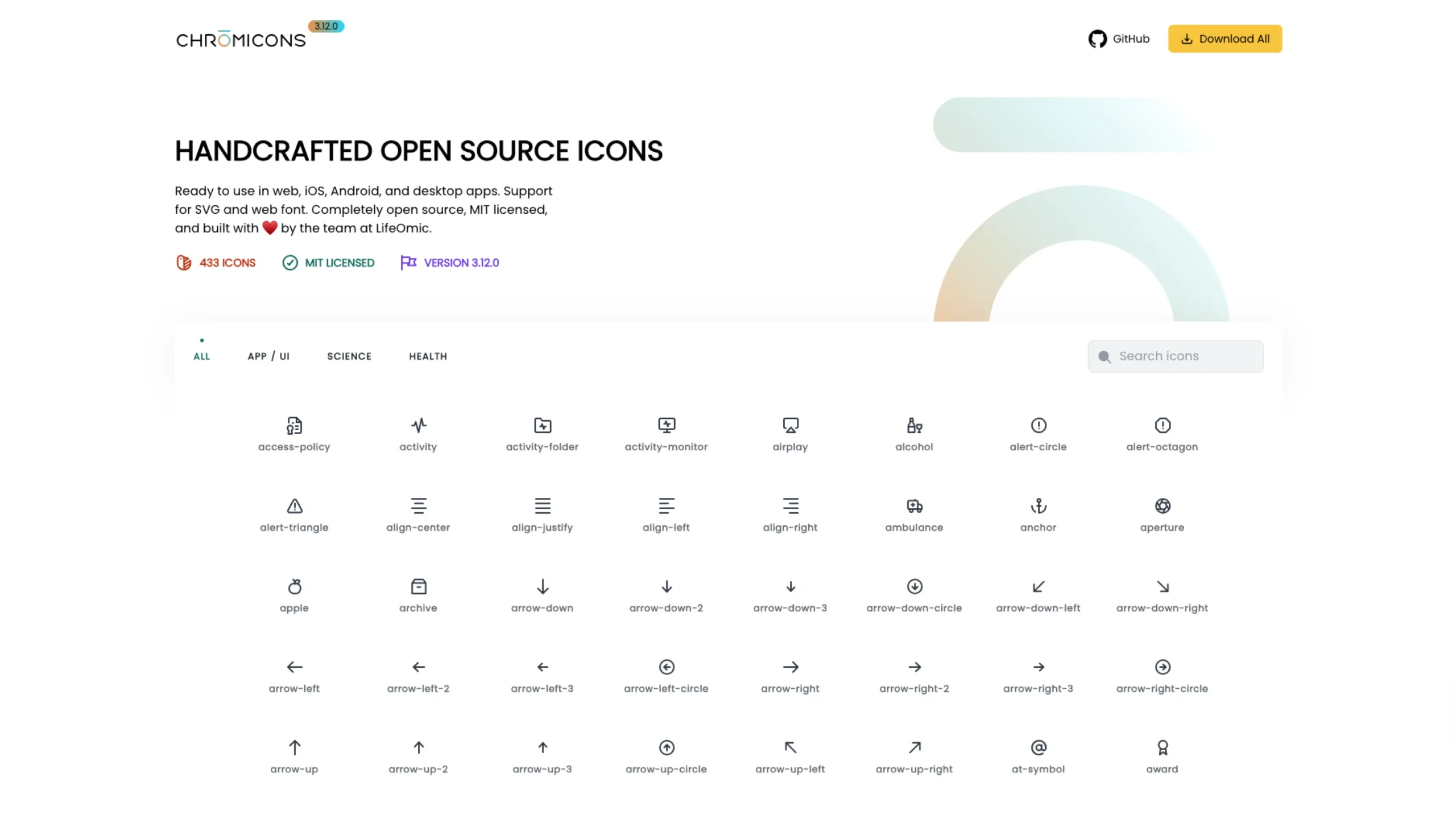
Chromicons is a handcrafted open-source icon set built by the team at LifeOmic, designed primarily for product teams working in health, science, and everyday app interfaces.
And the best part? It’s completely free, MIT-licensed, and ready to drop into almost any tech stack you’re using today.
In this article, I’ll walk through what makes Chromicons special, how it’s structured, and why it’s such a valuable resource for designers and developers.
What is Chromicons?
Chromicons is a collection of 450+ open-source SVG icons (and a web font) created with real product work in mind—not just pretty shots for Dribbble.
They’ve designed it so you can use the icons:
- In web apps (React, Vue, vanilla HTML/CSS/JS, etc.)
- In iOS and Android apps
- In desktop apps
- As SVGs or as a web font, depending on your preference and setup
Because it’s MIT-licensed, you’re free to use Chromicons in commercial projects, internal tools, client work, and side projects without worrying about restrictive licensing.
That alone makes it a great candidate for design systems and long-term product work.
Three prominent icon families: App / UI, Science, Health
Chromicons is especially handy if you’re in healthcare, life sciences, or data-heavy product design. The library is grouped into three primary categories, which you can quickly filter on the site:
1. App / UI
This is the “core toolkit” you’d expect from any modern icon set:
- Navigation (home, menu, back, arrows, chevrons)
- Status and feedback (alerts, checkmarks, info, error, success)
- Files and content (folders, documents, upload/download, edit)
- Media and interaction (play, pause, volume, share, search, etc.)
If you’re building dashboards, admin panels, SaaS products, or marketing sites, this category alone gives you enough to cover most of your interface needs.
2. Science
This is where Chromicons really starts to stand out.
You’ll find icons for:
- Lab tools (beakers, test tubes, microscopes, helix forms, molecules)
- Data and analysis (heatmaps, scatter plots, oncoprints, survival curves)
- Scientific concepts and visualizations related to research and bioinformatics
If you’ve ever tried to build a science-focused UI and ended up hacking together random icons from different sets, you’ll appreciate how cohesive and purposeful this collection feels.
3. Health
The Health category is clearly informed by real healthcare product work:
- Medical devices and symbols (stethoscope, hospital sign, wheelchair)
- Medication and treatment (pills, capsules, IVs, medical briefcase)
- Body and organs (liver, kidney, thyroid, virus, bone joints)
For healthcare SaaS, patient portals, EHRs, or wellness apps, this kind of domain-specific set saves a lot of time.
You get icons that actually mean something to clinicians, patients, and researchers—and they all match stylistically.
Designed to feel consistent and calm
A lot of icon sets fall into one of two traps:
Either they look overly decorative (nice for posters, not for apps),
Or they’re so generic they feel soulless.
Chromicons finds a nice middle ground:
- Clean line work that feels modern and neutral
- Balanced proportions that work well at both small and mid sizes
- Consistent visual rhythm so app, science, and health icons think like one family
Scroll through the gallery, and you’ll notice there’s no weird “one-off” style that breaks the system. They’ve clearly treated this as a coherent design system, not just a random pile of icons. LifeOmic
That consistency is precisely what you want when you’re building serious products—especially in health and science, where clarity and trust really matter.
Easy browsing, search, and filtering
On the Chromicons site, you can:
- Filter by category: All, App / UI, Science, Health
- Search by name: e.g., “stethoscope”, “virus”, “heart”, “chart.”
- Preview icons directly in the browser before downloading them
This makes it super easy to:
- Explore the set and see what’s available
- Build an internal icon shortlist for your design system
- Quickly look up a specific concept while you’re designing a screen
It feels more like a practical workbench than a static gallery, which I like.
SVGs, web fonts, and flexible workflows
Chromicons supports multiple implementation styles, so you can plug it into your stack however you prefer:
- SVGs
- Ideal for modern front-end builds
- Easy to style with CSS (stroke, fill, hover states)
- Great for React components or inline SVG workflows
- Web font
- Useful if your current setup or CMS works best with icon fonts
- Simple to plug into legacy systems or static sites
The GitHub repo (linked right from the site) gives you everything you need: the icon files, package structure, and documentation on how to use them in your projects.
Perfect for product teams in health & science
Chromicons comes from LifeOmic—a company that actually operates in the health and life sciences space. This shows up clearly in the icon vocabulary:
- You’ll see things like oncoprint, survival curve, precision wellness, medical briefcase, cancer, and more directly relevant concepts baked into the set.
That means:
- If you’re working on clinical tools, research dashboards, ** patient portals**, or health analytics, you don’t have to invent metaphors or hack generic icons to fit medical concepts.
- You can design faster while still being semantically correct and visually consistent.
For design teams who care about domain accuracy and UI polish, that’s a huge win.
Open source, MIT-licensed, and built with care
Chromicons is:
- MIT-licensed – very permissive and safe for commercial use
- Open source – you can inspect the files, tweak them, or fork the repo
- Actively maintained – versioned (e.g., 3.12.0) and kept up to date
It’s also clearly a collaborative effort: the site credits designers and developers by name, which I always see as a good sign.
It tells you this isn’t a random asset dump; it’s a project a real team cares about.
When to choose Chromicons
I’d reach for Chromicons when:
- You’re building healthtech, medtech, or biotech products
- You need science-savvy icons for data dashboards, lab tools, or experiments
- You want a cohesive UI icon set that covers navigation, content, and status
- You prefer open-source, MIT-licensed assets you can safely scale with
- You like working with SVGs and modern front-end workflows
In other words: if your product sits anywhere near health, science, data, or serious web apps, Chromicons belongs in your shortlist of go-to icon libraries.
Final thoughts
Chromicons doesn’t scream for attention, and that’s precisely why it’s good.
It’s thoughtful, focused, and clearly informed by real product problems—especially in health and science.
Suppose you’re building products in those spaces and want icons that feel trustworthy, consistent, and easy to implement.
In that case, I’d definitely recommend exploring Chromicons and incorporating it into your design system foundation.