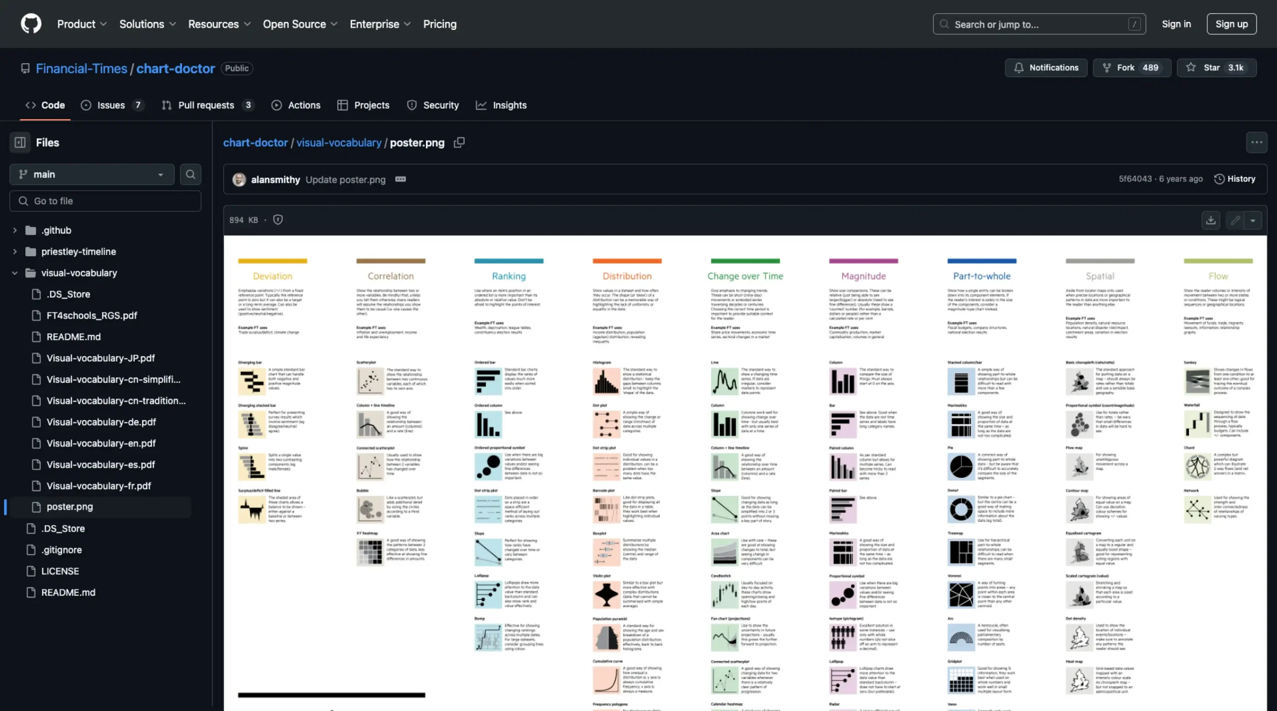
The Financial Times’ Visual Vocabulary poster, available on GitHub, serves as a valuable guide for choosing the most suitable chart or data visualization style for different storytelling needs. Organized as a reference tool, the poster categorizes visualizations by purpose—such as comparison, distribution, correlation, trends over time, and part-to-whole relationships—helping users quickly identify the best option for their data.
The resource features over 40 chart types, from straightforward bar charts to complex scatter plots and heatmaps, along with clear explanations of their ideal use cases.