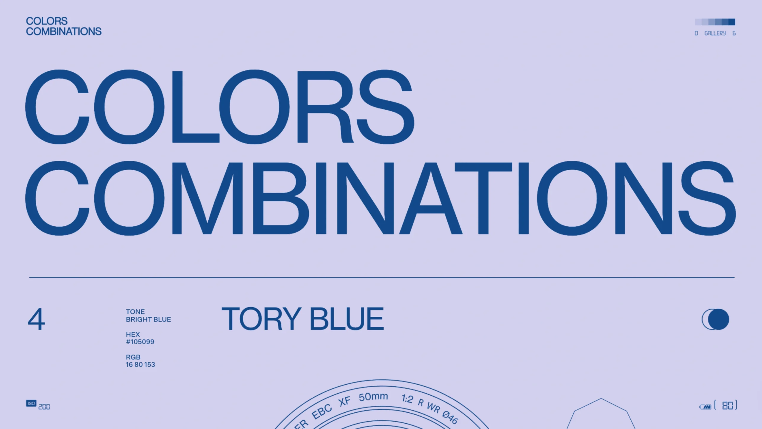
Part of a creative exploration by OBYS agency, this page showcases elegant color pairings based on Tory Blue.
It’s an experimental tool and visual playground for designers seeking refined, modern palette inspiration with real-world UI mockups.
🎨 The Color Story (a.k.a. Why Your Eyes Are Playing Tricks on You)
Ever wondered why that “blue” dress sometimes looks kinda purple under bad lighting?
Well, color isn’t just about what’s on the object — it’s a full-blown relationship drama between physics, light, and your brain.
Here’s the deal:
The color you see depends on how light hits an object, how that surface reflects (or sometimes emits) light, and how your eyeballs and brain decide to interpret the chaos.
Yep, your perception is basically doing post-production editing in real time.
Some objects reflect light, some let it pass through, and others just go full diva mode and glow on their own.
All of that adds up to the final “color” you think you’re seeing.
🧠 The Major Objective
Simple: understand how color really works — so you can stop arguing with your monitor about why your “perfect pastel” looks radioactive on another screen.
🌈 Example Color
Tone: Light Grayish Cyan
HEX: #93A5A1
RGB: 147, 165, 161
💡 Final Thought
Colors are a designer’s secret language. But finding that magical combo that feels just right? That’s the real art.
Inspiration can strike anywhere — a sunset, a coffee mug, or even your messy desktop wallpaper. Keep your eyes open, because color is always flirting with you.