


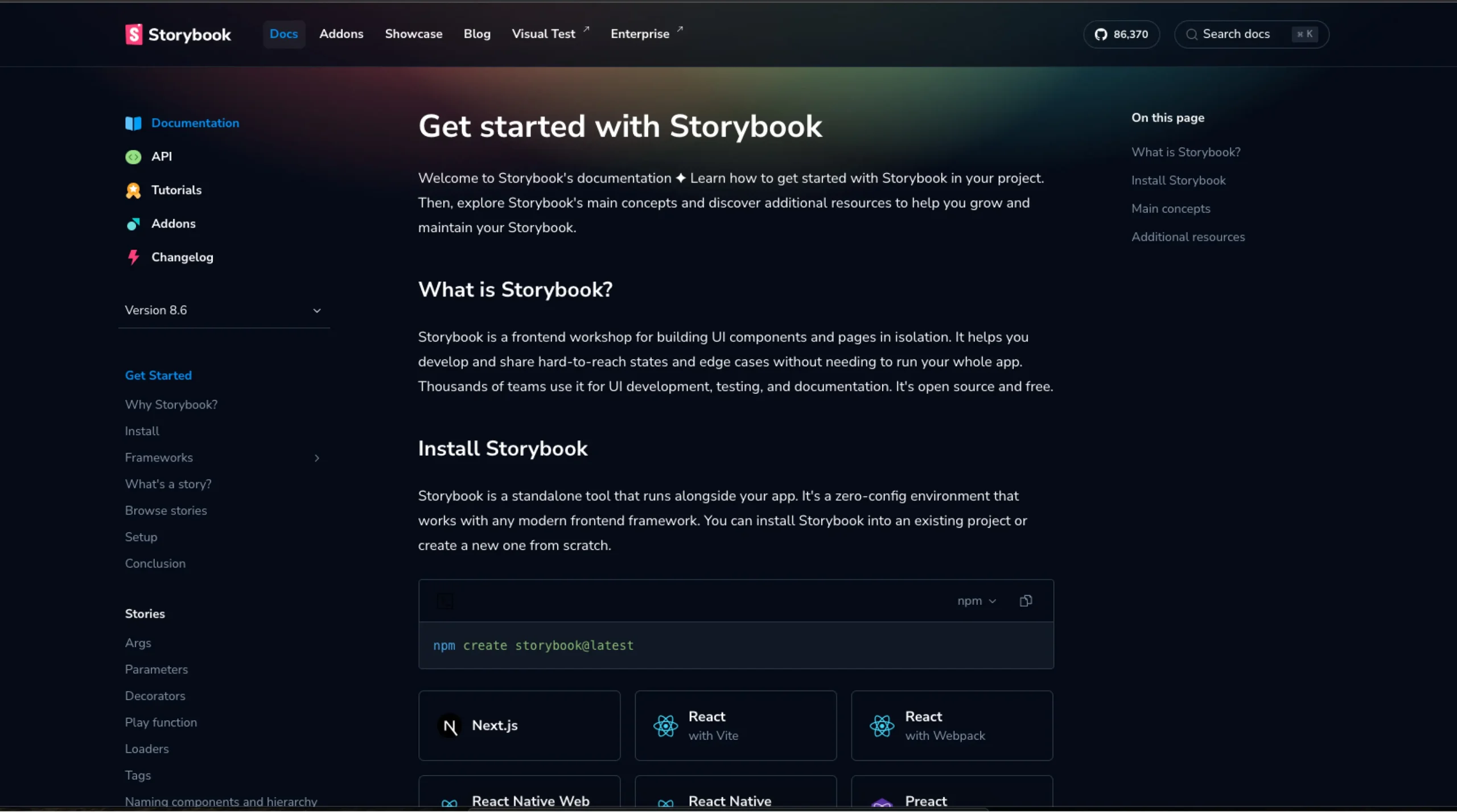
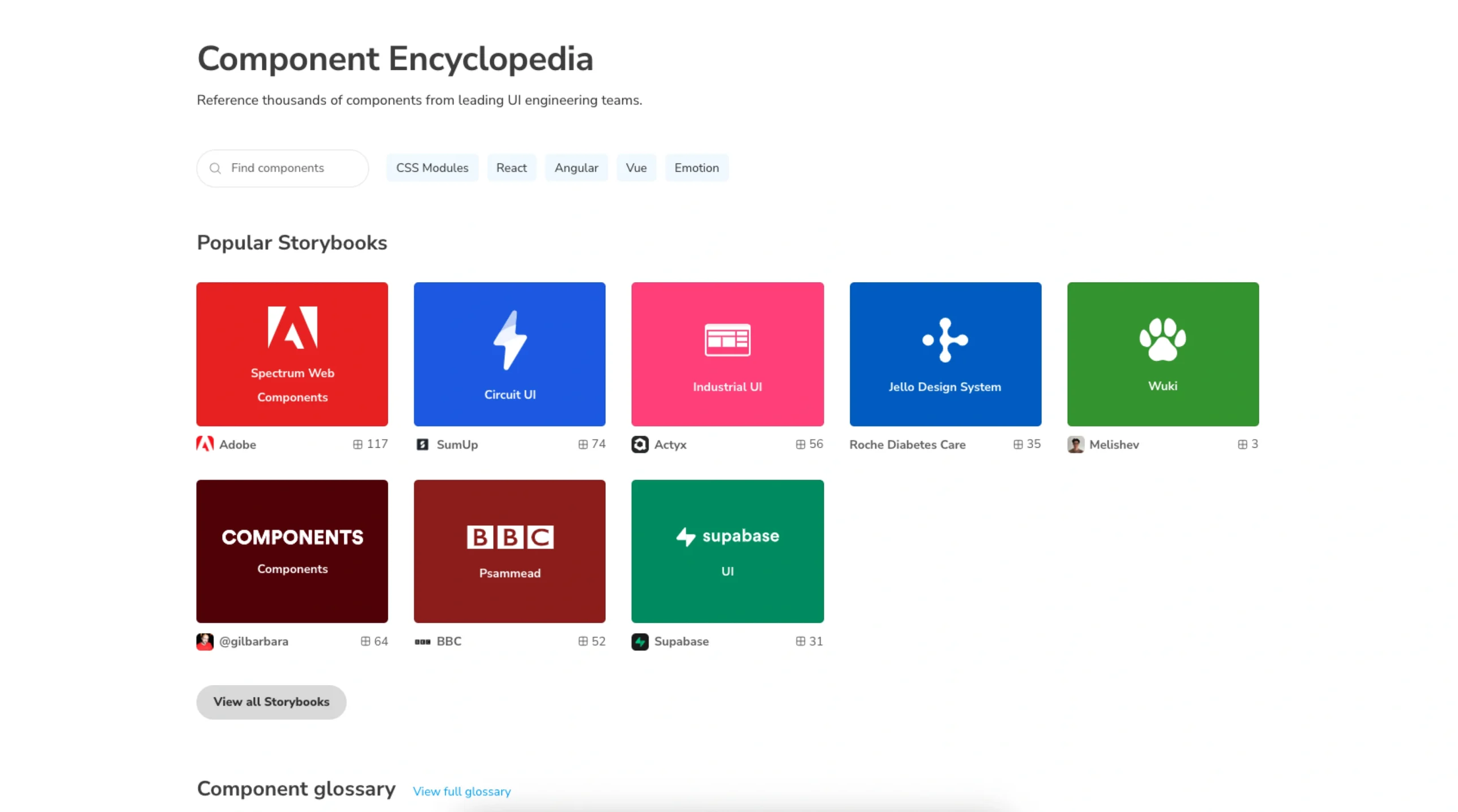
Storybook is an open-source tool for developing UI components in isolation. It’s widely used in modern front-end workflows to build, test, and document components independently from the main app. The Storybook Docs section provides in-depth guides and best practices on setting up and using Storybook for design systems, component libraries, and collaborative UI development.
It’s especially valuable for teams using React, Vue, Angular, and other frameworks to create consistent and reusable UI components.