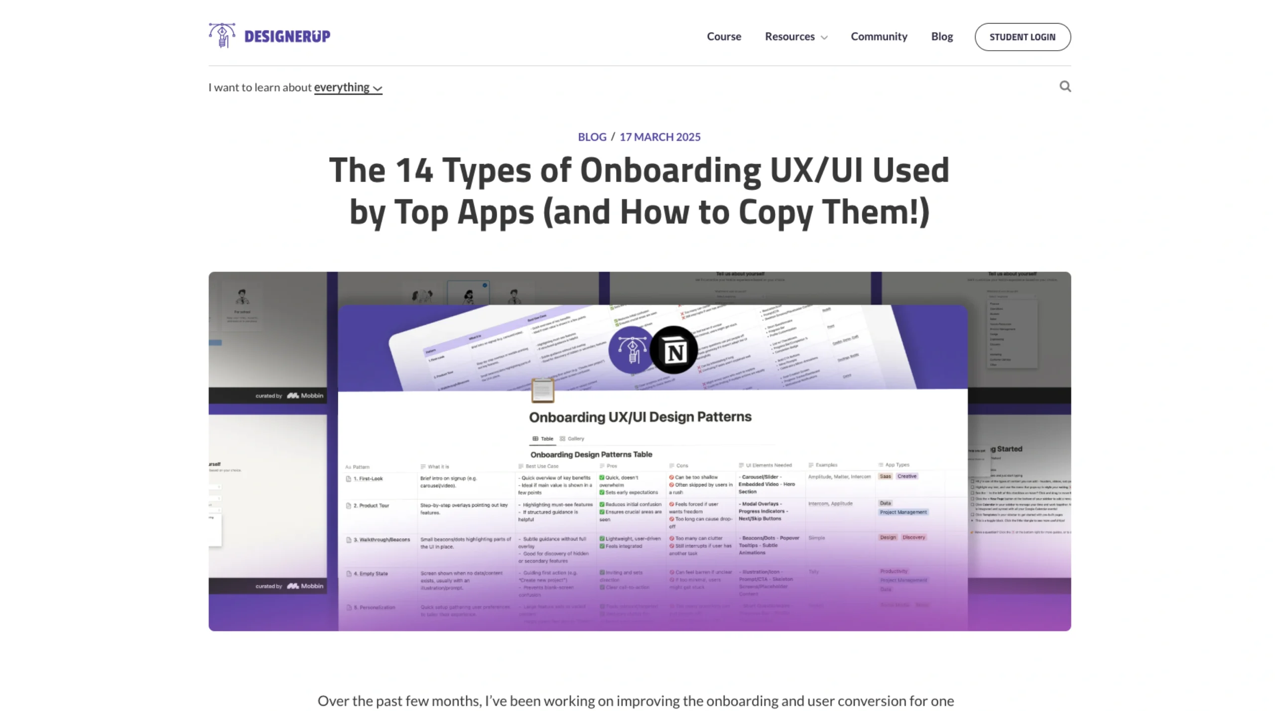
DesignerUp put together a convenient post called “The 14 Types of Onboarding UX/UI Used by Top Apps (and How to Copy Them!).”
It’s a deep dive into the different ways popular apps welcome new users.
The article lays everything out in a Notion table, neatly categorizing 14 onboarding styles.
You’ll see familiar patterns like First-Look screens, Product Tours, Walkthroughs, Empty States, and even Personalization.
For each one, they break down what it is, the pros and cons, the typical UI elements involved (like sliders, modals, or beacons), and which real-world apps use them.
The whole idea is to give designers and product teams a precise reference point to determine the most effective onboarding flow for their product.
Many of the patterns come from Mobbin’s research, and the post highlights how different types of apps—SaaS, productivity tools, or even creative platforms—customize onboarding to guide users effectively.
It doesn’t include interactive visuals or code snippets, but it’s a solid hub if you’re looking for inspiration grounded in actual user behavior. Interestingly, the post doesn’t mention a specific author—it just stands on its own as a resource.