MindMarket is a global qualitative research agency that helps brands understand real people in fundamental markets through culturally fluent research.
From multi-country UX and customer insight studies to behavioural analysis and recruitment, they handle everything through a single project lead.
So teams get deep, local insights with global consistency and far less operational chaos.
A Human-First Website That Actually Feels Human: A Design Review of MindMarket
In a world where most agency websites look like polished pitch decks, MindMarket takes a very different route.
Their website doesn’t try to impress you with buzzwords, overused stock photos, or dense case-study jargon. Instead, it does something far more effective: it feels human.
I think that’s what struck me first. From the very first scroll, MindMarket’s website makes its positioning clear—this is a brand built around real people, real behavior, and real insights.
The design supports that message at every level, though perhaps not in the ways you’d expect.
First Impressions: Warm, Open, and Inviting
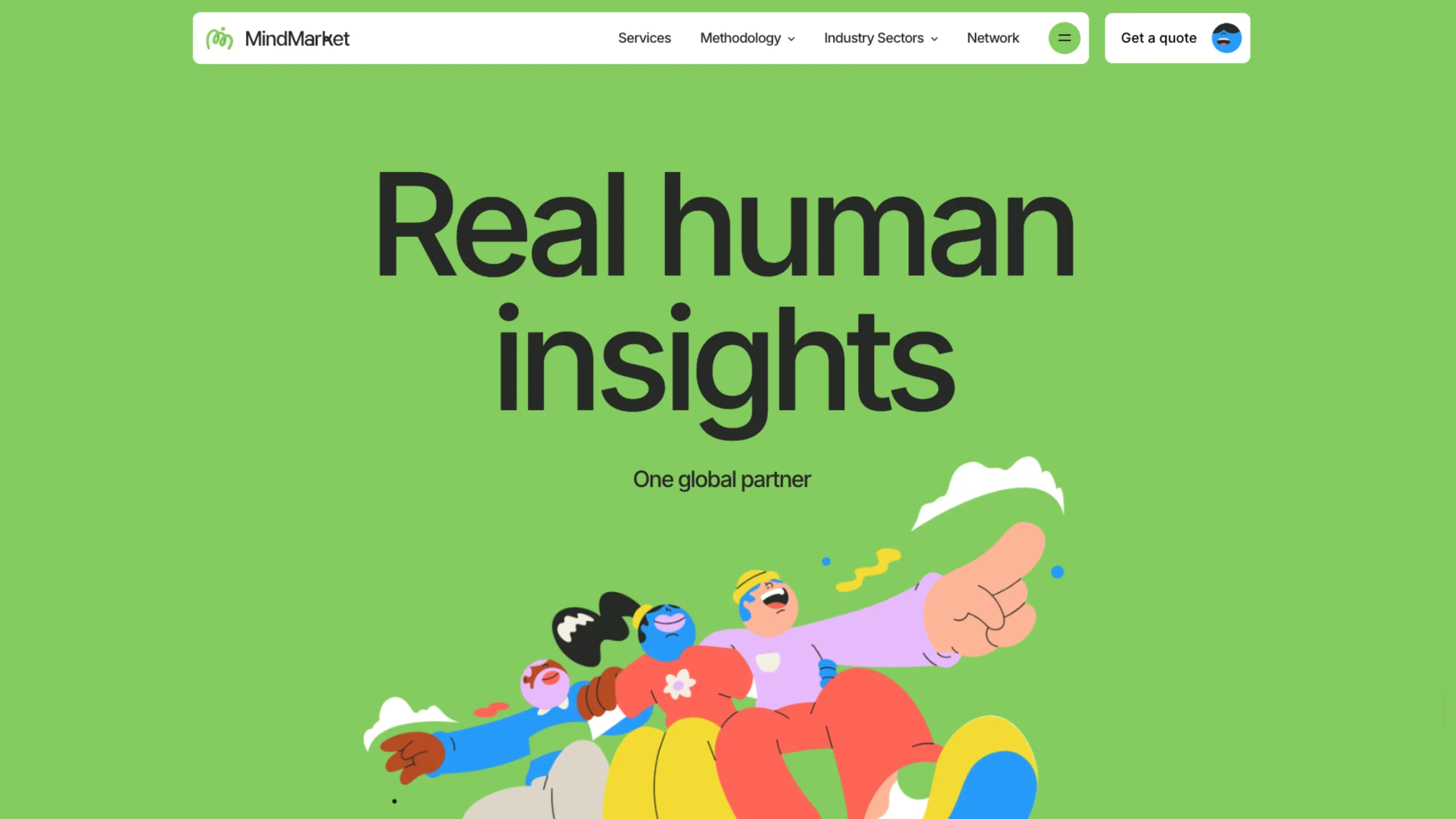
The homepage opens with bold green blocks, expressive illustrations, and generous spacing.
There’s no immediate pressure to “convert,” no aggressive CTA demanding your attention. Instead, the site invites you in gently. It’s refreshing, honestly.
The phrase “Real human insights” isn’t just a headline here—it’s a promise reinforced visually.
The layout feels calm and confident, giving the impression that this is a team that understands people deeply and doesn’t need to shout about it. Maybe that’s the whole point.
Illustration-Led Storytelling (Done Right)
Illustrations dominate the experience—but they’re not decorative filler. They’re loose and organic. Slightly imperfect. Full of movement and emotion.
This design choice feels intentional. The characters are diverse, dynamic, and relatable.
Nothing is overly polished or robotic, which aligns perfectly with MindMarket’s qualitative, human-centered research focus. Instead of abstract charts or stiff corporate visuals, the illustrations communicate emotion, behavior, and nuance—exactly what good research is about.
Or at least, that’s what they’re trying to do, and I think they succeed.
Color System: Optimism Over Authority
Green is the hero color, but not in a cold, corporate way. It’s fresh, energetic, and optimistic. Paired with warm neutrals and playful accent colors, the palette creates a sense of trust without formality.
This color approach subtly shifts the power dynamic. The brand doesn’t feel intimidating.
The research doesn’t feel inaccessible. The agency feels collaborative, not hierarchical.
It’s a great example of how color psychology can be used to lower barriers and invite conversation—though I suppose you could argue they’re playing it a bit safe by making green the “friendly” choice.
Layout & Flow: Designed Like a Narrative
One of the strongest aspects of the site is its flow. Rather than rigid sections stacked mechanically, the layout feels like a continuous story—precise vertical rhythm.
Plenty of white space (or neutral space, really). Content that unfolds naturally as you scroll.
Each section feels intentional and unhurried. You’re never overwhelmed with information, yet you always feel guided.
This pacing mirrors a good interview or research session—thoughtful, structured, but flexible. It made me think about how rare that balance actually is.
Copy Meets Design: Calm Confidence
The copy is concise, clear, and refreshingly jargon-free. It doesn’t try to sound “smart” for the sake of it. Instead, it sounds confident in its clarity, which is more complicated than it looks.
Design and copy work together here. Visuals carry emotion. Text delivers meaning. Neither competes for attention.
This balance is hard to achieve, and MindMarket executes it with restraint and maturity.
Though I wonder if some people might find it almost too restrained—depends on what you’re looking for, I suppose.
Showing Numbers Without Losing the Human Touch
When metrics and numbers appear, they’re handled carefully. They’re visually light, playfully styled, and easy to scan. Instead of dominating the page, the data supports the story. It reassures without overwhelming.
This approach reinforces credibility while maintaining the brand’s warm, people-first tone. I appreciate that they didn’t feel the need to make the numbers the hero—plenty of agencies would have.
Photography: Grounding the Brand in Reality
Midway through the experience, real photography enters the layout. This shift is subtle but powerful.
After immersing you in illustrated emotion, the photos remind you that these insights come from real people.
The impact is tangible. The work exists beyond the screen. It’s a smart transition that balances imagination with authenticity, even if it takes a moment to notice what’s happening.
The Overall Vibe: Thoughtful, Expressive, and Trustworthy
MindMarket’s website doesn’t try to be flashy. It tries to be felt.
The overall vibe can be summed up as: human-first, expressive but not ornamental, insight-led rather than ego-driven, collaborative rather than salesy.
It’s a strong example of how agency websites can move beyond templates and instead reflect absolute values through design. At least, that’s the impression I walked away with.
Final Thoughts
MindMarket’s website is a reminder that good UX isn’t always about efficiency or minimalism—sometimes it’s about empathy.
By embracing illustration, thoughtful pacing, and emotional clarity, the site communicates its purpose without overexplaining it.
For designers, agencies, and brands working in research, strategy, or human-centered fields, this website is worth studying.
It proves that when design aligns with intent, the result isn’t just beautiful—it’s believable. Though perhaps that sounds overly optimistic. Either way, it’s worth a look.