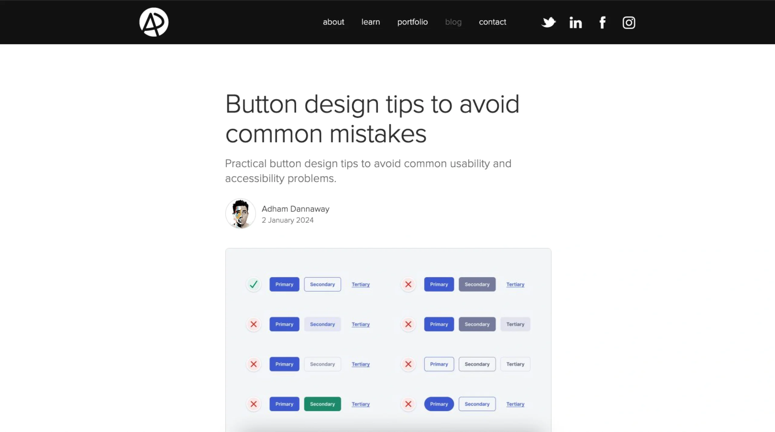
This article by Adham Dannaway offers practical guidance on designing effective and accessible buttons in user interfaces. It addresses common pitfalls such as poor contrast, ambiguous labels, and inadequate sizing, providing actionable tips to enhance usability. The piece emphasizes the importance of visual hierarchy, consistent styling, and clear affordances to ensure buttons are intuitive and user-friendly. By following these recommendations, designers can create buttons that not only look good but also improve the overall user experience.
Button Design Tips to Avoid Common Mistakes
I put together some quick and practical button design tips to avoid these problems and design better buttons.