Kettmeir is a historic winery in Caldaro, South Tyrol (Alto Adige), founded in 1919 and known for elegant mountain wines and Metodo Classico sparkling wines.
Working with dozens of local winegrowers across different altitudes and terroirs, they craft refined Pinot Bianco, Pinot Grigio, Chardonnay, Pinot Nero, and a celebrated line of traditional-method sparkling wines, paired with cellar visits, tastings, and vineyard experiences.
Website Review: Kettmeir
The Kettmeir website feels less like a traditional winery website and more like a carefully curated editorial experience. From the first screen, it’s clear that the brand isn’t rushing to sell—it’s inviting you to understand its philosophy.
First Impression & Brand Positioning
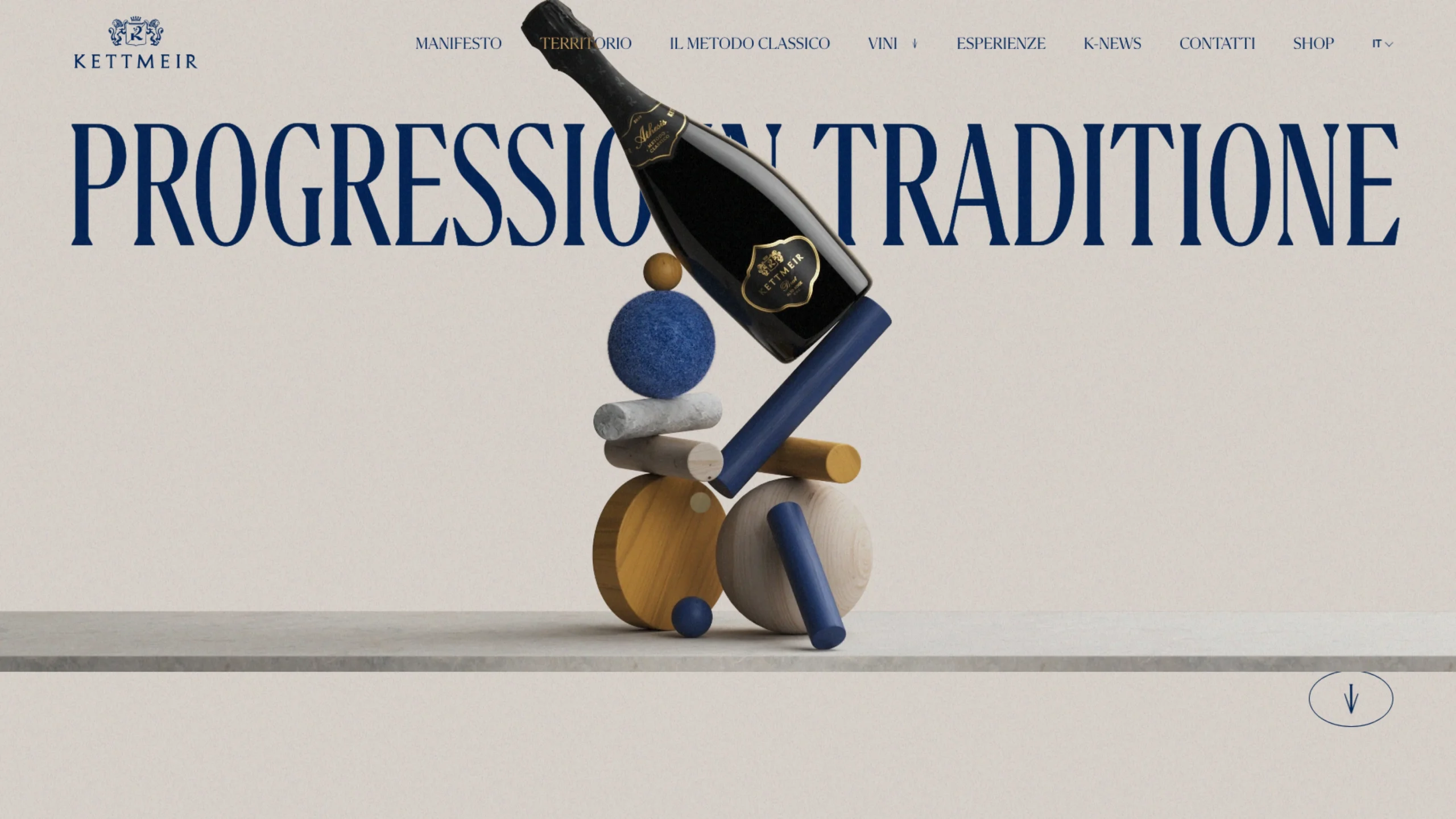
The opening headline, “Progress in Tradition,” sets the tone instantly. It communicates a confident balance between heritage and modernity—an important message for a winery founded in 1919. The hero visual reinforces this idea beautifully: a wine bottle balanced atop abstract wooden forms. It’s symbolic, refined, and quietly bold. There’s no excess, no clutter—just intention.
Visual Language & Aesthetic
Visually, the site leans into a gallery-like minimalism:
- A restrained color palette dominated by soft neutrals and deep blue typography
- Generous white space that allows content to breathe
- Editorial serif typography that feels premium, timeless, and European
The small embedded imagery within text blocks (wine, food, landscapes) is a standout choice. Instead of large, obvious image sections, these subtle inserts feel almost like footnotes—rewarding attentive users and reinforcing craftsmanship over spectacle.
Typography & Content Hierarchy
Typography is doing heavy lifting here—and it does it well. Large, poetic headlines contrast with quieter navigation elements, creating a strong reading rhythm. The copy avoids marketing noise and leans into storytelling:
“With our wines let’s tell you all about it which makes it exceptional…”
This isn’t conversion-driven language—it’s relationship-building language. The site assumes a thoughtful audience and respects their pace.
Navigation & Structure
The top navigation is clean and restrained: Manifest, Territory, The Classic Method, Wines, Experiences. These labels feel deliberate and conceptual rather than transactional. It subtly encourages exploration instead of funneling users straight to “Shop,” which supports the brand’s premium positioning.
UX & Interaction Design
From a UX standpoint:
- The site favors scroll-based discovery over clicks
- Animations and transitions (where present) are subtle and non-distracting
- There’s a calm, almost meditative flow to moving through pages
This won’t appeal to users looking for speed-shopping—but that’s clearly not the goal. Kettmeir is designing for brand affinity first, conversion second.
Strengths
- Strong alignment between brand history and modern presentation
- Confident use of restraint—nothing feels overdesigned
- Editorial storytelling that elevates the wine beyond a product
- Visual metaphors that communicate values without explanation
Potential Improvements
- Some copy could be tightened slightly for clarity, especially for international audiences.
- First-time visitors looking to understand what to buy quickly may need clearer entry points.
- Accessibility considerations (contrast, text scaling) could be reviewed, given the subtle palette.
Final Take
The Kettmeir website is a lesson in quiet confidence. It doesn’t chase trends or shout for attention. Instead, it trusts its heritage, its product, and its audience. From a UI/UX and brand experience perspective, it’s an excellent example of how restraint, storytelling, and visual symbolism can work together to create a memorable digital presence.
This is not just a winery website—it’s a digital extension of the cellar itself: calm, considered, and deeply rooted in tradition. 🍾