PostHog is one of those sites that instantly tells you who it’s for: product engineers who want real tooling, not fluffy dashboards.
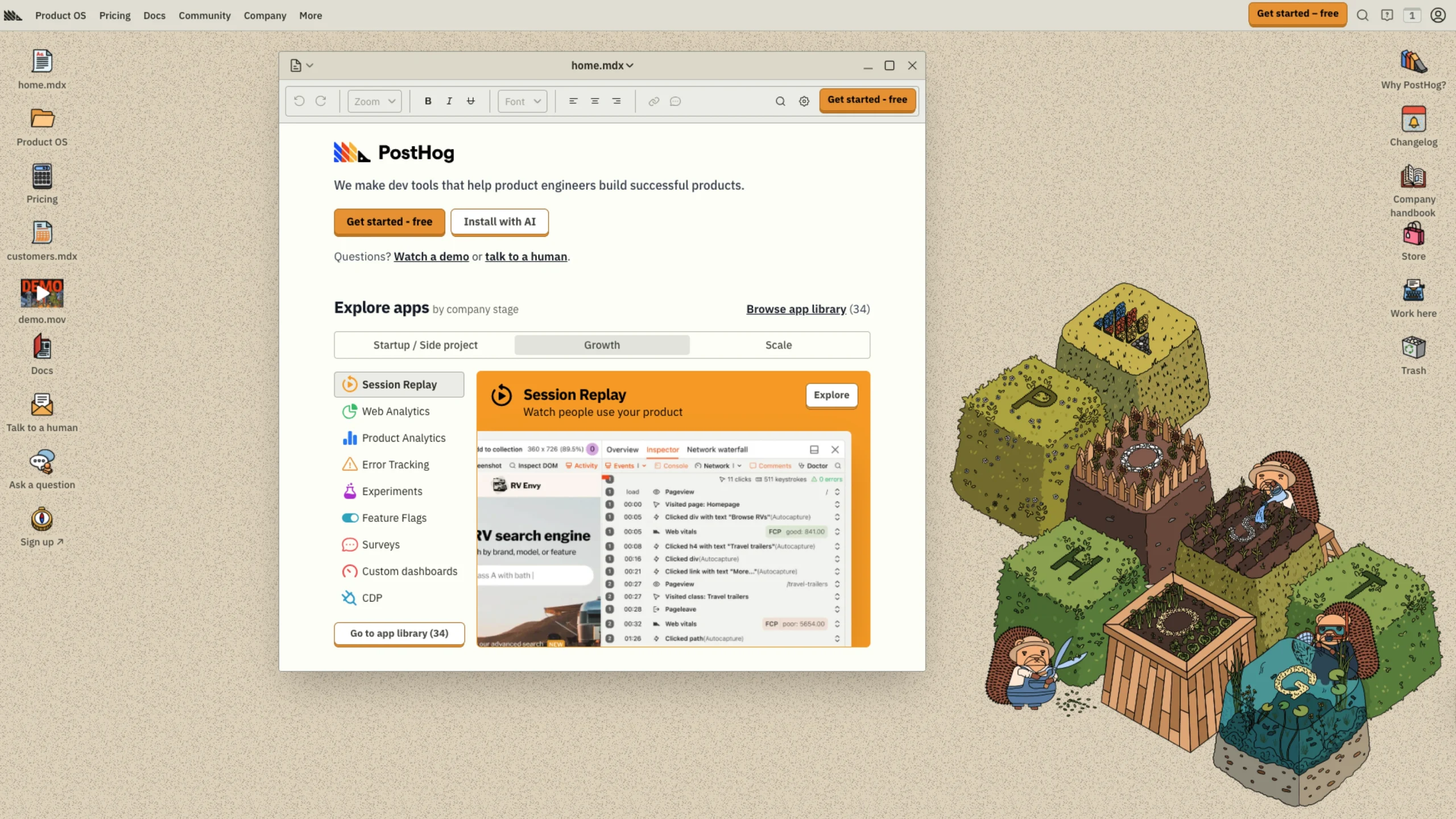
The hero leads with an explicit promise – “We make dev tools that help product engineers build successful products.”
No jargon, no buzzword soup. Right below that, they drop you straight into action with a prominent “Get started – free” CTA and a very developer-native pattern: a npx command you can copy and paste to “Install with AI in 90 seconds.”
It feels more like landing on a developer docs page than a typical SaaS marketing site, which is precisely the point.
Who is PostHog?
PostHog is an open-source, all-in-one developer platform for building successful products.
They bundle product analytics, web analytics, session replay, feature flags, experiments, error tracking, surveys, a data warehouse, data pipelines, and even an AI product assistant into a single stack – so engineers don’t have to duct-tape five different tools together.
Most of it is available with a generous free tier, and teams can run it in the cloud or self-host if they prefer.
A homepage built like a product overview
The homepage is structured like a smart, high-level product tour.
Right after the hero, you get “Explore apps by company stage” – a neat way to organize their tools by where your product is: Startup, Growth, or Scale.
Under that, they lay out core capabilities like Session Replay, Web Analytics, Product Analytics, Error Tracking, Experiments, Feature Flags, Surveys, and Custom Dashboards in a tight, scannable grid.
It feels like browsing an app store, but inside a single platform.
Each section reads like a carefully written slide from a pitch deck:
- “Who’s using PostHog?” adds social proof with a playful line:
“Yes, they actually use us, no, it’s not just some random engineer who tried us out 2+ years ago.” - “Customer data infrastructure, built for product engineers” frames their “Product OS” as more than analytics – it comes with a data warehouse, 120+ sources/destinations, SQL editor, BI, data viz, a user activity feed, plus APIs and webhooks.
The layout uses plenty of white space, clear headings, and short paragraphs, so even dense topics like CDPs and ETL stay readable.
Pricing that matches the brand personality
The Usage-based pricing section is one of the nicest UX moments. Instead of hiding numbers, they literally list examples:
- Product analytics – 1M events free, then per-event pricing
- Session replay – 5,000 recordings free
- Feature flags – 1M requests free
- Data warehouse – 1M rows free
The copy is direct and opinionated:
“You never have to ‘jump on a quick call’ with sales.”
It signals respect for developer time, and the table layout makes it easy to compare what you get from each product at a glance.
Later, the “Shameless CTA” section leans fully into humor – fake scarcity, “Not endorsed by Kim K,” a note that PostHog is a web product and cannot be installed by CD, and a joke about sending a floppy disk as a Rickroll. It’s playful, but it still ends in a clear, standard CTA: “Get started – free.”
Tone, microcopy, and interaction
From a UX writing perspective, PostHog’s tone is a big part of the experience:
- They talk like real humans: “We ship fast,” “Actually-technical support,” “Bedtime reading,” “Shameless CTA.”
- They constantly anchor content in real developer life: installing via terminal, working with frameworks like Next.js, React, Svelte, Astro, and plugging into tools like Stripe or support platforms.
Interactions are functional rather than flashy. You get:
- Obvious primary actions like “Get started – free”, “Browse app library”, “Watch a demo”, or “Talk to a human.”
- Utility-focused controls like “Shuffle companies” in the customer logo section – a slight touch that makes the page feel alive without overwhelming you.
It all supports the core narrative: this is a serious, comprehensive platform, but built by people who don’t take themselves too seriously.
Why is this interesting for UI/UX designers
For designers browsing UIUXshowcase, PostHog is a strong example of:
- Dev-first marketing: The homepage looks and reads like a hybrid of marketing site and documentation, which works perfectly for technical buyers.
- Personality with depth: They blend humor with authentic detail – Product OS, data warehouse, sources/destinations, pricing – so it never feels like style over substance.
- Clear hierarchy on a dense topic: A lot of features are packed into one page, but intelligent grouping and strong headings keep it easy to navigate.
Suppose you’re designing for developer tools, analytics platforms, or complex B2B products.
In that case, PostHog.com is worth studying as a reference for how to make a heavy platform feel approachable, opinionated, and fun—without losing credibility.