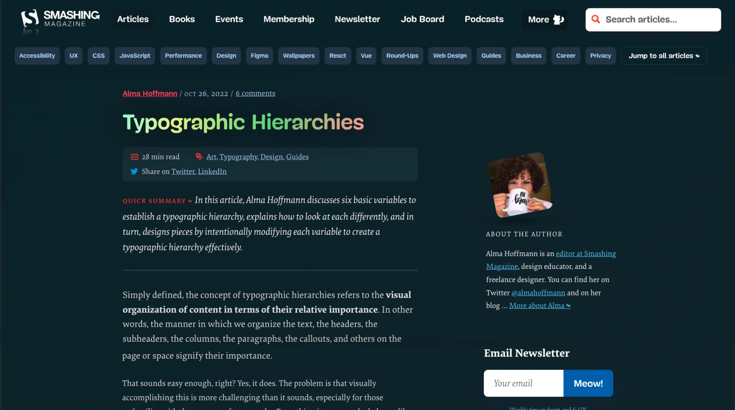
This article, authored by Alma Hoffmann and published on October 26, 2022, delves into the intricacies of typographic hierarchy, a fundamental concept in design that dictates the visual arrangement of content based on its importance. Hoffmann explores six key variables that influence typographic hierarchy:
- Proximity or Space: The spatial relationships between elements, guiding the reader’s eye and establishing connections.
- Weight: The thickness of the typeface, used to emphasize certain elements over others.
- Size: Font size variation to denote importance and create a visual flow.
- Size and Weight: Combining both attributes for a more pronounced emphasis.
- Color: Utilizing color to highlight or differentiate content.
- Visual Punctuation: Incorporating elements like lines or icons to segment and organize content.
Hoffmann emphasizes that effective typographic hierarchy is not merely about applying these variables but understanding their interplay and impact on user experience. She likens the process to a symphony, where each element plays a role in creating a harmonious and communicative design. The article serves as both a theoretical exploration and a practical guide for designers aiming to enhance the clarity and effectiveness of their work.


