I Just Gave Claude 1000’s of Mobbin UI Examples to Design With!
In a recent video, a product designer shared a smart way to connect AI tools with real UI inspiration from Mobbin.
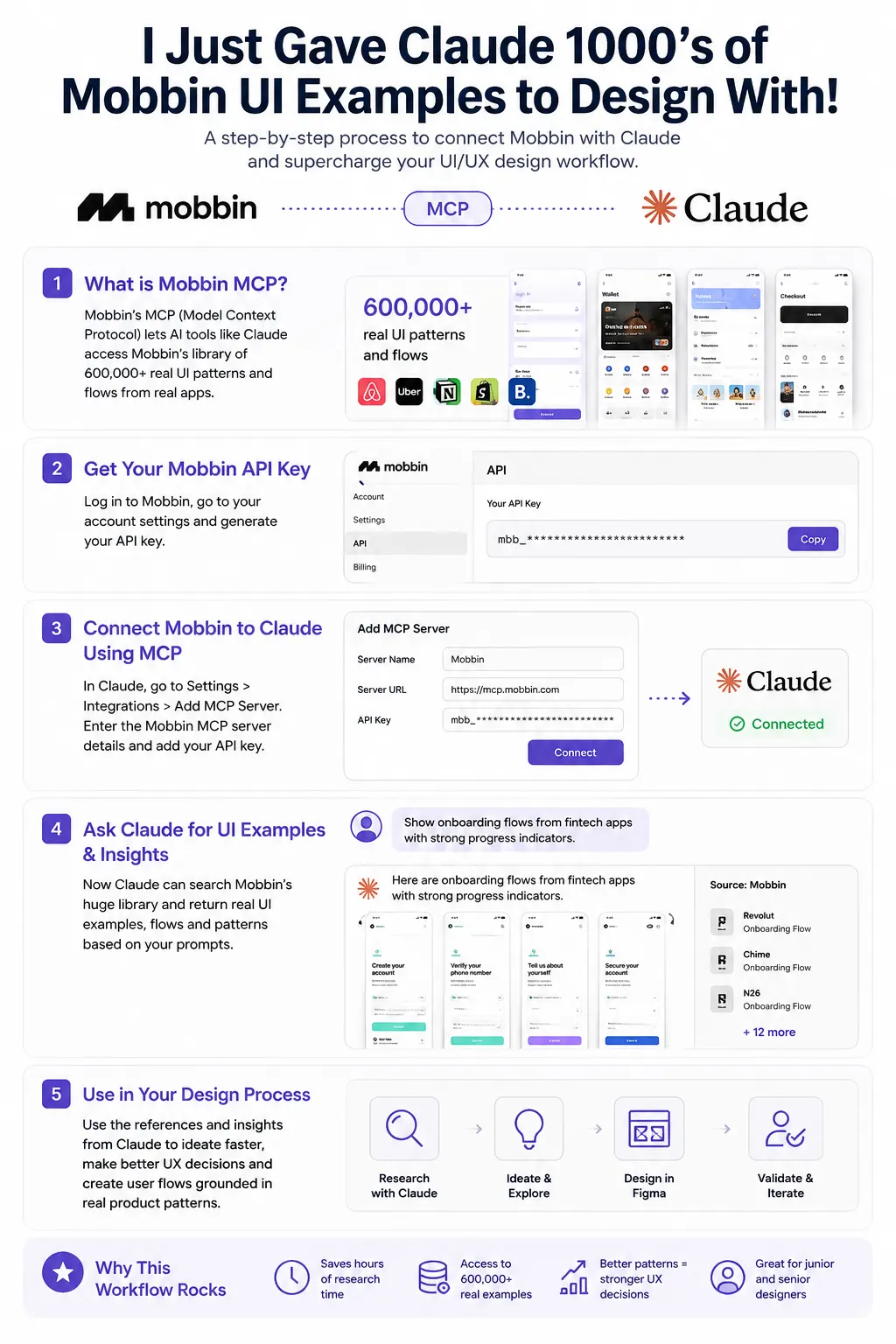
The idea sounds simple at first: give AI access to thousands of polished interface examples from real apps.
Yet the result feels much bigger once you see it in action.
The video, I Just Gave Claude 1000’s of Mobbin UI Examples to Design With!, focuses on Mobbin’s new MCP integration. MCP stands for Model Context Protocol.
This connection lets AI systems like Claude pull references directly from Mobbin’s massive collection of app screens, user flows, and interface patterns.
That changes the way many designers can work with AI.
For a long time, AI-generated UI had one major issue. A lot of outputs looked generic.
The layouts felt disconnected from real products. Buttons appeared in strange places.
User flows lacked consistency. Screens looked clean at first glance, though they often missed practical UX thinking.
Mobbin’s database changes that dynamic.
Instead of generating interfaces from thin air, Claude can now reference patterns from actual mobile apps and SaaS products.
The AI gets access to signup flows, onboarding screens, dashboards, settings pages, payment flows, empty states, search experiences, profile sections, and many other UI structures already used by successful digital products.
That creates a very different type of AI-assisted design process.
The creator of the video explains how this setup helps during research.
Rather than spending hours scrolling through separate apps, screenshots, Dribbble posts, or random inspiration sites, the AI can instantly surface examples connected to a prompt.
Imagine typing:
“Show onboarding flows from fintech apps with strong progress indicators.”
Or:
“Find dashboard layouts used in B2B analytics products.”
The AI can pull references directly from Mobbin’s library and use those examples as context during ideation.
For UX designers, that saves a surprising amount of time.
Research usually eats a large chunk of the design process. Gathering references, comparing patterns, reviewing flows, and studying interaction styles can take hours before wireframes even begin.
With this workflow, many of those steps become much faster.
The interesting part is how the creator uses the system during active design work.
Instead of asking Claude for random UI concepts, they give it context from proven products.
That means the AI starts producing layouts that feel grounded in real app behavior. Navigation placement starts making sense. Card structures feel familiar. Input fields align with patterns users already recognize.
This creates a stronger starting point for product teams.
The video hints at a future where AI acts less like a flashy image generator and more like a research assistant sitting beside the designer.
It can study references, compare structures, summarize patterns, and help shape flows using real product examples instead of vague guesses.
That matters a lot for junior designers.
Many newer designers struggle with pattern recognition. They know Figma tools.
They know visual styling. Yet they still need exposure to hundreds of interfaces before good UX instincts start forming naturally.
Access to AI paired with Mobbin’s library gives newer designers a faster way to study polished product decisions.
Senior designers may benefit in a different way.
Experienced product teams often care about speed, iteration, and consistency. During early concept phases, AI can quickly produce rough directions.
Teams can review options, discuss flows, and refine ideas without starting from a blank canvas every time.
The creator mentions ongoing experiments with this setup, which makes the video feel practical rather than theoretical.
This is not presented as some distant future concept. The workflow already works today.
One detail that stands out is the size of Mobbin’s collection. The transcript mentions over 600,000 real design patterns and flows.
That scale gives AI a massive pool of references to learn from during conversations and prompt-based exploration.
It almost turns Mobbin into a searchable UX memory bank for AI tools.
There is another interesting angle here, too. AI-generated UI has often been criticized for copying visual trends without deeper product thinking.
Access to real user flows could gradually improve that problem. Instead of isolated screens, the AI can study how products connect experiences across multiple steps.
That includes things like:
- onboarding progression
- error handling
- checkout structure
- account settings
- subscription management
- mobile navigation systems
- empty state messaging
Those details shape product usability far more than pretty gradients or trendy typography.
The video itself is short, direct, and practical. There is very little hype.
The creator simply walks through the connection between Mobbin and AI tools, then explains how it fits into daily product design work.
For designers already using AI tools, this feels like a natural next step.
AI becomes much more useful once it gains access to high-quality context.
Without context, outputs stay shallow. With real product references, the responses become far more grounded and usable.
This kind of workflow may slowly shift how UX teams handle research, wireframing, and ideation during the next few years.
Human designers still guide the process, make product decisions, and shape user experiences. AI simply becomes faster and more informed once connected to strong reference systems like Mobbin.