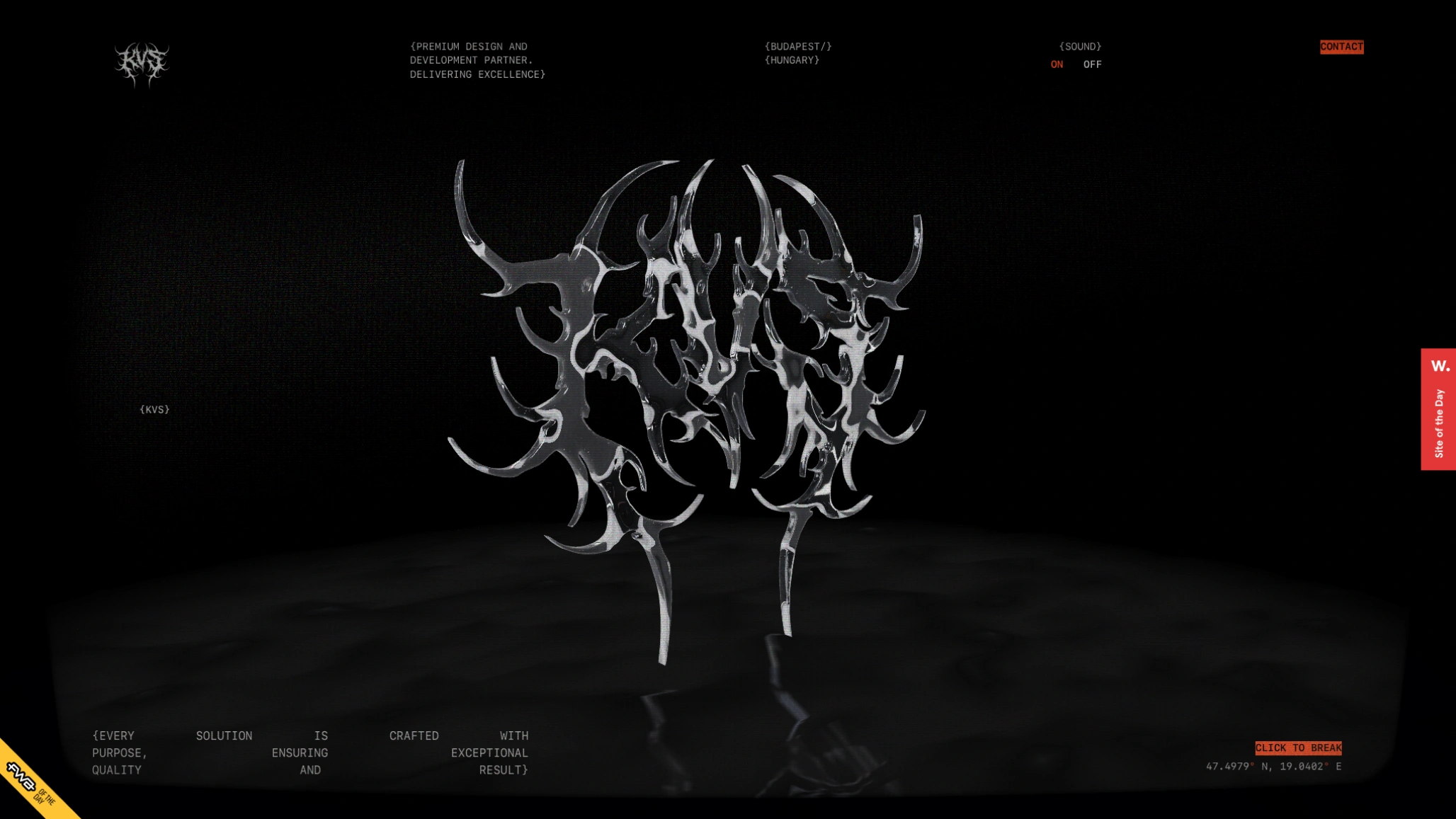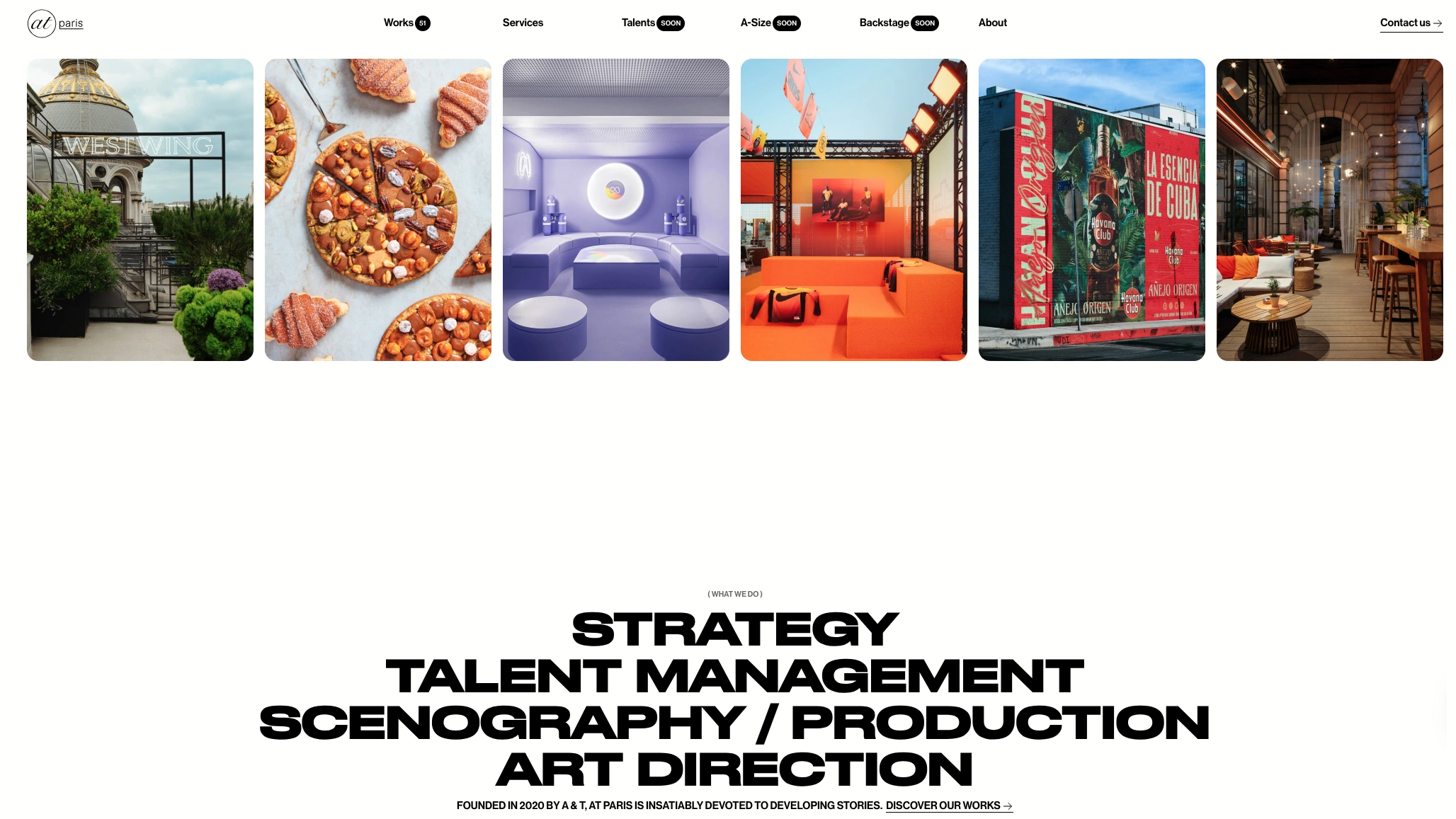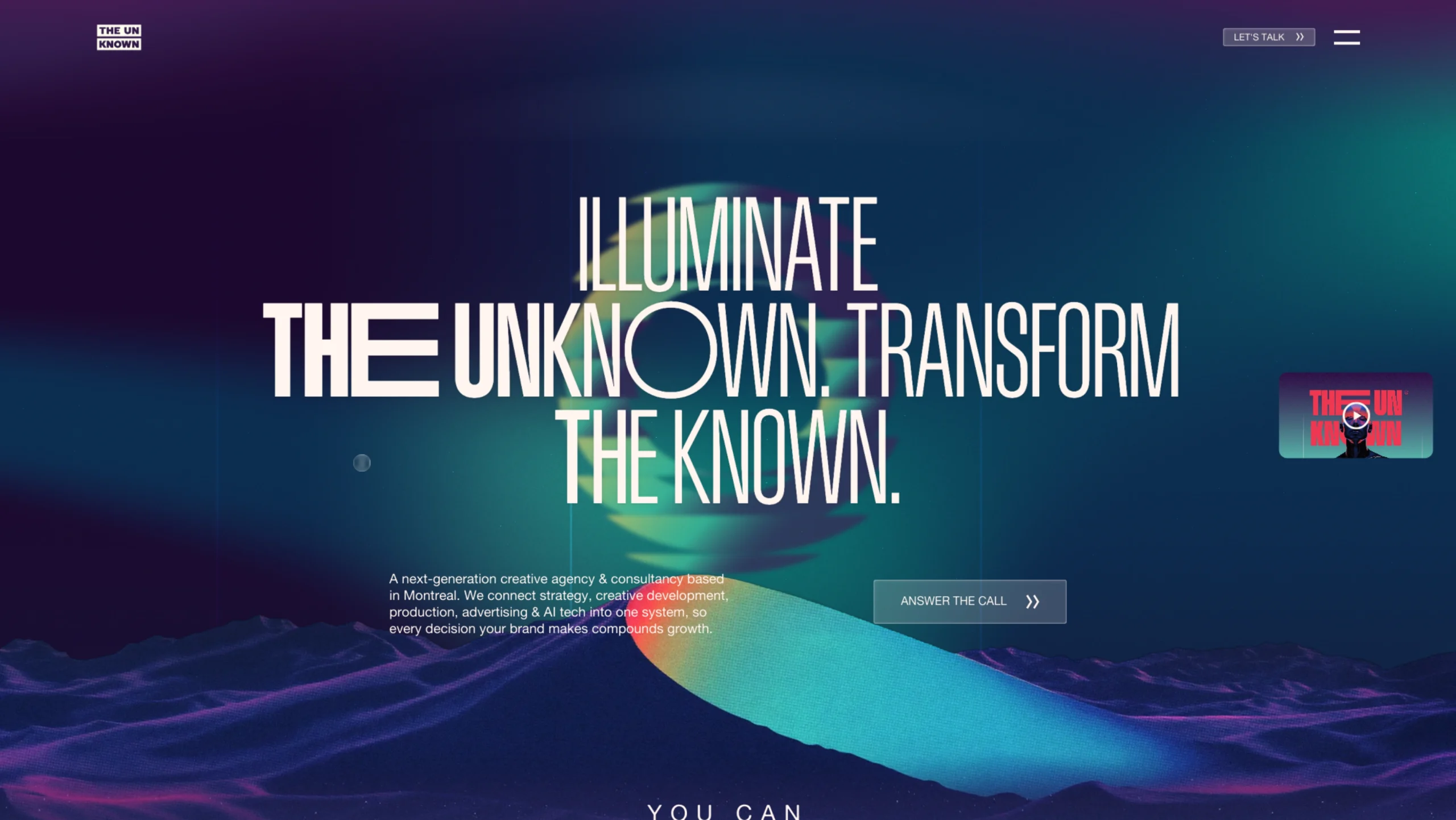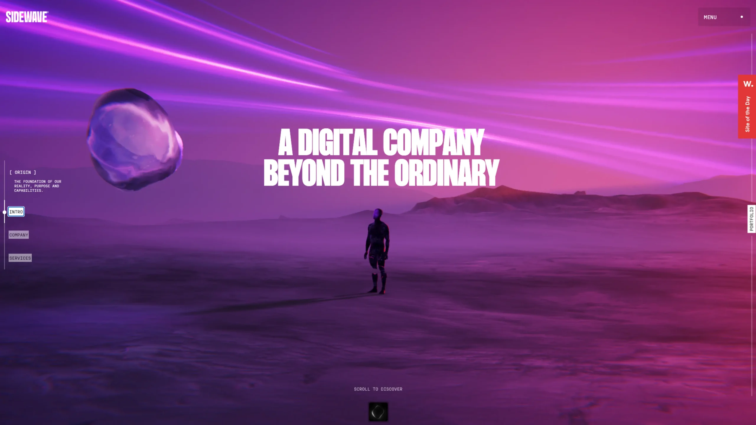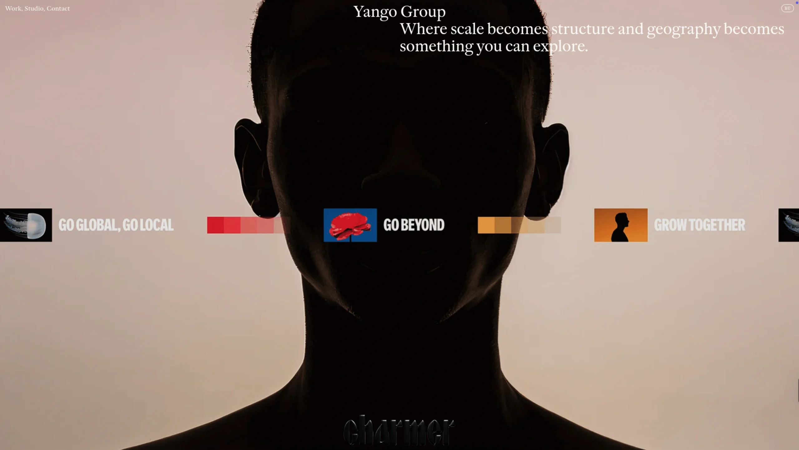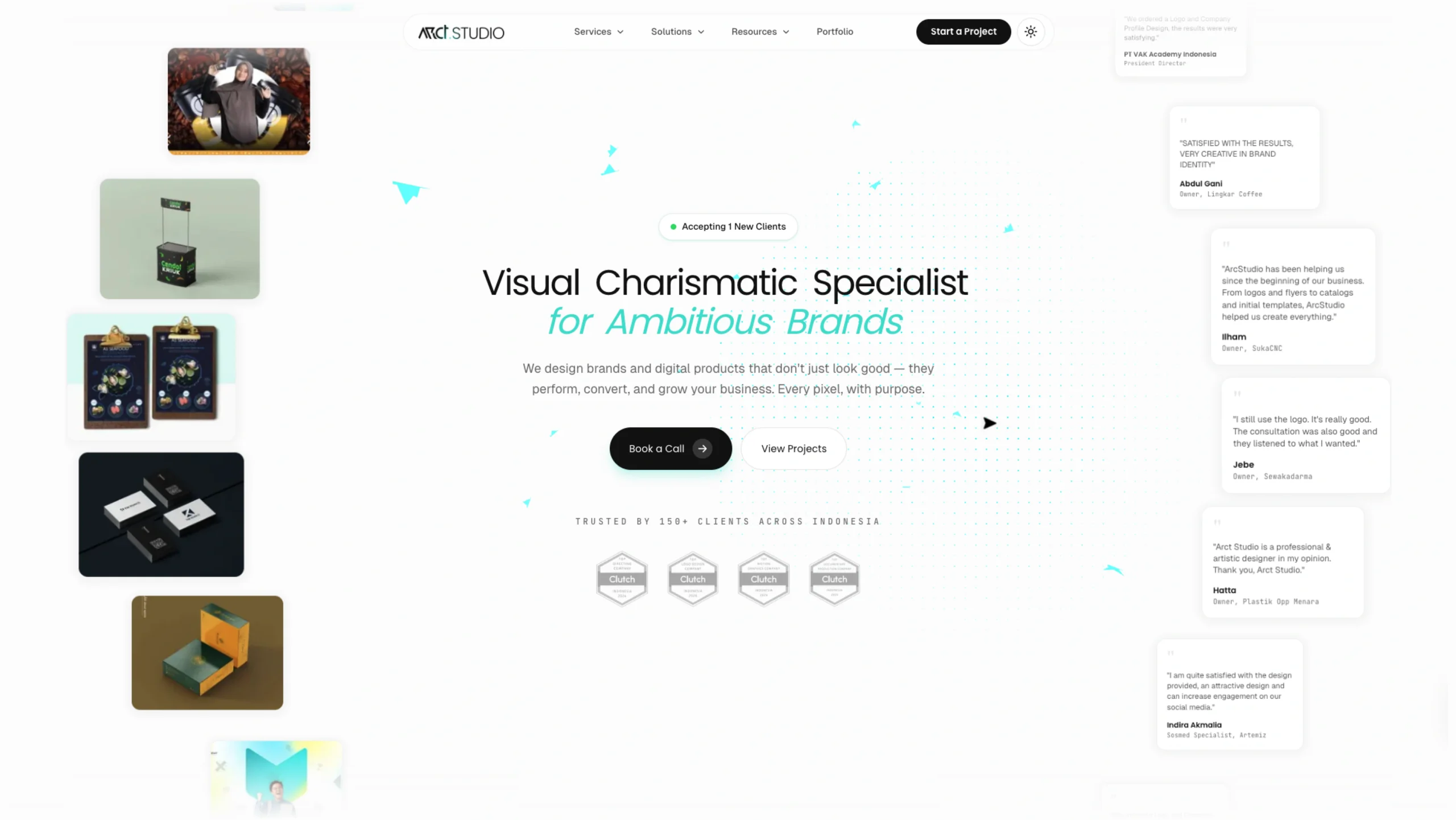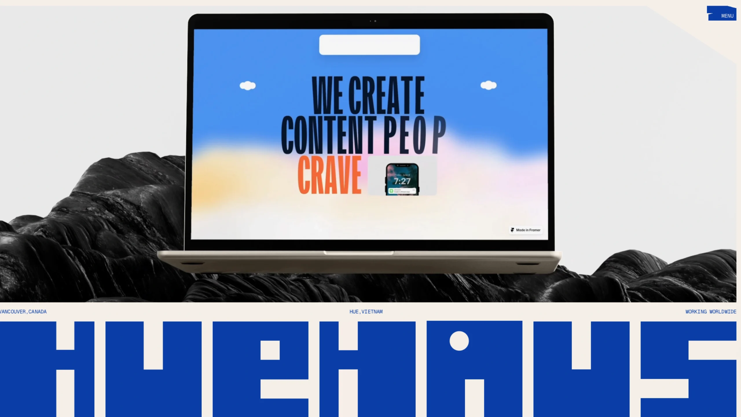
Huehaus is a specialized design studio and digital platform that celebrates the power of color through a minimalist lens. Its name is a clever portmanteau of “Hue” and “Bauhaus,” signaling its dedication to the legendary design school’s philosophy: form follows function, and less is more.
While many studios try to do everything, Huehaus focuses on creating visual systems where color isn’t just an afterthought—it is the primary architectural element of the design.
Key Features for UI/UX Designers
For the community at uiuxshowcase.com, Huehaus serves as a high-level reference for several critical design skills:
- Mastery of Tints and Shades: Huehaus is famous for its ability to create depth using monochromatic and analogous color palettes. They demonstrate how to build an entire UI using a single base color without it feeling flat or repetitive.
- Geometric Precision: Their work often utilizes strict grid systems and basic shapes (circles, squares, triangles) to create complex compositions. It’s a perfect example of how “simplicity” can be used to communicate sophisticated brand identities.
- Typographic Harmony: They pair bold color choices with “Swiss-style” typography (often utilizing clean, geometric sans-serifs). This ensures that even when the colors are loud, the message remains perfectly legible and organized.
- The “Mood” Methodology: Unlike generic agencies, Huehaus focuses on the psychology of color. Their portfolio showcases how different palettes can trigger specific emotional responses—from the “calm” of muted pastels to the “energy” of high-saturation primary colors.