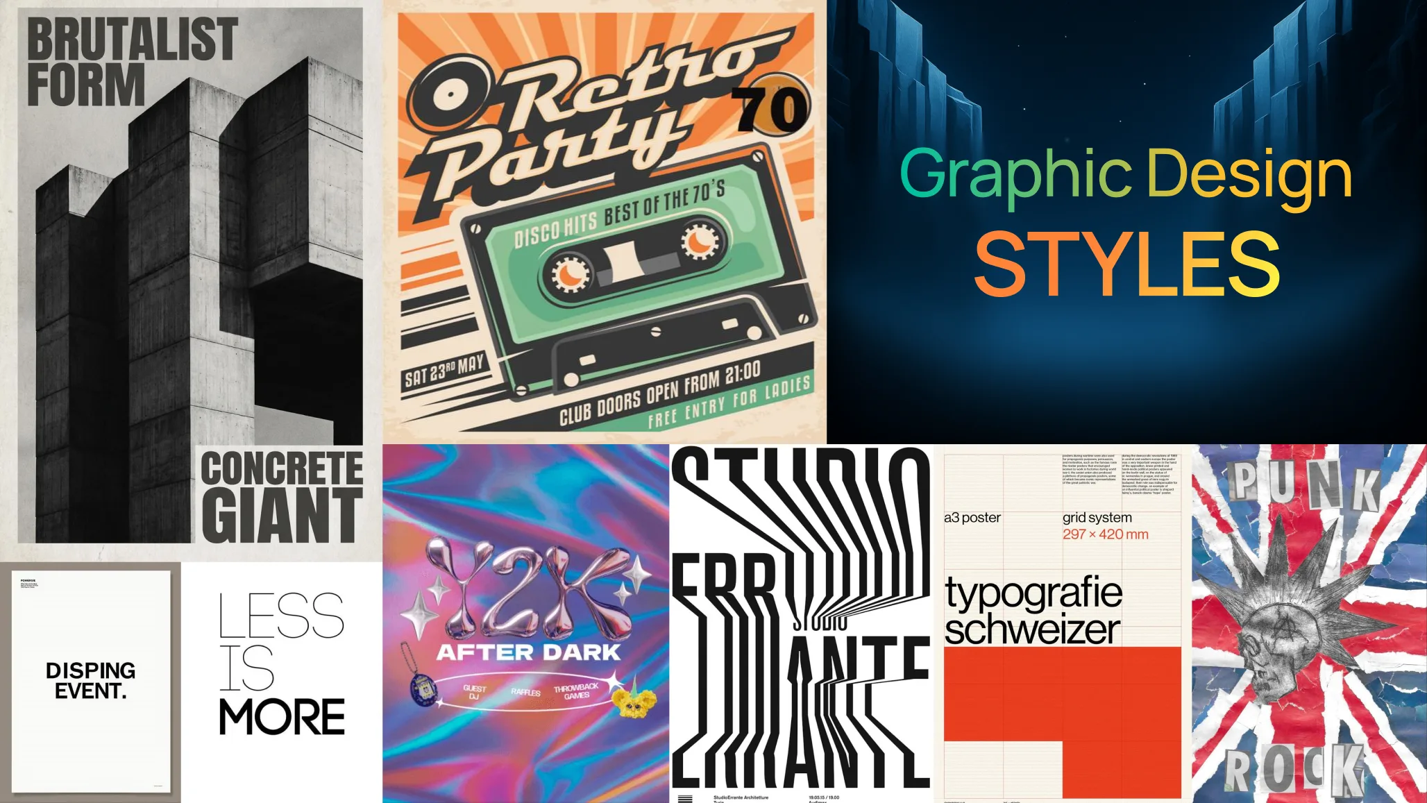
Graphic design styles can completely change the mood and personality of a visual. From the raw energy of Brutalism and British Punk to the structured simplicity of Swiss Design and Minimalism, each style has its own visual language.
This guide breaks down the key elements behind seven iconic design styles—including typography, colour, imagery, texture and layout—so designers can understand how they work and use them to create their own unique compositions.
Graphic design doesn’t have one visual language.
Some designs are loud and unapologetic. Others are quiet, spacious, and almost invisible. Some feel like they came straight out of the 1970s, while others look like they belong in a futuristic world.
The interesting part is that most design styles aren’t created from one magic ingredient. They’re usually the result of combining a few recognizable elements in a very intentional way.
Change the typography, colour palette, imagery, texture, or layout, and the personality of the entire design can shift.
That’s why understanding design styles is useful. Instead of simply copying a poster you like, you start to understand why it looks the way it does—and how you can borrow those ideas for your own work.
Here are seven graphic design styles worth exploring, along with the visual ingredients that help define each one.
1. Brutalism: Bold, Raw and Unapologetic
Brutalism isn’t interested in making everything look polished.
It often feels rough, oversized, slightly uncomfortable, and deliberately imperfect. In graphic design, brutalist work commonly uses strong contrast, oversized typography, asymmetrical layouts, rough textures, and limited colour palettes.
The basic formula could be:
High contrast + bold typography + rough texture + unexpected layout = Brutalism


Typography is often the star of the show. Headlines can become enormous, run vertically, overlap images, or even extend beyond the edges of the poster.
Black and white are common, but adding one strong accent colour can create even more tension.
The important thing is not to add distortion and noise just for the sake of it. The strongest brutalist designs still have a clear idea underneath the visual chaos.
Try it for: music posters, fashion campaigns, experimental branding, editorial design, and cultural events.
2. Retro: Nostalgia With a Modern Twist
Retro design is all about making something feel connected to another era.
It might reference the 1950s, 60s, 70s, 80s or even 90s. The exact look changes depending on the period you’re referencing, but vintage imagery, period-inspired typography, muted colours, grain, and aged textures are common ingredients.
A simple starting point:
Vintage imagery + muted colours + grain + nostalgic typography = Retro


Think faded photographs, cream backgrounds, mustard yellow, dusty orange, brown, muted teal, halftone effects, and slightly imperfect printing.
Texture is especially important. A perfectly clean digital image can make a retro design feel too modern. Adding paper grain, faded edges, ink imperfections, or subtle noise can give it that printed, physical character.
But retro doesn’t mean recreating an old poster exactly.
A nice approach is to take one or two vintage ingredients and combine them with a contemporary layout. That gives you something nostalgic without making the design feel like a museum piece.
Try it for: restaurants, music events, packaging, editorial graphics, travel brands, and lifestyle campaigns.
3. Swiss Design: Let the Grid Do the Work
Swiss Design, also known as the International Typographic Style, takes a very different approach.
Where brutalism might break the grid, Swiss design often makes the grid the foundation of the entire composition.
The style is associated with clean sans-serif typography, structured layouts, strong alignment, limited colour palettes, and objective communication.
The formula:
Grid + sans-serif + strong hierarchy + limited colour = Swiss Design


Start with a grid.
Then place everything against it: headline, body copy, images, captions, numbers and supporting information.
Helvetica is often associated with the style, but the bigger idea isn’t simply “use Helvetica.” It’s about clarity, structure and disciplined typography.
Black and white work beautifully here, sometimes with one strong colour such as red.
The result can feel incredibly simple, but getting that simplicity right takes discipline.
Try it for: corporate identity, editorial design, exhibitions, infographics, and modern brand systems.
4. Y2K: Make It Feel Like the Future—From the Past
Y2K design is interesting because it imagined the future through the visual language of the late 1990s and early 2000s.
Think chrome, metallic surfaces, glossy gradients, futuristic typography, translucent shapes, digital effects, and bright colours.
The formula:
Metallic surfaces + futuristic type + gradients + digital details = Y2K


This style can get playful very quickly.
Chrome objects can sit against neon gradients. Typography can become stretched, rounded, or futuristic. Stars, bubbles, wires, grids, and glossy 3D objects can become part of the composition.
The trick is knowing when to stop.
Y2K already has a lot going on visually, so adding every futuristic effect available can quickly turn the design into visual noise.
Choose a few signature elements and let them carry the aesthetic.
Try it for: music, fashion, gaming, digital products, entertainment, and experimental social campaigns.
5. British Punk: Make It Feel Handmade
British punk design has a completely different energy.
It feels immediate, rebellious, and DIY.
One of the most recognizable visual references is the cut-and-paste aesthetic associated with late-1970s punk graphics. Torn paper, photocopies, ransom-note lettering, photographs, newspaper clippings, and rough collage techniques are common visual ingredients.
The formula:
Torn paper + distressed type + photography + cutouts = Punk


Unlike polished digital design, punk graphics often look like someone physically cut, copied, pasted, and printed them.
And that’s part of the charm.
You can recreate that feeling digitally by combining scanned paper, rough masks, photocopy textures, handwritten type, and imperfect edges.
Don’t clean everything up.
A crooked image or uneven type alignment can actually make the design feel more authentic.
Try it for: music posters, underground culture, streetwear, zines, and alternative events.
6. All-Type Design: Let Typography Become the Image
What happens when you remove photography and illustration completely?
Typography takes over.
All-type design is built almost entirely around letterforms. The type becomes the image, the texture, and sometimes even the composition itself.
The formula:
Oversized type + scale contrast + hierarchy + distortion = All-Type Design


A single word can fill an entire poster.
Letters can overlap. Some can be tiny while others become enormous. Type can be stretched, cropped, rotated, or repeated.
But there’s still a hierarchy.
Even when the design looks experimental, viewers need to know what to look at first, second, and third.
A useful exercise is to create a poster using only one typeface and one word. Then experiment with scale, spacing, cropping, and placement.
You may be surprised by how much you can do without adding a single image.
Try it for: posters, album artwork, editorial covers, fashion campaigns and typography experiments.
7. Minimalism: Less, But With a Reason
Minimalism is probably the easiest style to describe and one of the hardest to execute well.
The idea isn’t simply to remove things.
It’s about keeping only what matters.
The formula:
White space + simple typography + limited elements + clear hierarchy = Minimalism


White space plays a major role.
Instead of filling every corner, minimalist layouts give elements room to breathe. Typography is usually simple, and colour is carefully controlled.
A good minimalist poster might contain only a headline, one graphic element, and a small amount of supporting information.
That’s not necessarily easier than making a busy composition.
In fact, when there are fewer elements, every decision becomes more visible.
Spacing matters. Alignment matters. Type size matters. Even a tiny change in position can affect the entire composition.
Try it for: technology brands, architecture, portfolios, editorial design, luxury brands, and presentation graphics.
The Real Trick: Don’t Copy the Style, Understand the Ingredients
Here’s the part worth remembering.
You don’t always need to choose one design style and follow it from beginning to end.
Some of the most interesting work happens when designers take ingredients from different visual languages and combine them.
For example:
Swiss grid + Brutalist typography
Clean structure underneath, oversized type on top.
Retro colour palette + Minimalist layout
A nostalgic mood without making the design feel old-fashioned.
Y2K typography + Swiss grid
Futuristic visuals controlled by a strict layout.
Punk texture + Modern typography
Raw physical texture combined with clean digital type.
That’s where things start getting interesting.
Instead of asking, “What style should I copy?”, ask:
“What visual ingredients create the feeling I want?”
Then build from there.
A Simple Formula for Your Next Poster
If you’re staring at a blank artboard and don’t know where to start, break the design into five ingredients:
1. Typography
Choose the personality first. Bold? Elegant? Experimental? Technical?
2. Colour
Start with two or three colours rather than trying to use everything.
3. Imagery
Decide whether photography, illustration, texture, or typography will be the main visual.
4. Layout
Will the design follow a strict grid or deliberately break it?
5. Texture
Ask whether the surface should feel clean, printed, aged, rough, glossy, or digital.
Once these five pieces are clear, the style starts to come together naturally.
The best part is that these rules aren’t really rules.
They’re starting points.
Graphic design becomes much more interesting when you understand the visual language behind a style and then make it your own.
So save this list, open a blank canvas, pick two or three ingredients, and start experimenting. You might end up with something completely different from the style you started with—and that’s usually where the interesting stuff happens.
Visual inspiration
The examples above include references spanning brutalist, Swiss, Y2K, retro, punk, and minimalist approaches. For example, Swiss-style references demonstrate the role of grids and typographic structure, while punk references show how cut-and-paste imagery and distressed type can create a deliberately rough visual language.
For further exploration, contemporary brutalist poster collections on Behance can also be useful for seeing how designers are interpreting the style today.
FAQs: Graphic Design Styles
What are the most popular graphic design styles?
Some widely recognised graphic design styles include Brutalism, Swiss Design, Retro, Y2K, British Punk, All-Type, and Minimalism. Each style has its own approach to typography, colour, imagery, composition, and texture.
What is Brutalist graphic design?
Brutalist graphic design is known for its raw, bold, and unconventional appearance. It often combines high contrast, oversized typography, rough textures, asymmetrical layouts, and limited colours to create a strong visual impact.
What is Swiss Design?
Swiss Design, also called the International Typographic Style, focuses on clarity, structure, and visual order. It commonly uses grids, sans-serif typography, strong alignment, white space, and simple colour palettes.
What is Y2K design?
Y2K design takes inspiration from the visual culture of the late 1990s and early 2000s. Typical elements include metallic effects, chrome, gradients, futuristic typography, glossy surfaces, and digital-inspired graphics.
How can I create a retro graphic design?
Start with vintage imagery, muted or warm colours, nostalgic typography, and grain or paper textures. You can also experiment with faded photographs, halftone effects and imperfect printing textures to create a more authentic retro feel.
What makes British Punk graphic design distinctive?
British Punk design is often raw, rebellious and DIY-inspired. Torn paper, cutouts, photocopied imagery, distressed typography, handwritten elements and collage layouts are some of its most recognisable characteristics.
What is all-type graphic design?
All-type design uses typography as the primary visual element instead of relying heavily on photographs or illustrations. Designers often experiment with oversized letters, scale, spacing, cropping, repetition, distortion, and typographic hierarchy.
What is minimalist graphic design?
Minimalist design focuses on removing unnecessary elements and keeping only what supports the main message. White space, simple typography, limited colours and a clear visual hierarchy are common characteristics.
Can different graphic design styles be combined?
Absolutely. Mixing styles can lead to more original work. For example, a designer could combine a Swiss grid with Brutalist typography, or use a retro colour palette with a minimalist layout. The key is to make sure the different elements still work together visually.
How do I choose the right design style for a project?
Start by thinking about the message, audience, and personality of the project. A punk-inspired style might suit a music event, while a minimalist approach could work better for a technology or luxury brand. The visual style should support the communication rather than simply follow a trend.
What elements define a graphic design style?
Most graphic design styles are built from a combination of typography, colour, imagery, layout, texture, shapes, and visual hierarchy. Changing even one of these elements can significantly alter the overall character of a design.
Do I need to follow one design style throughout a project?
Not necessarily. A consistent visual system is important, but designers can experiment with different influences as long as the final work feels intentional. Understanding the underlying principles of each style makes it easier to mix them without creating visual confusion.