


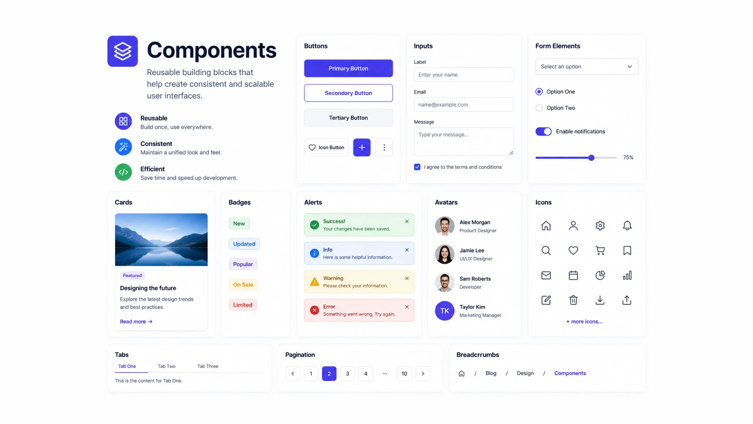
What Are Components?
Components are reusable building blocks used to create digital interfaces. They can be buttons, navigation menus, cards, forms, modals, search bars, or any other element that appears repeatedly across a website or application.
Instead of designing or coding the same element over and over, teams create a component once and reuse it wherever needed.
Think about a button.
You may see the same button style on dozens of pages. Rather than rebuilding it every time, designers and developers create a single component and use it repeatedly.
Simple idea. Huge impact.
Why Components Matter
Modern digital products can contain hundreds or even thousands of interface elements.
Without components, maintaining consistency becomes difficult.
A small design update could require editing dozens of screens manually.
Components solve this problem by centralizing repeated elements.
Update the component once, and the changes can appear everywhere it’s used.
That’s one reason large product teams rely heavily on component-based workflows.
Like Building With LEGO Bricks
Here’s a simple analogy.
Imagine building a city with LEGO bricks.
You don’t create every building from raw plastic. You use pre-made pieces and combine them in different ways.
Components work similarly.
Buttons, cards, navigation bars, and forms become reusable pieces that teams assemble into larger experiences.
The pieces stay consistent.
The final products can look very different.
How Components Work
A component contains predefined structure, styling, and sometimes behavior.
For example, a button component may include:
- Shape
- Color
- Typography
- Hover states
- Click interactions
Whenever the button is used, it follows those rules automatically.
This creates consistency across an entire product.
If the brand color changes, updating the component updates every connected button.
That’s far easier than editing hundreds individually.
Common Types of Components
Most digital products rely on a collection of shared components.
Buttons
Used for actions such as submitting forms or navigating pages.
Navigation Menus
Help users move through a website or application.
Cards
Display grouped content such as articles, products, or team members.
Forms
Collect information from users.
Modals
Show temporary content without leaving the current page.
Search Bars
Allow users to find content quickly.
Tabs
Organize information into manageable sections.
Alerts and Notifications
Communicate updates, warnings, or confirmations.
Many products use these same building blocks repeatedly.
Components in Design Systems
Components are often the foundation of a design system.
A design system defines how products should look and behave.
Components bring those rules to life.
For example, a design system may specify:
- Typography styles
- Color palettes
- Spacing rules
- Accessibility requirements
- Interaction patterns
Components package these standards into reusable elements.
This helps teams stay consistent even as products grow.
Components in Development
Design teams aren’t the only ones using components.
Developers rely on them heavily as well.
Modern frameworks such as React, Vue, Angular, and Next.js encourage component-based architecture.
A developer might create:
- Header Component
- Footer Component
- Product Card Component
- User Profile Component
Each component can be reused across multiple pages.
This reduces duplicated code and simplifies maintenance.
Why Teams Love Components
Components save time.
That sounds obvious, yet the impact can be surprisingly large.
A team managing a product with hundreds of screens doesn’t want to redesign or recode common elements repeatedly.
Reusable components help teams:
- Work faster
- Maintain consistency
- Reduce mistakes
- Simplify updates
- Improve collaboration
Designers and developers often speak the same language when discussing shared components.
That improves communication too.
Components Create Consistency
Consistency builds trust.
When buttons, menus, forms, and interactions behave predictably, users feel comfortable using a product.
Imagine visiting a website where every page has different button styles, spacing rules, and navigation patterns.
It feels messy.
Components help prevent that.
By reusing the same elements throughout a product, teams create a more polished experience.
Components vs Pages
People sometimes confuse components with pages.
They are very different.
Components
Small reusable building blocks.
Examples include:
- Buttons
- Cards
- Inputs
- Navigation items
Pages
Full screens made from multiple components.
For example:
A product page may contain:
- Header component
- Navigation component
- Product card component
- Review component
- Footer component
Pages are assembled from components.
Components are the ingredients.
Pages are the finished meal.
Variants Make Components Flexible
One interesting aspect of components is the use of variants.
A button may have:
- Primary version
- Secondary version
- Danger version
- Disabled version
All belong to the same component family.
This approach provides flexibility without creating entirely new components.
The design remains organized.
The user experience stays familiar.
Common Challenges
Components simplify many workflows, but they aren’t perfect.
Over-Engineering
Teams sometimes create too many components for situations that don’t require them.
Maintenance Complexity
Large component libraries require organization and documentation.
Version Control Issues
Changes can affect many screens simultaneously if not managed carefully.
Learning Curve
New team members may need time to understand component structures and naming conventions.
Even with these challenges, the advantages usually outweigh the drawbacks.
Components and Accessibility
Good components often include accessibility features from the start.
Examples include:
- Keyboard navigation
- Screen reader support
- Proper color contrast
- Focus indicators
- Accessible labels
When accessibility is built into components, those improvements spread throughout the product automatically.
This creates better experiences for all users.
Components in No-Code and Low-Code Platforms
Components aren’t limited to coding environments.
Platforms such as Webflow, Framer, Figma, and other visual design tools support reusable components as well.
A designer can create a card component once and reuse it across an entire website.
Updates happen quickly.
Consistency becomes easier to maintain.
The underlying principle remains the same regardless of the tool.
The Future of Components
Component-based design continues to shape modern product development.
As AI tools become more common, components are becoming smarter and more adaptable.
Future systems may automatically generate component variations, recommend layouts, or personalize interfaces based on user behavior.
Even with these advances, the core idea stays remarkably simple:
Create once.
Reuse many times.
Maintain consistency without unnecessary repetition.
Final Thoughts
Components are reusable interface elements that help designers and developers build consistent, maintainable, and efficient digital products.
They serve as the building blocks of websites, applications, and design systems, reducing repetitive work while improving collaboration and user experience.
From a simple button to a complex navigation menu, components make modern product development faster, cleaner, and easier to manage.
Frequently Asked Questions
1. What is a component in web design?
A component is a reusable interface element such as a button, card, form, or navigation menu used across multiple screens.
2. Why are components important?
They improve consistency, reduce repetitive work, simplify updates, and help teams build products more efficiently.
3. What is the difference between a component and a page?
A component is a reusable building block, while a page is a complete screen made from multiple components.
4. Are components used in design systems?
Yes. Components are a core part of most design systems and help enforce visual and interaction standards.
5. Which frameworks use components?
Popular frameworks such as React, Vue, Angular, and Next.js rely heavily on component-based architecture.
6. Can components improve accessibility?
Yes. Accessible components can include keyboard support, screen reader compatibility, focus states, and proper labeling, improving usability across an entire product.