


Contrast Ratio: Why Some Designs Are Easy to Read and Others Aren’t.
Have you ever opened a website and immediately felt comfortable reading everything on the page?
Now think about the opposite experience.
Maybe the text looked faded. Maybe the buttons blended into the background. Maybe you squinted a little and thought, “Why is this so hard to read?”
The difference often comes down to one important design concept: contrast ratio.
It’s not the flashiest topic in design. Designers usually get excited about colors, animations, illustrations, and layouts. Contrast ratio rarely gets that kind of attention.
Yet it quietly affects almost every digital experience we use.
A beautiful interface that people can’t read isn’t really beautiful. It’s frustrating.
That’s why contrast ratio sits at the center of accessibility, usability, and visual design.
What Is Contrast Ratio?
Contrast ratio measures the difference in brightness between two colors.
Most commonly, it measures the difference between text and its background.
The greater the difference, the easier it becomes to distinguish one element from another.
For example:
- Black text on a white background creates very high contrast.
- Light gray text on a white background creates low contrast.
Contrast ratio is expressed as a numerical value.
Examples include:
- 3:1
- 4.5:1
- 7:1
- 21:1
A larger number indicates stronger contrast.
The highest possible contrast ratio is 21:1, which occurs between pure black and pure white.
Why Contrast Ratio Matters More Than People Think
Here’s the thing.
Many users don’t consciously notice good contrast.
They simply read content, complete tasks, and move on.
Poor contrast creates the opposite experience.
Users begin struggling.
Reading takes more effort.
Important information gets missed.
Buttons become harder to identify.
Forms feel frustrating.
People may not know the phrase “contrast ratio,” but they’ll definitely feel its effects.
A Simple Everyday Analogy
Think about reading a menu in a dimly lit restaurant.
If the text is dark and clear, reading feels easy.
If the menu uses pale gray lettering against a slightly lighter gray background, the experience becomes annoying almost immediately.
You can still read it.
But you’re working harder than you should.
Digital interfaces work the same way.
Good contrast reduces effort.
Poor contrast increases cognitive load.
How Contrast Ratio Works
Contrast ratio is calculated by comparing the luminance of two colors.
Luminance refers to the perceived brightness of a color.
The calculation itself is mathematical, but designers rarely calculate it manually.
Modern tools handle the heavy lifting.
What matters is understanding the results.
For example:
- Black on white = 21:1
- Dark blue on white = strong contrast
- Light gray on white = weak contrast
- Yellow on white = extremely weak contrast
Two colors may appear different, yet still fail accessibility requirements.
That’s why visual judgment alone isn’t always enough.
Understanding Contrast Ratio Numbers
Let’s make the numbers easier to understand.
1:1 Ratio
No contrast exists.
The foreground and background colors are identical.
Text becomes invisible.
3:1 Ratio
This level may work for larger text and certain interface elements.
Smaller text often becomes difficult to read.
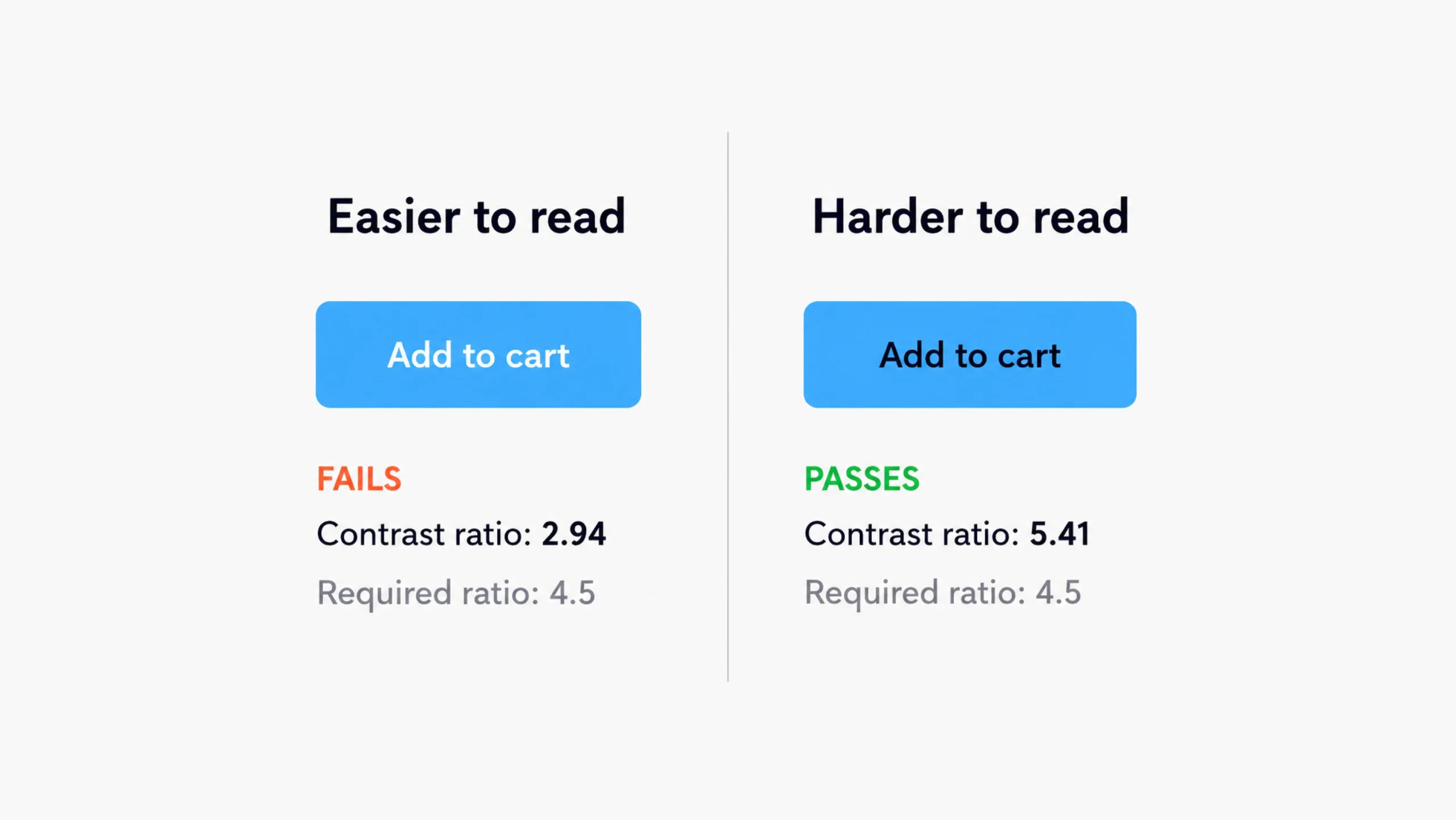
4.5:1 Ratio
This is a widely accepted accessibility target for normal-sized text.
Many accessibility standards use this threshold.
7:1 Ratio
This provides even stronger readability and supports users with various visual impairments.
21:1 Ratio
Maximum contrast.
Pure black against pure white.
Highly readable but sometimes visually harsh for extended use.
Interestingly, maximum contrast isn’t always the most comfortable choice.
We’ll come back to that.
Contrast Ratio and Accessibility
Accessibility is one of the biggest reasons contrast ratio matters.
People experience visual content differently.
Some users have:
- Low vision
- Color blindness
- Age-related vision changes
- Eye fatigue
- Temporary visual impairments
Strong contrast helps these users access information independently.
Without adequate contrast, content can become difficult—or impossible—to read.
Accessibility standards place significant emphasis on contrast because readable content is a fundamental requirement.
If users can’t see information clearly, every other design improvement becomes irrelevant.
Why Accessibility Standards Focus on Contrast
Imagine creating the world’s most intuitive navigation system.
Then imagine presenting it in barely visible text.
The navigation becomes useless.
Accessibility standards recognize this simple truth.
Users must be able to perceive information before they can interact with it.
Contrast supports that goal.
It’s one of the foundational pieces of accessible design.
Text Isn’t the Only Thing That Needs Contrast
Many people assume contrast ratio only applies to typography.
Actually, contrast affects numerous interface elements.
Examples include:
- Buttons
- Icons
- Input fields
- Charts
- Error messages
- Navigation menus
- Links
- Toggle switches
Every important visual element needs enough distinction from its surroundings.
Otherwise, users may overlook it completely.
Real-World Examples of Good and Bad Contrast
Let’s compare two scenarios.
Example 1: High Contrast
- Dark text
- Light background
- Clear button labels
- Visible form fields
Users can quickly scan, read, and interact.
The interface feels effortless.
Example 2: Low Contrast
- Pale gray text
- White background
- Light-colored buttons
- Faint form borders
The design may appear modern at first glance.
After a few minutes, users begin struggling.
Many trendy designs fall into this trap.
They prioritize aesthetics over readability.
The Rise and Fall of Ultra-Minimal Interfaces
A few years ago, ultra-minimal interfaces became extremely popular.
Designers used:
- Thin typography
- Light gray text
- Subtle borders
- Soft color palettes
The designs looked elegant in presentations.
Real users often disagreed.
Many interfaces became difficult to use.
Over time, design teams began balancing visual elegance with readability.
That shift brought contrast ratio back into the spotlight.
Contrast Ratio in UI Design
User interface design relies heavily on visual communication.
Every screen asks users to make decisions.
Where should they click?
What should they read first?
Which action matters most?
Contrast helps answer these questions.
Designers frequently use contrast to create hierarchy.
Higher contrast attracts attention.
Lower contrast recedes into the background.
This creates a natural reading flow.
Contrast Creates Visual Hierarchy
Think of contrast as a spotlight.
The brighter the spotlight, the more attention an element receives.
A call-to-action button often uses stronger contrast than surrounding elements.
Headlines typically stand out more than body text.
Important alerts attract attention through contrast differences.
Good hierarchy guides users without requiring conscious effort.
Common Contrast Ratio Mistakes
Even experienced designers occasionally make these mistakes.
Using Gray on Gray
One of the most common issues.
Both colors may look different in design software.
Users often struggle to distinguish them.
Prioritizing Style Over Readability
Some interfaces look beautiful in static mockups.
Actual usage tells a different story.
Readability should never become a secondary concern.
Ignoring Mobile Devices
A design that looks fine on a large monitor may become difficult to read on a phone.
Smaller screens often expose contrast problems.
Forgetting Older Users
Vision naturally changes with age.
Designs with weak contrast may become increasingly difficult for older audiences.
Relying Solely on Color
Contrast helps, but color shouldn’t be the only indicator.
Error messages, warnings, and status indicators should include additional visual cues.
How Designers Check Contrast Ratio
Fortunately, designers don’t need calculators.
Several tools can evaluate contrast instantly.
Popular options include:
- Figma accessibility plugins
- WebAIM Contrast Checker
- Stark
- Adobe accessibility tools
- Browser developer tools
These tools compare foreground and background colors and report the ratio.
Many also indicate whether the combination passes accessibility requirements.
Contrast Ratio and Dark Mode
Dark mode introduces an interesting challenge.
Many people assume white text on black backgrounds always creates the ideal experience.
The reality is more nuanced.
Extremely high contrast can sometimes feel harsh during extended reading sessions.
Many dark mode interfaces use slightly softened whites and dark grays.
This maintains readability while reducing visual strain.
The goal isn’t maximum contrast.
The goal is comfortable contrast.
There’s a difference.
Contrast Ratio and Brand Colors
Brand teams often face a challenge.
A company’s signature color may look fantastic in marketing materials but perform poorly in accessibility tests.
This doesn’t mean the brand color must disappear.
Instead, teams often create accessible variations for digital interfaces.
Many successful brands maintain strong visual identities while supporting accessibility requirements.
Good branding and accessibility can coexist.
The Business Benefits of Better Contrast
Good contrast doesn’t only help accessibility.
It benefits business performance as well.
Clear interfaces often lead to:
- Better readability
- Lower user frustration
- Higher engagement
- Improved task completion rates
- Stronger customer satisfaction
People stay longer when interfaces feel easy to use.
People leave faster when they struggle.
The connection is surprisingly direct.
Contrast Ratio in the Future of Design
Digital products continue appearing across new devices.
Phones.
Tablets.
Smart watches.
Automotive displays.
AR and VR environments.
As interfaces expand into new environments, readability becomes even more important.
Designers will continue focusing on contrast because human perception remains constant.
Technology changes.
Human vision doesn’t change nearly as fast.
Final Thoughts
Contrast ratio measures the visual difference between foreground and background elements. It plays a major role in readability, accessibility, usability, and visual hierarchy.
A strong contrast ratio helps users read content, identify actions, understand information, and navigate interfaces with confidence. Poor contrast creates friction, confusion, and frustration—even when the design looks attractive.
The best interfaces strike a balance between aesthetics and functionality. They look polished without sacrificing clarity.
In many ways, contrast ratio represents a simple design principle: if users can’t see something clearly, they can’t use it effectively.
And that’s why this seemingly small measurement has such a large impact on digital experiences.
Frequently Asked Questions (FAQs)
What is a contrast ratio in design?
A contrast ratio measures the difference in brightness between two colors, typically text and its background. Higher ratios create stronger visual distinction and improve readability.
Why is contrast ratio important?
Contrast ratio affects readability, accessibility, usability, and visual clarity. Poor contrast can make content difficult for many users to read and understand.
What is considered a good contrast ratio?
For normal-sized text, a contrast ratio of at least 4.5:1 is commonly recommended. Higher ratios often provide better readability.
What is the highest possible contrast ratio?
The maximum contrast ratio is 21:1, which occurs between pure black and pure white.
Does contrast ratio only affect text?
No. Contrast ratio affects buttons, icons, form fields, navigation elements, charts, and many other interface components.
How can designers test contrast ratio?
Designers can use accessibility tools such as Stark, WebAIM Contrast Checker, Figma plugins, browser developer tools, and Adobe accessibility features to evaluate color combinations.