


Dashboard: What It Is, Why It Matters, and How Great Dashboards Help People Make Better Decisions.
Imagine driving a car without a dashboard.
No speedometer.
No fuel gauge.
No warning lights.
No navigation.
Technically, you could still drive.
You’d just be guessing most of the time.
That doesn’t sound particularly comfortable.
Digital products face the same challenge.
Businesses collect enormous amounts of data every day. Sales figures, customer activity, website traffic, revenue reports, inventory levels, support tickets, employee performance metrics—the list keeps growing.
Without a way to organize and display that information, people end up drowning in numbers.
That’s where dashboards come in.
A dashboard turns raw data into something people can quickly understand, monitor, and act upon.
And honestly, that’s why dashboards have become one of the most important interfaces in modern software.
What Is a Dashboard?
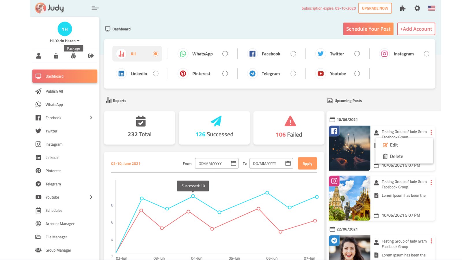
A dashboard is a visual interface that displays important information, metrics, reports, and data in a single location.
Its primary purpose is to help users monitor performance, identify trends, and make informed decisions without digging through spreadsheets, reports, or databases.
Think of a dashboard as a control center.
Instead of opening ten different pages to find answers, users can see key information gathered in one place.
Common dashboard elements include:
- Charts
- Graphs
- Tables
- KPIs (Key Performance Indicators)
- Activity feeds
- Notifications
- Filters
- Reports
- Status indicators
The goal isn’t to show everything.
The goal is to show what matters most.
A Quick Story From Everyday Life
Let’s step away from software for a moment.
Imagine managing a busy restaurant.
Every morning, you want answers to questions like:
- How many customers visited yesterday?
- Which menu items sold best?
- How much revenue came in?
- Which tables stayed occupied longest?
- How many deliveries were completed?
You could gather data from receipts, notebooks, and multiple systems.
Or you could view everything on a single screen.
That’s essentially what a dashboard does.
It brings important information together and makes it easier to understand.
Where Did Dashboards Come From?
The term “dashboard” originally came from vehicles.
A car dashboard presents critical information to the driver.
You don’t need to inspect the engine every few minutes.
The dashboard summarizes what you need to know.
Software borrowed the same concept.
As businesses started generating more digital data, the need for centralized reporting became obvious.
Spreadsheets worked for a while.
Then data volumes exploded.
Dashboards emerged as a practical solution.
Today they’re everywhere.
Banking apps.
Healthcare platforms.
Project management software.
Ecommerce stores.
Analytics tools.
Trading platforms.
Customer support systems.
The list goes on.
Why Dashboards Matter
Here’s the thing.
Data alone isn’t particularly useful.
That’s a statement that sounds strange at first.
After all, businesses spend enormous amounts collecting data.
Yet raw data often creates confusion rather than clarity.
A spreadsheet containing 50,000 rows of information may be technically accurate.
That doesn’t mean it’s easy to understand.
Dashboards transform information into insight.
They help answer questions quickly.
Questions like:
- Are sales increasing?
- Is website traffic dropping?
- Which campaigns are performing best?
- Are support tickets rising?
- Are users actively engaging with the product?
Without a dashboard, answering these questions might take hours.
With a dashboard, answers often appear in seconds.
How Dashboards Work
Most dashboards collect information from one or more data sources.
These sources might include:
- Databases
- APIs
- Analytics tools
- CRM systems
- Ecommerce platforms
- Marketing platforms
- Internal software
The dashboard processes this information and presents it visually.
Instead of showing thousands of records, it highlights patterns.
Humans tend to understand visuals much faster than raw numbers.
A rising line chart communicates a trend almost instantly.
A red warning indicator catches attention immediately.
Good dashboards leverage that natural behavior.
The Building Blocks of a Dashboard
Most dashboards consist of several common components.
Let’s take a closer look.
KPI Cards
KPI cards display high-level metrics.
Examples include:
- Revenue
- Active users
- Orders
- Conversion rate
- Customer satisfaction score
These numbers often appear at the top of a dashboard.
Users can scan them within seconds.
Charts and Graphs
Visual data representation helps users spot trends.
Popular chart types include:
- Line charts
- Bar charts
- Area charts
- Pie charts
- Donut charts
- Scatter plots
Choosing the right chart matters more than many people realize.
A poorly chosen chart can make useful data difficult to understand.
Tables
Tables provide detailed information.
Users often rely on tables when they need specifics rather than summaries.
For example:
Customer name.
Purchase date.
Order value.
Account status.
Filters
Filters allow users to customize what they see.
Examples include:
- Date ranges
- User groups
- Geographic regions
- Product categories
Filters make dashboards significantly more useful.
Without them, information can quickly become overwhelming.
Activity Feeds
Activity feeds display recent events.
Examples:
- New customer sign-ups
- Recent purchases
- Team activity
- System updates
These sections help users stay informed without searching for updates.
Different Types of Dashboards
Not every dashboard serves the same purpose.
Different audiences require different information.
Operational Dashboards
Operational dashboards focus on real-time monitoring.
They help teams track current activity.
Examples include:
- Call center dashboards
- Delivery tracking systems
- Manufacturing operations
- Customer support monitoring
Speed matters here.
Users need information immediately.
Analytical Dashboards
Analytical dashboards focus on trends and patterns.
These dashboards often support strategic decision-making.
Examples include:
- Marketing analytics
- Sales reporting
- Product performance analysis
- Customer behavior analysis
The goal is deeper insight rather than real-time monitoring.
Strategic Dashboards
Executives frequently use strategic dashboards.
These provide high-level overviews of business performance.
Common metrics include:
- Revenue growth
- Customer retention
- Market performance
- Profitability
These dashboards focus on long-term goals rather than daily activities.
Dashboard Design: Less Is Often More
One of the biggest misconceptions about dashboards is that they should contain as much information as possible.
The reality is almost the opposite.
Too much information creates noise.
Good dashboard design focuses on clarity.
Imagine entering a room where fifty people are speaking simultaneously.
Important information becomes difficult to hear.
A cluttered dashboard creates a similar experience.
Designers often work hard to remove unnecessary elements.
Sometimes the most valuable design decision involves removing something rather than adding it.
What Makes a Great Dashboard?
Successful dashboards share several characteristics.
Clear Hierarchy
Important information appears first.
Users shouldn’t need a treasure map to locate critical metrics.
Easy Scanning
Most users don’t read dashboards.
They scan them.
Information should support quick understanding.
Consistency
Charts, colors, labels, and interactions should behave predictably.
Consistency reduces cognitive effort.
Relevant Data
Showing every available metric often creates confusion.
Great dashboards focus on what users actually need.
Actionable Insights
Data becomes valuable when it leads to action.
Users should understand what information means and what they can do next.
Common Dashboard Design Mistakes
Even experienced teams occasionally create dashboards that look impressive but perform poorly.
Let’s look at some common problems.
Too Many Metrics
More data doesn’t automatically mean more value.
A crowded dashboard often becomes harder to use.
Poor Data Visualization
Choosing the wrong chart type can distort information.
A simple bar chart may communicate data more effectively than a complex visualization.
Excessive Color Usage
Color should guide attention.
Too many colors create visual chaos.
Ignoring Mobile Users
Many dashboards are designed for large screens.
Then users open them on mobile devices and struggle to interact with the interface.
No User Research
A dashboard designed without understanding user goals often misses the mark completely.
Different users need different information.
A CEO and a customer support agent rarely require the same dashboard.
Dashboard UX: Making Data Feel Human
Here’s an interesting contradiction.
Dashboards are heavily data-driven.
Yet great dashboard design isn’t really about data.
It’s about people.
People have goals.
Questions.
Concerns.
Deadlines.
Responsibilities.
A dashboard should help users accomplish something meaningful.
The numbers are simply part of that process.
That’s why UX designers spend significant time understanding user needs before creating dashboard layouts.
A beautiful dashboard that answers the wrong questions still fails.
AI Is Changing Dashboards
Artificial intelligence is beginning to reshape dashboard experiences.
Traditional dashboards often require users to interpret data themselves.
Modern AI-powered dashboards can assist with analysis.
Examples include:
- Automated insights
- Predictive analytics
- Trend detection
- Anomaly alerts
- Natural language summaries
Some platforms now allow users to ask questions directly.
Instead of searching through charts, users can type:
“What caused the revenue drop last month?”
The system generates an explanation.
That’s a major shift.
And we’re only at the beginning.
Real-World Dashboard Examples
Many popular products rely heavily on dashboards.
Examples include:
Google Analytics
Provides website traffic and user behavior insights.
Shopify
Displays sales, orders, products, and customer information.
HubSpot
Tracks leads, marketing campaigns, and customer relationships.
Salesforce
Offers sales reporting and customer management dashboards.
Stripe
Presents payment activity, revenue, and financial reporting.
Each dashboard serves different goals.
Yet all of them share one common objective:
Helping users make informed decisions quickly.
Final Thoughts
A dashboard is a centralized interface that presents important information in a clear and organized format.
It helps users monitor performance, track activity, identify trends, and make informed decisions without digging through endless reports.
The best dashboards don’t overwhelm users with data.
They simplify complexity.
They highlight what matters.
They provide context.
And they help people move from information to action.
Whether you’re designing a SaaS platform, a fintech application, a healthcare system, or an ecommerce product, dashboard design often becomes one of the most influential parts of the user experience.
After all, data has little value if people can’t understand it.
A great dashboard helps make that understanding possible.
Frequently Asked Questions (FAQs)
What is a dashboard in UX design?
A dashboard is a user interface that presents important data, metrics, reports, and insights in a single location, helping users monitor performance and make decisions quickly.
What is the purpose of a dashboard?
The purpose of a dashboard is to organize and visualize information so users can understand key metrics, identify trends, and take action without reviewing large amounts of raw data.
What are the main components of a dashboard?
Common dashboard components include KPI cards, charts, graphs, tables, filters, activity feeds, notifications, and status indicators.
What is the difference between an operational and analytical dashboard?
Operational dashboards focus on real-time monitoring and current activity, while analytical dashboards focus on historical trends, patterns, and business insights.
Why is dashboard design important?
Good dashboard design improves usability, reduces cognitive effort, highlights critical information, and helps users find answers quickly.
What tools are commonly used to build dashboards?
Popular dashboard tools include Tableau, Power BI, Looker Studio, Google Analytics, Salesforce, HubSpot, Stripe, and many custom SaaS dashboard solutions.