


F Pattern: What It Is, Why Users Scan This Way, and How It Shapes Modern Web Design.
Imagine opening a long article online.
Maybe it’s a news story.
A product review.
A blog post.
A research paper.
Now be honest.
Did you read every word from top to bottom?
Probably not.
Most people don’t.
Instead, they scan.
Their eyes move quickly across the page looking for clues, headings, keywords, and pieces of information that seem useful.
Interestingly, this scanning behavior often follows a predictable shape.
The shape resembles the letter F.
That’s where the term F Pattern comes from.
It’s one of the most widely discussed concepts in UX design, content strategy, and web usability.
And even though the internet has changed dramatically over the years, the idea remains surprisingly relevant.
What Is the F Pattern?
The F Pattern is a common eye-scanning behavior observed when people read content-heavy webpages.
Users typically scan:
- Across the top of the page horizontally.
- Across a second horizontal section slightly lower on the page.
- Vertically down the left side while occasionally stopping at points of interest.
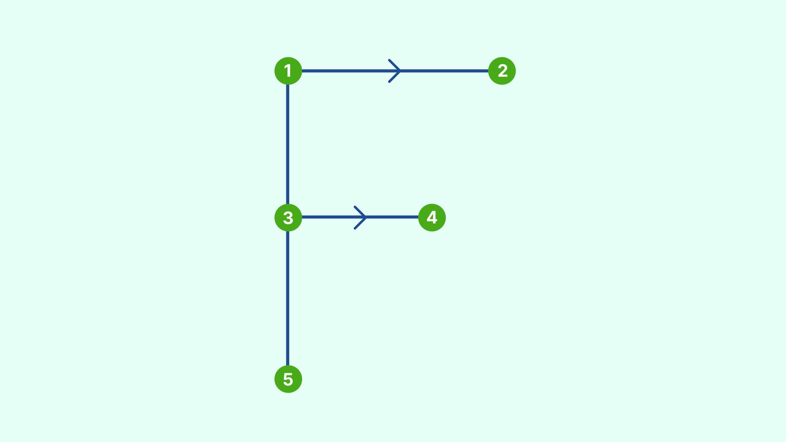
When visualized through eye-tracking studies, these movements often resemble the shape of a capital letter F.
Hence the name.
The pattern appears most often on:
- Blog articles
- News websites
- Documentation pages
- Search results pages
- Knowledge bases
- Long-form content
It’s less common on highly visual pages where images dominate attention.
Where Did the F Pattern Come From?
The concept became widely known through eye-tracking research conducted by the UX consulting firm Nielsen Norman Group.
Researchers analyzed how users interacted with web pages and noticed something fascinating.
People rarely read webpages line by line.
Instead, they scanned.
The eye movements repeatedly formed shapes resembling the letter F.
This finding challenged many assumptions about online reading behavior.
Designers had been carefully crafting layouts expecting users to consume every piece of content.
Reality looked very different.
People were skimming.
A lot.
Why Do Users Scan Instead of Read?
Here’s the thing.
The internet gives us endless information.
Articles.
Videos.
Social media posts.
Emails.
Documentation.
Product pages.
Most people simply don’t have the time or patience to read everything in detail.
So the brain develops shortcuts.
Scanning becomes a survival mechanism.
Users ask themselves questions such as:
- Is this relevant?
- Can this help me?
- Is this worth my time?
- Where’s the information I need?
The F Pattern reflects that behavior.
People search for value quickly.
Then they decide whether to continue reading.
Let’s Picture the Pattern
Imagine reading a restaurant menu.
You don’t usually analyze every item.
Your eyes move across the top.
You notice categories.
You scan down the list.
Certain dishes catch your attention.
The process feels natural.
Web content often works the same way.
A visitor arrives on a page.
Their eyes typically follow this sequence:
First Horizontal Scan
The headline receives attention.
Navigation menus may receive attention too.
Users look for immediate context.
Second Horizontal Scan
The eye moves slightly lower.
Subheadings and introductory text often get scanned.
This pass tends to be shorter than the first.
Vertical Scan
The user begins moving down the left side of the content.
Headings.
Bullet points.
Keywords.
Highlighted phrases.
Anything interesting may trigger a deeper look.
The result resembles an F shape.
Why the F Pattern Matters in UX Design
The F Pattern isn’t merely an interesting observation.
It influences how designers organize information.
Think about what happens if critical information sits in areas users rarely notice.
The content exists.
Yet it may never be seen.
That’s a problem.
Understanding scanning behavior helps designers place important information where attention naturally occurs.
Good UX often works with human behavior rather than fighting against it.
The F Pattern is a great example.
Content Hierarchy and the F Pattern
One reason content hierarchy matters so much is that users scan selectively.
They don’t give equal attention to every sentence.
Certain elements receive more attention:
- Headlines
- Subheadings
- Bullet lists
- Bold text
- Call-to-action buttons
- Links
- Visual elements
A well-structured page supports scanning.
A poorly structured page forces users to work harder.
And most users won’t.
They’ll leave.
Common Places Where the F Pattern Appears
The F Pattern shows up frequently in content-heavy environments.
Blog Articles
Readers often scan headings before deciding whether to read the full article.
News Websites
Users look for major headlines and summaries.
Search Engine Results Pages
People scan titles and descriptions quickly.
Documentation Platforms
Developers often scan documentation rather than reading every paragraph.
Knowledge Bases
Users search for answers, not entertainment.
Scanning becomes the fastest path.
The Relationship Between F Pattern and SEO
SEO and user behavior often intersect.
A page optimized for scanning tends to help both users and search engines.
Content creators frequently use:
- Clear headings
- Short paragraphs
- Bullet points
- Descriptive subheadings
- Internal links
These elements support readability.
They also make content easier to scan.
Google’s algorithms don’t literally measure an F Pattern.
Yet they increasingly reward content that serves users well.
Readability contributes to that experience.
F Pattern vs Z Pattern
These two patterns are often discussed together.
They’re related, though they appear in different contexts.
F Pattern
Best suited for content-rich pages.
Examples:
- Articles
- Reports
- Documentation
- Search results
Users scan vertically while consuming information.
Z Pattern
Common on simpler pages.
Examples:
- Landing pages
- Marketing websites
- Promotional pages
Users move their eyes in a Z-shaped path across the screen.
The goal is often guiding attention toward a primary call-to-action.
One pattern isn’t better than the other.
Each serves different user goals.
The Good Side of the F Pattern
Designers can use the F Pattern strategically.
Benefits include:
Faster Information Discovery
Users find relevant content more quickly.
Improved Readability
Content becomes easier to consume.
Better User Experience
Visitors experience less friction while searching for information.
Stronger Content Engagement
Well-structured content encourages continued exploration.
The Not-So-Good Side
Interestingly, the F Pattern can create challenges too.
Users sometimes miss information located outside their scanning path.
Important content placed in overlooked areas may receive little attention.
This creates an interesting contradiction.
The F Pattern helps users process information efficiently.
At the same time, it can cause them to overlook valuable details.
Designers must account for both realities.
Common Design Mistakes Related to the F Pattern
Many websites unintentionally work against natural scanning behavior.
Long Walls of Text
Large blocks of text can feel intimidating.
Readers often abandon them quickly.
Weak Headings
Generic headings provide little guidance.
Strong headings help users understand content structure.
Poor Visual Hierarchy
If everything looks equally important, users struggle to identify priorities.
Hidden Key Information
Critical details buried deep within paragraphs may never be seen.
Excessive Visual Clutter
Too many competing elements fragment attention.
The page becomes difficult to scan.
Is the F Pattern Still Relevant Today?
A fair question.
After all, user behavior evolves.
Web design evolves.
Technology evolves.
Some designers argue that modern browsing habits have reduced the importance of the F Pattern.
There is some truth to that.
Video content has grown.
Mobile browsing dominates many industries.
Interactive experiences have become more common.
Yet scanning behavior remains remarkably persistent.
People still skim articles.
They still scan search results.
They still look for shortcuts.
The exact shape may vary slightly across devices, but the underlying behavior remains familiar.
Humans continue searching for information efficiently.
That isn’t likely to change anytime soon.
Practical Design Tips for the F Pattern
If you’re designing content-heavy experiences, a few simple principles can help.
Place Important Information Early
Users pay the most attention near the top.
Write Strong Headlines
Headlines act as scanning anchors.
Use Meaningful Subheadings
Subheadings help users move through content quickly.
Keep Paragraphs Manageable
Shorter paragraphs improve scannability.
Use Lists Carefully
Lists can help break up content and highlight important points.
Highlight Important Keywords
Strategic emphasis can help users locate relevant information faster.
What Modern AI Products Can Learn From the F Pattern
AI tools, SaaS products, and enterprise platforms often present large amounts of information.
The F Pattern remains useful here.
Dashboard interfaces.
Knowledge bases.
AI-generated reports.
Documentation systems.
All benefit from clear hierarchy and structured presentation.
Even advanced AI experiences still rely on basic human reading behaviors.
Technology changes.
Human attention patterns change more slowly.
That’s worth remembering.
Final Thoughts
The F Pattern describes a common way users scan content-heavy webpages.
People typically move across the top, scan slightly lower, and then travel down the left side of the page, creating a shape that resembles the letter F.
This behavior reveals something important about digital experiences.
Most users don’t read everything.
They scan first.
Then they decide what deserves closer attention.
Designers, writers, marketers, and content strategists who understand this behavior can create experiences that feel easier to consume and easier to understand.
The F Pattern isn’t a strict rule.
It’s a tendency.
A reflection of how people process information when time and attention are limited.
And honestly, that’s a situation most internet users know quite well.
Frequently Asked Questions (FAQs)
What is the F Pattern in UX design?
The F Pattern is a common eye-scanning behavior where users read across the top of a webpage, scan a second horizontal section, and then move vertically down the left side of the content.
Why is it called the F Pattern?
It is called the F Pattern because eye-tracking studies showed that users’ reading behavior often forms a shape similar to the capital letter “F.”
Where is the F Pattern commonly found?
The F Pattern frequently appears on blog posts, news websites, documentation pages, search engine results pages, and other content-heavy layouts.
What is the difference between the F Pattern and the Z Pattern?
The F Pattern is common on information-rich pages where users scan content. The Z Pattern is more common on landing pages and marketing pages where users follow a simpler visual path toward a call-to-action.
Is the F Pattern still relevant for mobile devices?
Yes. Although mobile devices influence reading behavior, users still scan content and look for visual hierarchy, headings, and key information before reading in detail.
How can designers use the F Pattern effectively?
Designers can place important information near the top, create strong headings, use clear subheadings, maintain visual hierarchy, and structure content for easy scanning.