


Glassmorphism: The Frosted Glass Design Trend Explained.
Every few years, a design style captures the attention of designers, developers, and product teams.
Flat Design did it.
Material Design did it.
Neumorphism had its moment too.
Then came Glassmorphism—a visual style that made digital interfaces look like layers of frosted glass floating above colorful backgrounds.
If you’ve used a modern operating system, opened a sleek mobile app, or browsed a trendy startup website, chances are you’ve already seen Glassmorphism in action.
The effect feels familiar. It resembles looking through a clean glass window on a cold morning. You can still see what’s behind it, but the details appear softened and slightly blurred.
That visual trick creates depth, elegance, and a sense of modernity.
Let’s explore what Glassmorphism is, why it became so popular, and how designers use it effectively.
What Is Glassmorphism?
Glassmorphism is a user interface design style that uses transparency, background blur, soft shadows, and subtle borders to create elements that resemble frosted glass.
These interface elements appear semi-transparent and often sit above colorful or layered backgrounds.
Instead of completely hiding the content underneath, Glassmorphism allows portions of the background to remain visible through the interface component.
The result creates depth and visual separation without relying on heavy colors or thick borders.
In simple terms, Glassmorphism makes digital elements look like pieces of translucent glass floating in space.
A Quick Look at the Origins
Glass-like effects are not entirely new.
Designers experimented with transparency years before the term “Glassmorphism” became popular.
One of the earliest mainstream examples appeared in Microsoft’s Windows Vista, which introduced the Aero Glass interface.
Years later, Apple brought similar visual effects into macOS and iOS through blurred backgrounds and translucent panels.
The term Glassmorphism gained widespread attention around 2020 as designers began sharing concepts on platforms like Dribbble, Behance, and Figma Communities.
Soon, it became one of the most talked-about UI trends across the design industry.
Why Did Glassmorphism Become So Popular?
Good design trends often appear when technology catches up with creative ideas.
That’s exactly what happened here.
Modern devices became powerful enough to render blur effects smoothly.
Design tools like Figma, Sketch, Adobe XD, and Framer made these effects easier to create.
Users were also looking for interfaces that felt fresh.
Flat design had dominated digital products for years. While clean and practical, some designers felt it lacked depth.
Glassmorphism introduced visual layering without returning to overly decorative styles from the past.
The result felt modern, clean, and surprisingly sophisticated.
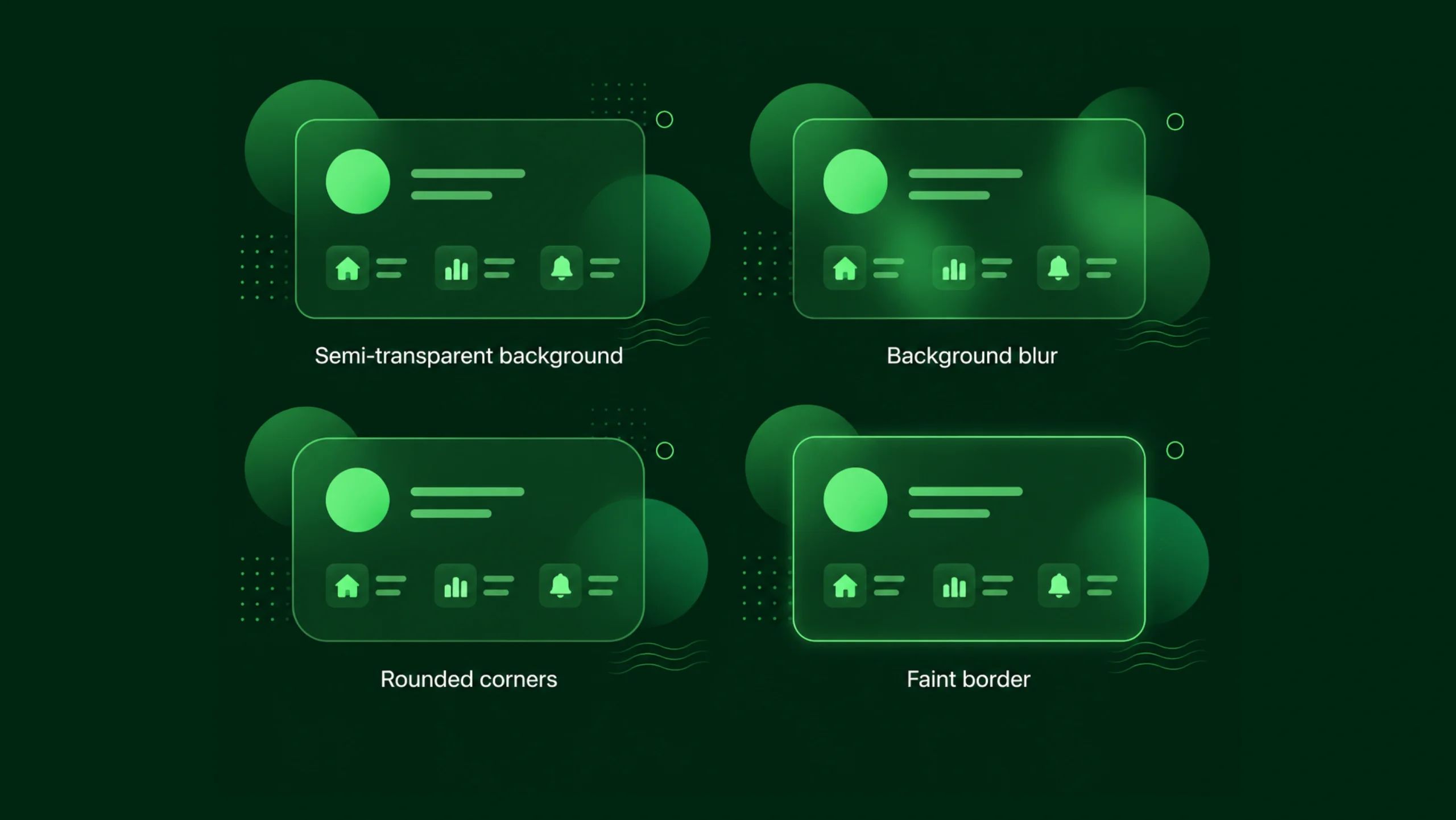
What Makes Glassmorphism Look Like Glass?
Several visual ingredients work together.
Remove one of them and the illusion starts to disappear.
Background Blur
Blur is the most recognizable feature.
Content behind the glass layer becomes soft and slightly distorted.
This mimics the appearance of frosted glass.
Without blur, transparency alone rarely creates the same effect.
Transparency
Glass panels typically allow part of the background to remain visible.
Designers often use low-opacity fills to achieve this appearance.
The balance matters.
Too transparent and content becomes difficult to read.
Too opaque and the glass effect disappears.
Subtle Borders
Real glass reflects light.
Designers often add thin white borders or highlights around components.
These delicate edges help define shapes and create realism.
Soft Shadows
Shadows separate glass panels from the background.
A gentle shadow creates depth without making the interface feel heavy.
Layered Backgrounds
Glassmorphism works best when colorful backgrounds exist beneath the transparent layers.
Gradients, illustrations, shapes, and images provide visual interest through the glass surface.
Think of a Modern Office Building
Here’s an easy way to picture it.
Imagine standing outside a modern office tower made of glass.
You can see shapes and movement inside, but reflections and tinted surfaces soften the details.
Glassmorphism creates a similar feeling inside a digital interface.
The content behind remains visible enough to add depth, yet soft enough to avoid distraction.
Where Glassmorphism Is Commonly Used
Not every interface needs glass effects.
Yet certain elements work particularly well.
Dashboard Panels
Analytics dashboards often use glass cards to separate sections while maintaining a visually connected layout.
Login Screens
Many login forms use translucent panels over colorful backgrounds or photography.
This creates a premium appearance without overwhelming users.
Navigation Menus
Floating menus and navigation bars frequently use Glassmorphism to stay visible while preserving background content.
Mobile Applications
Weather apps, finance apps, productivity tools, and media applications often adopt glass-like components.
Landing Pages
Startup websites commonly use Glassmorphism to create a modern, technology-focused aesthetic.
The Emotional Side of Glassmorphism
Design isn’t only about functionality.
Visual styles create emotional reactions.
Glassmorphism often communicates:
- Sophistication
- Innovation
- Modern technology
- Simplicity
- Premium quality
You know what?
Many people can’t explain why they like a Glassmorphism interface. They simply feel that it looks polished.
That’s the power of visual perception.
Glassmorphism and Visual Hierarchy
One interesting contradiction exists.
Glassmorphism adds visual complexity while trying to look minimal.
That sounds strange at first.
Yet it works.
The interface may contain blur, transparency, shadows, and lighting effects, but those elements often appear subtle.
Designers use glass panels to separate information and guide attention.
Important content sits on foreground layers, while supporting visuals remain behind them.
The hierarchy becomes clearer without relying on large blocks of color.
Glassmorphism vs Neumorphism
These two styles became popular around the same period, so they’re often compared.
Neumorphism creates soft, raised surfaces that appear carved from the background.
Glassmorphism creates translucent layers floating above the background.
Neumorphism focuses on subtle shadows and depth.
Glassmorphism focuses on transparency and blur.
Many designers found Glassmorphism easier to use in practical products because visual separation remained stronger.
Neumorphism sometimes created usability problems by making buttons difficult to identify.
Why Designers Like Glassmorphism
Several advantages explain its popularity.
It Creates Depth
Flat interfaces sometimes feel one-dimensional.
Glass layers introduce depth without making layouts feel cluttered.
It Looks Modern
Many technology companies use Glassmorphism because it feels contemporary and polished.
It Works Well With Color
Colorful gradients and illustrations look particularly attractive beneath glass panels.
It Supports Layered Interfaces
Complex products often contain multiple information groups.
Glass panels help separate content visually while maintaining a unified appearance.
The Challenges Nobody Talks About Enough
Glassmorphism looks beautiful.
Yet beauty alone isn’t enough.
Several challenges can appear if designers aren’t careful.
Readability Problems
Low contrast can make text difficult to read.
Transparent surfaces sometimes allow background elements to interfere with content.
Users shouldn’t struggle to understand information.
Performance Concerns
Blur effects require additional rendering work.
Older devices may experience slower performance if designers use excessive blur layers.
Modern hardware handles this better, but optimization still matters.
Overuse Creates Noise
Glass effects lose their impact when applied everywhere.
A dashboard filled with twenty glass panels can feel visually exhausting.
Sometimes less really is more.
Accessibility Matters
Accessibility should always remain part of the design process.
Glassmorphism introduces specific concerns.
Designers need to pay close attention to:
- Color contrast
- Text readability
- Focus states
- Keyboard navigation
- Screen-reader compatibility
A visually impressive interface means very little if users struggle to interact with it.
The strongest Glassmorphism designs prioritize clarity first and visual effects second.
How Designers Create Glassmorphism
Most modern design tools make the process straightforward.
Common techniques include:
- Create a semi-transparent shape.
- Apply a background blur effect.
- Add a subtle border.
- Introduce a soft shadow.
- Place the component over a colorful or layered background.
Tools frequently used for Glassmorphism include:
- Figma
- Sketch
- Adobe XD
- Framer
- Webflow
- CSS backdrop-filter
- SwiftUI
- Flutter
Many frameworks now include built-in support for blur effects and translucent components.
Glassmorphism in Modern Operating Systems
Large technology companies continue using glass-inspired design patterns.
Apple incorporates blurred materials throughout macOS and iOS.
Microsoft uses transparency effects within Windows.
Many Android interfaces include similar visual treatments.
This continued adoption keeps Glassmorphism relevant years after its initial popularity surge.
Is Glassmorphism Still Relevant?
Design trends often disappear quickly.
Glassmorphism has shown more staying power than many expected.
The reason is simple.
It solves a visual problem.
Designers want depth.
Users want clarity.
Glassmorphism provides a middle ground between flat interfaces and highly decorative designs.
The trend has matured. Instead of dominating entire products, it now appears more selectively.
That’s probably a good thing.
The strongest visual techniques are often the ones users barely notice.
Final Thoughts
Glassmorphism is a user interface design style that mimics the appearance of frosted glass through transparency, blur effects, subtle borders, and layered depth.
The style gained popularity because it introduced visual richness without abandoning modern simplicity. It helps designers create interfaces that feel contemporary, polished, and visually engaging.
Still, Glassmorphism works best when used thoughtfully. Readability, accessibility, and usability should remain the priority. A beautiful glass panel that makes content difficult to read defeats its purpose.
When applied carefully, Glassmorphism can add elegance, depth, and personality to digital products while keeping experiences clear and intuitive.
Frequently Asked Questions (FAQs)
What is Glassmorphism in UI design?
Glassmorphism is a design style that uses transparency, blur effects, soft shadows, and subtle borders to create interface elements that resemble frosted glass.
Why is Glassmorphism popular?
Designers appreciate Glassmorphism because it creates depth, looks modern, and works well with colorful backgrounds while maintaining a clean visual appearance.
What is the difference between Glassmorphism and Neumorphism?
Glassmorphism relies on transparency and blur effects, while Neumorphism focuses on soft shadows and surfaces that appear raised from the background.
Is Glassmorphism good for accessibility?
It can be accessible when designers maintain strong contrast, readable text, and clear interaction states. Poorly implemented Glassmorphism can create readability issues.
Which tools support Glassmorphism design?
Popular tools include Figma, Framer, Webflow, Sketch, Adobe XD, SwiftUI, Flutter, and CSS through the backdrop-filter property.
Is Glassmorphism still a popular design trend?
Yes. The style remains widely used in modern interfaces, operating systems, dashboards, mobile applications, and landing pages, though designers now apply it more selectively than during its peak popularity.