


What Is a Heatmap?
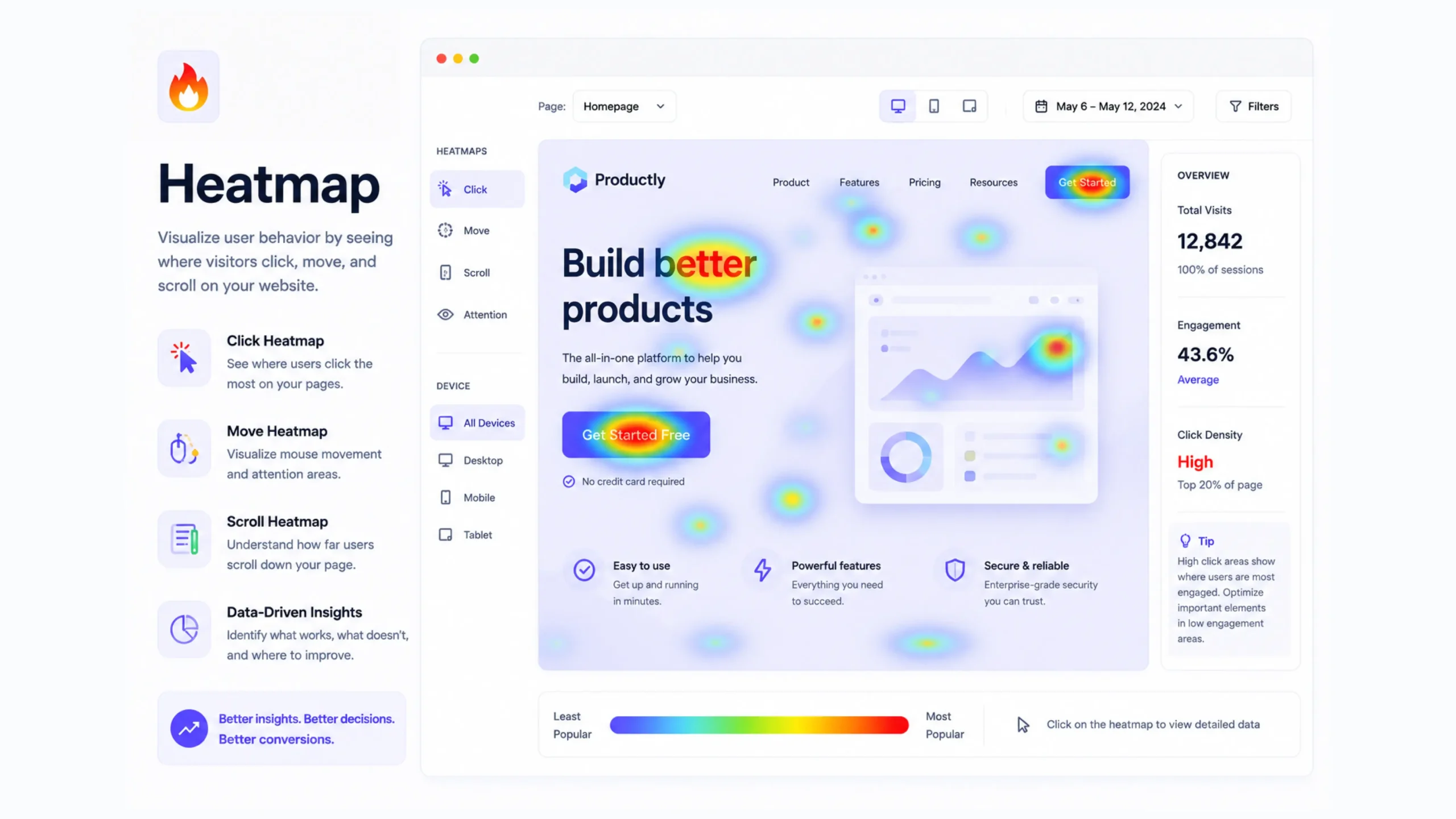
A heatmap is a visual representation of user behavior on a website or application. It uses colors to highlight areas that receive the most attention and interaction from visitors.
Think of it like a weather map. Hot areas appear in warm colors such as red, orange, or yellow, showing high activity. Cooler areas appear in blue or green, indicating less activity.
Instead of tracking temperature, though, a heatmap tracks user actions.
Website owners, UX designers, marketers, and product teams use heatmaps to understand what visitors are doing after they arrive on a page. Rather than guessing why users click certain buttons or ignore specific sections, a heatmap provides visual evidence.
It’s one of those tools that can instantly make user behavior easier to understand.
Why Are Heatmaps Important?
Analytics tools can tell you what happened.
Heatmaps help explain why it happened.
Imagine seeing that a landing page has a low conversion rate. Traditional analytics may show visitors leaving the page, but they won’t always reveal what captured their attention or what distracted them.
A heatmap fills in those gaps.
It helps answer questions such as:
- What elements attract the most clicks?
- How far do users scroll?
- Which buttons are ignored?
- Are visitors noticing important content?
- Is a page layout working as intended?
These insights often lead to smarter design decisions and better user experiences.
How Do Heatmaps Work?
Heatmap software collects behavioral data from website visitors and translates that information into visual patterns.
As users interact with a page, the tool records actions such as:
- Mouse movements
- Clicks
- Taps
- Scrolling behavior
- Hover activity
The collected data is then layered over the webpage using color intensity.
Areas receiving more engagement appear warmer. Less active areas appear cooler.
The result is a visual snapshot of how visitors interact with content.
Different Types of Heatmaps
Not all heatmaps track the same behavior.
Each type provides a different perspective.
Click Heatmaps
Click heatmaps show where visitors click most frequently.
These are particularly useful for identifying:
- Popular buttons
- Frequently clicked images
- Navigation usage
- Unexpected click behavior
Sometimes users click on elements that aren’t actually clickable. That can reveal design issues that might otherwise go unnoticed.
Scroll Heatmaps
Scroll heatmaps show how far visitors move down a page.
This information helps answer an important question:
Are users actually seeing your content?
Many websites place important calls-to-action near the bottom of a page. A scroll heatmap may reveal that most visitors never reach that section.
That’s a valuable discovery.
Move Heatmaps
Move heatmaps track cursor movement.
While mouse movement doesn’t perfectly match eye tracking, it often provides clues about where visitors focus their attention.
Designers frequently use this data to understand content engagement and page layout effectiveness.
Attention Heatmaps
Attention heatmaps combine several engagement signals to highlight areas receiving the most visitor focus.
These visualizations help teams identify which content sections attract the highest levels of interaction.
Mobile Heatmaps
Mobile users behave differently from desktop users.
Mobile heatmaps track taps, scrolling patterns, and touch interactions across smartphones and tablets.
As mobile traffic continues growing, these insights have become increasingly valuable.
The Story Colors Tell
At first glance, a heatmap looks like a colorful overlay.
Look closer, and it starts telling a story.
A bright red call-to-action button suggests strong engagement.
A cold blue section may indicate content visitors ignore.
Sometimes the findings are surprising.
A company may spend weeks perfecting a section that users barely notice. Meanwhile, a small image or headline receives most of the attention.
You know what? That’s why heatmaps are so popular among UX teams. They replace assumptions with actual user behavior.
Heatmaps and User Experience Design
User experience design often involves observation.
Heatmaps provide a way to observe thousands of users simultaneously.
Designers use them to:
- Improve page layouts
- Test navigation structures
- Refine content placement
- Identify usability problems
- Increase engagement
Think of a website as a retail store.
Store owners pay attention to which aisles attract customers and which shelves remain untouched.
Heatmaps offer similar visibility in a digital environment.
How Heatmaps Help Conversion Rate Optimization
Conversion Rate Optimization, often called CRO, relies heavily on user behavior data.
Heatmaps reveal friction points that may reduce conversions.
For example:
- Visitors ignore a signup form.
- A purchase button receives few clicks.
- Important content appears too far down the page.
- Users repeatedly click non-clickable elements.
These findings can guide improvements that increase leads, signups, sales, or inquiries.
Small design adjustments sometimes produce surprisingly large results.
Popular Heatmap Tools
Several analytics platforms offer heatmap functionality.
Some widely used options include:
- Hotjar
- Microsoft Clarity
- Crazy Egg
- Mouseflow
- Lucky Orange
- FullStory
Each platform provides slightly different features, though most focus on visualizing visitor interactions.
Many businesses combine heatmaps with traditional analytics tools such as Google Analytics for a fuller picture.
Common Heatmap Use Cases
Heatmaps can support many different goals.
Landing Page Optimization
Identify which sections attract attention and which sections are ignored.
Ecommerce Improvements
Understand product page engagement and purchasing behavior.
Content Analysis
See which articles, images, and content blocks receive the most interaction.
Navigation Testing
Discover how users move through menus and navigation systems.
Form Optimization
Find fields that cause friction or abandonment.
Mobile Experience Reviews
Understand how mobile visitors interact with content and interface elements.
Limitations of Heatmaps
Heatmaps are powerful, but they aren’t perfect.
A heatmap shows behavior, not motivation.
For example, a visitor may repeatedly click an element because they love it—or because they’re confused by it.
The visual data alone won’t always explain intent.
That’s why many UX researchers combine heatmaps with:
- Session recordings
- User interviews
- Surveys
- Analytics reports
- A/B testing
Together, these methods create a more complete picture.
Common Heatmap Mistakes
Teams sometimes misinterpret heatmap data.
Here are a few common mistakes:
Looking at Small Data Samples
A heatmap based on a handful of visitors may produce misleading conclusions.
Ignoring Context
High engagement isn’t always positive.
Repeated clicks can indicate frustration rather than interest.
Focusing Only on Clicks
Scroll behavior, movement patterns, and attention data often reveal equally important insights.
Making Immediate Changes
Heatmaps should guide investigation, not replace thoughtful analysis.
Good decisions come from multiple data sources.
Heatmaps and Modern Product Design
Today’s digital products generate enormous amounts of behavioral data.
Heatmaps help simplify that information into something visually understandable.
Designers, marketers, SaaS companies, ecommerce brands, and startups regularly use heatmaps to improve customer experiences.
The reason is simple.
People don’t always behave the way teams expect them to.
Heatmaps help reveal what users actually do.
And that’s often where the most valuable lessons appear.
Final Thoughts
A heatmap is a visual analytics tool that reveals how users interact with websites and applications through color-coded behavior patterns. By showing where visitors click, scroll, hover, and engage, heatmaps help businesses understand user behavior more clearly.
They don’t replace analytics, user research, or testing methods. Instead, they complement them by adding a visual layer of insight.
For designers, marketers, and business owners, heatmaps often uncover hidden opportunities—areas where user experience can improve, conversions can increase, and content can perform better.
Sometimes the most valuable website improvements come from simply watching where people pay attention.
Frequently Asked Questions (FAQs)
1. What is a heatmap in web analytics?
A heatmap is a visual tool that uses colors to display user interactions such as clicks, scrolling, taps, and mouse movements on a webpage.
2. Why are heatmaps useful?
Heatmaps help businesses understand visitor behavior, identify usability issues, and improve website performance through data-driven decisions.
3. What are the different types of heatmaps?
Common types include click heatmaps, scroll heatmaps, move heatmaps, attention heatmaps, and mobile heatmaps.
4. Do heatmaps improve conversion rates?
Heatmaps can reveal friction points and engagement patterns that help businesses improve conversions through better design and content placement.
5. Are heatmaps accurate?
Heatmaps provide valuable behavioral insights, though they should be used alongside analytics, user testing, and other research methods for deeper understanding.
6. Which heatmap tools are popular?
Popular heatmap platforms include Hotjar, Microsoft Clarity, Crazy Egg, Mouseflow, Lucky Orange, and FullStory.