


Imagine walking into a house that looks beautiful from the outside.
Fresh paint.
Stylish furniture.
Modern lighting.
Everything seems perfect.
Then you notice the bathroom door opens into a cabinet, the light switches are hidden behind furniture, and the kitchen drawers block each other from opening.
The house works, technically.
Yet something feels off.
Digital products often suffer from similar problems.
That’s where Heuristic Evaluation comes in.
Heuristic Evaluation is a usability inspection method where usability experts review a product, website, application, or interface against a set of recognized usability principles. These principles, often called heuristics, act as guidelines for identifying design issues that could create confusion, frustration, or inefficiency for users.
Unlike usability testing, which involves observing real users, heuristic evaluation relies on trained evaluators who systematically examine the interface and identify potential problems before users encounter them.
Think of it as a professional health check for a digital product.
The goal is simple:
Find usability issues early and fix them before they become expensive problems.
Why Heuristic Evaluation Matters
Many usability problems are surprisingly easy to predict.
A confusing menu label.
An unclear error message.
A missing confirmation after an action.
An inconsistent navigation pattern.
Experienced UX professionals can often spot these issues without conducting a full research study.
That’s exactly why heuristic evaluation became popular.
It provides a relatively quick way to identify usability concerns before investing heavily in development, testing, or launch activities.
A small issue discovered early might save hundreds of support tickets later.
Sometimes even thousands.
A Brief History of Heuristic Evaluation
The method gained widespread recognition through usability expert Jakob Nielsen during the early 1990s.
Nielsen proposed a set of usability principles that could help evaluators assess interfaces consistently.
These principles weren’t strict rules.
Instead, they served as practical guidelines derived from years of observing how people interact with technology.
Decades later, many UX teams still use these same principles.
Technology has changed dramatically.
Human behavior hasn’t changed nearly as much.
People still want products that are clear, predictable, and easy to use.
Looking Beyond Visual Design
Here’s something interesting.
A product can look amazing and still perform poorly during a heuristic review.
Why?
Because visual appeal and usability are not the same thing.
A beautifully designed interface might contain:
- Confusing terminology
- Missing feedback
- Inconsistent interactions
- Unclear navigation
- Poor error handling
Users may admire the design while struggling to complete tasks.
Heuristic Evaluation helps uncover those hidden friction points.
How Heuristic Evaluation Works
The process is relatively straightforward.
One or more evaluators independently inspect an interface.
They compare the product against established usability principles and document any violations.
Each evaluator reviews:
- Navigation
- Workflows
- Forms
- Error messages
- Content structure
- User feedback mechanisms
- Interface consistency
Afterward, findings are consolidated into a report.
Patterns emerge.
Repeated concerns usually indicate higher-priority issues.
The process sounds simple.
Doing it well requires experience and a strong understanding of usability principles.
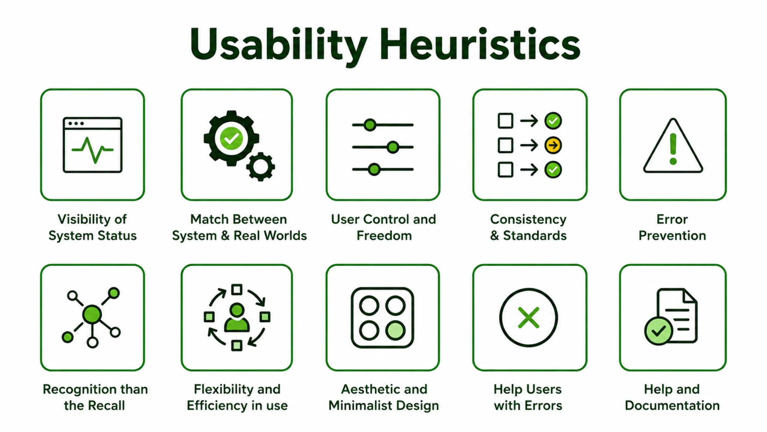
Jakob Nielsen’s 10 Usability Heuristics
These ten principles form the foundation of most heuristic evaluations.
1. Visibility of System Status
Users should always know what’s happening.
Loading indicators, confirmations, and progress updates help reduce uncertainty.
Nobody enjoys clicking a button and wondering if anything happened.
2. Match Between System and the Real World
Interfaces should use language people naturally understand.
Technical jargon often creates unnecessary confusion.
Good products speak the user’s language.
3. User Control and Freedom
People make mistakes.
They should be able to undo actions, cancel processes, and recover easily.
Think of the “Undo” feature in document editors.
Simple. Powerful.
4. Consistency and Standards
Similar actions should behave similarly.
Consistency reduces learning effort and builds confidence.
5. Error Prevention
Preventing mistakes is usually better than displaying error messages afterward.
Well-designed forms are a good example.
6. Recognition Rather Than Recall
Users shouldn’t have to remember information from one screen to another.
Helpful cues reduce mental effort.
7. Flexibility and Efficiency of Use
Experienced users often appreciate shortcuts and faster workflows.
Beginners need simplicity.
Good interfaces support both groups.
8. Aesthetic and Minimalist Design
Every element should have a purpose.
Extra information can compete with important information.
9. Help Users Recognize, Diagnose, and Recover from Errors
Error messages should explain what went wrong and how to fix it.
Messages like “Error 504” rarely help anyone.
10. Help and Documentation
Sometimes users need assistance.
Accessible help content can make a significant difference.
When Should You Conduct a Heuristic Evaluation?
One of the biggest advantages of heuristic evaluation is flexibility.
It can be performed during various stages of product development.
During Early Design
Wireframes and prototypes can be reviewed before development begins.
During Development
Evaluations help identify usability concerns before launch.
Before Product Releases
A final review often uncovers overlooked issues.
During Product Audits
Organizations frequently evaluate mature products to identify improvement opportunities.
During Redesign Projects
Existing interfaces can be reviewed before major changes occur.
The earlier problems are identified, the easier they are to fix.
Benefits of Heuristic Evaluation
Many UX teams appreciate heuristic evaluation because it offers practical value without requiring large research budgets.
Fast Results
Evaluators can identify many issues within days rather than weeks.
Cost Efficiency
The method requires fewer resources than large-scale usability studies.
Early Feedback
Design flaws can be identified before coding begins.
Expert Insights
Experienced evaluators bring years of usability knowledge into the review process.
Better Prioritization
Severity ratings help teams focus on the most impactful problems first.
For many organizations, this combination makes heuristic evaluation extremely attractive.
Heuristic Evaluation vs Usability Testing
These methods are related but different.
Heuristic Evaluation
Experts inspect the interface.
The focus is on usability principles.
Usability Testing
Real users perform tasks.
The focus is on actual behavior.
A useful analogy might help.
Heuristic Evaluation is like having a mechanic inspect a car.
Usability Testing is like watching people drive it.
Both provide valuable insights.
Many UX teams use both methods together.
The Step-by-Step Evaluation Process
A structured approach generally produces better results.
Step 1: Define Goals
Identify which areas of the product require review.
Step 2: Select Evaluators
Multiple evaluators often uncover more issues than one evaluator working alone.
Step 3: Conduct Independent Reviews
Evaluators inspect the interface separately.
Independent reviews reduce bias.
Step 4: Document Findings
Each issue is recorded with supporting details.
Step 5: Assign Severity Ratings
Problems are prioritized based on impact.
Step 6: Consolidate Results
Findings are combined into a comprehensive report.
Step 7: Recommend Improvements
Teams receive actionable recommendations.
Common Problems Discovered During Evaluations
Certain usability issues appear repeatedly across products.
Poor Navigation
Users struggle to find important information.
Confusing Labels
Menu names fail to match user expectations.
Weak Error Messages
Users receive little guidance after mistakes.
Inconsistent Design Patterns
Buttons behave differently across screens.
Missing Feedback
Users are unsure whether actions succeeded.
Overloaded Interfaces
Too much information competes for attention.
These issues may seem small individually.
Together, they can significantly affect user experience.
Understanding Severity Ratings
Not every usability issue deserves equal attention.
Evaluators often assign severity ratings to prioritize work.
Cosmetic Issues
Minor concerns with limited impact.
Low Severity Issues
Problems that create slight inconvenience.
Medium Severity Issues
Issues that noticeably affect usability.
High Severity Issues
Problems that interfere with important tasks.
Critical Issues
Barriers that prevent task completion entirely.
Severity ratings help product teams focus their efforts effectively.
Real-World Example
Imagine an online insurance platform.
Users repeatedly abandon the quote process.
A heuristic evaluation uncovers several issues.
The form uses unfamiliar terminology.
Error messages provide little guidance.
Progress indicators are missing.
Required fields are unclear.
None of these problems are catastrophic on their own.
Together, they create friction.
After improvements are made, completion rates increase significantly.
This type of outcome is surprisingly common.
Popular Tools Used During Evaluations
Heuristic Evaluation itself does not require specialized software.
Evaluators often use tools such as:
- Figma
- Miro
- Notion
- Jira
- Confluence
- FigJam
- Google Sheets
The framework matters more than the tool.
Strong analysis produces strong results regardless of platform.
Limitations of Heuristic Evaluation
No research method is perfect.
Heuristic Evaluation has limitations.
It Relies on Expertise
The quality of findings depends heavily on evaluator experience.
It Doesn’t Replace User Feedback
Experts can predict many issues, though real users may reveal unexpected problems.
Subjectivity Exists
Different evaluators may interpret issues differently.
Context Can Be Missing
Real-world user motivations are not always visible during inspections.
This is why heuristic evaluation often complements other research methods rather than replacing them.
Why Heuristic Evaluation Still Matters
Digital products have become increasingly sophisticated.
Artificial intelligence, voice interfaces, augmented reality, and advanced personalization continue to change how people interact with technology.
Yet many usability problems remain remarkably familiar.
People still get confused by unclear labels.
They still appreciate immediate feedback.
They still prefer interfaces that feel predictable and easy to understand.
That’s why heuristic evaluation remains valuable decades after its introduction.
It offers a structured way to assess usability, identify friction, and improve experiences before problems reach real users.
For UX designers, product managers, researchers, developers, and business stakeholders, it remains one of the most practical methods for evaluating interface quality.
Sometimes the fastest way to improve a product is simply to look at it through the lens of proven usability principles.
That’s exactly what heuristic evaluation provides.
Frequently Asked Questions (FAQs)
1. What is heuristic evaluation in UX?
Heuristic Evaluation is a usability inspection method where experts review a product or interface against established usability principles to identify potential usability problems.
2. Who created heuristic evaluation?
The method became widely known through usability expert Jakob Nielsen, who introduced a set of ten usability heuristics that are still widely used today.
3. How is heuristic evaluation different from usability testing?
Heuristic Evaluation relies on expert reviewers, while usability testing involves observing real users completing tasks. Both methods serve different purposes and are often used together.
4. How many evaluators are recommended for a heuristic evaluation?
Many UX professionals recommend three to five evaluators. Multiple reviewers typically identify more usability issues than a single evaluator.
5. What are usability heuristics?
Usability heuristics are recognized principles used to evaluate interface quality. Examples include visibility of system status, consistency, error prevention, and user control.
6. When should heuristic evaluation be conducted?
It can be performed during wireframing, prototyping, development, redesign projects, pre-launch reviews, and ongoing product improvement efforts.