


What Are Responsive Breakpoints?
Responsive breakpoints are predefined screen widths where a website or application changes its layout, styling, or content presentation to better fit a device’s screen size.
Think about opening the same website on:
- A smartphone
- A tablet
- A laptop
- A desktop monitor
- A large 4K display
The content remains the same, yet the layout often changes dramatically.
Navigation menus collapse.
Columns stack.
Images resize.
Buttons shift position.
Those changes usually happen at responsive breakpoints.
In simple terms, breakpoints act like decision points that tell a website when to adapt its design.
Why Responsive Breakpoints Matter
People no longer browse the web using a single device.
Someone might start reading an article on a phone during breakfast, continue on a tablet in the afternoon, and finish on a laptop at night.
A fixed-width website would struggle in these situations.
Text might become unreadable.
Buttons could become difficult to tap.
Images might overflow the screen.
Responsive breakpoints solve these issues by helping interfaces adjust automatically.
The result feels smoother and more natural.
Users often don’t notice responsive design when it’s done well.
They only notice when it’s missing.
A Simple Everyday Analogy
Imagine a dining table that automatically expands when more guests arrive.
The table serves the same purpose.
It simply adjusts to fit the situation.
Responsive breakpoints work in a similar way.
The website remains the same product, but its layout adapts to available screen space.
How Responsive Breakpoints Work
Breakpoints are usually implemented through CSS media queries.
Developers define screen widths where styling changes occur.
For example:
@media (max-width: 768px) {
  .container {
    flex-direction: column;
  }
}
In this example, the layout switches from horizontal to vertical once the screen width reaches a specific size.
The browser continuously checks screen dimensions and applies appropriate styles.
Everything happens instantly.
Users rarely notice the transition.
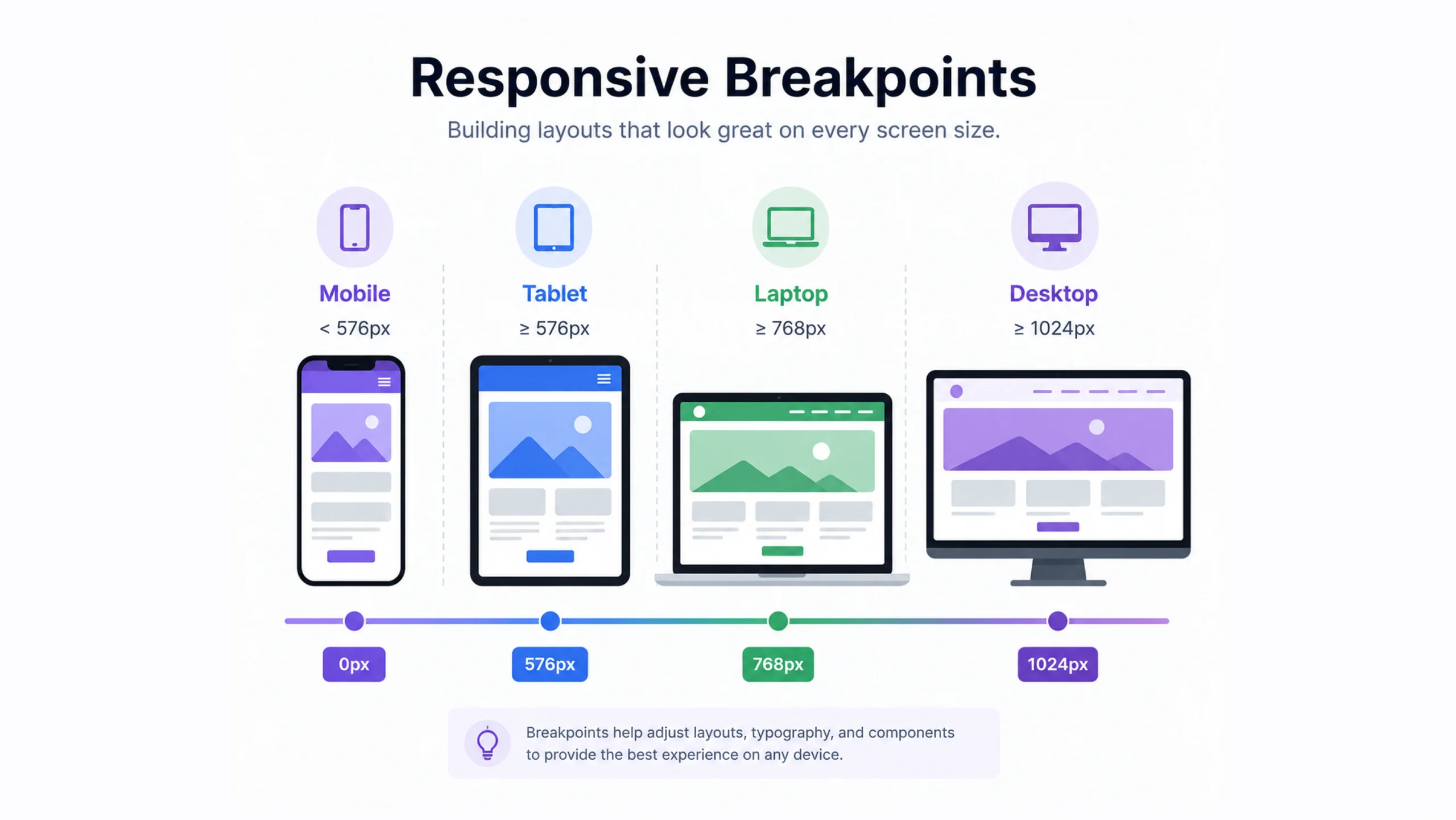
Common Responsive Breakpoint Sizes
There isn’t a single universal standard.
Different teams use different systems.
Still, several breakpoint ranges appear frequently.
| Device Type | Common Width |
|---|---|
| Mobile Small | 320px – 480px |
| Mobile Large | 481px – 767px |
| Tablet | 768px – 1023px |
| Laptop | 1024px – 1279px |
| Desktop | 1280px – 1439px |
| Large Screens | 1440px+ |
These values serve as guidelines rather than strict rules.
Modern design teams often adjust breakpoints based on content needs rather than device categories.
Content Should Drive Breakpoints
Here’s something many beginners discover later.
Breakpoints shouldn’t exist simply because a device exists.
They should exist because the content needs them.
For example:
A three-column layout may look perfect at 1200 pixels.
At 900 pixels it becomes cramped.
At 700 pixels it becomes difficult to read.
The breakpoint should occur where usability starts to suffer.
Not where a device category begins.
This subtle difference often leads to better responsive designs.
Mobile-First Design and Breakpoints
Many modern teams follow a mobile-first approach.
This means designers start with the smallest screen size and gradually add styles for larger screens.
Why?
Mobile devices often present the greatest constraints.
Limited space forces teams to focus on priorities.
Once the core experience works on mobile, expanding it becomes easier.
A typical mobile-first workflow might look like:
- Design for phones.
- Add tablet enhancements.
- Expand for laptops.
- Refine for large screens.
Many frameworks support this approach naturally.
Desktop-First Design
Desktop-first design takes the opposite path.
The experience starts with larger screens and scales downward.
This method was common years ago when desktop traffic dominated.
It still appears in some enterprise environments.
The challenge is that shrinking a complex desktop layout often creates usability problems.
That’s one reason mobile-first strategies have gained popularity.
Responsive Breakpoints in Popular Frameworks
Modern frontend frameworks include predefined breakpoint systems.
Tailwind CSS
Tailwind provides default breakpoints such as:
- sm
- md
- lg
- xl
- 2xl
Developers can customize them as needed.
Bootstrap
Bootstrap includes responsive grid breakpoints for:
- Small devices
- Medium devices
- Large devices
- Extra-large devices
Material Design
Google’s Material Design system uses responsive layouts and breakpoint recommendations to support multiple screen sizes.
These systems help teams maintain consistency across projects.
Benefits of Responsive Breakpoints
Better User Experience
Users can interact comfortably regardless of device.
Improved Readability
Text remains easy to read across screen sizes.
Better Navigation
Menus and controls adapt to available space.
Higher Engagement
Visitors tend to stay longer when websites are easier to use.
Future Flexibility
Responsive systems adapt more easily to new devices.
That’s becoming increasingly valuable as screen sizes continue to diversify.
Common Breakpoint Mistakes
Even experienced teams occasionally make mistakes.
Using Too Many Breakpoints
Adding dozens of breakpoints can create unnecessary complexity.
More isn’t always better.
Designing Only for Popular Devices
Popular devices change constantly.
Designing around specific screen models can quickly become outdated.
Ignoring Real Content
Some layouts appear perfect with placeholder text but break when real content is added.
Testing realistic content is important.
Forgetting Landscape Orientation
Phones and tablets often rotate.
Layouts should work in both portrait and landscape modes.
Responsive Design Is More Than Screen Width
Many people think responsive design begins and ends with breakpoints.
That’s only part of the picture.
Modern responsive experiences also consider:
- Screen density
- Input methods
- Device orientation
- User preferences
- Accessibility settings
For example, a user may increase browser zoom levels or enlarge text.
A truly responsive experience accommodates these adjustments gracefully.
Responsive Breakpoints and UX Design
Responsive breakpoints play a major role in user experience design.
UX designers frequently test layouts at multiple screen sizes to evaluate:
- Readability
- Navigation
- Touch targets
- Information hierarchy
- Task completion
A beautiful desktop interface can become frustrating on mobile if responsiveness isn’t considered early.
That’s why responsive thinking usually begins during wireframing rather than after development.
The Future of Responsive Breakpoints
Screen technology continues to evolve.
Foldable phones, ultra-wide monitors, smart TVs, car displays, and wearable devices introduce new challenges.
Modern CSS features such as container queries are changing how responsiveness works.
Instead of responding only to screen width, components can respond to the size of their parent container.
This gives designers even greater flexibility.
Responsive design continues to evolve, though its core goal remains unchanged:
Create experiences that work well wherever people use them.
Final Thoughts
Responsive breakpoints are one of the foundations of modern web design.
They allow websites and applications to adapt gracefully across phones, tablets, laptops, and large displays.
Good breakpoints improve usability, readability, navigation, and overall user satisfaction.
The most successful responsive experiences focus less on devices and more on content, context, and user needs.
As digital products continue appearing on new types of screens, responsive breakpoints will remain a critical part of creating accessible and user-friendly experiences.
Frequently Asked Questions (FAQs)
1. What are responsive breakpoints?
Responsive breakpoints are predefined screen widths where a website adjusts its layout and styling for different devices.
2. Why are responsive breakpoints important?
They help websites remain usable, readable, and visually appealing across various screen sizes.
3. What is the most common mobile breakpoint?
Many projects use breakpoints around 768px for transitioning between mobile and tablet layouts.
4. Are responsive breakpoints still relevant today?
Yes. Responsive breakpoints remain a key part of modern web design and development.
5. What is a mobile-first breakpoint strategy?
A mobile-first strategy starts with small-screen designs and progressively adds styles for larger screens.
6. What’s the difference between breakpoints and media queries?
A breakpoint is the screen width threshold, while a media query is the CSS rule used to apply styling changes at that threshold.