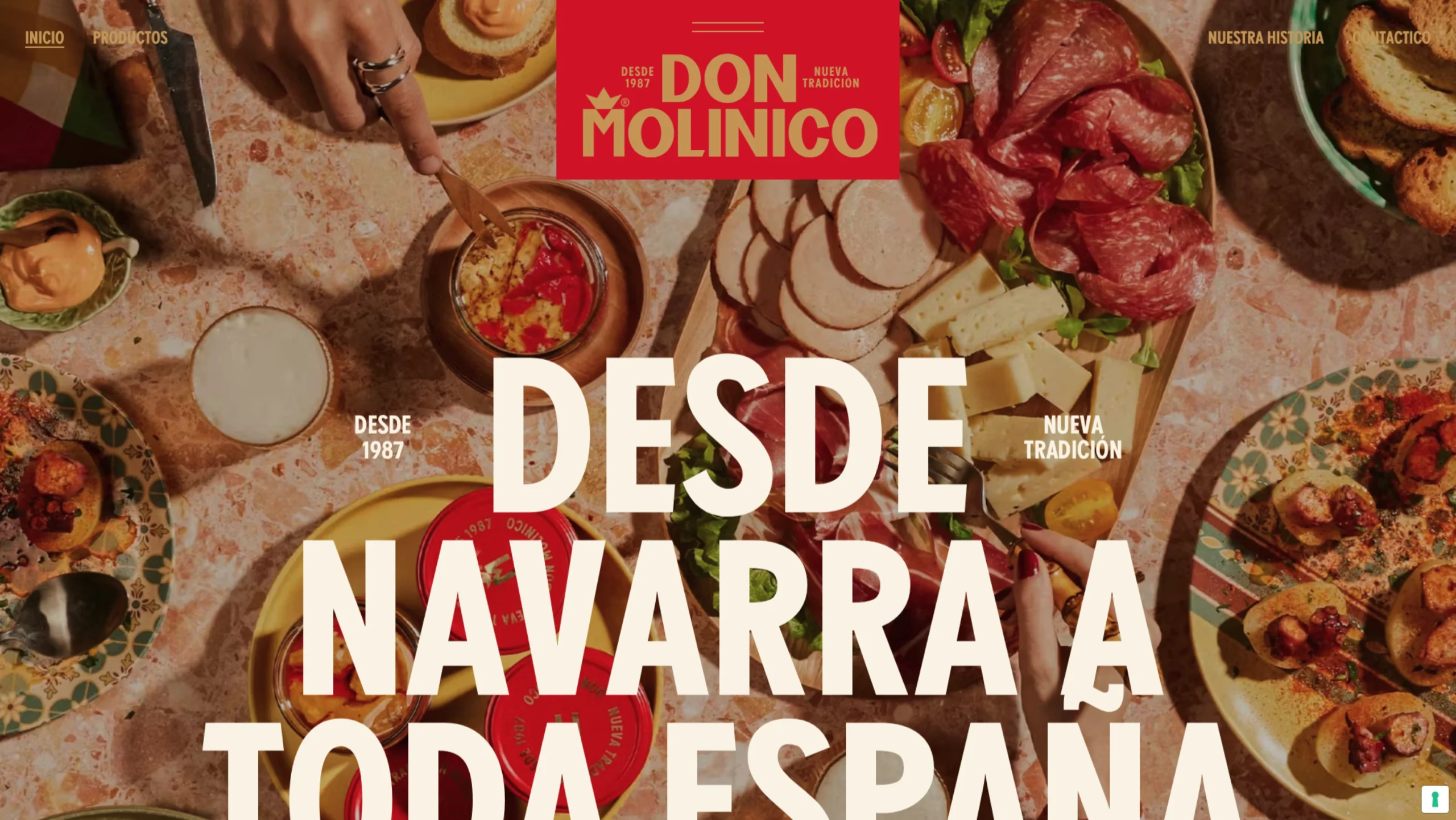
Don Molinico is an authentic Spanish food brand deeply rooted in the culinary heritage of the Navarre region.
Founded in 1987 by Jesús Mari, the company has long brought traditional, ready-to-eat local delicacies—most famously its premium pimientos del piquillo rellenos (stuffed piquillo peppers)—straight to Spanish tables without sacrificing time-honoured quality.
To capture a modern market, the brand rolled out a massive strategic repositioning. Their digital storefront serves as a stunning showcase of how legacy agricultural roots can be elevated into a premium, world-class design identity.
The Rebranding & Visual Identity
Developed in collaboration with the renowned creative agency AUGE Design, the site’s brand architecture beautifully bridges classic heritage with premium contemporary design:
- The “New Tradition” Framework: The entire experience is framed around an ironic and charming brand philosophy: “We don’t have a grandmother, but we have her recipe.”
- Navarre-Inspired Color Systems: The primary interface relies heavily on a bold, rich red paying homage to the traditional colors of Navarra, paired elegantly with a premium gold tone that symbolizes modern innovation and culinary excellence.
- Award-Winning Packaging Alignment: The clean, striking graphic layout mimics the physical packaging choices that earned the brand widespread industry acclaim, including a Bronze title at the Pentawards and First Place at The Dieline Awards.