Explore Robert Licau’s Framer portfolio, featuring refined product design, thoughtful UX, polished interfaces, and a clear visual approach to turning complex digital products into intuitive experiences.
Robert Licau — A Product Designer Portfolio That Turns Complexity Into Clarity
RobertLicau.com is the kind of portfolio that understands an important principle of product design: the portfolio itself is a product.
Rather than trying to impress visitors with excessive animation, decorative effects, or a long list of credentials, Robert Licau’s website builds its identity around clarity, restraint, strong typography, carefully presented work, and a very deliberate dark visual language.
For UIUXshowcase, this is exactly the kind of portfolio worth featuring. It feels designed by someone who understands that good product design is not simply about making interfaces attractive; it is about making complexity easier to understand.
First Impression: Quiet, Confident and Extremely Focused
The first thing that stands out is the website’s restraint.
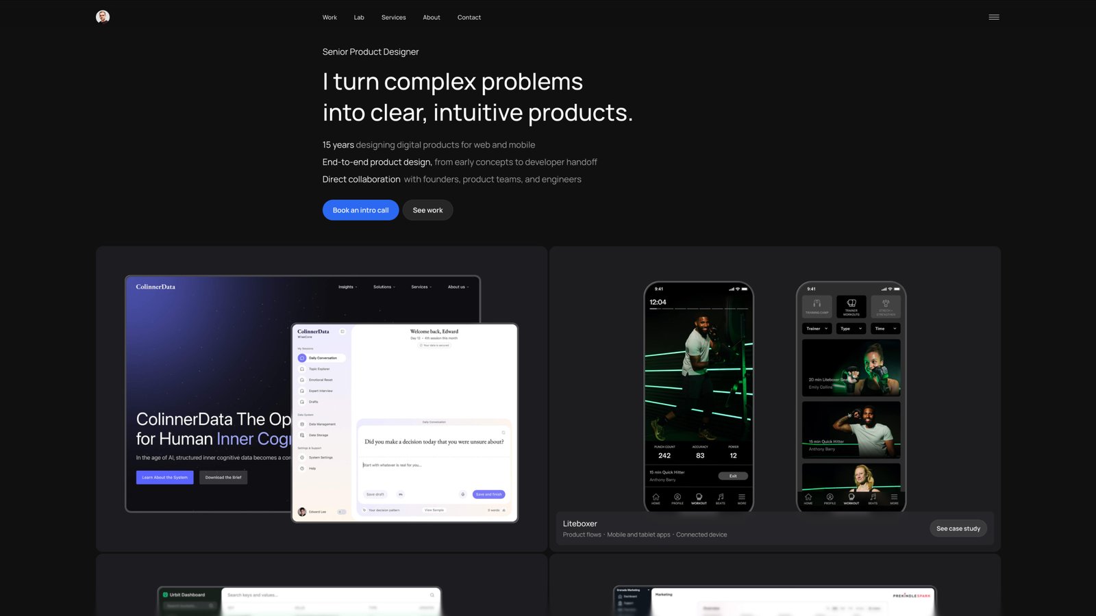
The interface uses a predominantly black and charcoal canvas, allowing the work itself to provide most of the visual energy. Instead of filling the screen with gradients, oversized illustrations, or unnecessary motion, Robert lets typography, spacing, and product imagery do the heavy lifting.
The opening statement is direct:
“I turn complex problems into clear, intuitive products.”
It is a simple sentence, but it establishes the portfolio’s entire design philosophy.
The supporting information quickly answers three practical questions:
- How much experience does Robert have?
- What kind of product work does he do?
- How does he collaborate with teams?
The homepage describes 15 years of designing digital products across web and mobile, end-to-end product design from early concepts through developer handoff, and direct collaboration with founders, product teams, and engineers.
That is good portfolio communication. There is very little ambiguity about who the designer is and what someone can expect from working with him.
The Portfolio Doesn’t Shout — It Curates
One of the strongest decisions on the website is the way the work is presented.
Instead of treating the portfolio as an enormous gallery of disconnected screenshots, Robert creates a hierarchy between selected product work and visual explorations.
The featured work includes projects such as ColinnerData, Liteboxer, Urbit Apps and Prekindle, with concise descriptions that immediately communicate the type of product involved.
That distinction matters.
A designer’s portfolio can easily become a wall of beautiful UI screens. Robert avoids that trap by giving the important projects enough context while allowing the visual explorations to function more like a secondary archive.
It makes the site feel less like a Dribbble profile and more like the portfolio of someone who actually works on products.
A Strong Visual System Runs Through the Entire Experience
The website’s visual consistency is one of its most successful qualities.
There is a recognizable system built around:
- Deep black backgrounds
- Charcoal content surfaces
- Thin borders
- Generous spacing
- White and muted typography
- Carefully controlled blue and purple accents
- Rounded interface containers
- Large product imagery
- Minimal navigation
- Strong typographic hierarchy
The dark background is not simply being used because dark interfaces are fashionable. It creates a neutral stage for the product screens.
This becomes especially effective when colorful interfaces appear inside the portfolio cards. The products become the visual focal point while the surrounding interface stays deliberately quiet.
That is a subtle but important distinction.
The portfolio doesn’t compete with the work. It frames the work.
Typography Does a Lot of the Heavy Lifting
There is also a strong editorial quality to the typography.
Large headings establish hierarchy without relying on oversized graphic treatments. Supporting copy remains relatively compact, while section headings create clear pauses as users move through the page.
This gives the portfolio a rhythm that feels closer to an editorial publication than a conventional designer portfolio.
The result is particularly effective because the site contains a lot of information: projects, testimonials, background, services, pricing, and contact information.
Yet the information doesn’t feel dumped onto the page.
It is segmented.
That distinction between having a lot of information and making information feel overwhelming is something product designers deal with every day. Robert’s portfolio demonstrates that principle at the website level.
The Work Is Allowed to Speak
The project presentation is another reason this portfolio deserves attention.
The ColinnerData work, for example, is presented through a combination of product interface imagery, product context, and narrative. The project explores an AI conversation experience designed around capturing and organizing personal knowledge, with the interface spanning conversation, data management and dashboard experiences.
What works particularly well is the relationship between the explanatory content and the visuals.
The interface screenshots aren’t simply there as decoration. They help explain the product.
That is an important difference.
A portfolio image can show that someone knows how to make a beautiful dashboard. A well-presented product can show that the designer understands why the dashboard exists in the first place.
Robert’s site repeatedly leans toward the second approach.
From AI Conversations to Structured Data
The ColinnerData presentation is particularly interesting from a visual storytelling perspective.
The work moves between different levels of abstraction: AI conversations, saved knowledge, dashboards, records, data visualization, and the broader product story.
The visual language reflects that movement.
Conversation interfaces are given more breathing room and a calmer editorial quality, while information-heavy dashboard views become denser and more structured.
That creates a useful visual distinction between:
thinking → contributing → organizing → reviewing
The product itself deals with personal knowledge and AI-assisted conversations, so the portfolio’s presentation needs to communicate both the human and the structured sides of the experience. Robert’s design approach makes that transition visually understandable.
The Homepage Understands the Business Side of Portfolio Design
Perhaps one of the most mature aspects of the website is that it doesn’t stop at showcasing design work.
Eventually, the portfolio answers the question every prospective client is asking:
“How can we work together?”
Robert presents clearly defined services including:
Focused UX Review
A fixed-fee review focused on one key product flow.
Product Design Project
A broader engagement covering user flows, detailed UI, prototypes, reusable components, and developer handoff.
Ongoing Product Design
An ongoing design engagement positioned as senior design support for product teams.
The homepage even communicates starting prices and scope for these offerings.
This is an unusually useful decision for a designer portfolio.
Instead of forcing a potential client to send an email just to discover whether there is a commercial fit, the site gives visitors enough information to self-qualify.
It makes the portfolio function as both a body of work and a business interface.
Testimonials Are Used as Evidence, Not Decoration
The testimonial section also feels carefully considered.
Rather than presenting short generic statements such as “Great designer!” or “Amazing work!”, the website includes longer comments from founders and product leaders describing specific qualities: collaboration, organization, product thinking, visual direction, and responsiveness.
One testimonial describes Robert as someone who could take a messy product vision and turn it into an organized UX/UI flow. Another discusses redesigning a marketing dashboard and establishing a clearer visual and navigation direction.
This is valuable because the testimonials reinforce the positioning established at the top of the page.
The headline says Robert turns complexity into clarity.
The work demonstrates it.
The testimonials provide external evidence for it.
That is a well-constructed communication loop.
About: Building Trust Without Overexplaining
The About section is another strong part of the portfolio.
Instead of relying on a traditional biography, Robert talks about the types of products he has worked on, his experience building businesses, his collaboration with founders and engineers, and his involvement from early product discussions through developer handoff.
The supporting statistics then make the information scannable:
15+ years
In product design
13+ years
Working with US product teams
Designer + founder
Experience building products and businesses
Web + mobile
Across consumer and business products
This is a good example of progressive disclosure.
The paragraph provides context for people who want to read.
The statistics provide a quick summary for people who want to scan.
The Portfolio Feels Like a Product Designer Designed It
There is something particularly satisfying about seeing a product designer apply product thinking to their own website.
Navigation is simple.
The content hierarchy is deliberate.
Projects are categorized.
Social proof appears at the appropriate stage.
Services have defined scopes.
Pricing is visible.
The contact path is obvious.
And the final CTA doesn’t try too hard.
“Let’s talk about your product.”
The website then offers a 30-minute introductory call as the next step.
It is straightforward and friction-conscious.
There is no complicated funnel.
No excessive form.
No distracting pop-up.
Just a clear transition from exploration → confidence → conversation.
The Framer Choice Fits the Design Philosophy
The site is built with Framer, and that choice feels appropriate for the type of portfolio Robert is creating.
The website has the polish expected from a high-end visual portfolio while retaining the feeling of a living product rather than a static presentation.
Framer is particularly well suited to this kind of work because it allows the visual system, responsive layouts, interactions, and content structure to live closely together.
But the more important point is that the technology doesn’t become the headline.
The website doesn’t feel like a demonstration of what Framer can do.
It feels like a portfolio that happens to have been built with Framer.
That distinction is important.
Why We’re Featuring RobertLicau.com
At UIUXshowcase, we look for portfolios that demonstrate more than visual skill.
We look for websites where design decisions communicate the designer’s thinking.
RobertLicau.com does that particularly well.
It demonstrates how a product designer can:
- Build a strong personal visual identity without relying on gimmicks.
- Present complex digital products with clarity.
- Balance UX thinking with polished UI execution.
- Use typography and spacing as primary design tools.
- Create a portfolio that works equally well as a showcase and a business tool.
- Use testimonials to reinforce positioning.
- Make services and pricing understandable.
- Give selected work enough context without turning the homepage into an essay.
- Create a consistent visual language across product screens, editorial content, and marketing sections.
Most importantly, the website practices what it promises.
It talks about turning complex problems into clear, intuitive products — and the portfolio itself follows that principle.
Final Curator’s Note
There are plenty of product designer portfolios that are visually impressive.
Far fewer understand editing.
Robert Licau’s portfolio demonstrates that restraint can be just as powerful as visual experimentation. The dark canvas, carefully controlled typography, product-focused imagery, and structured content create an environment where the work remains the protagonist.
What makes the website particularly memorable is not one isolated visual trick.
It is the consistency of the decisions.
From the opening statement to the project presentation, from testimonials to services, from the About section to the final booking CTA, everything contributes to the same message:
Here is a designer who understands complexity — and knows how to make it easier to navigate.
That clarity, combined with a refined visual system and a strong understanding of how a portfolio should function as a real product, is why RobertLicau.com earns its place in the UIUXshowcase Portfolio collection.