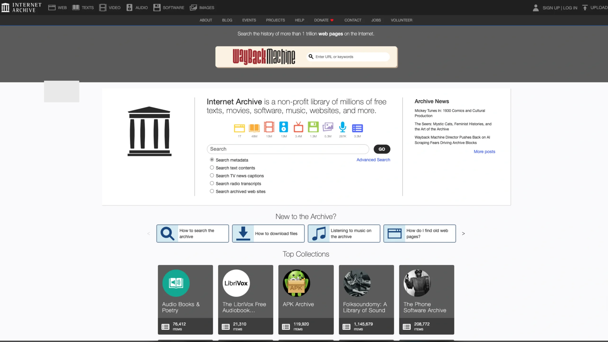
The Internet Archive is a non-profit digital library with a mission to provide “Universal Access to All Knowledge.” Since its founding in 1996, it has grown from a simple web-crawling project into a gargantuan repository hosting over 800 billion web pages, 40 million books, and millions of hours of audio and video.
From a UI/UX perspective, Archive.org represents a unique challenge: How do you design an interface for everything ever created?
Design Highlights for UI/UX Professionals
- Scale-First Navigation: The UX is built around the “Search-First” principle. Because the library is too vast to browse alphabetically, the interface prioritizes a robust, multi-filtered search system that allows users to drill down by media type, year, creator, and language.
- The Wayback Machine UI: This is perhaps the most iconic piece of interface design in web history. Its “Timeline and Calendar” view is a brilliant example of Temporal UX, allowing users to visualize the “snapshots” of a website across decades. It turns abstract data into a navigable journey through time.
- Functional Minimalism: The site intentionally avoids heavy visual trends to ensure longevity and speed. It uses a “Utilitarian” design language—clear headers, standard blue links, and a high-contrast grid. This ensures that the site remains usable on everything from a modern 5K monitor to an older machine in a developing nation.
- The “Book Reader” Interface: Archive.org’s in-browser book reader is a gold standard for digital skeuomorphism. It mimics the physical act of turning a page, providing a tactile feel that makes reading long-form historical documents more immersive and natural.