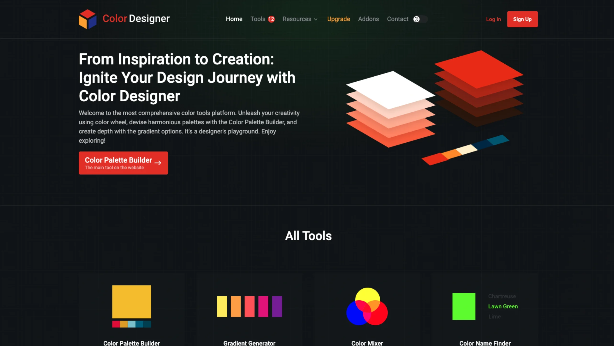
It includes tools for creating harmonious colour schemes, extracting palettes from images, generating gradients, converting colour formats, checking accessibility, and building consistent design systems.
Its intuitive interface makes it a valuable resource for both beginners and experienced designers.
From Inspiration to Creation: Explore the Full Color Toolkit with Color Designer
Choosing the right colors can make or break a design. A great palette can make an interface feel calm, energetic, premium, playful, or trustworthy. But getting there often means jumping between different websites to pick colors, build palettes, check contrast, create gradients, convert formats, and test combinations.
Color Designer brings many of those everyday color tasks together in one place.
Whether you’re designing a website, building a brand identity, developing a mobile app, or simply experimenting with colors, Color Designer offers a collection of practical tools to explore, create, test, and manage color.
And the best part? You don’t need to be a color theory expert to start using it.
What is Color Designer?
Color Designer is an online platform built around one simple idea: make working with color easier.
Instead of using one tool for palettes, another for gradients, another for contrast, and yet another for converting color formats, you can find all of these workflows under one roof.
The platform covers everything from color picking and palette creation to image-based color extraction, contrast checking, color comparison, and format conversion.
Think of it as a color toolbox you can keep open alongside Figma, Photoshop, Framer, Webflow, or your favorite design tool.
It’s particularly useful during those early design moments when you’re still asking questions like:
- What colors should I use?
- Does this blue work with this orange?
- What’s the name of this color?
- Can I pull a palette from this image?
- Will this text have enough contrast?
- How do I convert this HEX value to another color format?
- Can I create a gradient with these colors?
Instead of searching for a separate solution every time, Color Designer gives you a starting point.
A Color Playground for Designers
Color is rarely a one-step decision.
You might start with a single color from a moodboard, turn it into a palette, experiment with variations, create a gradient, check accessibility, and finally export the values for development.
That’s where having several connected color tools comes in handy.
Color Designer includes a collection of tools that support different parts of this process.
1. Color Palette Builder
A good palette is usually more than picking a handful of colors that look nice together.
You need to think about relationships, hierarchy, accents, backgrounds, text, states, and how the colors will behave across an actual interface.
The Color Palette Builder gives you a dedicated space to build and work with palettes.
It’s useful when you’re starting a new product, creating a brand color system, or simply exploring different combinations before bringing them into your design file.
You can experiment with colors and develop a palette around a particular visual direction rather than making every color decision independently.
2. Gradient Generator
Gradients are everywhere in modern digital design.
They can add depth to hero sections, backgrounds, cards, illustrations, buttons, and even entire brand identities. But creating a gradient that feels intentional can take some experimentation.
The Gradient Generator makes that experimentation easier.
You can explore different color combinations and create smooth transitions between them. For Pro users, the tool also supports more than three colors, opening up more possibilities for complex and expressive gradients.
This is especially handy if you’re working on a visual-heavy website or trying to move beyond the standard two-color gradient.
3. Color Mixer
Sometimes you already have a color but need something slightly different.
Maybe the blue is too strong. Maybe the purple needs to feel warmer. Or perhaps you want to understand what happens when two colors are blended.
The Color Mixer is designed for exactly this kind of exploration.
It’s a simple utility to experiment with color relationships without having to manually guess values.
For designers, these small explorations can be surprisingly useful when refining a visual identity or building a UI color scale.
4. Color Wheel
The color wheel remains one of the most useful ways to understand how colors relate to each other.
The Color Wheel can help when you’re looking for complementary, analogous, or other harmonious color relationships.
It’s particularly useful during the concept stage of a project, when you know the mood you’re trying to create but haven’t yet settled on the exact palette.
Instead of randomly trying combinations, you can use color relationships as a starting point.
5. Color Name Finder
Ever looked at a color and thought, “What color is that actually called?”
The Color Name Finder helps answer that question.
Give it a color and explore its associated name. It’s a small tool, but it can be useful when documenting a design system, discussing colors with a team, or simply trying to put a name to a color you’ve discovered.
It’s also a fun way to explore the huge range of colors beyond familiar names like red, blue, or green.
6. Color Converter
Designers and developers don’t always speak in the same color format.
A designer might be working with HEX values in Figma, while a developer needs RGB, HSL, or another color representation.
The Color Converter makes it easier to move between formats.
Color Designer supports formats including:
- HEX
- RGB
- HSL
- LAB
- LCH
- OKLAB
- OKLCH
This becomes particularly useful when working with modern color systems or handing design specifications over to developers.
7. Color Palette From Image
Sometimes the best color inspiration isn’t another color palette.
It’s an image.
A photograph, piece of artwork, architectural shot, product image, or even something you spotted while travelling can contain an interesting combination of colors.
The Color Palette From Image tool lets you use an image as the starting point for your palette exploration.
This can be a great way to move from visual inspiration to actual design tokens.
For example, you could take a photograph with an interesting mood and use its colors as the starting point for a website or brand concept.
8. Image Color Picker
Found the perfect color in an image but don’t know its value?
The Image Color Picker lets you pick colors directly from an image.
This is useful for everything from extracting a brand color from a reference image to matching UI elements with photography or illustrations.
It’s one of those tools that can save a surprisingly large amount of time when you’re trying to reproduce a visual direction.
9. Random Color Generator
Not every design session starts with a clear idea.
Sometimes you just want to explore.
The Random Color Generator is useful for those moments when you want to discover something unexpected or break away from the colors you’ve been repeatedly using.
Random generation can be a surprisingly effective source of inspiration, particularly when you’re creating moodboards, experimenting with visual concepts, or looking for a starting point.
10. Color Contrast Checker
Good-looking colors aren’t necessarily usable colors.
A combination might look great on your monitor but become difficult to read when used for text, buttons, or other interface elements.
The Color Contrast Checker helps you evaluate color combinations with accessibility in mind.
For product designers, this is an important step in moving from “this looks good” to “this works for users.”
It can be particularly useful when checking text and background combinations before finalizing a UI.
11. Compare Colors
Choosing between two colors can sometimes be harder than choosing the first one.
The Compare Colors tool gives you a straightforward way to put colors side by side and evaluate them.
It’s useful when you’re refining shades, comparing alternatives, or deciding which color better fits a particular UI element or brand direction.
12. Color Palette Generator
If you don’t want to build a palette manually from scratch, the Color Palette Generator gives you another way to get started.
It’s useful for quickly exploring combinations and generating a foundation that you can then refine for your project.
That’s an important distinction: generated colors don’t have to become your final palette. They can simply give you something to react to.
Sometimes knowing what doesn’t work is enough to move a design forward.
13. Color Picker
And, of course, there’s the classic Color Picker.
When you already know the color you’re looking for and simply need to inspect, select, or work with its values, this is the place to start.
It’s a basic tool, but one you’ll probably come back to frequently.
More Than Just Color Picking
One thing that makes Color Designer interesting is that it doesn’t stop at picking colors.
It covers several stages of the design process.
You can discover a color, turn it into a palette, experiment with variations, create gradients, extract colors from images, compare combinations, check contrast, and convert colors into formats that work better for development.
That makes it useful across different stages of a project.
During exploration
Use the color wheel, random generator, image tools, and palette generator to find a direction.
During design
Use the palette builder, mixer, picker, and comparison tools to refine the visual language.
During handoff
Use the converter to provide developers with the color formats they need.
During accessibility checks
Use the contrast checker to make sure your chosen combinations aren’t just visually appealing but usable.
That’s a pretty practical workflow.
Pro Features for More Serious Color Work
Color Designer also offers a set of Pro features for designers who need more flexibility.
Palette Variations
Creating one palette is rarely enough.
You may need lighter and darker versions, alternative combinations, or variations for different parts of a product.
The Palette Variations feature lets you generate and tweak different versions of your palette for different styles, branding requirements, and project needs.
This can be especially useful when you’re developing a more complete visual system rather than choosing colors for a single screen.
More Than Three Colors in Gradients
Standard gradients often use two colors.
But why stop there?
With Pro, the Gradient Generator supports more than three colors, allowing you to create richer transitions and more expressive visual effects.
This could be useful for landing pages, digital art, branding, illustrations, and experimental UI.
Save Unlimited Colors, Palettes, and Projects
Color exploration can get messy quickly.
You might have a dozen potential palettes, several variations, and a collection of colors you don’t want to lose.
Pro lets you save unlimited colors, palettes, and projects, making it easier to return to previous explorations instead of starting over.
Export in Modern Color Formats
For more advanced workflows, Color Designer supports exporting colors in:
HEX, RGB, HSL, LAB, LCH, OKLAB, and OKLCH.
That’s particularly useful for designers working closely with developers or building modern design systems where perceptual color spaces and newer color models may become part of the workflow.
Palette Visualizer — Coming Soon
Color Designer is also working on a Palette Visualizer, which is listed as coming soon.
The idea fits naturally with the rest of the platform: once you’ve created a palette, being able to see how those colors work together visually can make the refinement process much easier.
Color Designer for UI/UX Designers
For UI/UX designers, Color Designer can be useful at several points in a typical project.
Imagine you’re starting a new SaaS product.
You have a brand color, but nothing else.
You could start with the Color Wheel to explore relationships, use the Palette Builder to build a working palette, generate variations for different UI states, and then use the Contrast Checker to validate important text and interface combinations.
From there, you can convert the final colors into the formats your development team needs.
That’s a much more structured approach than simply picking colors until the interface looks right.
And it can help create consistency across the product.
Color Designer for Branding
Brand designers can also get a lot out of the platform.
Branding often starts with inspiration: a photograph, an object, an illustration, a texture, or even a particular mood.
The Color Palette From Image tool gives you a direct bridge between that inspiration and an actual color palette.
You can then experiment with variations, compare colors, and refine the palette until it feels appropriate for the brand.
This doesn’t replace creative judgment. It simply makes the exploration process faster.
And that’s really where tools like this shine.
Color Designer for Developers
Color isn’t only a design problem.
Developers regularly need to convert, inspect, compare, and implement color values.
The support for multiple color formats makes Color Designer useful during implementation and handoff, especially when a project uses different color models across design and code.
Instead of searching for separate converters and utilities, you can keep many of those tasks within the same toolkit.
Why We Like Color Designer
There are plenty of individual color tools on the internet.
The challenge is that they’re often scattered.
One website generates palettes. Another creates gradients. Another checks accessibility. Another converts HEX to RGB.
Color Designer takes a different approach by putting a broad collection of these utilities together.
That makes it less about one killer feature and more about having the right color tool available when you need it.
The interface is also approachable enough for beginners while offering more advanced options for experienced designers.
And if you’re someone who works with color regularly, having a single place bookmarked can make your workflow a little less fragmented.
Who Should Try Color Designer?
Color Designer is worth exploring if you’re:
- UI/UX designers building digital products and design systems
- Brand designers developing visual identities and color palettes
- Web designers experimenting with gradients and interface colors
- Developers who regularly work with different color formats
- Product designers validating palettes and accessibility
- Illustrators and visual designers looking for color inspiration
- Students and beginners learning color theory and relationships
- Design teams looking for a shared collection of practical color utilities
You don’t need to use every tool.
That’s not really the point.
You can simply pick the ones that fit your workflow.
Final Thoughts
Color is one of those parts of design that looks simple until you actually have to make decisions.
Picking one color is easy.
Building a complete, accessible, flexible, and consistent color system is another story.
Color Designer makes that process easier by bringing a wide range of color utilities into one place.
From the first spark of inspiration to the final color values handed over to development, there’s something useful at almost every stage.
If you’re a designer, developer, or anyone who spends a lot of time working with color, it’s definitely worth adding to your toolkit.
Explore, experiment, compare, refine, and create.
That’s what a good color tool should let you do.
Frequently Asked Questions
1. What is Color Designer?
Color Designer is an online collection of color tools for designers, developers, and creatives. It includes tools for creating palettes, generating gradients, mixing and comparing colors, picking colors from images, checking contrast, converting color formats, and more.
2. Is Color Designer useful for UI/UX design?
Yes. UI/UX designers can use Color Designer to explore color combinations, build interface palettes, create color variations, check text and background contrast, and prepare color values for development.
3. How can I create a color palette with Color Designer?
You can use the Color Palette Builder or Color Palette Generator to start creating a palette. You can experiment with different colors and combinations, then refine the results to match your brand, product, or visual direction.
4. Can I generate a color palette from an image?
Yes. Color Designer has a Color Palette From Image tool that can help extract colors from an image. This is useful when a photograph, illustration, or other visual reference is the starting point for your color palette.
5. How can I find a color from an image?
The Image Color Picker lets you pick a specific color directly from an image. This can be useful when you need to reproduce a particular color from a photograph, graphic, illustration, or design reference.
6. What is the Color Wheel useful for?
The Color Wheel helps you understand relationships between colors and explore harmonious combinations. It’s particularly useful when you’re learning color theory or looking for a starting point for a new palette.
7. Can Color Designer help me create gradients?
Yes. The Gradient Generator lets you create color gradients and experiment with different combinations. Pro users can also create gradients using more than three colors for more complex visual effects.
8. Why should designers use a color contrast checker?
A color combination that looks good isn’t necessarily easy to read. The Color Contrast Checker helps designers evaluate color combinations, particularly for text and backgrounds, so accessibility can be considered before a UI is finalized.
9. Which color formats does Color Designer support?
Color Designer supports several commonly used and advanced color formats, including HEX, RGB, HSL, LAB, LCH, OKLAB, and OKLCH. This makes it easier to move color values between different design and development workflows.
10. Can I save my colors and palettes?
Yes. Pro users can save unlimited colors, color palettes, and projects. This is useful when you’re working on multiple projects or want to keep different palette explorations available for later.
11. Is Color Designer useful for developers as well as designers?
Yes. Developers can use it for tasks such as converting color values between formats, checking colors, comparing values, and working with modern color spaces. It can also make design-to-development handoff easier when teams use different color formats.
12. Is Color Designer free to use?
Color Designer provides a collection of color tools that can be used online, while additional capabilities are available through its Pro offering. Pro features include palette variations, gradients with more than three colors, unlimited saved colors and projects, and expanded color-format export options.