


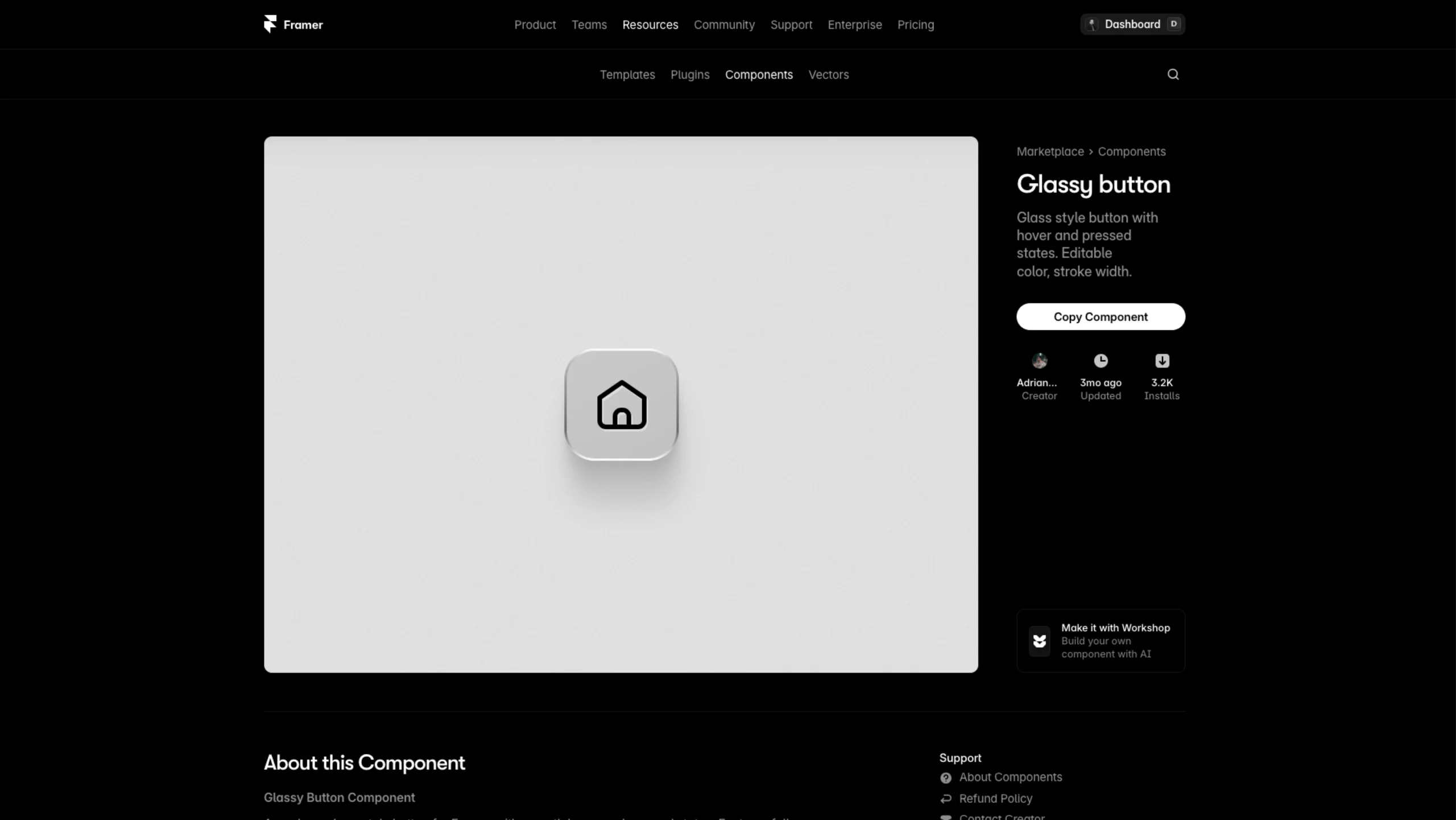
Glass-style button with customizable colour, stroke width, and interactive hover/pressed states.
About the Glassy Button component
This is a modern glass-style button for Framer with smooth, polished interactions.
It reacts beautifully on hover and press, and you can quickly tweak the icon color and stroke width to match your design.
The frosted background and soft shadows give it that premium, minimal look that works perfectly in clean interfaces.
What it does:
- Creates a glassy, frosted button with depth and a subtle shine
- Plays smooth hover and pressed states to make interactions feel alive
- Let’s you adjust icon color and stroke width in seconds
- Works with any icon from your existing library
- Fits perfectly in dashboards, navigation bars, and modern UI layouts
Note: This component uses the Iconic icon set. You’ll need to add that vector set to your Framer file to swap icons via the component’s variables.