Kit is an Australian skincare brand that champions the “utilitarian” approach to beauty.
Their philosophy, “Modern formulas for all skin kinds,” reflects a shift away from complex 12-step routines toward a modular “toolbox” of essentials.
By combining high-quality botanicals with clinical actives, kit: offers a gender-neutral range that prioritizes skin health as a holistic ecosystem.
Design Highlights for UI/UX Enthusiasts
For designers, the kit: digital experience is a masterclass in Minimalist Editorial Design:
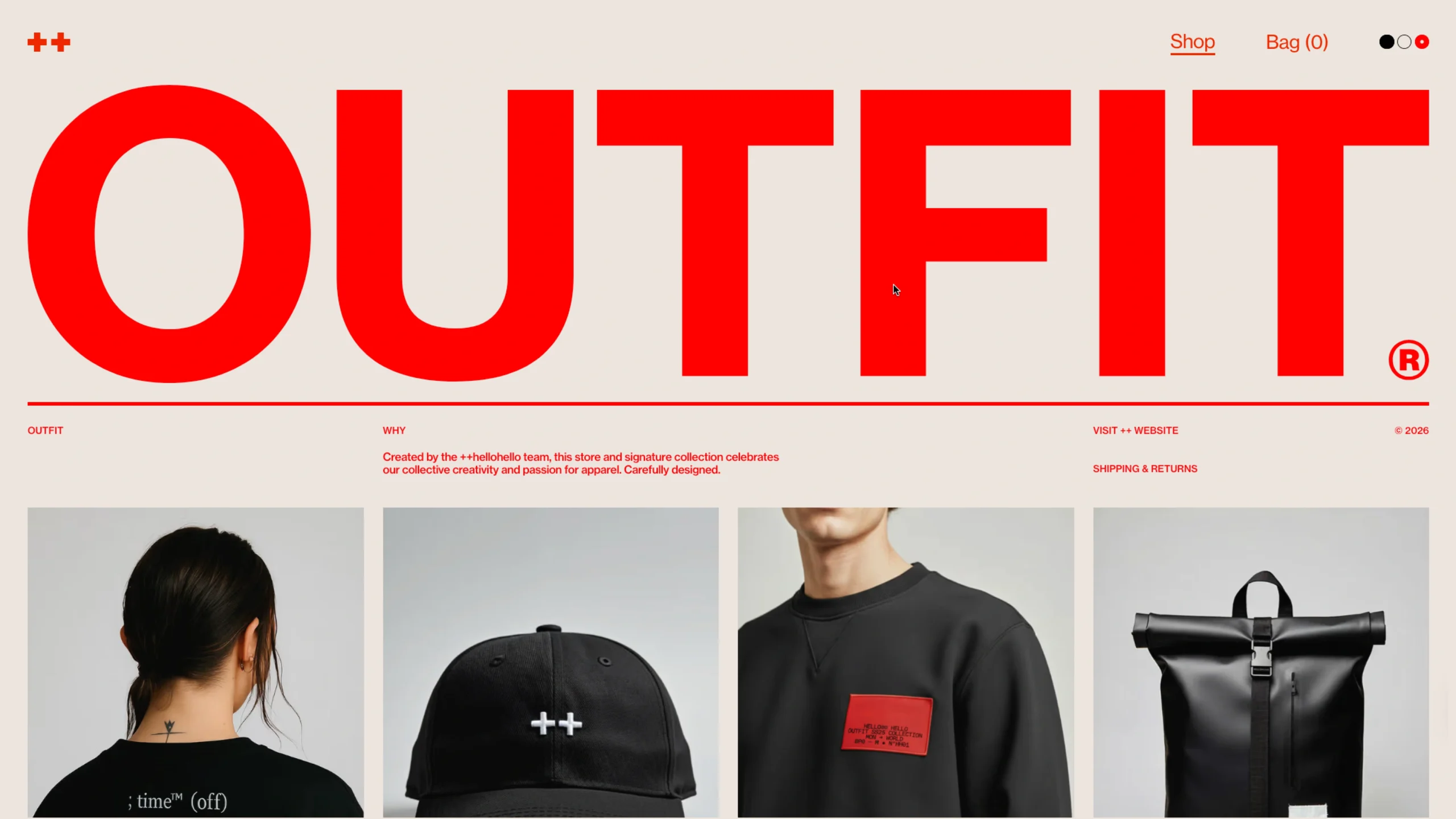
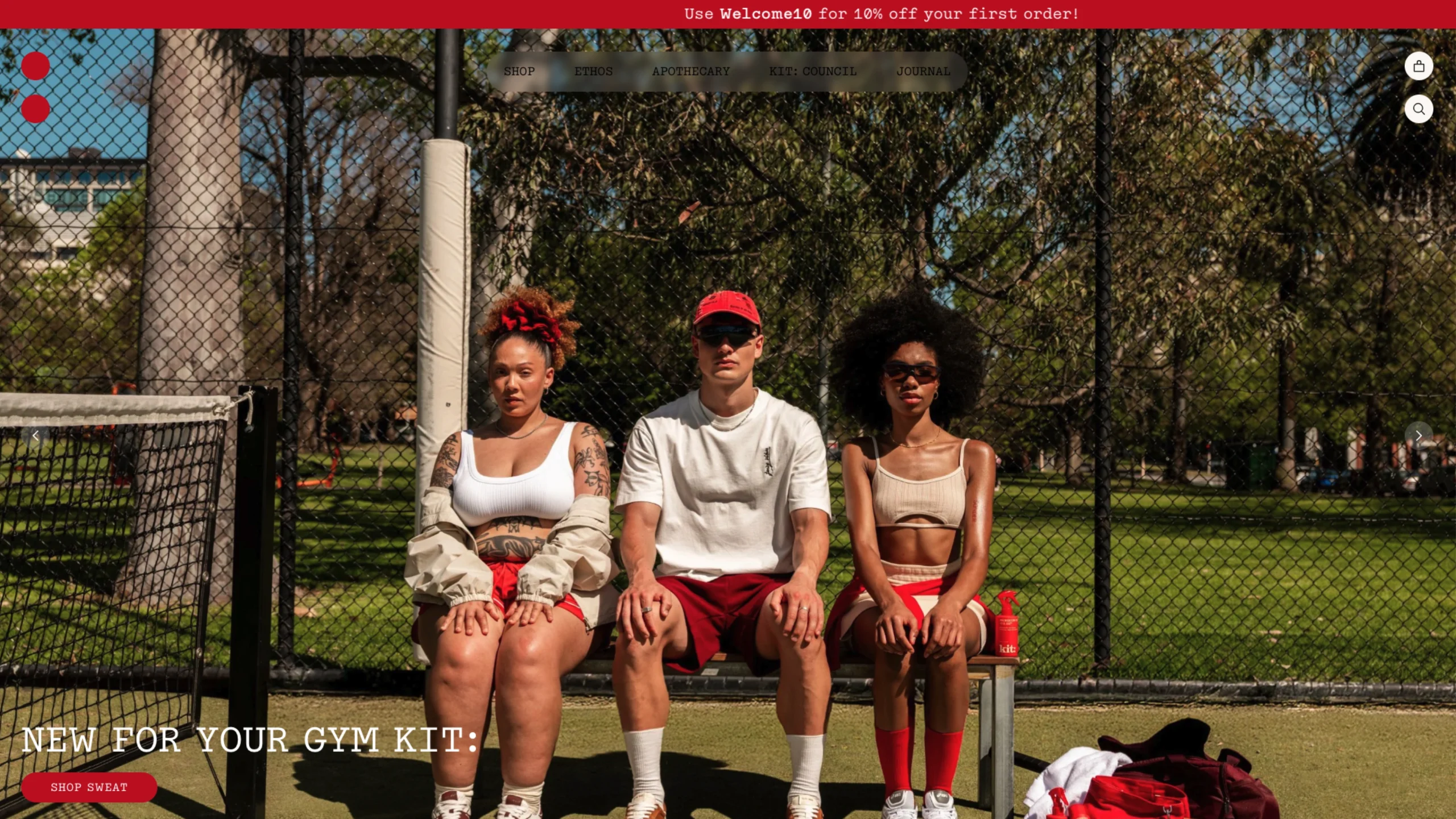
- The “Power Red” Branding: The use of a bold, vibrant red against a backdrop of neutral, clinical tones is a daring choice that sets them apart from the typical “pastel and green” palette of natural skincare. It creates an energetic, high-contrast UI that demands attention.
- Streamlined Information Architecture: The site uses a “Bento-style” layout to organize product benefits and ingredients. This allows users to quickly scan complex scientific information without feeling overwhelmed, perfect for the modern mobile shopper.
- Performance-Driven Shopify Plus Build: The recent redesign saw a +107% increase in conversion rates by focusing on reducing cognitive load. Every interaction—from the “Build your kit” feature to the cart drawer—is optimized for speed and clarity.
- Gender-Neutral Visual Language: The art direction uses diverse, non-traditional models and avoids “feminine” or “masculine” tropes. This inclusive UX makes the brand accessible to everyone, aligning with modern social values.