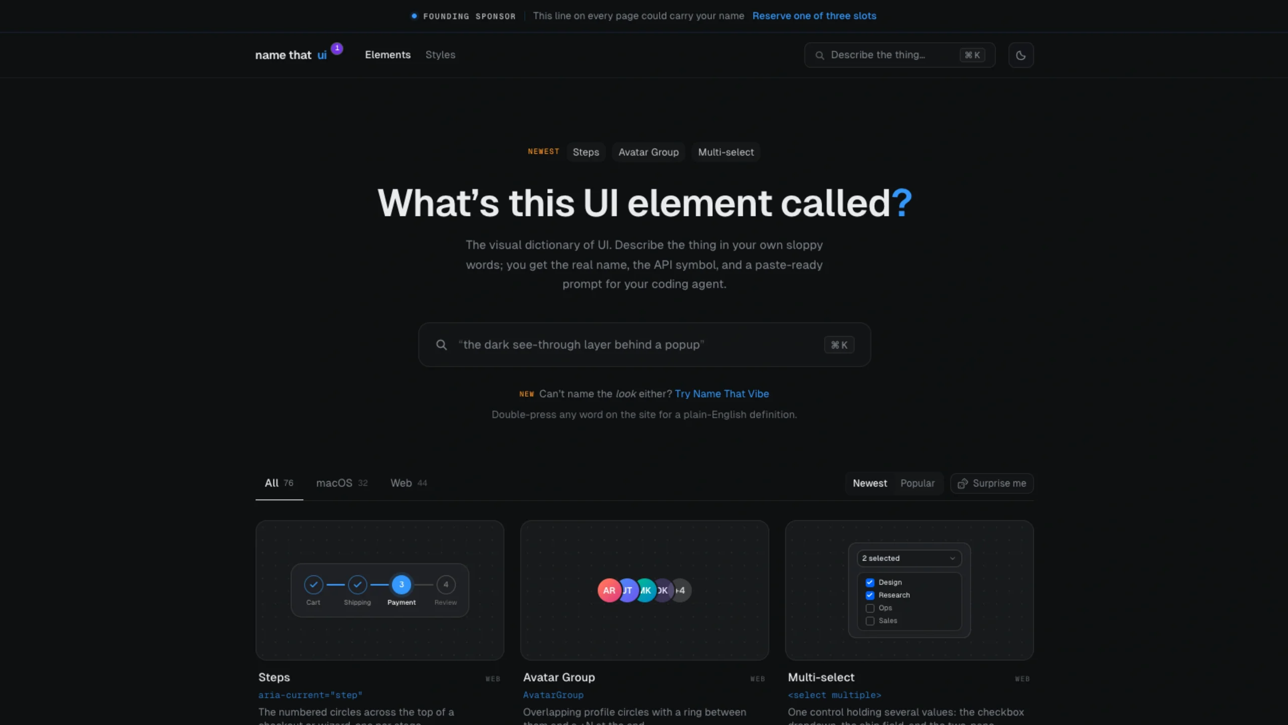
Name That UI is a visual reference tool for designers and developers that helps identify and learn the names of common UI patterns and interface elements.
It makes it easier to communicate design ideas using established UX terminology, especially when searching for inspiration, documenting interfaces, or discussing components with product and engineering teams.
The visual dictionary for UI. Describe what you’re looking for in your own words, and get the proper name, API icon, and a ready-to-use prompt for your coding agent.
The Visual Dictionary of UI: Learn the Real Names Behind the Interfaces You Use Every Day
Have you ever looked at a UI element and thought, “What is that thing called?”
Maybe it’s the little three-dot button in the corner of a card. Or the row of numbered circles at the top of a checkout. Or that blinking line inside a text field. You know what it does, but you don’t know the proper name for it.
That small gap in vocabulary can make design and development conversations harder than they need to be.
Designers might describe something visually. Developers may think in terms of HTML, CSS, accessibility attributes, or framework components. And AI coding agents often need even more precise instructions.
This is where a visual UI dictionary becomes useful.
A resource like NameThatUI helps connect the visual appearance of an interface with its real design name, technical implementation, and development terminology. Instead of saying “the little box that pops up when I click the image,” you can call it a lightbox. Instead of “the three lines that open the menu,” you can describe it as a hamburger menu or navigation drawer.
That may sound like a small difference, but having the right vocabulary can save a surprising amount of time.
Why UI vocabulary matters
UI design is full of small patterns that most people recognize but don’t always know by name.
Consider a few everyday examples:
- The numbered stages in a checkout are steps.
- The overlapping user photos are an avatar group.
- The “On this page” navigation that follows your position while scrolling is a scrollspy.
- The small message that appears after you complete an action is a toast or snackbar.
- The three dots used to reveal additional actions form an overflow menu.
- The blinking vertical line inside a text field is an insertion caret.
- The translucent layer behind a modal is a scrim or backdrop.
Once you know these names, explaining an interface becomes much easier.
Instead of describing what something looks like, you can describe what it is.
And that matters even more when you’re working with developers, design systems, documentation, accessibility requirements, or AI coding tools.
From visual guesswork to precise terminology
One of the most useful things about a UI dictionary is that it connects three different worlds:
What you see → what it’s called → how it’s implemented.
For example, you might see a calendar popup when selecting a date.
Visually, you might call it “that calendar thing.”
In UI terminology, it’s a date picker.
At the technical level, it could be implemented using something as simple as <input type="date"> or through a custom component.
The same idea applies to hundreds of interface patterns.
A carousel might use an accessibility description such as aria-roledescription="carousel". A tab interface may use role="tablist". A focus state on the web may be represented using :focus-visible.
You don’t need to memorize every technical detail. The important part is knowing enough vocabulary to move from visual description to precise implementation.
Common web UI patterns you should know
Steps
Steps are the numbered stages you often see across a checkout, onboarding flow, or multi-step form.
For example:
1. Account → 2. Details → 3. Payment → 4. Confirmation
The active stage can be represented with aria-current="step".
Once you know the pattern is called a steps component, searching for examples, explaining the design, or asking an AI coding agent to build one becomes much easier.
Avatar Group
An avatar group displays multiple profile images together, usually with overlapping circles.
You might see three or four people followed by something like +8.
It’s useful for showing:
- Team members
- Participants
- Contributors
- Project collaborators
- People who liked or viewed something
Knowing the term avatar group is much more useful than describing it as “several profile pictures stacked together.”
Multi-select
A multi-select lets users choose more than one value from a set.
It can take several forms, including a checkbox dropdown, a chip-based input, or a transfer list with two panels.
The important distinction is that the user isn’t choosing a single value. They’re building a collection of selected values.
Scrollspy
A scrollspy connects the page’s scroll position with navigation.
Think about an article with an On this page menu. As you move through different sections, the corresponding navigation item becomes active.
On the technical side, implementations often use IntersectionObserver.
The name is useful because “the navigation that highlights the section I’m currently reading” is a much longer way to describe it.
Alerts, Callouts and Banners
These three patterns can look similar but serve different purposes.
An inline alert usually communicates a message related to a particular part of the interface.
A callout highlights useful information, guidance, or an important note.
A banner generally spans a larger area and communicates something broader.
They’re all notices, but their placement and purpose can be different.
Sign-in Form
A sign-in form seems simple, but it contains several smaller patterns.
You might have:
- Email or username input
- Password field
- Password visibility toggle
- “Forgot password?” link
- Divider with “OR”
- Social sign-in buttons
- Continue button
Even something as small as autocomplete="current-password" is part of making the form easier and more accessible to use.
Pagination
Pagination is the navigation used to move through multiple pages of content.
The familiar version looks like:
1 2 3 4 5 Next
But pagination can also appear as dots, compact page controls, or previous/next navigation.
On the web, the navigation itself can be identified with something like <nav aria-label="pagination">.
Date Picker
A date picker is the calendar interface that appears when you need to select a date.
It can support:
- Single dates
- Date ranges
- Disabled dates
- Current-date highlighting
- Month and year navigation
The familiar calendar popup is one of those UI patterns everyone recognizes but not everyone knows by name.
Layout patterns that shape modern interfaces
Modern interfaces aren’t only made from buttons and forms. Layout patterns have their own vocabulary too.
Bento Grid
The bento grid has become a popular way to present content using different-sized tiles within the same grid.
One tile might span two columns while another occupies a smaller space.
The visual idea is similar to a bento box: separate sections fit together to create one larger composition.
Technically, CSS Grid can handle this kind of layout using properties such as grid-column: span 2.
Masonry Layout
A masonry layout arranges cards of different heights into columns without forcing every item into the same row height.
Pinterest is one of the best-known examples of this visual pattern.
The result feels more fluid than a traditional equal-height card grid.
Sticky vs. Fixed
These two are often confused.
A sticky element stays in view after reaching a certain scroll position, while still being connected to its containing layout.
A fixed element is positioned relative to the viewport.
That difference matters when designing things like:
- Sticky navigation
- Floating toolbars
- Persistent action buttons
- Side panels
Knowing the difference can prevent a lot of frustrating implementation discussions.
Motion has a vocabulary too
Animation is another area where designers often describe what they see without knowing the technical term.
Easing
Easing controls the speed curve of an animation.
Without easing, motion can feel mechanical. With the right timing function, it can feel natural and responsive.
The technical property is:
transition-timing-function
But the design conversation is simply about how the motion accelerates and slows down.
Spring Animation
A spring animation uses physics-inspired motion.
Instead of stopping immediately at its destination, an element can slightly overshoot and settle into place.
In tools such as Framer Motion, you may see settings such as stiffness and damping.
This is common in polished interfaces because it can make interactions feel more physical.
Text Scramble
You’ve probably seen this effect in futuristic interfaces.
Characters rapidly change or “scramble” before settling into the final word.
It’s called a text scramble or decode effect.
Knowing the name makes it much easier to find examples or describe the interaction to an AI coding agent.
Parallax Scrolling
Parallax creates a sense of depth by moving different layers at different speeds.
A background might move more slowly than the foreground while scrolling.
The result can make a flat webpage feel more dimensional.
Modern CSS can support scroll-driven effects using features such as animation-timeline: scroll().
Marquee
A marquee is content that continuously moves horizontally across the screen.
You’ll often see it used for:
- Brand logos
- Partner names
- Keywords
- Announcements
- Testimonials
- Decorative text
The effect can be created using CSS animation translateX.
Small interaction details have names too
Some of the most useful UI terms describe tiny elements.
A resize handle is the small grip you drag to change the size of an element.
A focus ring shows which control currently has keyboard focus.
A truncation uses an ellipsis or line clamp when text is too long to display.
A divider or separator creates a visual break between sections or controls.
A scrim is the translucent layer behind an overlay.
A hover card displays additional information when a user hovers over or focuses on a reference.
These may seem like minor details, but they’re exactly the kinds of things designers and developers need to discuss when refining an interface.
Don’t confuse similar UI patterns
Good UI vocabulary isn’t just about knowing names. It’s also about understanding the differences between things that look similar.
For example:
Badge vs. Chip vs. Pill vs. Tag
These compact labels can look almost identical.
But their purpose can be different.
A badge often communicates status or a count.
A chip can represent a selection or interactive value.
A tag commonly categorizes content.
A pill usually describes the visual shape rather than one specific function.
The same visual style can therefore represent different UI concepts.
Switch vs. Checkbox vs. Radio
These controls also look related but have different meanings.
A switch is generally used for an immediate on/off setting.
A checkbox allows independent choices.
A radio group lets the user select one option from a set.
Using the correct pattern isn’t just about aesthetics. It affects usability, accessibility, and user expectations.
Dialog vs. Drawer vs. Sheet
All three can appear over the current page.
A dialog usually presents focused content or a task.
A drawer slides in from an edge of the screen.
A sheet is a panel presented as part of a particular interaction context.
Knowing the difference helps you choose the right interaction instead of simply calling everything a “popup.”
Popover vs. Dropdown vs. Tooltip
These are another common source of confusion.
A tooltip provides brief contextual information.
A dropdown menu presents actions or choices.
A popover can contain richer interactive content anchored to another element.
They may occupy similar visual space, but they’re designed for different jobs.
The macOS UI vocabulary
The same idea extends beyond websites.
macOS has its own rich collection of interface terminology and framework names.
For example, a standard Mac application window is represented by NSWindow.
A resizable two-pane interface is a split view, represented by NSSplitView.
The left navigation area is a sidebar, while the small red, yellow, and green controls are known as traffic lights.
The translucent material used in parts of macOS is known as visual effect material or vibrancy.
There are also more specialized patterns:
- Menu bar
- Menu bar extra
- Context menu
- Disclosure triangle
- Dock badge
- Focus ring
- Inspector
- Panel
- Popover
- Sheet
- Toolbar
- Stepper
- Segmented control
- Token field
- Combo button
- Level indicator
- Column view
- Outline view
- Save panel
- Search field
- Scroll view
Once you start learning these terms, macOS interfaces become much easier to describe precisely.
Why this matters for AI-assisted development
There’s another reason this vocabulary has become more valuable: AI coding agents.
When you’re working with tools such as Claude Code, Cursor, GitHub Copilot, or other coding agents, vague descriptions can lead to vague implementations.
Compare these two prompts:
“Make a menu that opens from the side when I click the three lines.”
with:
“Build a responsive hamburger menu that opens a navigation drawer. Use
aria-expandedandaria-controlson the trigger and provide keyboard-accessible focus management.”
The second prompt gives the coding agent a much clearer starting point.
The same applies to almost every component.
Instead of:
“Make those boxes at the top that show where I am in the checkout.”
You can say:
“Add a four-step checkout component with the current step marked using
aria-current="step".”
Instead of:
“Show a small message after saving.”
You can say:
“Display a non-blocking toast with
role="status"after the save action.”
The better you can name the pattern, the easier it becomes to communicate your intent.
A UI dictionary is really a communication tool
Learning UI terminology isn’t about sounding more technical.
It’s about reducing ambiguity.
A designer can say “use a scrollspy here.”
A developer immediately has an idea of what that means.
A product manager can ask for a date picker instead of describing a calendar interaction from scratch.
A researcher can document a command palette instead of saying “the keyboard search window.”
And an AI coding agent can turn a precise UI concept into working code with fewer assumptions.
That’s the real value of a visual UI dictionary.
It gives a name to things you’ve probably seen hundreds of times.
Learn the name. Understand the pattern. Build it better.
Interfaces are made from thousands of small decisions.
Some are obvious: buttons, forms, navigation, cards.
Others are tiny: focus rings, resize handles, scrims, insertion carets, disclosure triangles, overflow menus, and loading indicators.
Once you know what these things are called, you start seeing interfaces differently.
You stop seeing “a bunch of elements on a screen.”
You start seeing patterns.
And that shift is useful whether you’re a UI designer, product designer, frontend developer, design-system specialist, accessibility practitioner, or someone building products with AI.
The next time you look at an interface and think, “What is that thing called?”, don’t settle for a vague description.
Find the name.
Because once you can name a UI pattern, you can search for it, discuss it, document it, design it, code it—and give your AI coding agent a much better instruction.