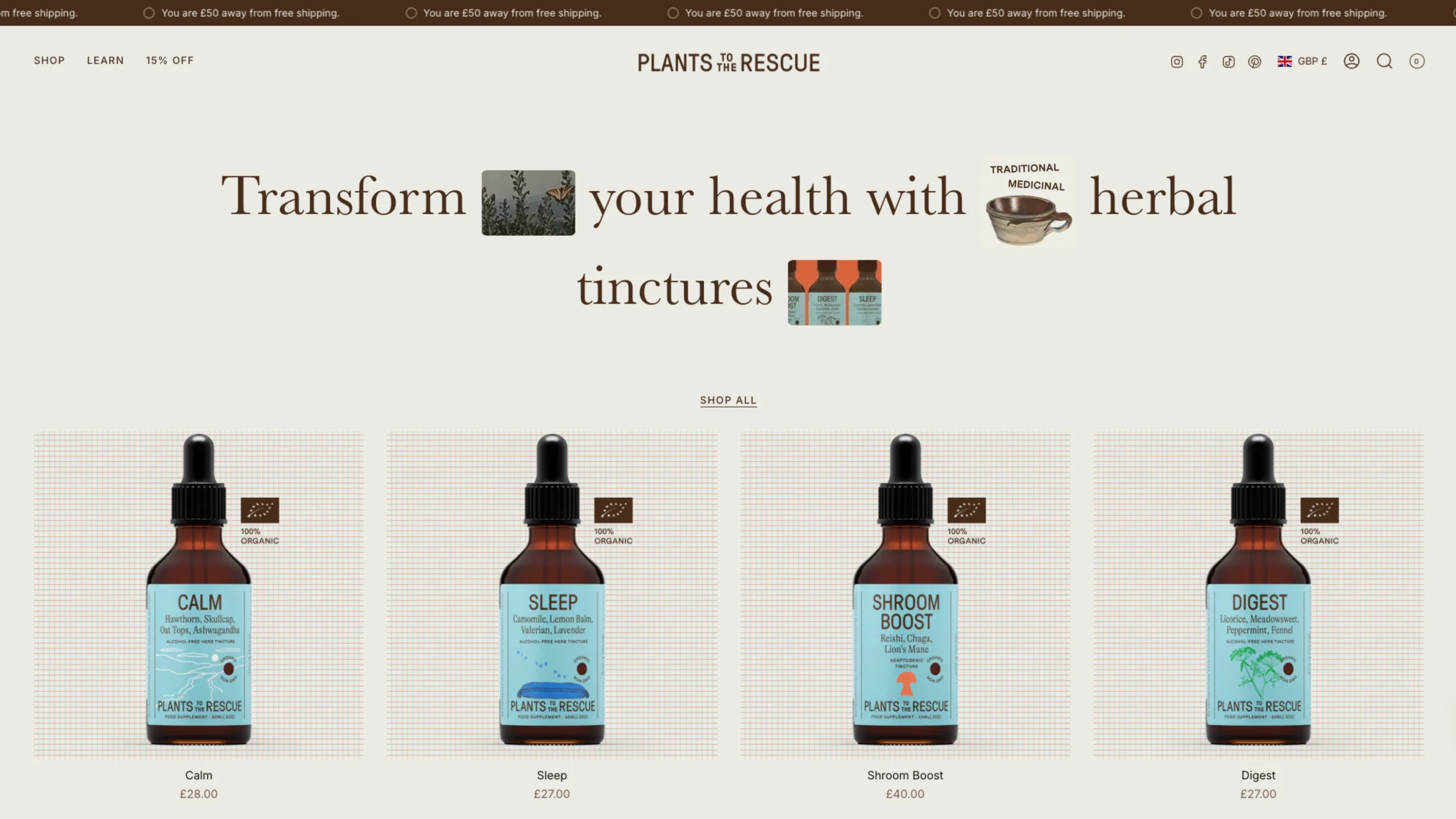
Plants to the Rescue is a UK-based wellness brand that focuses on making herbal medicine accessible, inclusive, and modern.
Founded on the belief that high-quality plant medicine shouldn’t require a background in botany to understand, the brand offers expertly formulated tinctures designed for specific lifestyle needs—like sleep, focus, and anxiety management.
Design Highlights for UI/UX Enthusiasts
For designers visiting your showcase, this site offers several key inspirations:
- The “Soothing” Palette: The website uses a beautiful, earthy color scheme dominated by sage greens, soft creams, and deep forest tones. This choice immediately lowers the user’s cognitive load and establishes a “zen” atmosphere that aligns with the products’ benefits.
- Typographic Hierarchy: The site uses clean, serif headers that feel academic yet approachable, paired with simple sans-serif body text. This balance communicates authority and trust (essential for health products) without feeling cold or clinical.
- Micro-Copy with Impact: Instead of using overly technical jargon, the UI labels products by their benefit (e.g., “Calm,” “Sleep,” “Digest”). This is a user-centric design choice that makes the shopping experience intuitive for someone who knows their problem but not necessarily the herb they need.
- Transparency Sections: The “About” and “Process” pages use clear, icon-driven layouts to explain their extraction methods. This visual storytelling builds trust by showing the “science behind the magic.”