


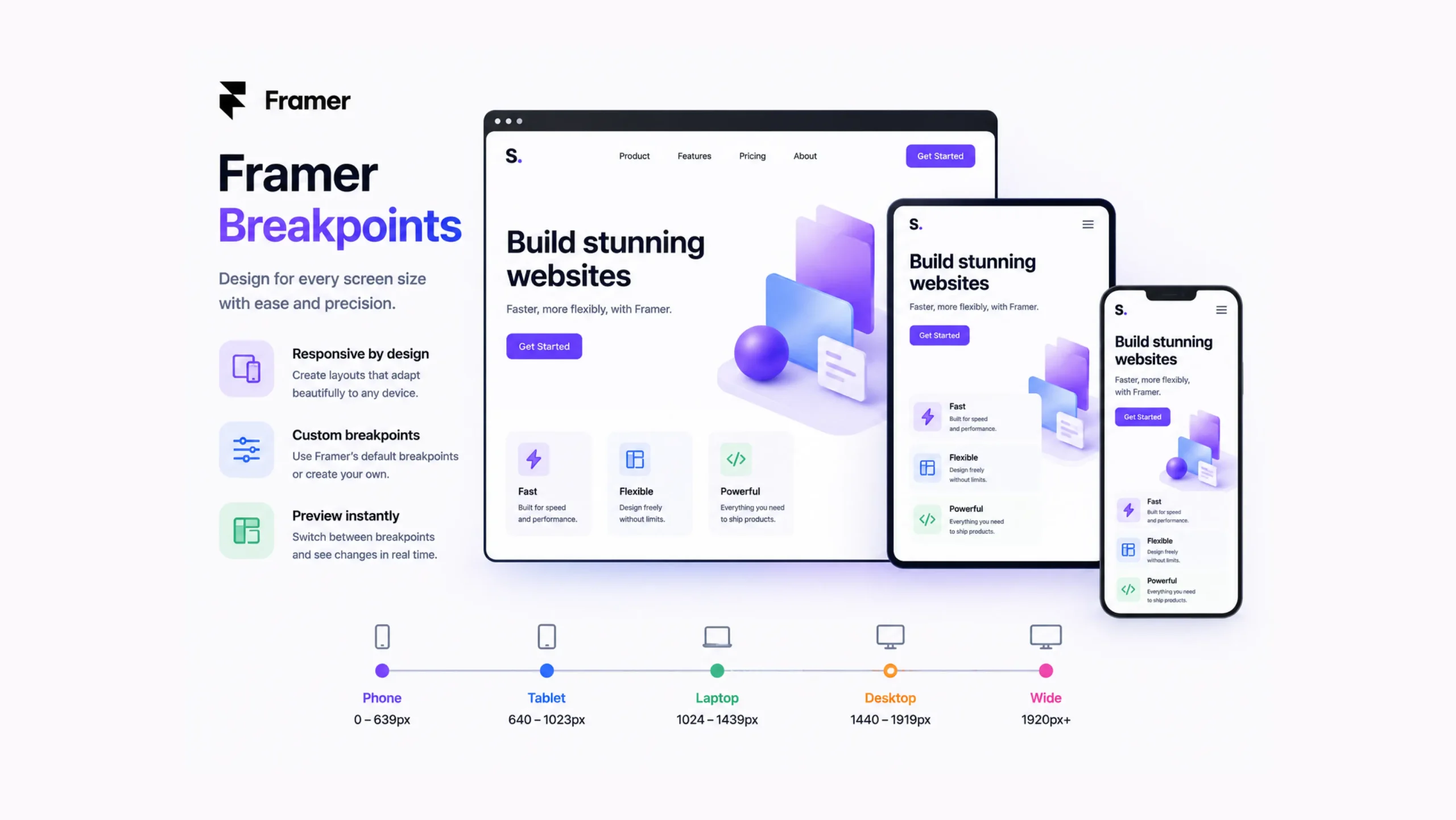
What Are Framer Breakpoints?
Framer Breakpoints are responsive design settings that allow a website to adjust its layout according to the size of a visitor’s screen.
A website that looks perfect on a large desktop monitor may become difficult to use on a smartphone if no adjustments are made. Breakpoints solve this problem by letting designers customize how content appears at different screen widths.
In simple terms, breakpoints tell a website:
“When the screen reaches a certain size, switch to a different layout.”
This helps websites stay readable, functional, and visually appealing across a wide range of devices.
Why Breakpoints Matter
Think about how people browse the web today.
Someone might visit a website on a laptop during work, check it again on a phone while commuting, and later open it on a tablet at home.
The same website must perform well in every situation.
Without breakpoints, elements may overlap, text may become difficult to read, and navigation menus may stop working properly.
A website can look polished on one screen and completely broken on another.
Breakpoints help prevent that.
The Everyday Analogy
Imagine packing clothes into different-sized suitcases.
A large suitcase can hold everything comfortably. A smaller suitcase requires folding, rearranging, and organizing items differently.
The contents stay the same.
The arrangement changes.
That’s essentially what breakpoints do for websites.
The content remains available, but its presentation adapts to fit the available space.
How Framer Breakpoints Work
Framer allows designers to create layouts for different screen sizes.
When the browser reaches a specific width, Framer automatically applies the design associated with that breakpoint.
For example:
- Desktop layout for large screens
- Tablet layout for medium screens
- Mobile layout for smaller screens
Each breakpoint can have its own adjustments for spacing, typography, images, navigation menus, and content positioning.
Visitors never see these transitions happening behind the scenes.
They simply experience a website that feels natural on their device.
Common Breakpoint Types
Most responsive websites rely on a few major categories.
Desktop
Desktop breakpoints target larger screens, including laptops and monitors.
These layouts often use:
- Multi-column designs
- Larger navigation menus
- Wider content sections
Tablet
Tablet breakpoints sit between desktop and mobile layouts.
Designers often reduce spacing and adjust column structures to better fit medium-sized screens.
Mobile
Mobile breakpoints focus on smaller devices.
Layouts become more vertical, navigation menus are simplified, and content stacks into easier-to-read sections.
This is often the breakpoint that receives the most attention since mobile traffic now represents a large share of web visits.
Why Designers Love Framer Breakpoints
Responsive design can become complicated.
Framer makes the process easier by allowing visual adjustments without manually writing large amounts of code.
A few key advantages stand out.
Better User Experience
Visitors can browse comfortably regardless of screen size.
Faster Design Process
Changes can be made visually, reducing repetitive work.
Greater Design Control
Each breakpoint can have custom styling and layout adjustments.
Improved Readability
Text remains clear and accessible across devices.
Consistent Branding
The website maintains a cohesive appearance even as layouts change.
Breakpoints and Responsive Design
Here’s the thing.
Many people think responsive design and breakpoints are the same concept.
They’re closely connected, but they aren’t identical.
Responsive design is the overall strategy of creating websites that adapt to different devices.
Breakpoints are one of the primary tools used to achieve that goal.
You could say responsive design is the destination, while breakpoints are part of the roadmap.
What Changes Across Breakpoints?
Quite a lot, actually.
Designers commonly adjust:
- Font sizes
- Margins and padding
- Grid layouts
- Navigation menus
- Image dimensions
- Section spacing
- Button sizes
- Content arrangement
Sometimes these changes are subtle.
Sometimes they’re dramatic.
A four-column desktop layout may become a single-column mobile layout without changing the content itself.
Real-World Examples
Ecommerce Stores
Product grids often display four products per row on desktop screens.
On mobile devices, those same products may appear one or two per row.
SaaS Websites
Feature sections frequently shift from side-by-side layouts to stacked layouts on smaller screens.
Blogs
Articles often increase text width on desktop and narrow it on mobile for easier reading.
Agency Websites
Large hero sections and animations may be simplified on smaller devices to improve usability.
The Mobile-First Conversation
Modern web design often starts with mobile layouts before expanding to larger screens.
At first glance, that sounds backwards.
Why start with the smallest screen?
The reason is simple.
Small screens force designers to focus on the most important content first.
Once that foundation is established, larger layouts become easier to build.
Many Framer designers follow this approach because it naturally supports responsive design.
Common Breakpoint Mistakes
Even experienced designers occasionally run into issues.
Ignoring Intermediate Screen Sizes
Some websites look great on desktop and mobile but struggle on tablets.
Testing every major screen category helps prevent surprises.
Overcrowding Mobile Layouts
Trying to squeeze desktop layouts onto phones often creates clutter.
Mobile screens need breathing room.
Excessive Customization
Creating too many breakpoint-specific changes can make projects difficult to maintain.
Simplicity often works better.
Forgetting Real-World Testing
Previewing a design inside a browser is helpful.
Testing on actual devices often reveals issues that simulations miss.
Framer Breakpoints vs Fixed Layouts
Older websites often relied on fixed layouts.
The design remained the same regardless of screen size.
Years ago, that approach was more common because people accessed websites primarily from desktop computers.
Today, fixed layouts create problems.
A desktop-focused site can become frustrating on smaller devices.
Framer Breakpoints provide flexibility that fixed layouts simply cannot offer.
The website adapts rather than forcing users to adapt.
Why Breakpoints Matter More Than Ever
Screen sizes continue to expand.
Large monitors, foldable devices, tablets, smartphones, and ultrawide displays all create different viewing experiences.
A single layout rarely works everywhere.
Breakpoints allow websites to accommodate this variety without sacrificing usability.
And honestly, most visitors never think about breakpoints.
That’s actually a good sign.
When responsive design works well, it feels invisible.
Users focus on the content rather than the layout.
Final Thoughts
Framer Breakpoints are responsive design controls that help websites adapt to different screen sizes. They allow designers to customize layouts for desktops, tablets, and mobile devices while maintaining a consistent user experience.
From improving readability to creating cleaner navigation and better content organization, breakpoints play a major role in modern web design. They help websites remain functional, visually appealing, and accessible no matter where visitors choose to browse.
For anyone building responsive websites in Framer, learning how breakpoints work is one of the most valuable skills to develop.
FAQs
1. What are Framer Breakpoints?
Framer Breakpoints are responsive design settings that allow layouts to adapt to different screen sizes and devices.
2. Why are breakpoints important?
They help websites remain readable, usable, and visually consistent across desktops, tablets, and smartphones.
3. Can I customize layouts for each breakpoint in Framer?
Yes. Framer allows designers to adjust spacing, typography, positioning, and other design elements for individual breakpoints.
4. What devices do breakpoints support?
Breakpoints commonly support desktop, tablet, and mobile devices, though additional screen sizes can be accommodated when needed.
5. Are breakpoints necessary for responsive design?
They are one of the primary tools used to create responsive websites and adapt layouts to different screen widths.
6. What happens if a website doesn’t use breakpoints?
The website may appear poorly formatted on certain devices, leading to layout issues, readability problems, and a weaker user experience.