


Skeuomorphism: The Design Style That Made Digital Interfaces Feel Real.
Imagine opening a notes app and seeing a yellow legal pad.
Or launching a calculator app that looks almost identical to the calculator sitting on your desk.
Today, those designs might feel old-fashioned. Yet there was a time when they represented the future of digital experiences.
That design approach is called Skeuomorphism.
For years, Skeuomorphism shaped how people interacted with computers, smartphones, tablets, and software. It helped millions of users transition from physical objects to digital tools by making unfamiliar technology feel familiar.
The style eventually fell out of favor, replaced by flatter and simpler interfaces. Even so, its influence remains surprisingly strong.
Many modern design principles can trace their roots back to Skeuomorphism.
Let’s explore what Skeuomorphism is, why it became popular, and why designers still study it today.
What Is Skeuomorphism?
Skeuomorphism is a design approach that makes digital objects resemble their real-world counterparts.
The goal is simple.
If users already understand a physical object, a digital version that looks similar will feel easier to understand.
Designers achieve this by recreating visual characteristics such as:
- Textures
- Shadows
- Materials
- Buttons
- Lighting effects
- Physical dimensions
A digital notebook may look like paper.
A calendar app may resemble a desk calendar.
A music player may imitate physical audio equipment.
The design borrows visual cues from the physical world and applies them to digital products.
Where Does the Word Come From?
The term “skeuomorphism” comes from the Greek words:
- Skeuos (tool or container)
- Morphe (shape or form)
The word originally described objects that retained decorative features from older materials or manufacturing methods.
For example, early pottery sometimes included details that imitated wooden construction techniques.
In digital design, the meaning evolved.
Now it refers to interfaces that mimic physical objects even when those physical characteristics are no longer necessary.
Why Did Skeuomorphism Become So Important?
To answer this, we need to travel back to the early days of personal computing.
Computers were unfamiliar.
Smartphones were new.
Touchscreens felt strange.
Many users had little experience interacting with digital products.
Designers faced a challenge.
How could they make technology feel approachable?
The solution was surprisingly human.
Make software look like things people already recognize.
A digital notebook looked like a notebook.
A calculator looked like a calculator.
A bookshelf app looked like a wooden bookshelf.
Users immediately understood what they were looking at.
No lengthy instructions required.
The Early Smartphone Era
Skeuomorphism became particularly popular during the rise of smartphones.
Early versions of Apple’s iPhone and iPad contained many famous examples.
The Notes app resembled a yellow notepad.
The Calendar app featured stitched leather textures.
The Books app displayed wooden bookshelves.
The Contacts app looked like a physical address book.
At the time, these choices felt intuitive.
Users transitioning from paper-based tools could quickly understand digital alternatives.
The Key Characteristics of Skeuomorphic Design
Several visual elements define Skeuomorphism.
Realistic Textures
One of the most recognizable features is texture.
Designers often recreate:
- Leather
- Wood
- Metal
- Paper
- Fabric
- Plastic
These textures make digital interfaces feel tangible.
Physical Objects
Many skeuomorphic interfaces imitate real-world products directly.
Examples include:
- Notebooks
- Calculators
- Cameras
- Calendars
- Clocks
- Audio equipment
Shadows and Depth
Physical objects occupy space.
Skeuomorphic interfaces use shadows and highlights to create a similar illusion.
Buttons appear raised.
Panels appear layered.
Controls appear touchable.
Detailed Visual Styling
Unlike minimalist approaches, Skeuomorphism embraces decorative details.
Stitching.
Reflections.
Metal finishes.
Paper edges.
Wood grain.
These details contribute to realism.
Why Did Users Love It?
The answer lies in psychology.
Humans naturally connect new experiences with familiar ones.
Think about moving into a new city.
You feel more comfortable when something reminds you of home.
Digital products work similarly.
When users encountered a notebook-like interface, they instantly understood its purpose.
The design reduced uncertainty.
And reducing uncertainty is one of the fastest ways to improve usability.
At least during the early stages of technological adoption.
The Psychology of Familiarity
Skeuomorphism relies heavily on recognition.
Recognition is easier than learning.
People don’t need to decode unfamiliar icons or interaction patterns.
The visual clues already exist.
A button that looks pressable feels pressable.
A slider that resembles physical hardware feels interactive.
The interface communicates through visual memory.
That’s powerful.
Famous Examples of Skeuomorphic Design
Many iconic products embraced Skeuomorphism.
Apple’s Notes App
Perhaps one of the most famous examples.
The app looked remarkably similar to a yellow legal pad.
Apple’s Calendar App
Early versions featured leather textures and realistic page-turning effects.
Books Applications
Digital bookshelves became common during the early tablet era.
Books appeared arranged on wooden shelves just like a physical library.
Calculator Applications
Many calculators recreated physical buttons, displays, and layouts.
Users instantly recognized their purpose.
The Benefits of Skeuomorphism
Despite criticism, Skeuomorphism offered genuine advantages.
Easier Learning
New users could understand interfaces faster.
Visual familiarity reduced confusion.
Emotional Connection
People often felt comfortable using interfaces that resembled objects they already knew.
The experience felt warm and approachable.
Clear Affordances
Affordance refers to clues that suggest how something should be used.
A button that looks raised encourages interaction.
A knob that resembles a physical knob suggests rotation.
Skeuomorphism often communicated these clues effectively.
Strong Brand Personality
Detailed visuals gave products a memorable identity.
Many early applications felt distinctive rather than generic.
The Criticism Started Growing
As technology matured, opinions changed.
What once felt helpful began to feel unnecessary.
Users no longer needed a notebook to look like paper.
They already understood digital notes.
The visual training wheels were no longer required.
Designers started questioning the extra decorative elements.
Did every app need leather textures?
Did every button need reflections and shadows?
The answer increasingly became “no.”
The Downsides of Skeuomorphism
Several limitations contributed to its decline.
Visual Clutter
Detailed textures can distract users from content.
Sometimes the decoration becomes more noticeable than the information itself.
Larger File Sizes
Realistic graphics often require more assets and resources.
This was particularly challenging on older devices.
Reduced Flexibility
Highly detailed interfaces can be harder to adapt across different screen sizes and platforms.
Outdated Appearance
As design trends evolved, many skeuomorphic interfaces began to look dated.
The realism that once felt innovative eventually felt excessive.
The Rise of Flat Design
Around the early 2010s, Flat Design gained momentum.
Companies started removing decorative textures.
Shadows became simpler.
Interfaces became cleaner.
Content received greater emphasis.
Microsoft’s design language influenced many of these changes, and Apple later adopted flatter aesthetics with iOS 7.
The shift was dramatic.
Wooden shelves disappeared.
Leather textures vanished.
Gradients became more restrained.
The industry embraced simplicity.
Skeuomorphism vs Flat Design
These styles sit on opposite ends of the visual spectrum.
Skeuomorphism imitates reality.
Flat Design strips away most visual realism.
Skeuomorphism focuses on familiarity.
Flat Design focuses on clarity and efficiency.
Skeuomorphism uses textures and decorative details.
Flat Design relies on typography, color, spacing, and structure.
Both approaches solve different problems.
Neither is automatically better.
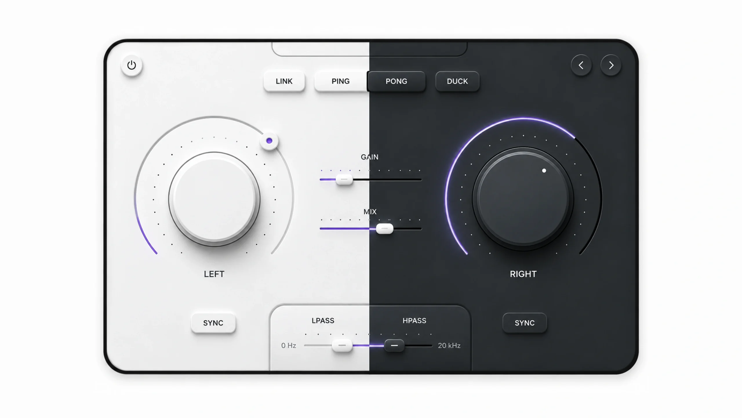
Skeuomorphism vs Neumorphism
Neumorphism emerged years later and borrowed some ideas from Skeuomorphism.
Both styles create depth.
Both attempt to make interfaces feel tactile.
The difference lies in execution.
Skeuomorphism imitates actual objects and materials.
Neumorphism creates soft surfaces using shadows and highlights without realistic textures.
You could think of Neumorphism as a distant relative rather than a direct replacement.
Is Skeuomorphism Completely Gone?
Not at all.
In fact, many modern products still use skeuomorphic principles.
The difference is subtlety.
Designers rarely recreate full leather notebooks anymore.
Yet they still use:
- Depth
- Shadows
- Realistic motion
- Familiar interaction patterns
- Physical metaphors
These ideas continue to influence digital experiences.
The philosophy survived even as the visual style evolved.
Modern Examples of Skeuomorphic Thinking
Current interfaces often borrow selected aspects of Skeuomorphism.
Voice assistants use microphone icons.
Trash bins still represent deleting files.
Folders still represent organization.
Many digital interactions rely on metaphors borrowed from the physical world.
The visuals may be flatter, but the underlying concepts remain familiar.
That’s Skeuomorphism’s lasting legacy.
What Designers Can Learn From Skeuomorphism
One lesson stands out.
People learn faster when experiences feel familiar.
Technology changes.
Human psychology changes slowly.
Designers who understand this principle create products that feel intuitive.
The specific textures and visual styles may evolve, but the need for familiarity remains constant.
That’s why Skeuomorphism still appears in design discussions, classrooms, and product strategy conversations.
Its influence extends far beyond leather textures and wooden bookshelves.
Final Thoughts
Skeuomorphism is a design approach that makes digital interfaces resemble real-world objects through realistic textures, shadows, materials, and familiar visual cues.
The style played a major role in helping people adapt to new technologies during the early years of smartphones and modern software. By borrowing from physical objects, designers created interfaces that felt approachable and easy to understand.
Over time, the industry shifted toward simpler visual styles such as Flat Design and later Neumorphism. Yet Skeuomorphism’s core principle—using familiarity to help users learn—remains deeply relevant.
The textures may have faded, but the ideas behind them continue to shape modern digital experiences.
Frequently Asked Questions (FAQs)
What is Skeuomorphism in UI design?
Skeuomorphism is a design style that makes digital elements resemble physical objects through realistic textures, materials, shadows, and visual details.
Why was Skeuomorphism popular?
It helped users understand unfamiliar technology by presenting digital tools in forms they already recognized from everyday life.
What are examples of Skeuomorphic design?
Examples include notebook-style note apps, realistic calculator interfaces, digital bookshelves, leather-textured calendars, and analog clock applications.
What is the difference between Skeuomorphism and Flat Design?
Skeuomorphism uses realistic visuals and physical metaphors, while Flat Design removes most decorative details and focuses on simplicity.
Is Skeuomorphism still used today?
Yes, though in a more subtle form. Many modern products still use familiar metaphors, depth, and realistic interaction cues inspired by Skeuomorphism.
What replaced Skeuomorphism?
Flat Design became the dominant alternative, followed by styles such as Material Design, Neumorphism, and Glassmorphism, each offering different approaches to depth and visual hierarchy.