


Neumorphism: A Complete Guide to Soft UI Design.
Design trends come and go.
Some disappear within months. Others leave a lasting mark on how digital products are created.
Neumorphism belongs somewhere in the middle. It arrived with a lot of excitement, generated thousands of design concepts, sparked heated discussions among UX professionals, and forced designers to rethink how depth and realism could fit into modern interfaces.
If you’ve ever seen a button that looks gently pressed into the screen—or slightly raised from it—you’ve already encountered Neumorphism.
The style feels soft, subtle, and almost physical. It tries to make digital elements appear touchable without using heavy textures or obvious realism.
That’s what makes it interesting.
And that’s also what makes it controversial.
Let’s explore what Neumorphism is, how it works, and why designers still talk about it years after its rise.
What Is Neumorphism?
Neumorphism, often called “Soft UI,” is a visual design style that uses subtle shadows and highlights to make interface elements appear either raised above or pressed into the background.
The word comes from combining:
- New
- Skeuomorphism
The goal is to create a fresh interpretation of realism without returning to highly decorative interfaces.
Instead of using obvious textures, glossy surfaces, or detailed visual effects, Neumorphism relies on light and shadow.
Buttons, cards, sliders, and input fields appear to emerge naturally from the background.
Everything feels connected, almost as if the interface has been sculpted from a single surface.
A Brief History of Neumorphism
To understand Neumorphism, it helps to look at what came before it.
Years ago, digital products heavily used Skeuomorphism. Designers created interfaces that resembled real-world objects.
Calendars looked like paper calendars.
Notes apps resembled yellow notepads.
Buttons looked like physical buttons.
Then Flat Design arrived.
Companies like Microsoft and Apple shifted toward cleaner interfaces with fewer decorative details.
Flat Design improved clarity and simplified digital experiences.
Yet after several years, some designers felt interfaces had become too flat.
Everything looked clean, but sometimes interactive elements became harder to identify.
Neumorphism appeared as an attempt to reintroduce depth without returning to old-fashioned realism.
It became especially popular around 2019 and 2020 through design communities such as Dribbble and Behance.
Why Neumorphism Caught Everyone’s Attention
At first glance, Neumorphism looks different.
That’s part of its appeal.
Many digital products had started to resemble one another. Similar layouts. Similar components. Similar visual patterns.
Neumorphism introduced a softer aesthetic.
The shadows looked gentle.
The surfaces appeared smooth.
Buttons seemed molded directly into the interface.
For designers looking for fresh visual inspiration, it felt exciting.
For users, it often felt elegant and futuristic.
At least initially.
The Secret Behind Neumorphism
The entire style depends on a simple visual illusion.
Two shadows.
That’s it.
Well, almost.
Designers place:
- A light shadow on one side
- A darker shadow on the opposite side
These shadows simulate a light source.
The combination creates the appearance of depth.
When shadows are positioned correctly, elements seem raised above the surface.
Reverse the shadows, and elements appear pressed into the background.
It’s surprisingly simple.
Yet the effect can be remarkably convincing.
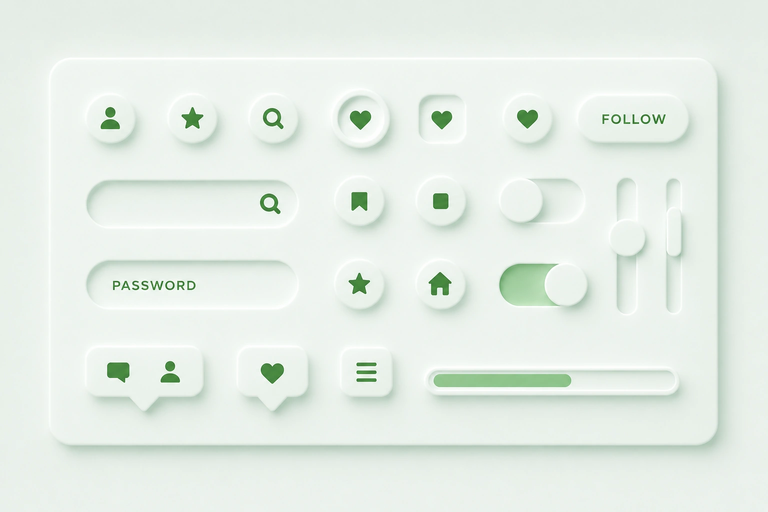
The Core Characteristics of Neumorphism
Several visual traits define Neumorphic interfaces.
Monochromatic Backgrounds
Neumorphism often uses a single base color.
Components blend into that background instead of sitting on top of contrasting surfaces.
The result creates a seamless appearance.
Soft Shadows
Harsh shadows are avoided.
Designers use blurred shadows with low contrast.
This softness gives the style its distinctive look.
Subtle Highlights
Light reflections help create the illusion of elevation.
Combined with shadows, these highlights mimic natural lighting.
Minimal Color Contrast
Most Neumorphic interfaces rely on similar color tones rather than dramatic differences.
This contributes to the smooth, unified appearance.
Rounded Corners
Sharp edges are uncommon.
Rounded shapes reinforce the soft aesthetic.
Raised vs Pressed Elements
Neumorphism typically presents components in two ways.
Raised Components
These appear elevated above the background.
Examples include:
- Buttons
- Cards
- Floating controls
- Navigation elements
Raised components suggest interaction.
Users perceive them as clickable.
Pressed Components
These appear embedded into the interface.
Examples include:
- Active states
- Selected filters
- Input areas
- Toggle switches
Pressed components often indicate an active or selected status.
Think of Clay Instead of Plastic
Here’s a useful analogy.
Imagine sculpting an interface from a smooth piece of clay.
Instead of placing buttons on top, you gently shape them into the surface.
Some areas rise slightly.
Others sink slightly.
Everything feels connected.
That’s the visual language Neumorphism tries to create.
Common Applications of Neumorphism
During its peak popularity, designers experimented with Neumorphism almost everywhere.
Some uses worked well.
Others didn’t.
Music Players
Media controls often look elegant with Neumorphic styling.
Play buttons, sliders, and volume controls fit naturally within the aesthetic.
Smart Home Dashboards
Lighting controls and device switches frequently benefit from soft depth effects.
Mobile App Interfaces
Productivity apps, finance apps, and utility tools often showcase Neumorphic concepts.
Wearable Interfaces
Smartwatch applications sometimes use subtle Neumorphic treatments because the style feels tactile.
Why Designers Like Neumorphism
Despite criticism, the style offers several advantages.
It Feels Fresh
Neumorphism stood out during a period dominated by flat interfaces.
The visual treatment immediately caught attention.
It Creates Visual Depth
Depth helps users distinguish interactive elements.
A carefully crafted Neumorphic interface can create an appealing sense of dimension.
It Looks Premium
Many people associate the style with luxury products and high-end technology.
The smooth surfaces often communicate refinement.
It Encourages Simplicity
Neumorphic designs usually avoid clutter.
The focus remains on a small number of carefully designed elements.
The Problem Nobody Could Ignore
Here’s where things became complicated.
Neumorphism looked beautiful in design portfolios.
Real products presented a different challenge.
Many interfaces became difficult to use.
And usability matters.
A lot.
Accessibility Became the Biggest Concern
Accessibility experts quickly identified several issues.
The biggest problem was contrast.
Neumorphism often uses subtle differences between foreground and background elements.
For many users, especially those with visual impairments, these differences were difficult to perceive.
Buttons sometimes looked like decorative shapes.
Input fields became hard to identify.
Interactive states weren’t always obvious.
A design can be visually impressive and still create usability problems.
This became the central criticism of Neumorphism.
Why Contrast Matters
Imagine trying to find a light gray button sitting on a slightly darker gray background.
Now imagine doing that on a sunny afternoon while looking at a mobile phone outdoors.
Not easy.
Design systems typically rely on clear contrast to communicate hierarchy and interaction.
Neumorphism often weakens that contrast.
That’s why many UX professionals approached the trend cautiously.
Neumorphism vs Skeuomorphism
People often confuse these styles.
They’re related, but not identical.
Skeuomorphism tries to imitate real-world materials.
Leather textures.
Wood grain.
Metal surfaces.
Paper notebooks.
Neumorphism removes most of those visual details.
Instead, it relies on lighting and depth alone.
The result feels cleaner and more modern.
Neumorphism vs Flat Design
Flat Design removes depth almost entirely.
Neumorphism reintroduces depth through subtle shadows.
Flat Design prioritizes clarity.
Neumorphism prioritizes aesthetics and tactile appearance.
Many modern products actually blend aspects of both approaches.
Neumorphism vs Glassmorphism
Glassmorphism and Neumorphism gained popularity around the same time.
Their goals differ significantly.
Glassmorphism creates translucent layers using blur and transparency.
Neumorphism creates soft surfaces using shadows and highlights.
Glassmorphism emphasizes floating elements.
Neumorphism emphasizes embedded elements.
Both styles create depth, but through completely different visual techniques.
Can Neumorphism Work in Real Products?
Yes.
With limitations.
The strongest implementations use Neumorphic effects selectively.
Designers often apply the style to:
- Cards
- Control panels
- Decorative surfaces
- Secondary components
Critical actions usually receive stronger contrast and clearer visual indicators.
Many modern products borrow inspiration from Neumorphism rather than following it strictly.
This balanced approach often works better.
Is Neumorphism Still Relevant?
The hype has faded.
The influence remains.
That’s an important distinction.
Few large products use pure Neumorphism today.
Many products borrow individual ideas from it:
- Soft shadows
- Layered depth
- Gentle lighting
- Subtle elevation
In that sense, Neumorphism continues to shape contemporary interface design.
Its strongest contribution wasn’t the style itself.
It reminded designers that depth still matters.
Final Thoughts
Neumorphism is a design style that creates soft, tactile interfaces through carefully placed shadows and highlights. By making elements appear raised or pressed into a shared surface, it introduces depth without relying on heavy textures or realistic graphics.
The style attracted widespread attention because it looked elegant, modern, and visually distinctive. Yet its biggest challenge remains accessibility. Low contrast and unclear interaction cues can make interfaces difficult to use if designers aren’t careful.
Today, Neumorphism works best as a source of inspiration rather than a strict design rule. When combined with strong usability principles, it can create interfaces that feel polished, inviting, and memorable.
Like many design trends, the real value lies in knowing when to use it—and when not to.
Frequently Asked Questions (FAQs)
What is Neumorphism in UI design?
Neumorphism is a design style that uses soft shadows and highlights to create interface elements that appear raised above or pressed into a shared background surface.
Why is Neumorphism called Soft UI?
The style creates smooth, rounded, and visually soft components. Its gentle shadows and subtle depth effects give interfaces a soft appearance compared to traditional designs.
What is the difference between Neumorphism and Skeuomorphism?
Skeuomorphism imitates real-world materials such as leather, paper, or metal. Neumorphism focuses mainly on light, shadow, and depth without detailed textures.
Why is Neumorphism criticized?
The main criticism involves accessibility. Low contrast and subtle visual differences can make buttons, forms, and interactive elements difficult to identify.
Is Neumorphism still popular?
Pure Neumorphism is less common than it was during its peak. Many designers now borrow selected ideas from the style instead of applying it across entire products.
Which tools can be used to create Neumorphism?
Popular tools include Figma, Sketch, Adobe XD, Framer, Webflow, Photoshop, and CSS through carefully configured shadows and lighting effects.